Borrowed from TVforum.co.uk and updated/edited by myself
THE BASICS
Plan your mock, try to get a basic idea of what you want it to look like. Try sketching it on paper with a pencil and sketch some rough ideas. These basic plans can help you a lot, as they give you something to aim for in your end product.
Don’t spend five minutes rushing out a few half-formed ideas. In fact, don’t spend five minutes rushing any part of your mock. No one is rushing you to finish your mock, so set yourself an easy pace, so you can create something that you can be proud of and looks great.
POSTING
Don’t expect to post one mock and get bad reviews, and then get rave reviews when you post another mock the next day! Take a step back and think “what would the average viewer think” and if you think they would like it, why not try posting part of it to the Random Mocks thread.
If you have a full presentation package that you wish to feature and build on, Start a new topic and show us what you have got.
SOFTWARE
There’s a wide range of software you can use to make your mock, from expensive software, to cheap, even free programs, Check some of them out below.
It’s important to know how these programs work - it will really help when you make your mock! Plus, you’ll know the limitations and capabilities of your software and will be less likely to compromise your design .
SAFE ZONES
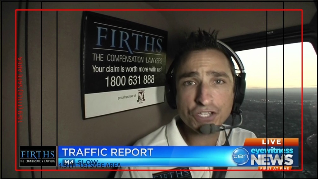
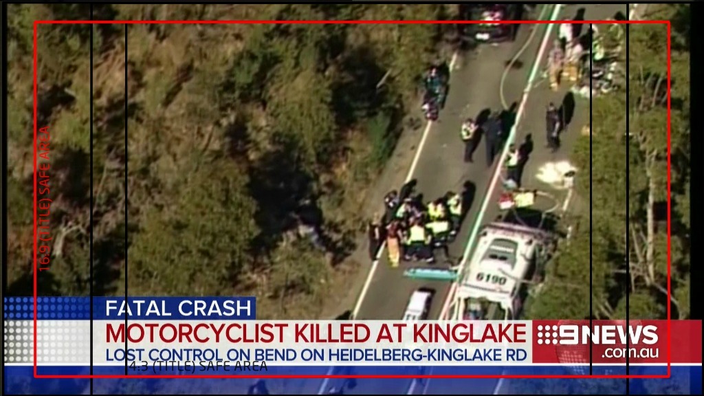
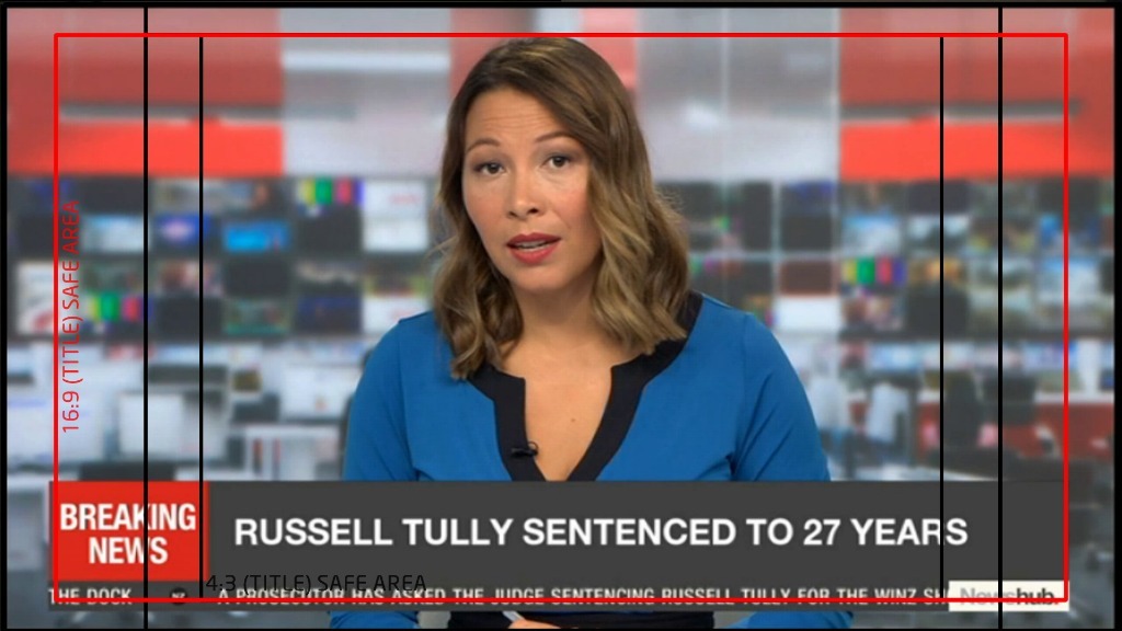
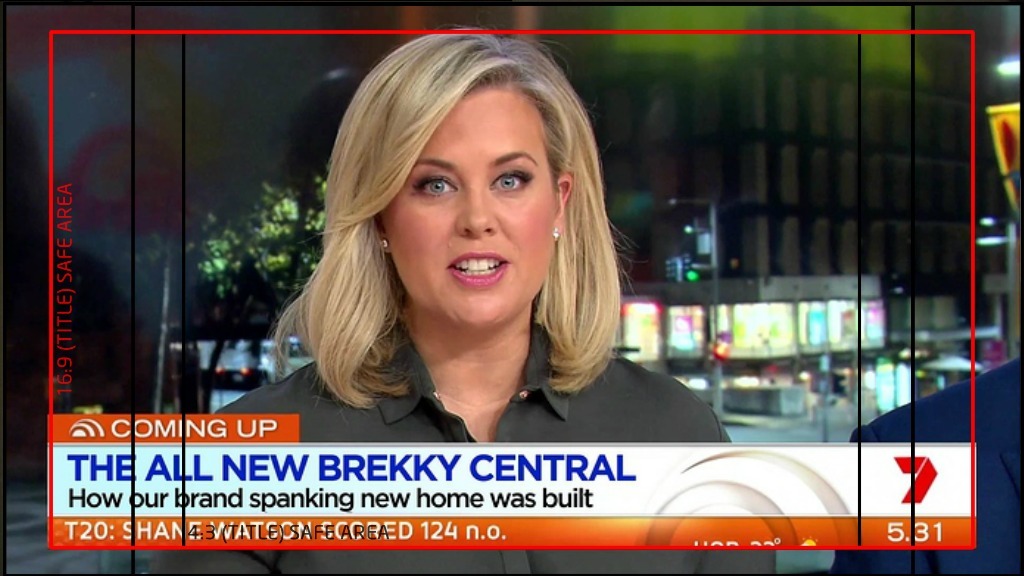
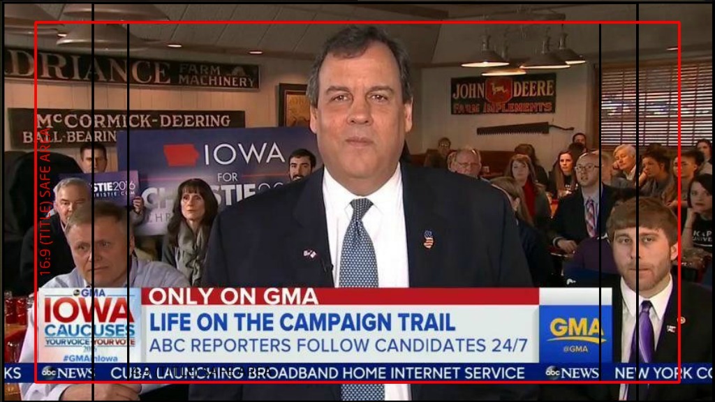
Safe Areas are zones where the graphics displayed inside them will appear on a TV of a certain aspect ratio. All important graphics (Such as the ticker tape on 9News Now, or lower thirds like you see on TEN), These will appear in the 16:9 safe area. Since the move to DIGITAL TV This means that the graphics will be visible to everyone, even if they have overscan turned on.
A good idea is to use this as an overlay or underlay so you can build your design within the 16:9 Title Safe Area shown below in RED
ON AIR SAFE ZONES


