I’m sorry but it looks terrible. Also cant people spell Gardner’s last name right lol?
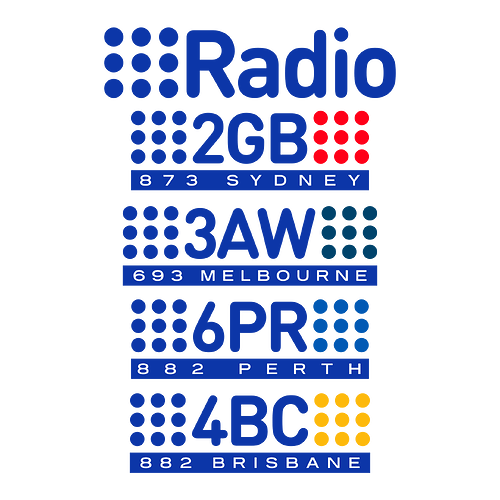
My vision of the Nine Radio stations back in January. Inspired by Nine’s Stereovision promos in mid-80s, the dots are placed on both sides of the station call sign, with the right side one in the station’s distinctive colours.
The Latest at 9:45 instead of 11:30 or something? Sign me up
As BBC News (24) in UK is winding down as an independent channel, I thought I’d share my vision here as a tribute (of sorts), if the channel launches alongside World back in 1995…
The channel ident. Based on World’s flag background, I recreated the slanted BBC logo, and used a similar font for the wordmark.
The supers. I saw a compilation of BBC News reports on Pres Cafe, which started with an odd News Summary opening. So, I decided to recreate a similar layout.
The headline was based on what they did with the correspondent tags, while the gold colour scheme was based on the Nine O’Clock News. The news items are based on this BBC News report.
Although ticker didn’t come to the Beeb until 2003, I still used the underline to create a (tiny) ticker - and here it is, for completeness.
The filler promo in between bulletins, using a similar layout to the BBC channels at the time. Inspired by the promo from an actual News 24 recording.
The LIVE tag. I know the tag didn’t appear with locations until the 2000s, but I think that might’ve been possible with the supers they’d superimposed on. The layout for the tag was also inspired by the same News Summary two pictures ahead.
Whew. That’s quite a lot. Hope you get the idea I’m going with ^^
Whoa! The backdrop looks so good
These are absolutely awesome! Fantastic work
why is the logo and NEWS in dark blue, when the background is dark blue? it’s hard to read
Shall I pull out The Cycle of MediaSpy?
Maybe fix the spelling
honestly tho, with a bit of spit and polish, this mock does have the potential to look good:
@Monsterbroe - i do highly suggest reading the Guide to Mocking - you do have potential to make good mocks, but you need to learn about quality over quantity. experiment with different software, even learn tutorials with your existing software. honestly, my first mocks were crap, but I learned and got better, and I reckon you can too.
Rather than criticise you, I’d like to provide some tips and advice that would benefit future mocks:
A first point to mention is while widescreen graphics were well and truely common place in the early 2010s, the majority of Networks still accounted for 4:3 safe zones when creating graphics in terms of supers, OSTs, and watermarks to accommodate older television sets still in use, since analogue viewing was common, albeit not for much longer.
Advice can be found here in the Guide to Mocking thread.
The second point is the older NBN Television logo you have used for the watermark is too big. Another issue is the colour as it clashes with the background, same with the title-card:

However, the watermark clash can be remedied by adding either a very fine white or black outline behind it and is common practice with Sunrise for example. However, the logo could do better with a brighter colour, or have it encased within a box.
Correct spelling and grammar in a mock makes all the difference as well!
Third is the colour combo can work (take the older blue and yellow CBS O&O graphics for example) and minimalist graphics with little to no decorations can work at times as well like BBC News’ 2013-2019 graphics, though the font chosen is a little too plain.
Try experimenting with different font families either free or paid depending on your circumstances, though even some of the pre-set styles on your computer or device can work well too. The Useful stuff for mocks thread can also help with this as well.
I feel the name you have chosen for this Today Tonight-esque program can sound memorable, however the same colour clash with the background and font issues remain from above. Perhaps you could try adding a filter on the photo to help the logo stand out such as a subtle blur effect or colour tint.
And if you’re going to make VHS-esque caps, they should be both period and aspect ratio accurate. This graphics package was used in 1999 (with the split 7 circle) and 2000 to 2004 with the ribbon logo, and cropping the borders would’ve benefited as well.
A bonus tip for everyone here is when creating graphics is hooking up your device to a TV via HDMI. You can not only test to see if the graphics stay within the safe zones, but it also looks cool too! Here’s an old example I made in 2020 from a project that is currently in hiatus:
I know this was a lengthy response, but I hope that this advice will be beneficial for you @Monsterbroe and others! ![]()
It’s awesome you took the time to do it.
safe zones…?
The fonts look like something from Microsoft Word which unfortunately cheapens the look.
Including the above, here are some things you can do to improve this mock:
- Abide by TV safe zones
- Use a nicer font. fonts.google.com has a lot of really nice classy ones which might work
- For your watermark, make them transparent and in a whiter/grey tone
- For the titlecards, consider the background colours which the logos sit on - they can clash (especially the Here And Now one)
- The biggest piece of advice I can say is learn to use something other than MS PowerPoint - https://getpaint.net/ is free, Photoshop etc


