Agreed. Random mocks doesn’t imply slapping random text old old graphics.
It’s about cultivating new ideas and thoughts of branding.
Agreed. Random mocks doesn’t imply slapping random text old old graphics.
It’s about cultivating new ideas and thoughts of branding.
I don’t know about you, but today I learned there’s a place called Minj that’s in a very different place to where I thought it was.
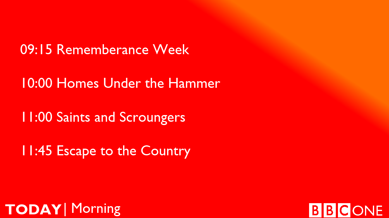
It’s better than what they’ve got now. Only a couple days and their current already looks extremely dated
This is ABC News Overnight, brought to you by Coca-Cola.
I think I speak for us all here when I say 
Sorry to be harsh but that isn’t really a mock. More like words tacked over a backdrop.
Coca-Cola, as easy as ABC!
The slogan writes itself.
Also if we’re to indulge this idea with any seriousness, maybe use a current photo of William Street?
I literally have no clue how to make a decent mock…but I’ll figure it out one day
Follow tutorials on YouTube, and practice. I recommend trying out the photoshop trial as well. I made terrible mocks when starting out, but with practice, you can improve! ![]()
There’s a Guide to Mocking here just for that.
Another go at creating new graphics for 7NEWS, with consistent uniform across 7NEWS, Sunrise and The Latest.
7NEWS
Sunrise
The Latest
This looks pretty good. I would like to see the moving ticker come back on Sunrise as part of a revamp.
the borders for the L3’s need to go away - maybe put you mock on a coloured background
Love it, but the ABC already over does the blue. Would love them to return to purple.
Here is some advice @LLZ, when I first started producing mocs about 3 years ago, I began by replicating current graphics. For example, I remember I tried replicating the Today Show graphics of that time. I tried to get them spot on, this way you can work on your graphical skills and get to know the software you are using.
Best of luck!
I was messing around in Paint3D and I personal think that this looks go if this logo was ever revamped. (My first mock as well, also tried to line it up to about the same as the 9HD logo.)
An idea sparked by @nationalnews in the Sunrise thread this morning. Sunrise introduced a new graphic this morning in between the two main hosts. The effect did not look good on TV. Here are some of my ideas:
Here is the original:
Ideas:
My personal favourite is the second last one.
As I was scrolling down & noticed “The elephant in the room” I was almost expecting one time for there to be an elephant in between the hosts!
My personal favourite is the last one. Some great mocks here!