What font is used for the coles logo?
That’s just the regular Coles logo isn’t it?
When it comes to logos, conventional English grammar rules don’t really apply when deciding whether to use all lowercase or uppercase etc.
Lowercase typefaces could be seen as younger or edgier, especially when they’ve gone with a fairly basic rounded font of that could just be the way the font was designed to be used in all lowercase.
I think it looks fine, plenty of ways they can refresh the overall brand without changing the logo itself.
It might be seen as younger doesn’t make it the correct use of branding and you can still have the same effect with the use of a capitalisation of the name. I work for a company that is known by abbreviation and uses lower case typeface for the logo. Even some government departments can use upper-case typeface in an effective modern way.
It’s the same wordmark they’ve used for 30 years ![]()
I don’t think the Coles logo looks as good with a capital C, nothing wrong with stylization and it all being in lowercase…
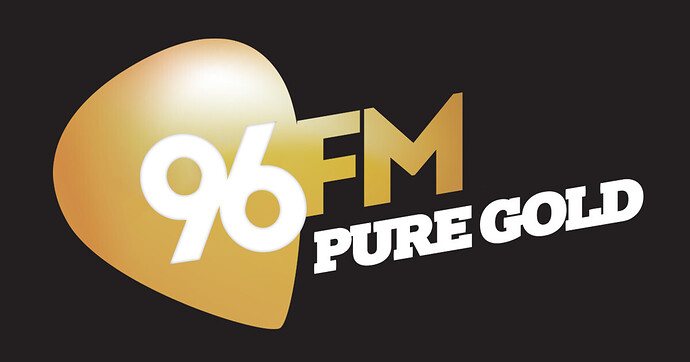
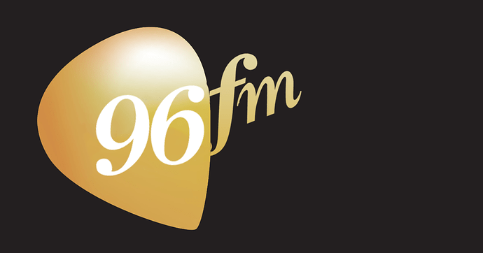
Following the discussion on the FM Spectrum Replan - Perth thread, I decided to make 2 96FM logos, if it were to move to Pure Gold if ARN bought 6iX and made it KIIS. I made one in the Pure Gold style, and one with the heritage logo in the Pure Gold style.
Hopefully we see something similar to this today! I would opt for the black instead of blue, but the overall style would translate well to 7NEWS. ![]()
The black might be too close to ABC?
Is that a Prime Wollongong Ident?
(Looks like Port Kembla)
I don’t know; I’d assumed it was a blurry shot of Canberra. It was just what I found on a quick search for prime television logo 1989.
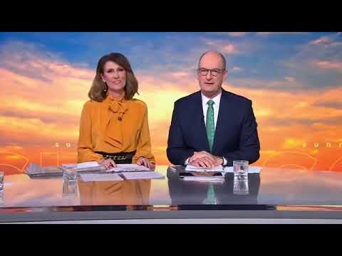
Just a quick mock, with the new Sunrise opener with the NBC Today music. Just wanted to see how it would’ve sounded with it
I find this NBC music to be fantastic in this video.
I think it would be too loud for Australia, but I do like it. It works well.
Yeah, I also felt it was too loud. Has a very American sound to it too, not sure it would work here.
As a homage to full-service radio in New Zealand, which was known as community radio and was widespread amongst regional communities in those days, I created a series of logos using Microsoft PowerPoint.
Before the More FM brands came along during 2004/05 and in recent years, most logos act as a homage to New Zealand’s former private radio stations (such as “Radio i” in Auckland, “Radio Windy” in Wellington, “Radio Avon” in Christchurch, “4XO” in Dunedin, “Radio Waikato” in Hamilton, “2XS” in Palmerston North and so on) and some are generic (such as “Gisborne FM” and “Hawke’s Bay FM”). Included are One Double-X (1XX in Whakatane and the Eastern Bay of Plenty) and Coast FM (West Coast) which, in real life, are independent radio companies as of today.
