Updated above post with a titlecard using the “News at Five” brand
I just tried it out and it didn’t look very good honestly. Looks better all in white.
Updated above post with a titlecard using the “News at Five” brand
I just tried it out and it didn’t look very good honestly. Looks better all in white.
Updated with possible Sports Tonight integration into news service.
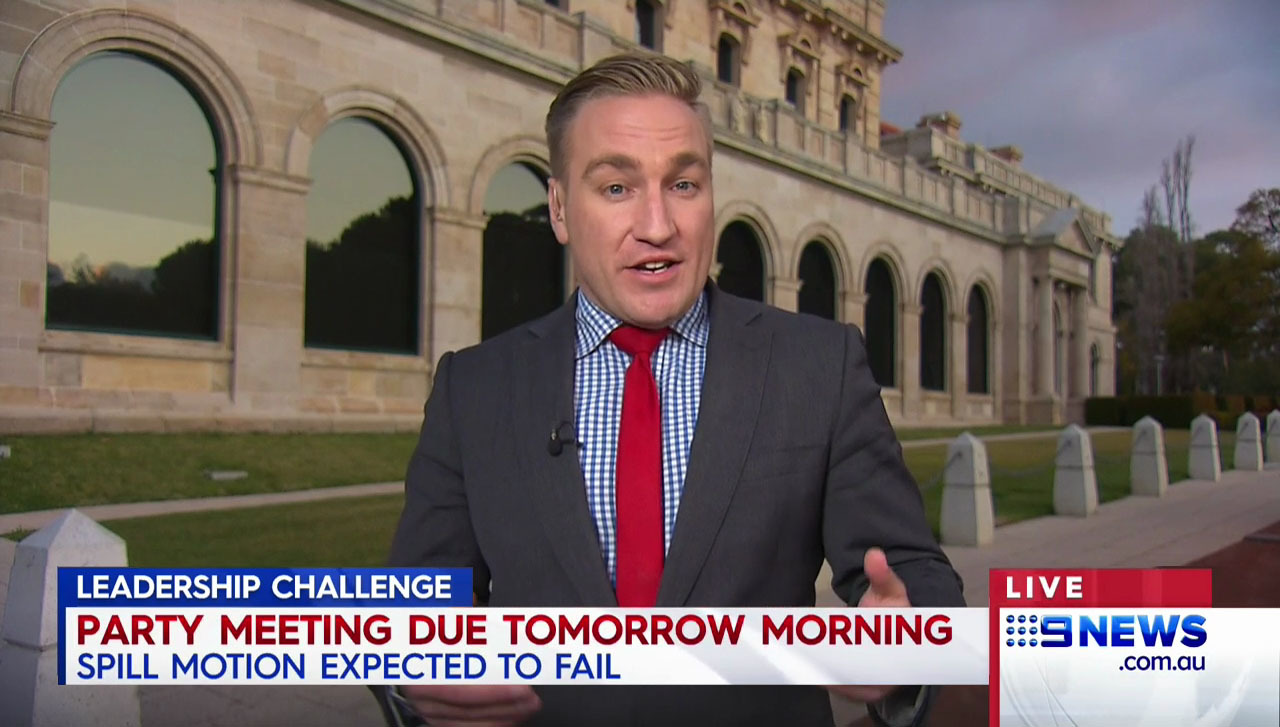
@nationalnews How I would’ve fixed the supers 
Yes! This is exactly what I was about to go and mock up. Looks a million times better.
Probably the simplest mock you’ll see me make, but I don’t like the absence of the Nine News logo in the “Breaking News” fullscreen graphic.
Started creating a new look for Nine based on a few different previous looks, see if you can spot each element (the dominant look is from my favourite package used on Channel Nine) 
Thoughts are appreciated 
As per the 2002-2005 look, each day would be colour-coded.
I like that one. Perhaps a direction that Nine should consider if they want a more simplified On-Air Presentation package! 
2 posts were merged into an existing topic: Random Mocks
I really like it! Although the OCD in me cant stand the fact that the day is in bold text in one but not the other ![]()
haha whoops 
Obviously the 2002 package. 9HD logo is current, but takes a colour scheme from 9Go. Background image is of the 2012 ident for Welcome Home. The time being in a box reminds me of the late 2008 variation of weHeartTV. Any more I’m missing?
Think you named more than I could’ve, spot on
What do I win?
Holiday to Ayr.
Can I get a refund for it?
nope sorry 
I’ve reuploaded all these 3 mocks because I finally found the setting in Photoshop which disabled text-smoothening. Text looks much better now