Okay thanks. When I get the chance I’ll change the colour schemes around then 

Yep, that looks better! 
1 Like
Looks better, the news logo looks a little too thin and flat though. Also the presenters names just look like they’ve been typed over the title card, having seen your previous work I think this area could be improved.
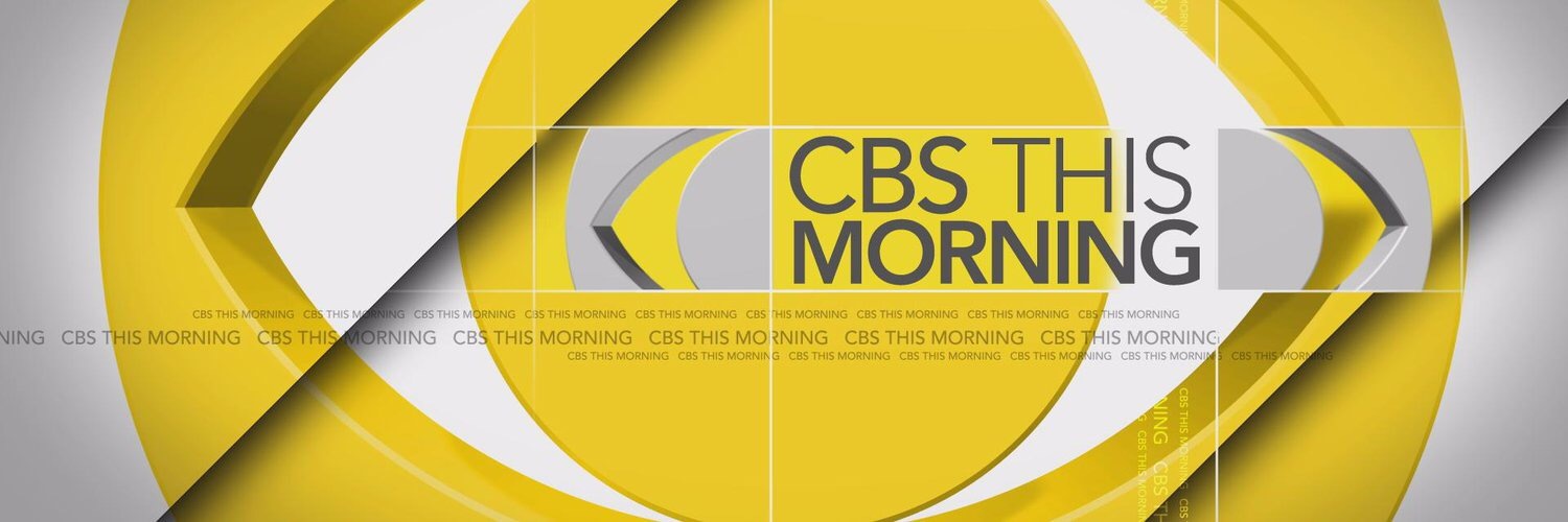
I’d like to see something in a similar style to this:
3 Likes
Thanks for the feedback. I’ll give it a shot Apart from the news logo being too thin and flat, do you think it works without the actual “TEN” circle?
Also to mention, I’d try making the font thicker but unfortunately I only have the “normal” and “extra bold” variations of the font and the extra bold type is way too bold 
1 Like
Looks excellent, would be interesting to see what it would look like if the names were swapped with the date so it was a more generic one as Adelaide and Perth don’t have two newsreaders.
1 Like
Will try soon. I also have a few other titlecards that I want to try out
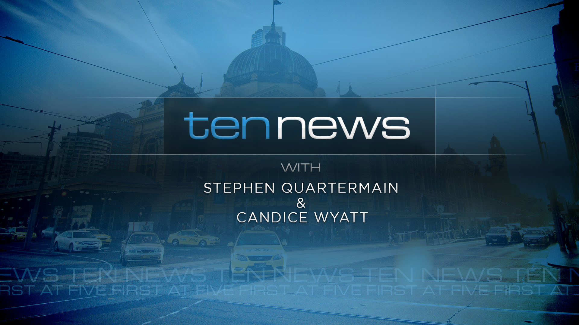
Thinking about what @killy06 has said, this is what I have come up with for a titlecard. Any thoughts?

9 Likes
The backdrop is awesome, love it!
1 Like
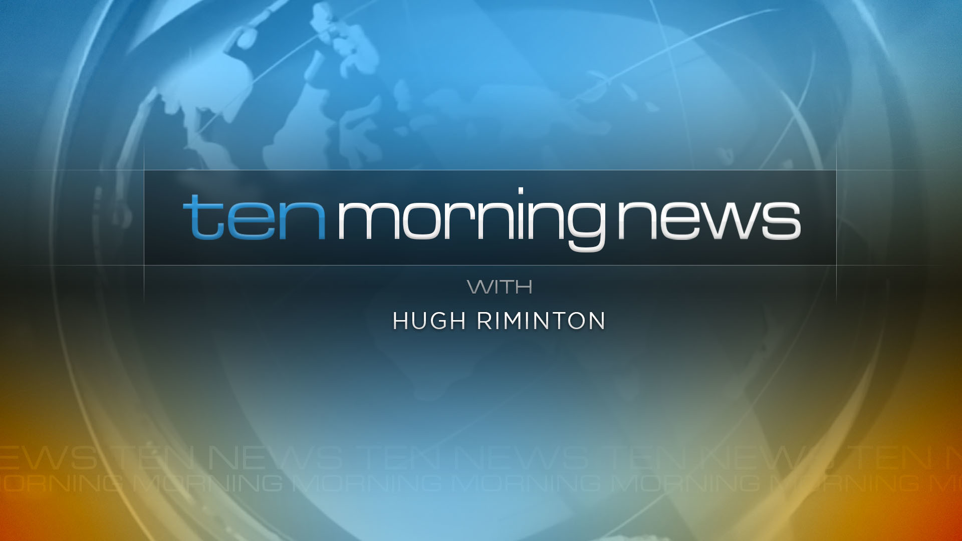
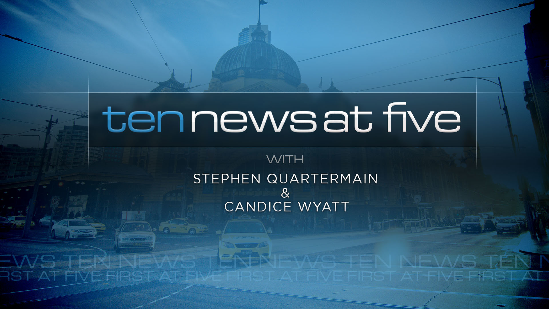
Going to use this post for all titlecards that I create for the Ten News theme.
Generic (with names):
City (with names):
Generic (morning with name):

Generic (morning [coloured : @utaussiefan with name)
Generic (late news, purposely darkened the background for late night)

City (using News at Five brand)
Sports tonight (if TEN were to re-integrate the brand into their news service)

16 Likes
That is one nice title card, looks serious and not tabloid like most new bulletins now. Can’t wait to see the other ones. Could add some orange or yellow to the morning one just to brighten it up a bit.
2 Likes
Added to the post. Not sure how I feel about it. Any thoughts or suggestions?
Added a late news titlecard. Themed the background to appear darker for late night viewing
1 Like
I like the modified colouring for the different timeslots!
1 Like
Love it! Very reminiscent of the 2009 package.
2 Likes
Thanks!
I’ve always loved the 2009 / 2011 package(s) so there was a bit of a design cue from these eras 
I love those title cards for morning and late news. What would it look like with orange/yellow for the morning/late word to separate it from news? (Using the generic blue background)
1 Like
Good idea! I’m done for now, however when I get the chance another day I’ll give it a shot Should look good on the morning news edition especially.
Looks awesome! Great job Nick!
1 Like
Very noice!
1 Like