WIN hasn’t had a truly inoffensive watermark since about 1996.
Actually, the last time WIN had a small transparent watermark on the top-right hand corner was back in 2002. In fact, it changed to a big obtrusive ‘mappy’ watermark on 1st September 2002 (excluding Tasmania, which kept the original watermark for another couple years or so), at the same time when Nine relaunched their on-air presentation.
3 Likes
At least they’ve been see through though mostly until this latest on air all the time. It used to be only solid like now when doing coverups. I remember Win tas use to have a tiny little Win with the 9 dots that was barely visible that was good but that dates back to early digital TV rollout times.
1 Like
At least on that one, the lettering is centered
True, some of them have only been mildly inoffensive, as opposed to truly inoffensive (or at the other end of the scale as we have been seeing lately, totally obnoxious).
1 Like
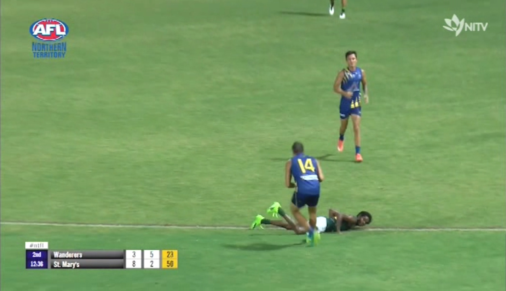
The changeover on screen message was half hidden by the cricket graphics, it needs to be made into a proper rolling ticker above the graphics for viewers to change channels.
This is the w/m used prior to the current map including a promo - possibly the smallest watermark of any of the commercials at the time. MS comments were that the promo add ons were too small.

4 Likes
You’re lucky; fully huge mappy is back here (perhaps Bruce got right onto the mistake of a slightly smaller size earlier).
Ignoring the HD watermark in the process. Still in the same position from before mappy made its return. Do they even watch that they produce?
It appears that resized watermark is only for The Project. Back to original size for tonight’s regular programming - at least in WA.
2 Likes
Apologies if this one has already been mentioned, but here’s a cap of Ten’s rather intrusive In-Program Promotional “Watermark” (if you can even call it that, because the graphic isn’t even transparent!) for the premiere of I’m A Celebrity, Get Me Out Of Here! Season 3 on January 29…
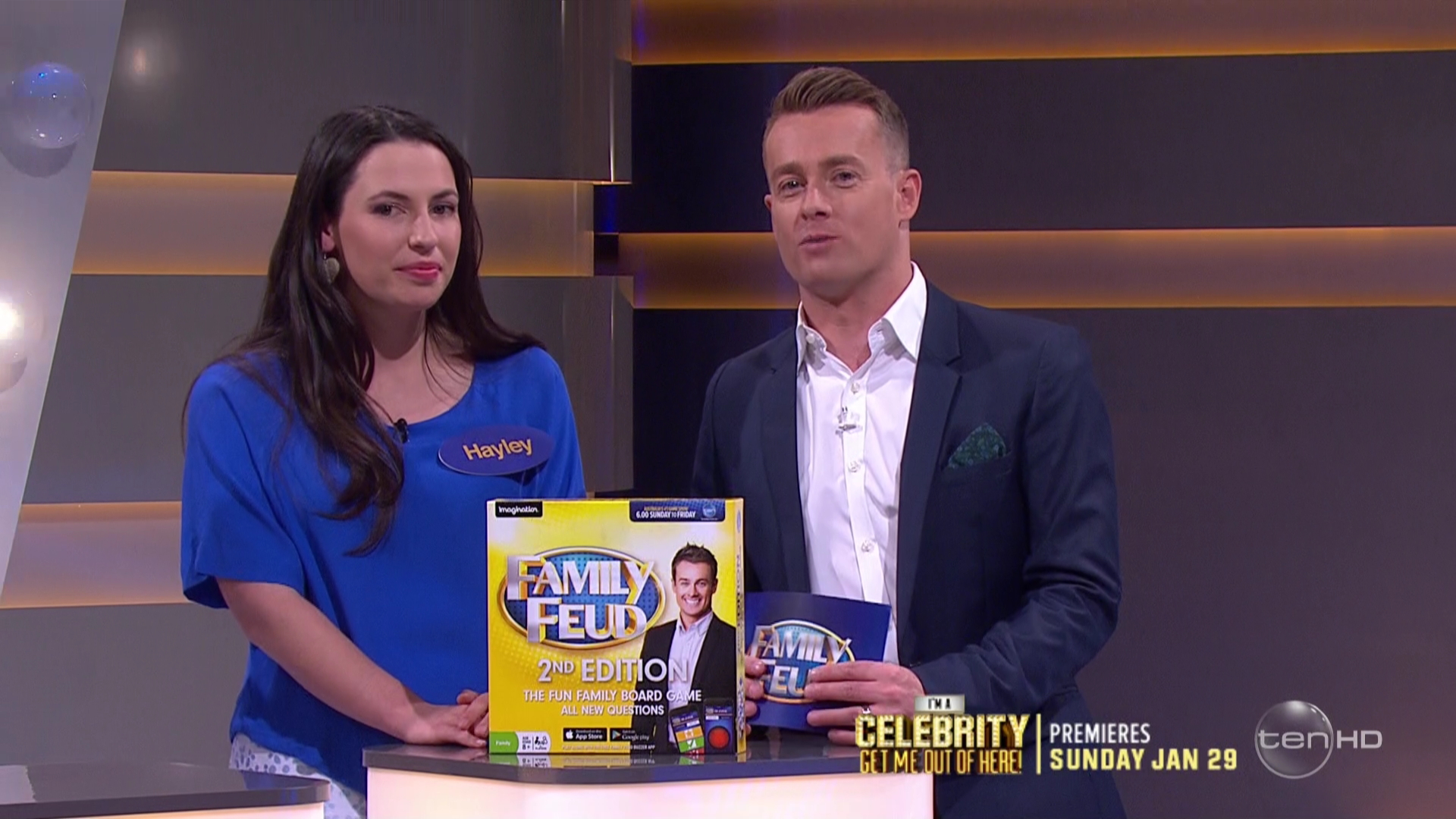
I’m not sure about everyone else, but personally I think that Ten’s In-Program Promotional Watermarks are generally the worst out of all three commercial networks.
6 Likes
That just takes up WAAY too much space.
ACMA should think about creating and enforcing some rules on the allowable size and opacity of watermarks.
They just get bigger and uglier every year.
Time to put a stop to it.
3 Likes
I notice a square CC (closed caption) logo on a solid black background near the bottom right of the screen at the start of ABC News Victoria tonight. When was it introduced?
When ABC ‘HD’ went ‘HD’
It sux so badly. Completely covered the subtitles on Entertainment Tonight from the movie Lion when they interviewed the child star.


That’s less bad than the previous one, although some transparency would still be nice!
1 Like
In WIN-land it just isn’t going to be the same not being able to see (through/overlapped by the Ten/WIN one) each channel’s watermark for whatever programme the cast are watching, since everything (including any viewer sitting on the floor) will be obscured by the solid blue mappy monstrosity. ![]()
4 Likes