Spotted this on Gem Sunshine Coast last night, lasted for a couple of minutes before it was positioned correctly.

7 Likes
Ahh, don’t we all love a good ol’ WIN coverup fail?! 
3 Likes
Trust me - NBN will be in what I like to call “watermark what the f**k” tomorrow if News/Today does new graphics. It can take NBN a couple of days to figure out how to shonk cover anything with a Nine logo.
4 Likes
Wish Nine would move their watermark after each over, just to really piss WIN off and their ridiculous coverups.
Surely Bruce is above this, it must be some hack down the chain with an obsession against Nine
3 Likes
I’m pretty sure it is Bruce that orders it. I remember being told once that you could tell when he was in the country because the watermark intensity would be turned up to 95%… then after he left it’d go back to around 34%.
7 Likes
Ten needs to give the massive Celebrity watermark a rest. It doesn’t need to be up for the whole of every program. It’s really annoying that it covers all the graphics on Entertainment Tonight.
2 Likes
9 Gold Coast new watermark - HD and SD are the same. There has never been a HD symbol on that channel.
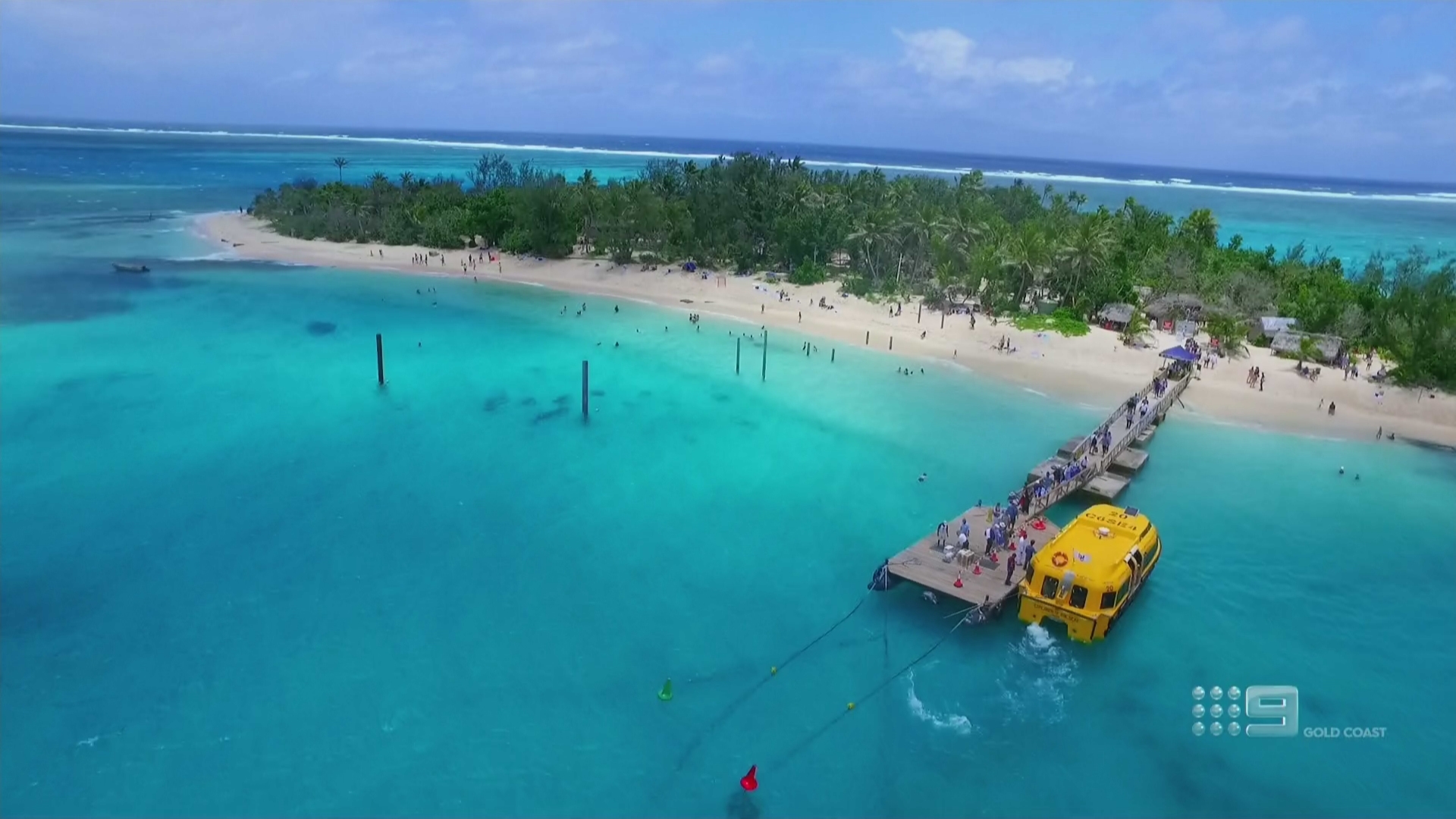
3 Likes
I’m sure most people here have noticed but interestingly, the 9Now streams don’t have the “HD” addition despite being 720p. Considering that the “HD” addition often appears too early/too late/at the wrong moments on LCN 90, they may as well ditch it!
1 Like
Watch 7TWO on Prime. The watermark is a lot smaller and fainter. Even when metro 7 had the old watermark, Prime’s version was fainter. Click comparison image below for full size:
3 Likes
That’d look better if the text was below the logo
Also, here’s a comparison between the 7mate watermarks on 7 and Prime. Prime’s watermark is fainter – it is also squashed (and has been as far as I can remember):
3 Likes
Exactly, you have to wonder where their designs come from sometimes. It would make perfect sense to put the location centred beneath the logo rather than just tacked on. Not really sure what the point of having Gold Coast there is anyway.
1 Like
The only reason (I can think of) for having a separate “Gold Coast” watermark would be so viewers can tell that it’s different from the main Brisbane feed and even that’s a bit redundant when we’ve got LCN names (or whatever the actual term is) for that sort of thing! 
1 Like
That’s because Prime is lazy much like with the 7Two watermark. Nobody can be bothered fixing them. How long have they been like that? Ever since “7Two/Mate on Prime” was dropped?
1 Like
Yes that’s right nothing has changed since then via Prime
1 Like
True, but I’d rather a faint squashed watermark than a loud “correct” watermark.
It’s one of these things you don’t REALLY want to see anyhow 
1 Like

Scary. We had he exact same colour scheme in our house in the 1970s. Orange, Green and 50 shades of Brown. 
3 Likes
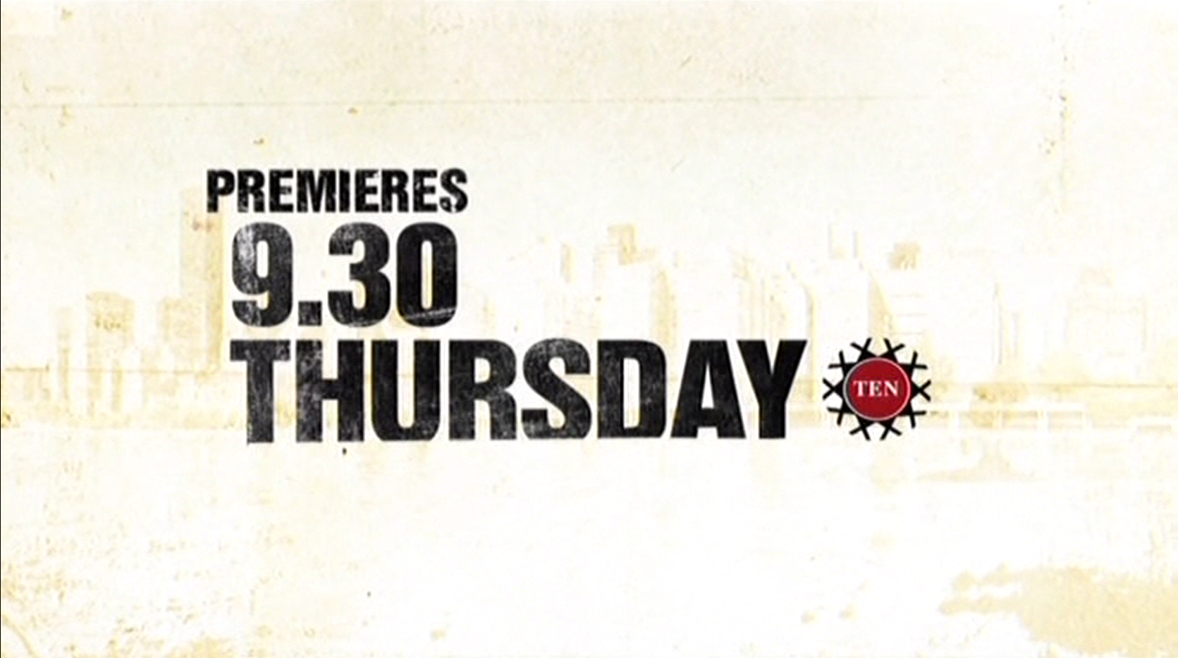
I remember that logo being used back when they were promoting Life on Mars… And I was thinking in Melbourne they should have been using the old 0 logo instead.
1 Like