That promo looks amazing, I hope it does moderately well but they should never have held it back IMO.
Really love the transition of those coming soon graphics at the end also.
That promo looks amazing, I hope it does moderately well but they should never have held it back IMO.
Really love the transition of those coming soon graphics at the end also.
Haven’t they been using that for a good few months now?
I did look back at the forum posts and my other recordings and it looks like that it dates back to at least October.
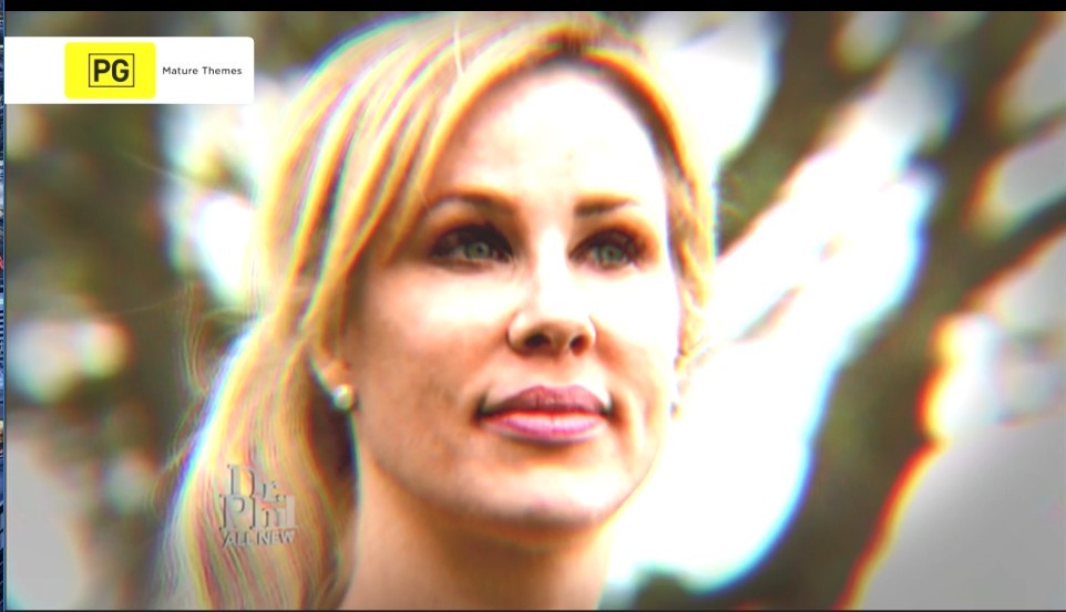
Goes to show that I don’t watch Dr. Phil from the start 
If ten were to do a refresh this year, which I hope they do and start everything from scratch, maybe it’ll encourage WIN to change its "9 look”. COUGH* WIN NEWS
I’d love if they’d do something completely different like they did for the 2012 refresh, with a new take on all graphics to coincide with Young Talent Time’s revival. That introduced a refreshed Ten logo, new PRG graphics, new look lineup, and the previous single colour solid watermark, which replaced the single line version from the early 2000s.

")
Ten needs to be creative again, and stop trying to mimic some elements from other channels. I hope this year or next year, we’ll see something completely new, and hopefully a new song too. I’m really starting to get sick of hearing the same one every time. ![]()
Ahh yes, the failed 2012 yellow logo! 
Yea… I did hear that was quite short lived and it returned to the late 2000s glossy Ten logo shortly after. The point I’m making is, I hope they do something creative with their future On-Air Presentation efforts like they used in the early-mid 2000s, as some pointed out they look similar to Nine’s promos, just like WIN News at the moment! ![]() I loved the blue yellow flashing dots element they used for most of the 2000s. Hoping they can make something concrete again with their presentation elements.
I loved the blue yellow flashing dots element they used for most of the 2000s. Hoping they can make something concrete again with their presentation elements. ![]()
I loved those idents, I think the single coloured logos could work nicely today.
It would certainly fit in with the logos for One and Eleven, as Ten don’t appear to be changing them any time soon, as well as the current Tenplay logo. They could use the dark blue 2D Ten logo that is used on Tenplay.


I actually made a mock almost a year ago using the flat Ten logo used on Tenplay for making a flat version of the Ten HD logo. I think maybe a tad brighter, and a new style On-Air Presentation to suit with it, I think it could work well! Let’s hope the new Ten in 2017 promos are a hint of a presentation refresh. 

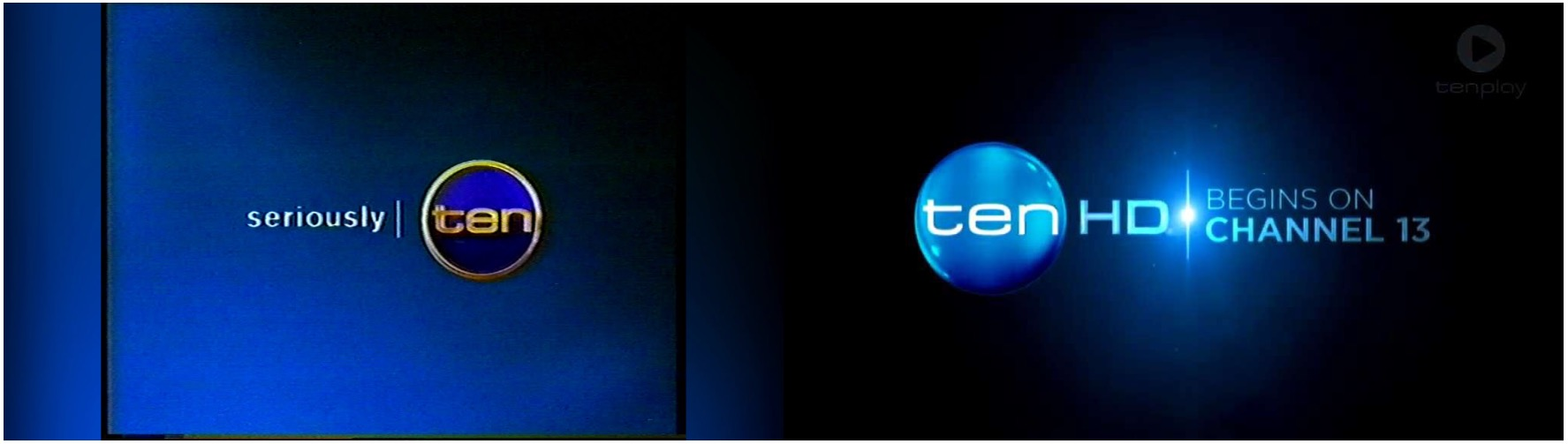
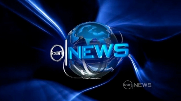
I really like the new super-3D look of the TENHD logo. It would look great as a new treatment for it’s news ie. ten|NEWS
Yes me included too! I was really hoping for a full presentation refresh with the launch of Ten HD as the blue spot light background in the pre-launch promos gave me early 2000s vibes.
The stretched line element and the Gotham font made me feel Ten was finally going to do something different in a long time since the last changes were over 10 years ago now. And then when Lexington said that the News was in for a refresh, most of us had hoped for the new Ten logo to be used. None of that ever eventuated, so why give the HD service its own logo, when it’ll only be used as the watermark for every program even ones produced in SD? I did spot the new logo in some corporate press releases, so that felt like a glimmer of hope, but here we are. 
I did make a modified Ten Eyewitness News logo using the glossy elements of the pre-launch promo back in May (apologies if this seems off-topic):
Yes, they should just adopt what they used on Ten HD for everything associated with Ten.
A reminder that this thread is for actual presentation - discussion of mocks can continue in the appropriate threads.
Apologies, @JosShoulderPads had mentioned they should have used the new Ten logo apart of the News, so I posted a mock I made from the Random Mocks thread when I posted it back in May last year. Apologies if it looked like I went off topic.
I reckon the 3D TENHD logo would look terrific combined with the old mid-2000 logo
I recon they should go back to this Ten logo if they go for full 3D

Personally I dislike the Ten logo here because of the increased distance between the text and the edge of the circle (there’s just something visually unappealing [to me] about the greater distance, as there has been in previous Ten logos which have also had a large gap), but if the text was slightly larger so the gap was smaller then it’d be OK.
In this set of logos the TenPlay one looks out of place, because it’s the only one with a gradient.
One element (s) of ten that do need refreshing is eleven & one, maybe if ten could incorporate something in all 3 logos (ten, eleven, one), like how 9 use the dots and 7 uses its logo. But what could ten use? Maybe make the logos for eleven and one round?