Ten On-Air Presentation

Yeah it’s been updated with footage from 10 talent from the upfronts, you can tell cause they’re wearing the same outfits from the event. Still don’t like how there’s some fairly old footage used though, would’ve been a good opportunity to update some.

Also those movie tie-in’s @TV.Cynic posted are fantastic, 10 has always had the best ones IMO.

Some presentation elements from tonight

11 Likes

Soooooo good. WIN doesn’t show like 90% of that.

4 Likes

There’s a lot of depth in that relaunch. Very clever. I’m excited to watch it’s journey.

4 Likes

Well spotted. It felt like they had rushed the original to air and weren’t happy with it so decided to update it. But it seems they didn’t spend the bucks to get all the personalities in to record those and just decided to do kill two birds with one stone and do it during the Upfronts when they were all together. Just 10, doing it on the cheap, again. :wink:

We’ve had one for 10 and 10 Boss, so here is one for 10 Peach:

Do you like the 10 Peach name for a TV channel?

  • Yes
  • No

0 voters

1 Like

Do you like the 10 Peach font/branding?

  • Yes
  • No

0 voters

2 Likes

I’ve come now to not mind the font, but still unsure about the name itsself and the watermark size could be a little more compact

2 Likes

What’s with the double votes? Yes AND no, explain yourselves!

Sure… I’m of the opinion that the entire package across the network including Peach is great, but that the name is underwhelming at best.

3 Likes

Sorry about that. This is the first poll I’ve ever set up. wasn’t sure how to do it.

Will it wreck the poll, if I change it now?

Edit: Apparently I can’t change it anyway now. I need to get a moderator to do it. Can a mod help here please?

No was just curious why someone would vote both yes and no in that poll.

I’ve asked a mod to fix it but still waiting.

I like the way @Bort thinks

1 Like

Love and hate it at the same time?

1 Like

Not sold on the name or the logo, but the rest of the package fits

I’m like that. I hate the name. I hate the logo. I don’t mind the graphics.

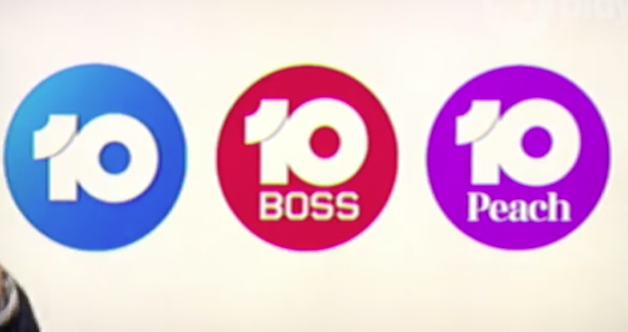
Did anyome notice the variation of the 10 Peach logo on Have You Been Paying Attention? in the intro tonight?

The Peach appears in the 10 circle in the same way they have done the third version of the 10 BOSS logo. If they’re going to stick with this font, I think this logo would look better as a watermark and logo.

Anybody have a screen cap?

3 Likes

55%20pm

2 Likes

You know, the reconfigured logos (with “BOSS” and “Peach” underneath the “10”) actually don’t look that bad - probably what they should’ve launched with if I’m being honest.

Next step for 10: Tweaks to the presentation of the news!

3 Likes