Discuss Seven’s On-Air Presentation here.
It’s old and desperately needs updating ASAP! That about sums it up nicely I think. 
2 Likes
I generally have to agree with that analysis.
It’s been a bit tired for a while now, but Nine’s refreshed branding (which for what it’s worth, manages to have a standardised network look while keeping unique elements for each channel quite well IMO) now makes Seven’s current branding positively ancient.
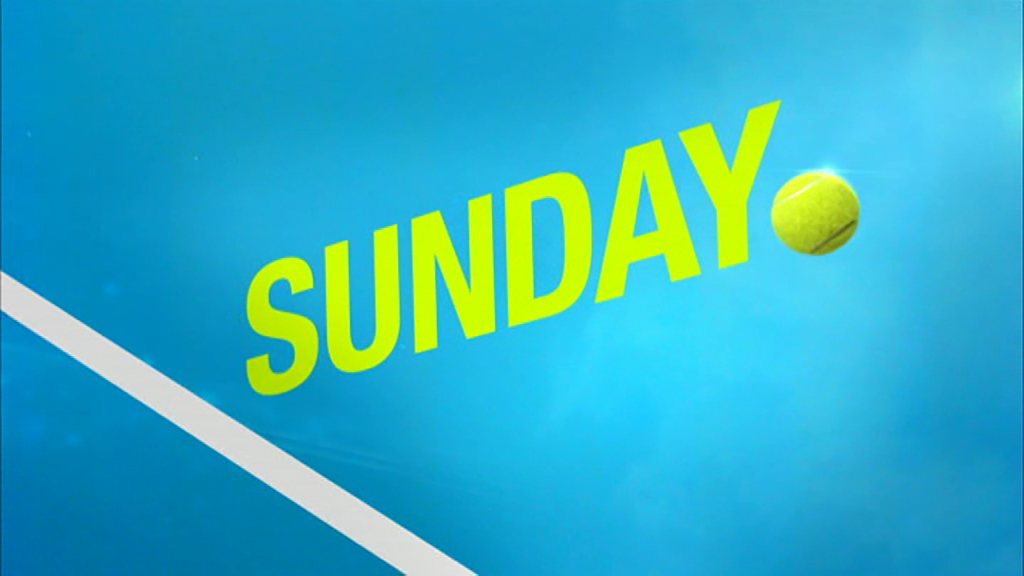
Seven definitely needs an overhaul both with the on air presentation and news service too. I suspect change around the time Rio starts as Seven in the past have used the Olympics to change their look but I’m not holding my breath. I want it to happen. I have noticed slanting in their current promos for MKR, tennis and others. Maybe it’s a change that is coming?
If you were watching Seven in Sydney at 12am, you wouldn’t have even known it was New Years. Didn’t they used to do special promos at midnight?
I think Seven stopped doing those after 2009.
2 Likes
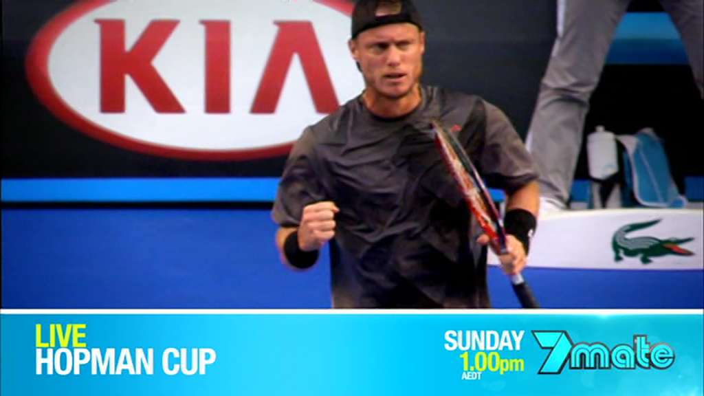
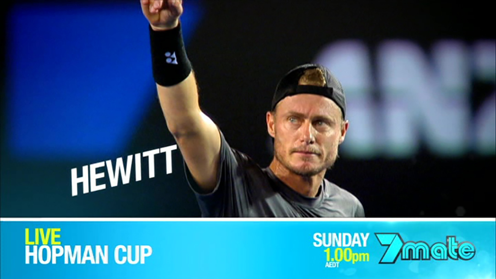
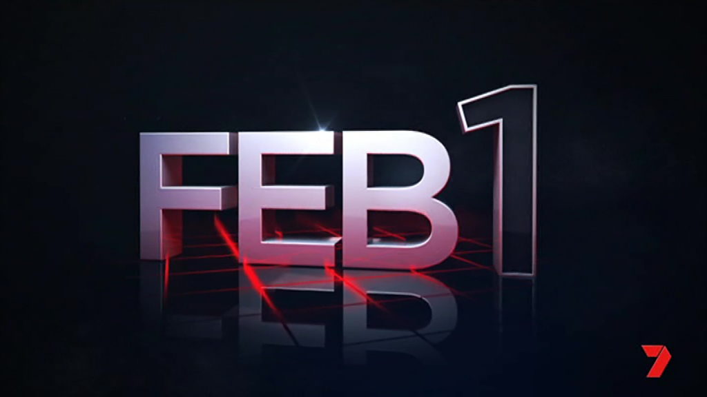
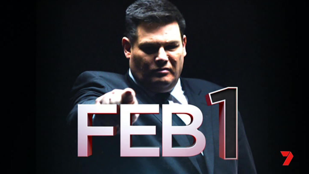
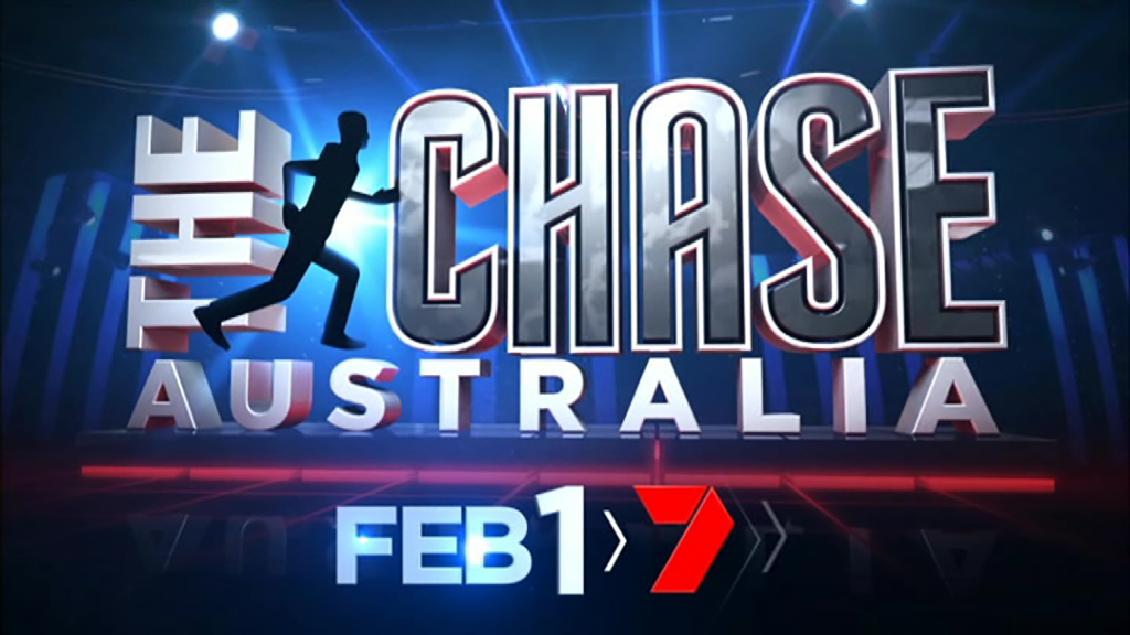
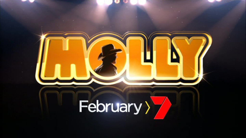
I wonder if the new ‘angled’ graphics on the February 1 promos are part of a new on air package?
Here’s hoping they do something this year. God knows they badly need it! Since Nine relaunched their channels, it makes Seven’s presentation look really, really dated.
1 Like
They figured out that there are hardly any people home home watching telly on New Year’s Eve so the effort wasn’t worth it.
3 Likes
Definitely looks like Seven has a new look from today going by promos for shows during Sunrise this morning.


If they had the Sydney fireworks a few more would be watching. Not many are going to stay home on New Year’s Eve to watch a random episode of Grimm.

So Seven have gone back to an older (large & flat) logo?
2D red always been their logo. They’ve just been adding graphical effects and gradients to on-air branding.
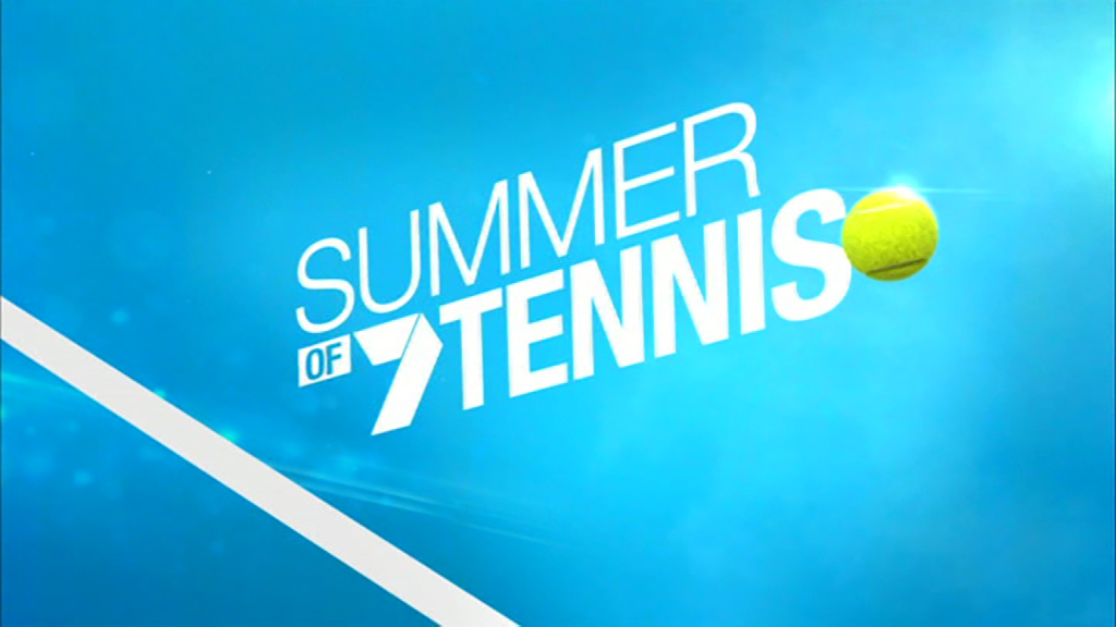
I might add that they’re fairly inconsistent. Both 7Two and Seven News use an older version of the logo, and they just used that same version for the Seven logo on a Tennis promo (the one used pre-2012). So each different design isn’t a completely different logo, but rather different versions are used for different places when appropriate.
I like the arrow motif.
2 Likes


I whould say the arrow will replaces the straight line that whould be about it
Not to mention the flat red logo. 