On Gold Coast the Sunrise clock is appearing as well
3 Likes
…and also these “Return From Break” stings as well:
But like the generic national backdrop, I wouldn’t be too surprised if they wait at least another few weeks to change it.
2 Likes
In Melbourne we had new generic version return from ad breakers…
1 Like
Similar to the new openers with the new font and animation, or just an update of the background?
So the same style and background as the LIVE and BREAKING NEWS breakers but blue background with the folding back glass animation ontop of that.
1 Like
All caps:

4 Likes
Sydney now using the new style Seven News corner logo during the Opening Headlines (old version was still used on last night’s Opener):
Also…
4 Likes
I like it
ducks from sniper fire
5 Likes
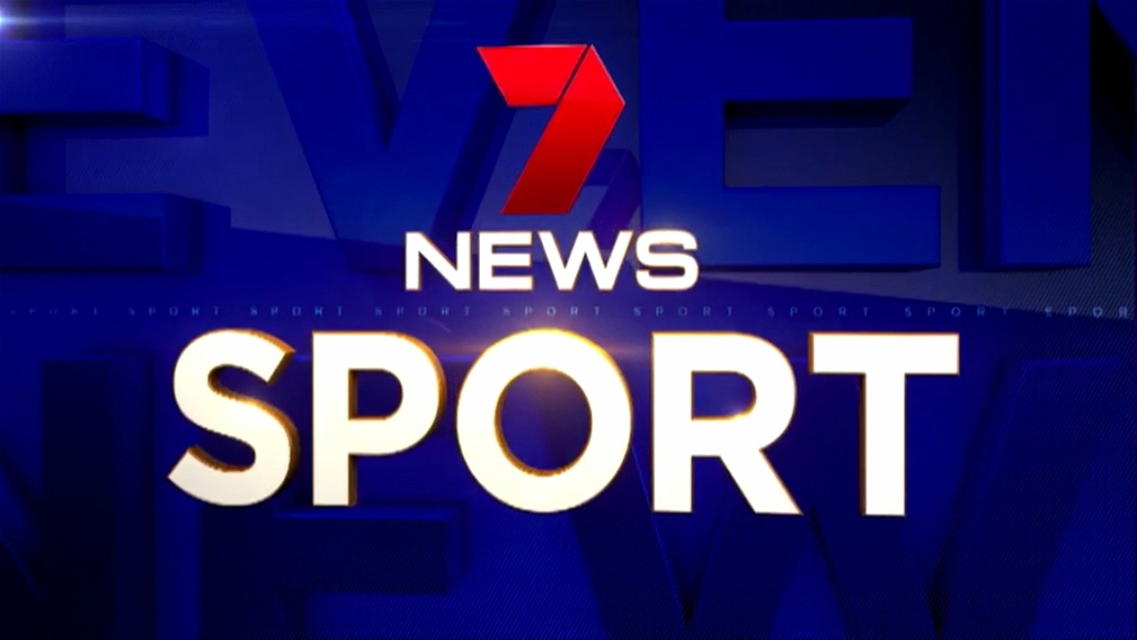
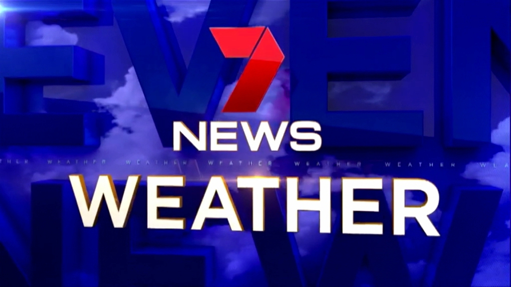
The Afternoon News had the old sting, this is the one they should be using, as seen in Melbourne bulletin tonight:
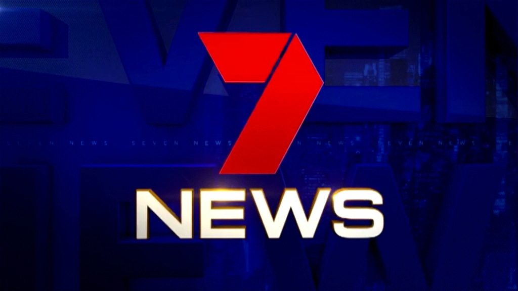
Also sport and weather
6 Likes
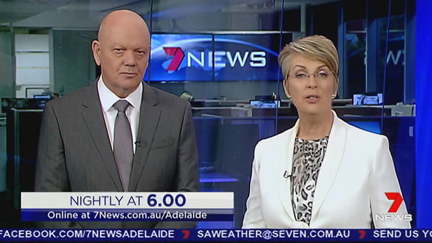
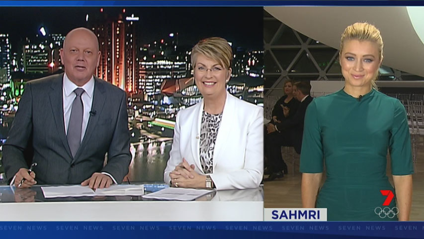
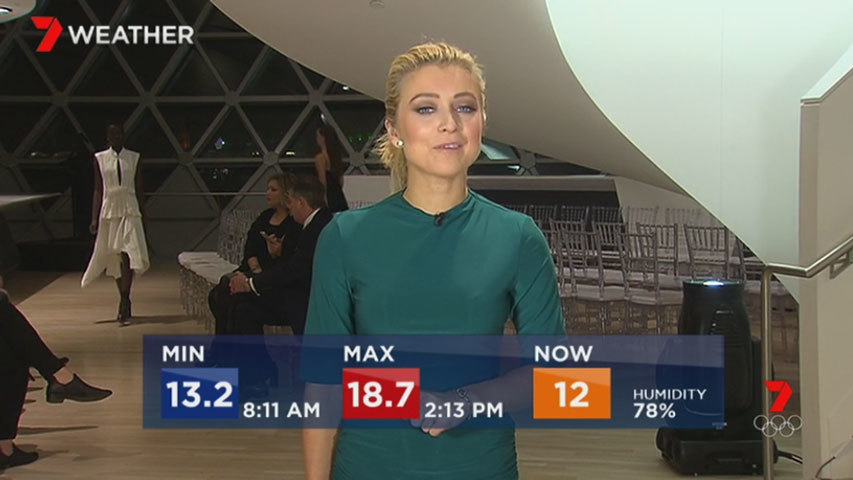
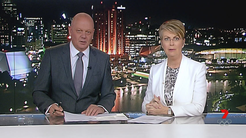
A few more Adelaide caps:
Afternoon update and titlecard
Live Cross split-screen
Live bug with and without a clock
Live weather cross and alternate today’s temperature screen
And finally, Adelaide presenter Jane Doyle’s response to how blue everything now looks*:
- Only joking! Her facial expression is unrelated, but I found it funny anyway!
9 Likes
Perth have never used the add breaker
Ah well. Back to the drawing board Seven. You have a couple of months to sort it all out, especially in Sydney when the cardboard cut-out will be off screen in December never to return for the Musher Show to take over.
4 Likes
It has been used before in 2014 during the temporary theme change, in the headline transitions. It was seen for a brief second which was then followed by the wiping scan-lines transition.
")
1 Like
Caps of Melbourne bulletin tonight:

1 Like
A step forward over their old look. Not a leap, still worse than all the other networks, still not fitting the music, still not consistent, but forwards.
7 Likes
Perth:

2 Likes
I actually really like this new look. I like the flashy style that isn’t seen in Australia
3 Likes
Not great attention to detail throughout the package and in the implementation, but I like the concept and the refresh as a whole. The opener in particular is very slick without being overwrought, really gives the bulletin a more prestigious feel despite the content.
Gold is an interesting inclusion as a highlight colour but it’s used sparingly enough to not seem dated. Would be nice to see that colour scheme reflected in the set lighting.
Need to tighten up the relationship between set backdrops, lighting and the new graphics package. Right now Sydney seems to make use of about 30 different shades of blue.
9 Likes
Thanks for the upload. Is it me, or has Ferguson’s lean become more pronounced over the years? Give him a couple more and he’ll start toppling over.
And how many headlines do they really need??
Minor tweak tonight in Adelaide the presenters name was una blue box tonight.