Looks dreadful, the blue is far too dark.
3 Likes
I just looked at the opener and it was the same - but yest they have the “blue graphics” as well!.

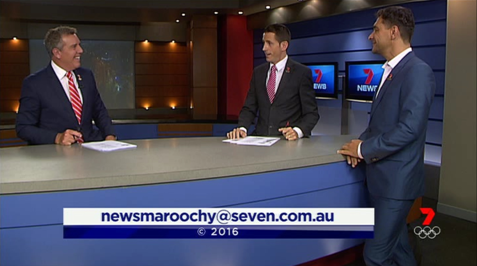
But some things unchanged including weather

3 Likes
Worst on air look. Can’t think of a worse on-air news presentation than the final National Nine News package from January to October 2008.
1 Like
cmon Perth, new virtual set please since the last updates have been from the 4:30pm backdrop! Doubt it though! 
I think if they changed the blue supers to black then it be more consistent. They should’ve focused on the red and black theme which was first seen when we had the NBC Mission promos.
Here is a quick mock I did in a minute. Something similar to this (thanks to TV.Cynic for the original cap)
7 Likes
7 news Adelaide brought back the green screen for weather after a few years of the plasma.
1 Like
There are good things about the changes, like the supers not taking up as much room on screen. They just need to be red! ![]()
1 Like
And you compare this to the rest.
Nine looks so much cleaner and they haven’t changed their look (excluding minor adjustments) since January 2014. Ten’s presentation has always been top notch ever since 2013. ABC’s package has aged fairly well though simple since it was introduced in July 2010. SBS also aint that bad ever since 2012
4 Likes
1 Like
If you say so. ![]()
3 Likes
They need to update that durtan behind the sports reader.

Like Sunrise’s current graphics, personally I think that Seven News’ latest graphics would’ve looked great if they were launched maybe two or three years ago but I’d prefer something a bit different in 2016.
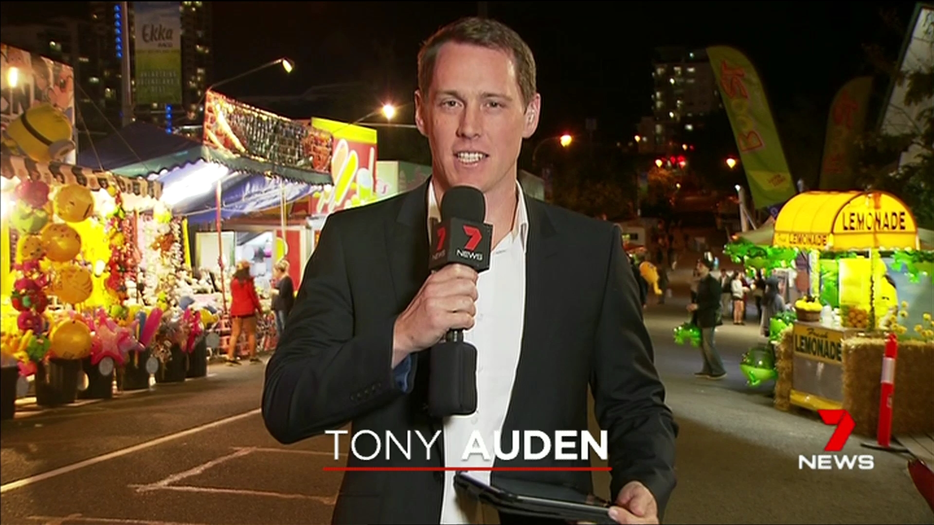
Also, I’d probably expect further tweaks to the graphics before too long. The presenter name supers are a little difficult to read and this is in native HD!
1 Like
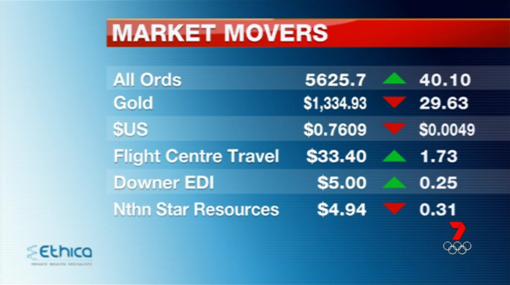
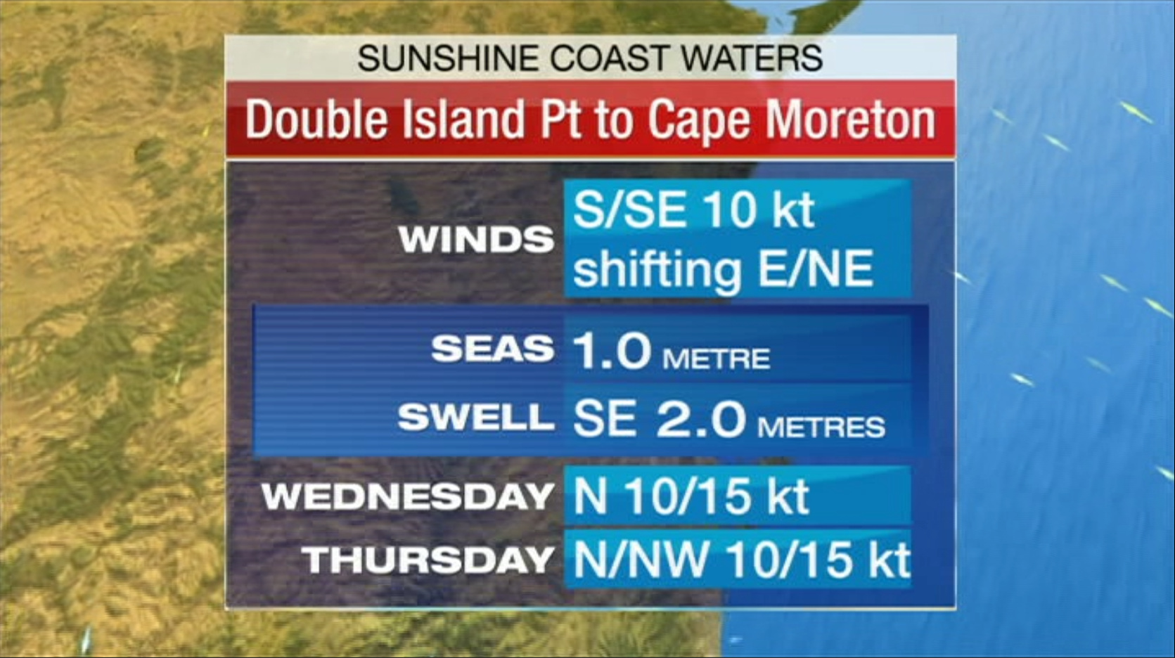
Shame about the weather though. Always baffled me why weather graphics always get overlooked with relaunches. All the networks are guilty of it. How hard can it be?
Edit: I see only Regional Queensland has left weather unchanged. My point still stands, lol.
2 Likes
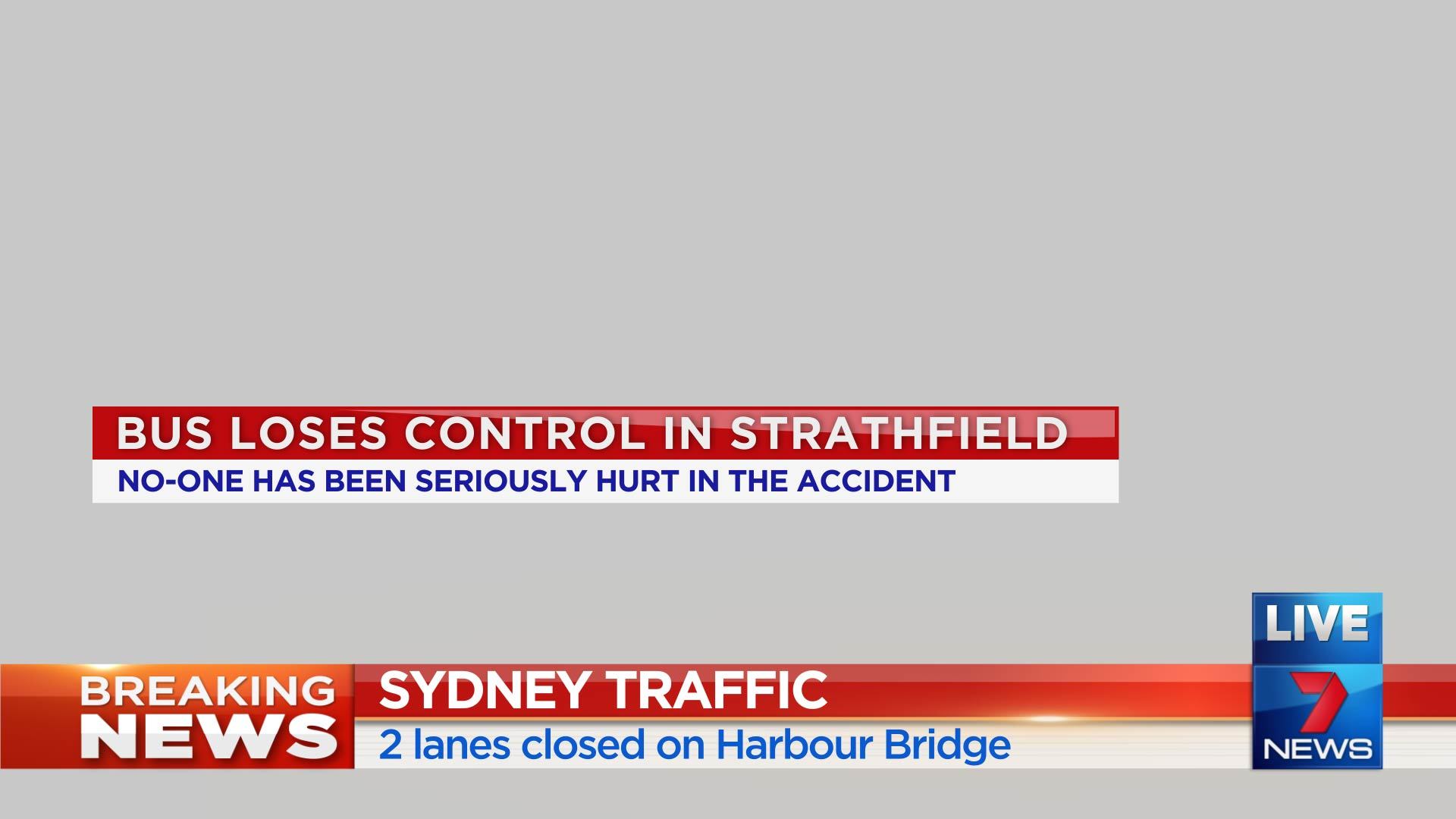
This, in all its redness, would make a better standard lower-third than the blue one providing the lower font was changed to black (or a dark shade of grey), if you ask me. ![]()
1 Like
Perspective between the new and previous super. Not much difference.
A lousy re-launch if you ask me.
4 Likes
Sorry, but I just saw another update with Sue with the same backdrop, so I think our hopes have been dashed, but who knows? ![]()
Knew it, no change!
1 Like
The opener title card looks great.
I quite like the supers too. But probs because they are so different.
2 Likes
Supers are an improvement over the awful, outdated ones they had before.
The inconsistency in the package is bizarre though, not to mention the drawn out launch of all the different elements.
5 Likes