It looks very realistic but I’m pretty sure it’s virtual - there was a segment this morning where the whole set behind Todd was juddering very slightly as the camera panned across (didn’t happen while I was recording unfortunately!).
It would be awesome if they could make the virtual Rio set into the Seven News set in each market. All they really need to do is just add a desk!
3 Likes
They can even have my old dining table if they want.
3 Likes
My first thought when we got our first glimpses at the Rio set is how perfect it would be for a resurrected Today Tonight.
4 Likes
If it is indeed a real set they’d be silly not to use it for something else, it’s simple enough to be repurposed and maybe that was their intention for it post games. Hell, even TEN recycled some of their Commonwealth Games furniture on Studio 10 / RPM.
4 Likes
I think it is a mix. The main screen looks like its real - it has a dark tinge to it that virtual wouldn’t. The ring around the top is virtual, but I’d say most of it is real.
Haven’t watched Seven Perth in ages, but there seems to be a new Seven News promo out.
Three most prominent images? AFL West Coast face painting, AFL Fremantle merchandise, and a roadside tribute.
This organisation is without shame - but it perfectly represents what their “news” has become. AFL promotion so Stokes can make some sort of return on that foolishly large investment in the broadcast rights, and weirdly over the top death/crime/accident porn. It’s very odd. I can’t imagine that anyone except the dimmest of old pensioners is still watching this.
1 Like
God I hate the new graphics on openers and ad breakers. What’s with piling the text on top of each other most of the time and leaving all this space across the centre of the screen, but then making it larger and spreading it across the bottom of the screen the rest of the time?
It’s just messy, weird and clunky.
Not in Brisbane… It’s one line of MASSIVE text…
Yes and that looks just as bad. There is no need for it to be so huge.
1 Like
The original version of that promo debuted during Telethon last year. Some of the footage has been changed such as the addition of the West Coast Eagles and Fremantle Dockers showcase as you mentioned.

Cue the speculation! 
But seriously, that new Seven News Melbourne social media DP kind of reminds me of something they would’ve used for their 2010 look.
Personally, I wish that they’d change the font of the “NEWS” text to something that looks a bit more contemporary. While it worked great in the mid-2000’s, the Square font (especially the thicker version that Seven News is using as part of their current “promotional logo”) is looking pretty outdated over halfway through the 2nd decade of the 21st century IMO.
5 Likes
Australia’s Seven utilizes VuePix LED walls for Olympic studio
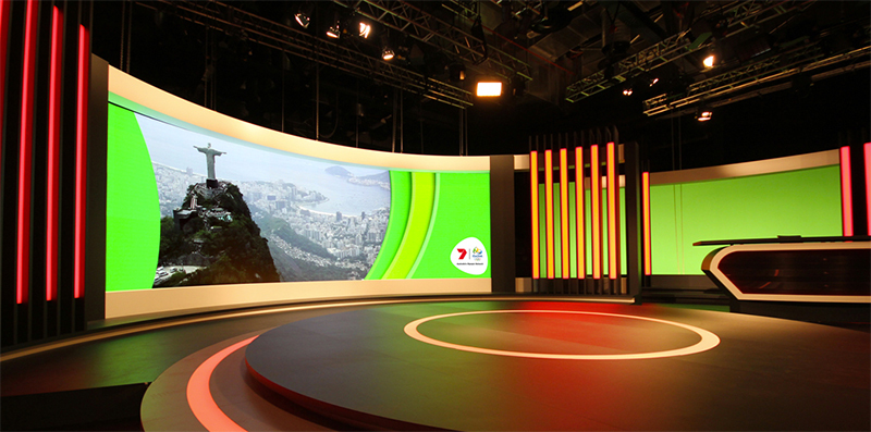
Australia’s Seven Network is utilizing two LED walls from VuePix for its Rio Central Studio set, located at NEP Studios in Sydney.
“We needed to come up with a fully customized curved screen solution”, says Nathan Wright, VuPix product manager at ULA Group, the technology supplier and integrator on the project. “Our VuePix S1mm technology screen was an ultimate choice for the set, thanks to its high refresh rate it eliminates any problems with moare effect for cameras in TV environment”.
6 Likes
Just saw a changed opener for 7 News Perth and just saw some new supers.
4 Likes
Nothing different about the presentation of the most recent Seven News Sydney update, but I think they usually wait until 6pm bulletin time (or just before it) to switch over anyway.
Relaunccchhhhhh!!! Hopefully it is a nicer unified look.
Next up fix the sets and get something consistent in each set nation wide
2 Likes
I try and get a cap soon! The graphics were white and blue. Red looks gone, and the opener had some new animations with looks like glass panels sweeping across on what was the current opener!.The NEWS font also looked to have changed slightly
2 Likes
Should be the other way around IMO…get rid of the blue and distinguish themselves from the other news services!
4 Likes
White & blue ugh doesn’t sound good. Probably stuffed up as usual with these “tweaks”
3 Likes