Seven News Content and Appearance (2015-2020)

It looks messy. They’re not the Seven News colours. It clashes with the 7 logo. Amateur again.

Oh and what was in that “news update”? Fremantle Dockers star out injured, 3 different repeats of Nic Natanui taking a mark, and a look at the new AFL stadium.

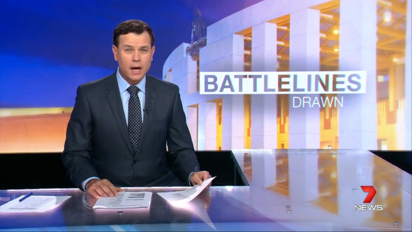
There must be some news standards that Seven Perth is in breach of, surely? Taking the piss now.

1 Like

Yes, I had found it odd to have a footy injury as the top headline, where there were far more important stories to cover first.

The Sydney update featured Wiggles getting married. And 7 wonder why Mark Ferguson has no authority.

1 Like

Riveting news for the pre-schooler demographic!

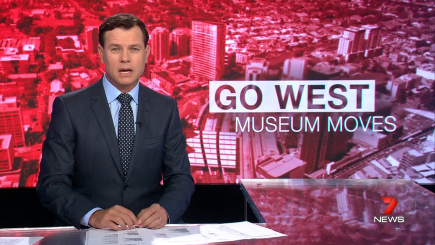
And if you thought that was bad enough, I read in the paper today that Seven News have teamed up with The Daily Telegraph for another “We’re For Western Sydney and not anyone else” advocacy campaign. Some report on that is supposed to be airing on tonight’s bulletin. * sigh *

I know that Western Sydney is the longtime heartland of Channel Seven Sydney (and probably The Daily Telegraph as well), but I really don’t know why they persist with participating in these campaigns. It’s not as if the Western Sydney-centric approach been particularly successful in boosting the ratings of Seven’s 6pm bulletin in recent years.

First time I’ve seen text included on one of these new backdrop graphics, looks fantastic IMO:

And another:

12 Likes

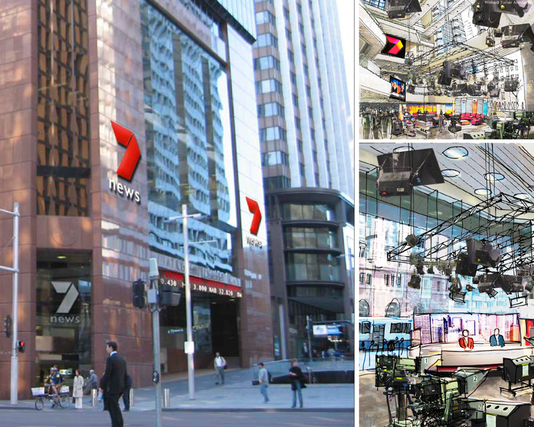
That does look great! Here’s hoping they use the screens to their full potential moving forward!
Don’t understand why 6pm bulletins don’t make use of standing presentation? The new Sydney set has 4 side screens they can use, why not use them than get them to do the job of what essentially a light box can do. Seems a waste.

4 Likes

Also noticed that the promo has been updated to include the new flatter logo. The update ender still uses the older style logo.

[quote=“Leostar, post:1110, topic:103”]
Don’t understand why 6pm bulletins don’t make use of standing presentation?[/quote]

Mark can’t pull it off unfortunately.

2 Likes

An edited version of this would be perfect (just found it on Basil’s instagram):

https://www.instagram.com/p/BDEiQ8audSc/

4 Likes

Argh! Why isn’t that the main bulletin background???

5 Likes

This is sooooo much better,clear and just needs the director of news listen

3 Likes

These actually look really good. Whoever has been doing these graphics have been doing great work.

2 Likes

Perhaps it’s a sign of things to come. We can only hope.

4 Likes

Saw a new Breaking News bumper tonight here in Melbourne… Rather random update.

9 Likes

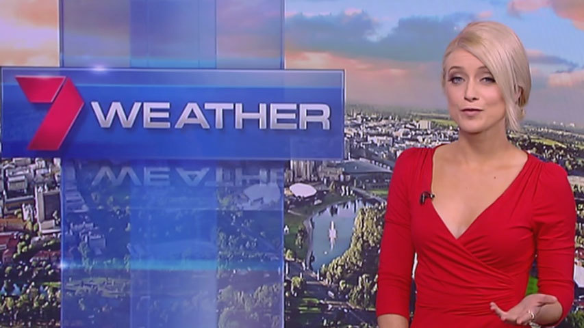
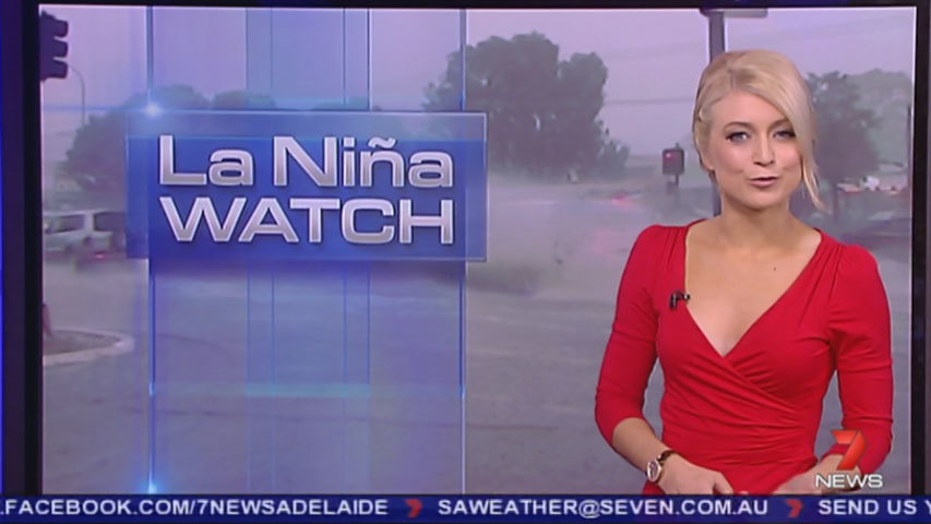
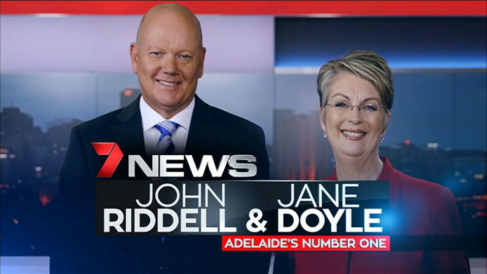
Spotted some different looking graphics to start the weather report in Adelaide tonight. The actual weather maps and forecast screens have not changed.


Also there is a news promo circulating which uses an endboard more in line with the East Coast style:

5 Likes

The new Perth opener


<img src="/uploads/default/original/2X/0/097fd843e1fa0ede51c029fd7d247d8cfa79d217.jpg" width=“300” height=><img src="/uploads/default/original/2X/8/8666106f352cc9cdd408ad59ff0185418f676727.jpg" width=“300” height=><img src="/uploads/default/original/2X/7/7c2e6bad97409ec2adeda17f10ff534e9366f7bb.jpg" width=“300” height=><img src="/uploads/default/original/2X/d/d3a0847647f3d0eb832d6fd117beea262ace1b3c.jpg" width=“300” height=><img src="/uploads/default/original/2X/9/99d8d5cf916d4f13184aea9a9fa07b573f859d37.jpg" width=“300” height=><img src="/uploads/default/original/2X/3/3482a78dec1c8c21de8100ea793ca9d7e7a8d263.jpg" width=“300” height=>

4 Likes

Is it that hard to time the opener, they get out of the opening titles way too soon - almost before the animation has resolved and before you have had time to read it. Feels off about 1-2 seconds.

3 Likes

Does anyone have that image or similar for me to use in a mock.

1 Like

A Seven News update in Melbourne used the old 2004-16 theme.

2 Likes

Strangely, it happened again tonight during the swimming.

I love finding things like this online

2 Likes