Did Kay ever look like that? 
I’d love to see them do more promotion using this soundtrack again
Such a brilliant soundtrack.
4 Likes
Tony Auden presenting weather on the Morning News this morning from in front of a green screen.
Is he presenting from Brisbane still or has been sent to another studio?
1 Like
[quote=“NQCQTV2, post:823, topic:103, full:true”]
Tony Auden presenting weather on the Morning News this morning from in front of a green screen.
Is he presenting from Brisbane still or has been sent to another studio?
[/quote] There is still a green screen in Brisbane, they just don’t use it often. One prime example is for Flashback. From what I have seen, Tony usually presents from a green screen on the national bulletins.
Just realised, yesterday was the 1st Anniversary of Seven Perth’s move from Tuart Hill to Osborne Park, and the first night of the current “virtual” news set 
Crickey a year already 
Modified backdrop is being used on the Early News this morning:

4 Likes
The usual backdrop was used during the Morning News.
Both looks equally horrific.
2 Likes
I agree.
How come that Seven can get decent enough looking On-Air Presentation packages in other areas of the network (eg, general channel and sport graphics), yet they completely screw it up as far as the look of the news is concerned?
6 Likes
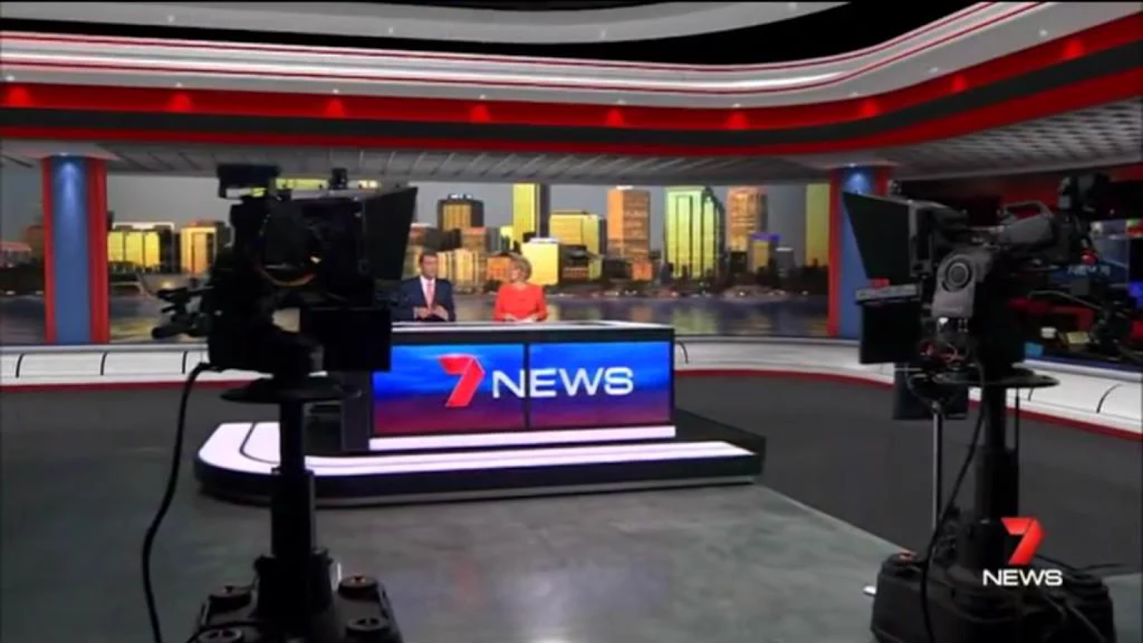
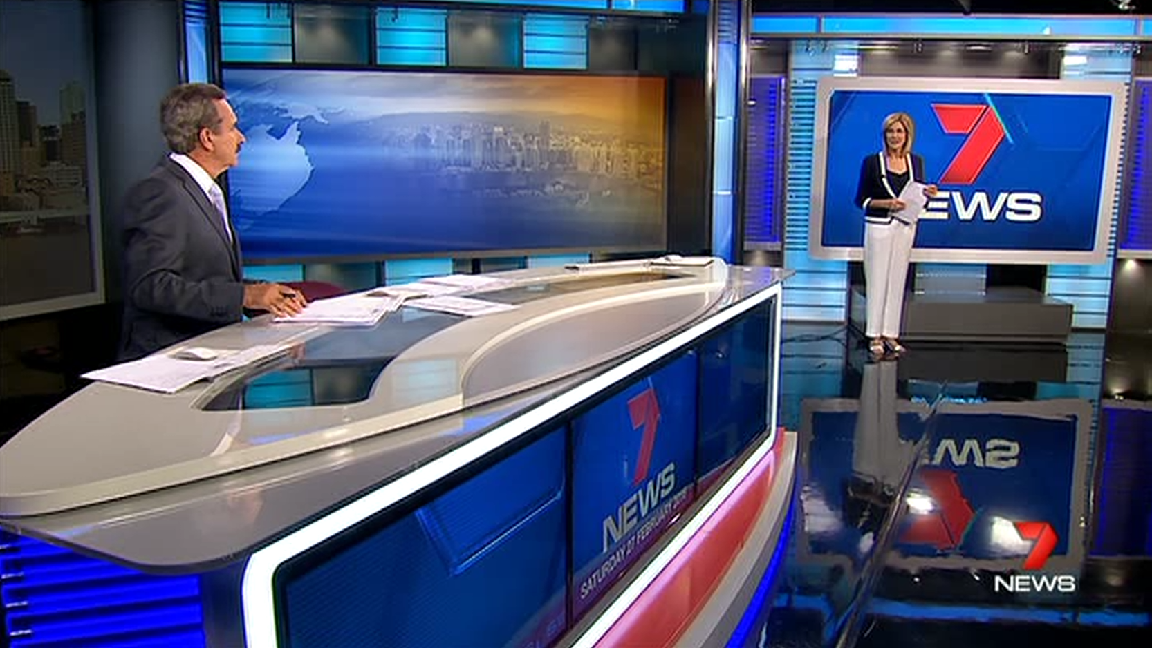
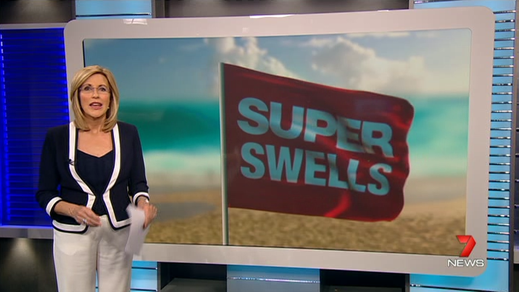
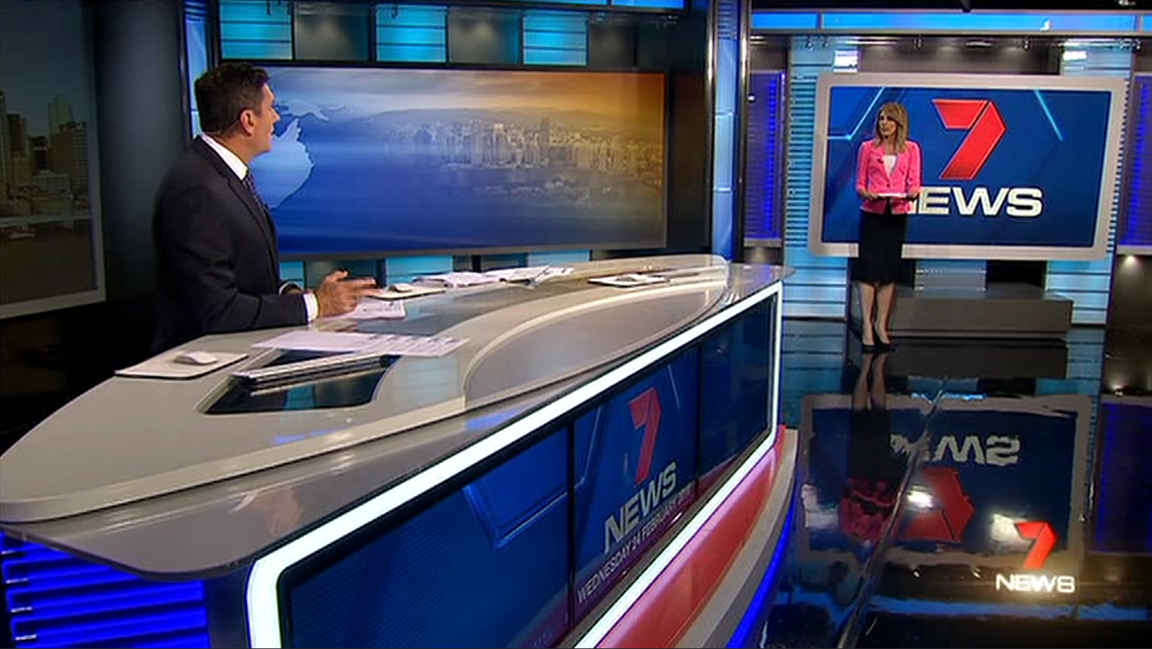
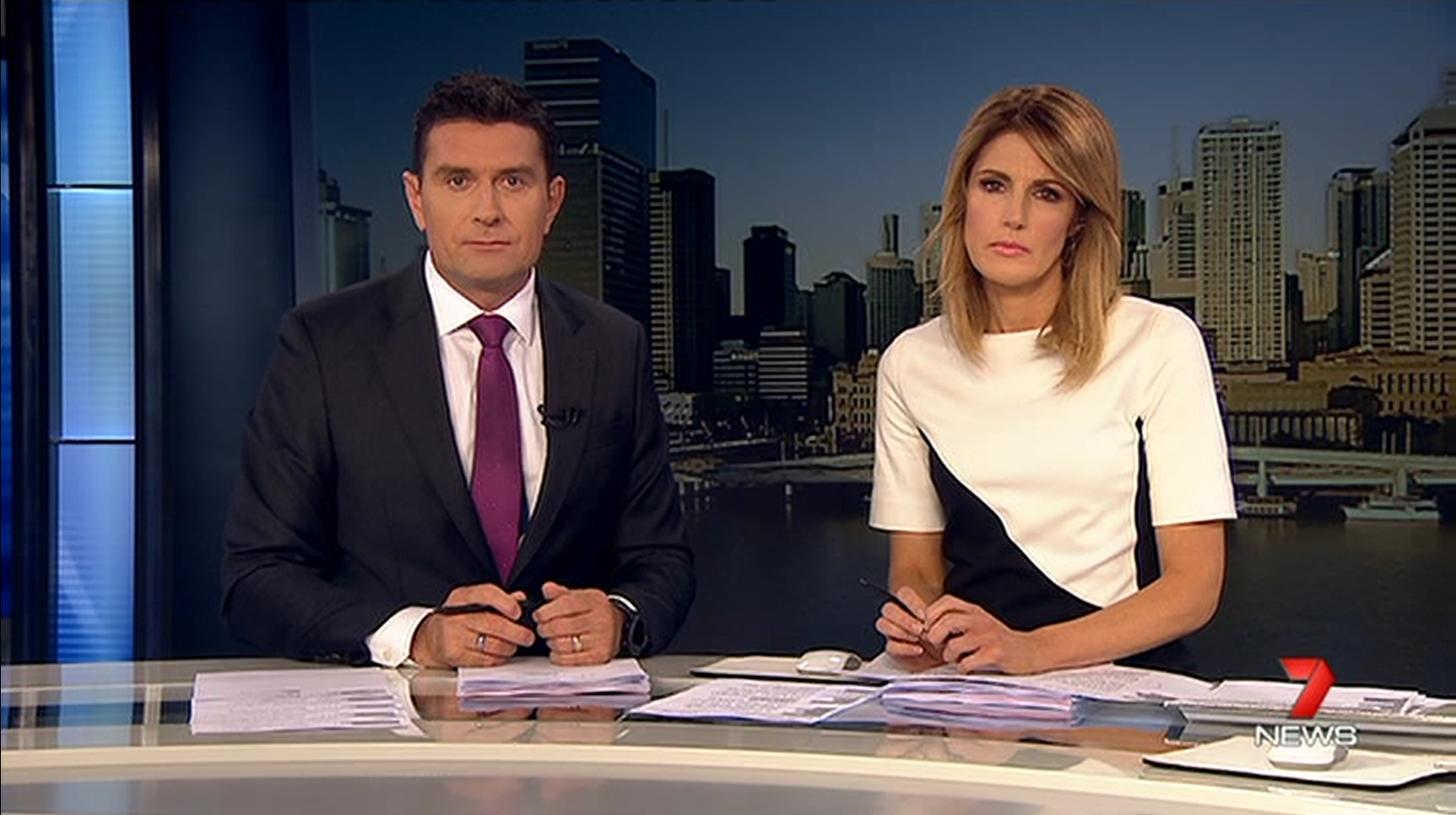
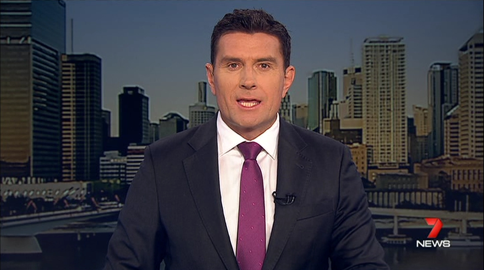
Seven News Queensland see have changed things up only slightly this week. I noticed, I think on Monday, the bulletin began with a wideshot with Bill at the desk and Sharyn doing a standing presentation and I thought it was a one off. But Kay did it again tonight, with one anchor doing half their time in front of the weather screen and the other half at the desk. I assume it swaps the following night. I will try and record it tomorrow.
Yes it was swapping between Sharyn and Bill during the week…
1 Like
I know that it’s probably been said many times before, but the entire news set in Queensland looks ridiculous IMO! Why is it (and to be fair, the Sydney/national set as well) predominately blue when the primary colour of Seven’s branding is red?
I find it really annoying how there’s absolutely no consistency whatsoever in the On-Air Presentation of Seven News! At least with the news presentation of other networks, you’ve got one or two distinct design elements (like Nine’s dots or the ABC’s sliders) and the sets/graphics look mostly clean. With the presentation of Seven News, there’s just one big mess all over the place!
9 Likes
Were they inspired by Sydney in the late 90s and early 2000s? 
2 Likes
Agree. The screen looks like a giant iPad for starters.
Seven Brisbane is a perfect example of “if it ain’t broke…”. It’s been an epic achievement to totally screw up what was a high rating news bulletin that was smashing the opposition.
5 Likes
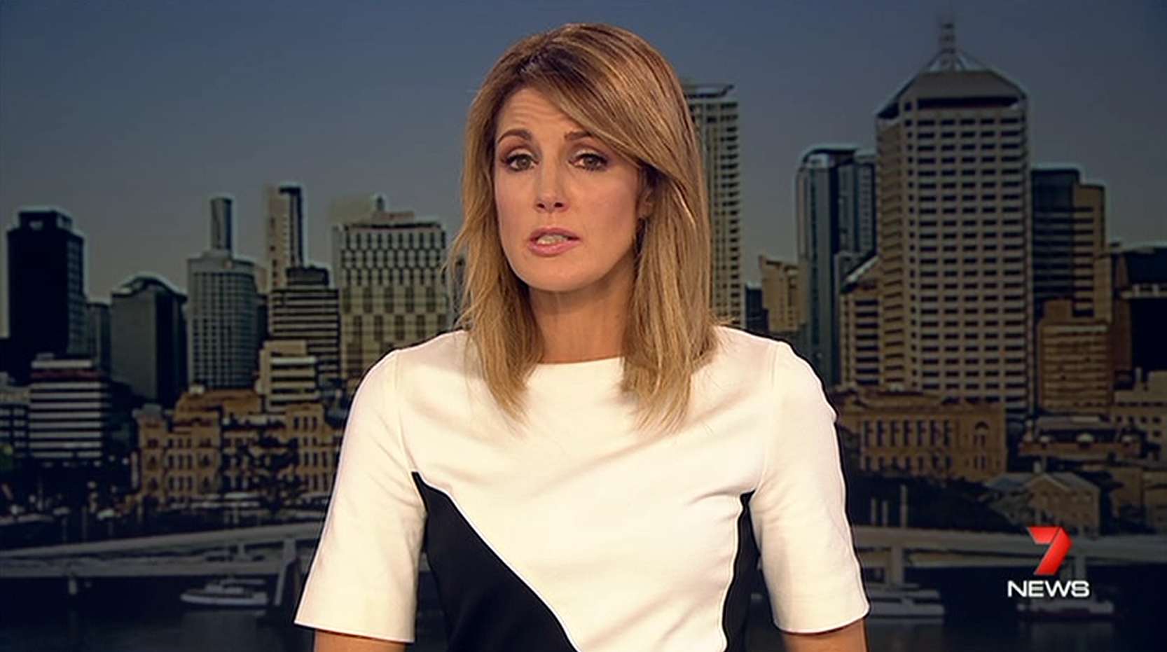
The majority of the bulletin is presented in front of a very dark live shot that brings down the tone of the whole bulletin; not to mention how happy everyone looks  .
.
This is where the idea comes from for this week’s fiddling
Actually that’s where most of the ideas for Seven News over the past few years have come from, but I take your point… ![]()
3 Likes
So they need to smile more when presenting stories? lol. Ugh seven can’t do anything right with the news! … I reckon 7news should be Red & Black and anything except blue! So overrated 
That first photo pretty much sums up the tone of the whole bulletin. Sharyn speaks in a very drawn out monotone voice and there is very little chemistry between the presenters.