Video montage of Jodie Speers’ first bulletin as fulltime presenter of Seven’s Early News:
![]()
No but really though it looks like a failed World News Tonight remake.
First of all, that sounds like a bit of a mock towards SBS news. That is actually news worth watching compared to any commercial station so I wouldn’t mock it.
Second of all it actually looks nothing like the SBS set, Don’t know where you got that from? Maybe the similar colour? Well I have brown eyes and so does Barack Obama, I don’t think we look alike at all.
I think that CLEW9 was saying that it looks like a failed ABC (US) World News Tonight remake.
The SBS World News set is rather different. Basically just a plasma is the main feature of it, although I strongly doubt anyone who watches SBS World News for the content really cares what the set or graphics look like.
[quote=“eddel, post:659, topic:103”]
I was worried I might miss it so hit the button a fraction of a second too early but you get the idea:
[/quote] I think the set looks better with the national backdrop then the Sydney set. However I would love for the control room as the backdrop.[quote=“KVZ, post:644, topic:103”]
Some examples of how much better/different the set could look if they fixed the shitty lighting and printed panels and replaced their horrendous graphics.
[/quote] Much better than what is actually on air. Love the live backdrop, like the new desk plasma graphic and love the control room on the plasmas.
They’re even using the new theme music on the radio promos (here in Sydney at least anyway)!
Federal Politics backdrop in Sydney:
Another special backdrop, actually looks quite good and beats having Mark standing awkwardly in front of a plasma wall.
<img src="/uploads/default/original/2X/f/f348ac4cefca6cce8ab5675968ad6b3c5e2b2335.png" width=“690” height=“386”
Won’t clutter the thread up with any more caps but there are lots of really good story graphics being used in Sydney tonight. Lots of pink and blue, it would all look great as part of a new graphics package!
That’s a far better use of those screens than the cityscape. They need to be doing that on the national bulletins, also. Ann is just getting lost in that world map. The lighting was woeful on the bit of the morning news I saw today.
Is it just me or does the set in the afternoon news almost look virtual (i.e. in front of a green screen like Perth). And yes I know a knew physical set was built.
Wonder when Melbourne will get a new set.
And on Brisbane radio too
Like the special backdrops that I saw tonight (and the steady cam action that went with them!!!). Shows how god awful their regular backdrop is.
The set looks better on cam than it does in the photos. i do like it a lot better. I agree with the majority though, they should have relaunched the graphics as well
I actually quite like what Sydney have done there with the story backdrops, that looks a million times better than the boring city shot.
If they’re not gonna use a live shot, those story backdrops would be a great thing to use instead of the static image.
I actually really dislike how the globe backdrop looks on the Morning/Afternoon news with that set. The dark blues on the graphics clash and don’t look nice against the lighter blue around the rest of the set. Not a fan at all of the globe background
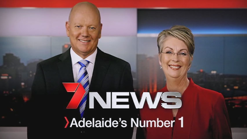
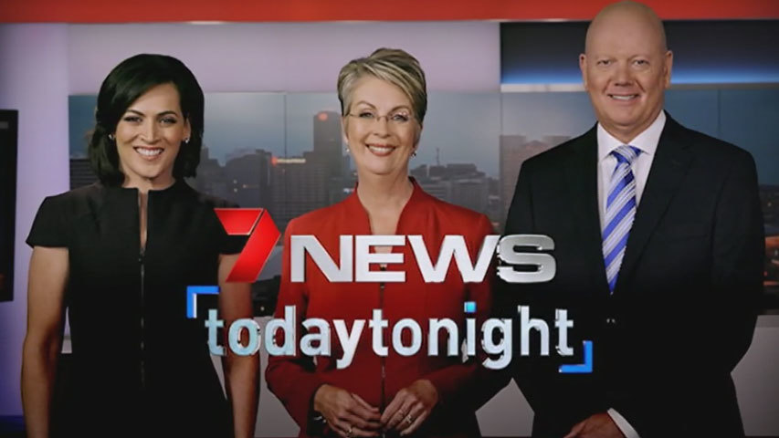
Adelaide 7 News have updated their promo endboards. There’s a news one (with arrow) and a combined news/TT one.
Is that a hint that TodayTonight may get a new logo? :o
It’s to my understanding that the TT logo in the 2nd endtag was recently launched and that only Adelaide is using it.
Ok I had just checked the TodayTonight thread. Wasn’t aware they launched a new logo.
Yeah I was reffering to ABC’s World News Tonight.


