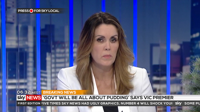
Not bad at all, but personally I think black text on the super for story info etc would be much better suited.
The red you’ve used for the text is a few shades too pale but I could definitely see them going for something like this. Maybe also just have the gradient in the bottom left corner instead of across the entire screen?
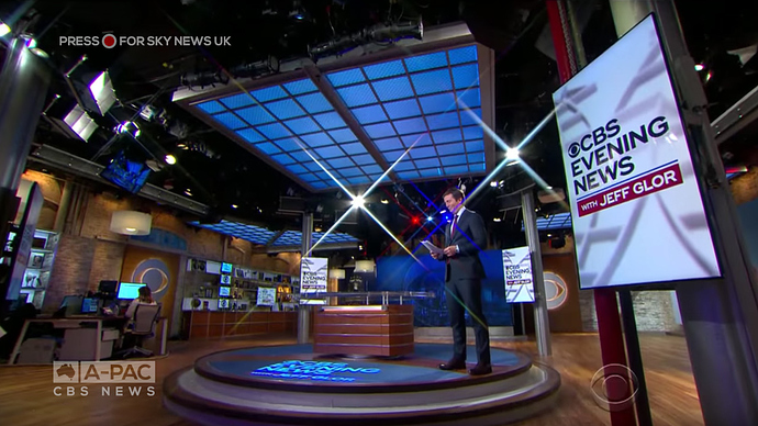
After watching a bit of A-PAC today for the debate, I thought the graphics could do with a bit of a refresh, as well as to give the channel a bit of it’s own identity.
But it still has kids programs during the day, yet it’s not called ABC COMEDY/KIDS
Pay tv?
Foxtel runs it, but they stream it for free at http://www.a-pac.tv/
Also those A PAC graphics need to be rolled out to Sky.
Well they can’t keep calling it ABC2/KIDS as the evening timeshare is no longer ABC2. I’d say the name ABC COMEDY/KIDS is too long for most equipment to handle so they just dropped the /KIDS part.
I’m surprised they didn’t go for a split channel setup like the UK and put KIDS on 25 or something.
I guess you could consider COMEDY to be the channel, and KIDS as a daytime programming block on the channel.
But seriously though, what under 6yo viewer of KIDS (or parent of said child for that matter) needs programming to start at FIVE IN THE MORNING? Six o’clock perhaps (like it was 2011-14), but FIVE?
I would’ve thought the opposite to be honest, with ABC KIDS having had more on-air hours than ABC2/COMEDY for several years now.
People live busier lives these days with earlier commuting times (including kids leaving for school/daycare/kindy earlier, etc.), so it wouldn’t surprise me if there are children aged six and under who are awake at five in the morning!
Especially in QLD where daylight starts creeping in from 4am.
A lot of young kids are well and truly awake by 5am.
You’d have to move the Comedy to 25. Every time the slightest change happens to the ABC Kids channel with times there is outrage from the parents on the Facebook page. Changing the channel number is just going to be too much, plus I can agree to an extent, my little guy knows the channel is two two’s, if it was made two and a five on the remote it would blow his mind.
The 5am start has saved us a few times, I set our guy up watching and we manage to get a bit more sleep. He’s not too bad and lately has been sleeping to past 7 some days but usually he’s right on the dot of 6. Which is how I used to be, I’d get up early to go watch the test pattern before the shows started at 6 on ABC.
Had some spare time so I decided to do some mocks for a refreshed Sky News Australia for 2018. The theme is based from the UK while using the colours of the new cover photos Sky News Australia implemented. It’s nothing overly fancy, I aimed to make it simple and fresh.
Idea for a new Supa design for sunrise. The blue bar is obviously the flipper etc and the weather would be localised for each market, so only 1 temperature.
Like it heaps, but I think temperature may need to be a flipper of different areas as it would be broadcasting across the whole state?
Yeah true, I admit I hadnt thought about regionals…
They could let the regions fill in the blank with their own weather…
Some more gfx. I have reintroduced the weather flipper to cater for regionals. I also have done a bold new style for breaking news, that I’m sure some people will love and some will hate. The idea is that Red is used Way too much in News so Breaking News doesn’t really stand out like it should…
Really great job, I like this a lot.
I really like this theme.
I reckon the weather flipper should be designed so that affiliates can insert their own local temperatures (exactly the same as NBC do with Today in the U.S.).
I’d have it set to just show the local area only, but I’d have it flip between “NOW”, and “TODAY”.


