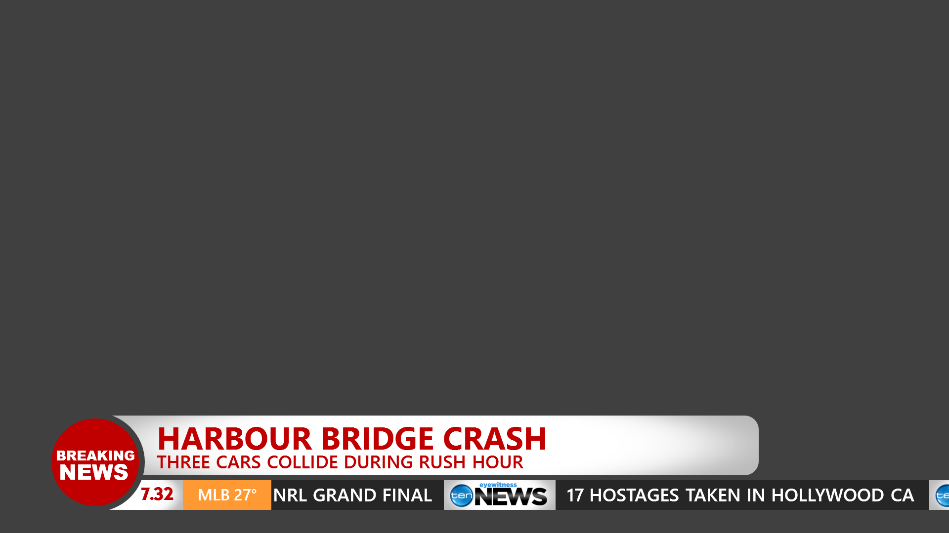
Thought I’d have a crack at a tweaked Opener for Nine News Sydney:
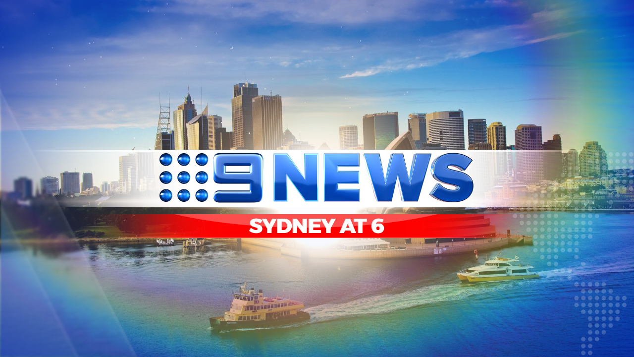
14 Likes
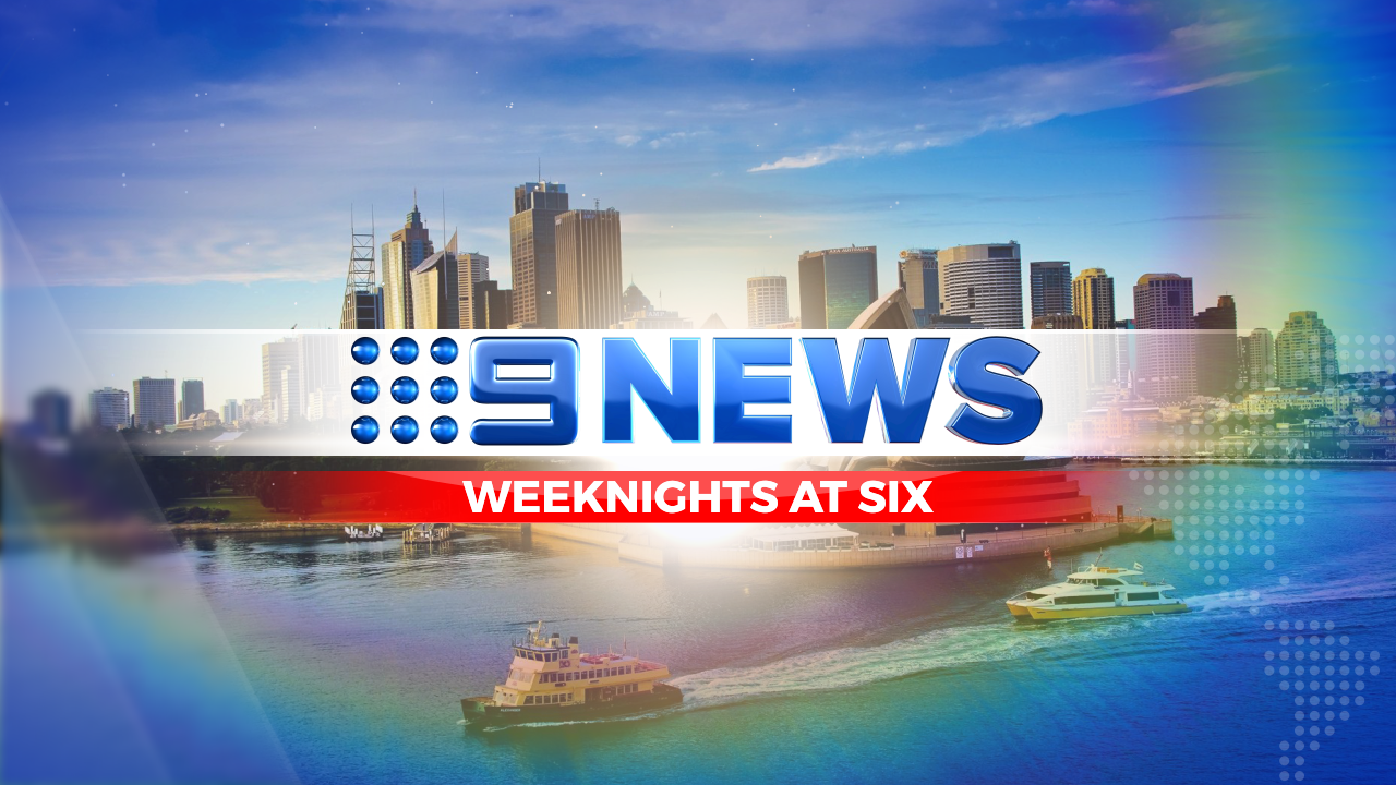
That’s way better than my mock.
Send that one to Nine, please! 
3 Likes
I like the idea a lot! (started something similar myself but never finished it). Only thing I would change is making that map focused on Australia, with the city glowing like what they currently do.
3 Likes
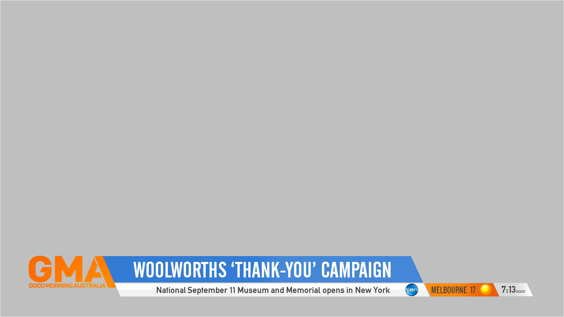
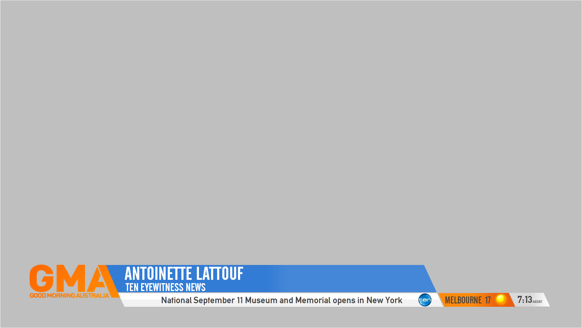
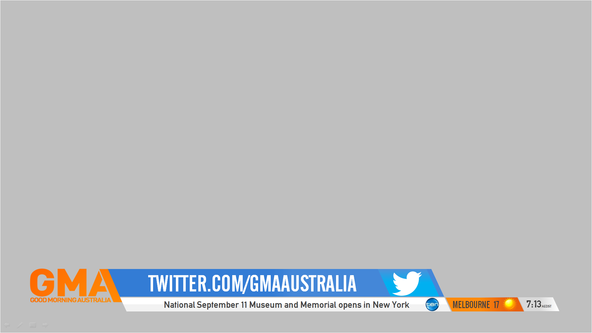
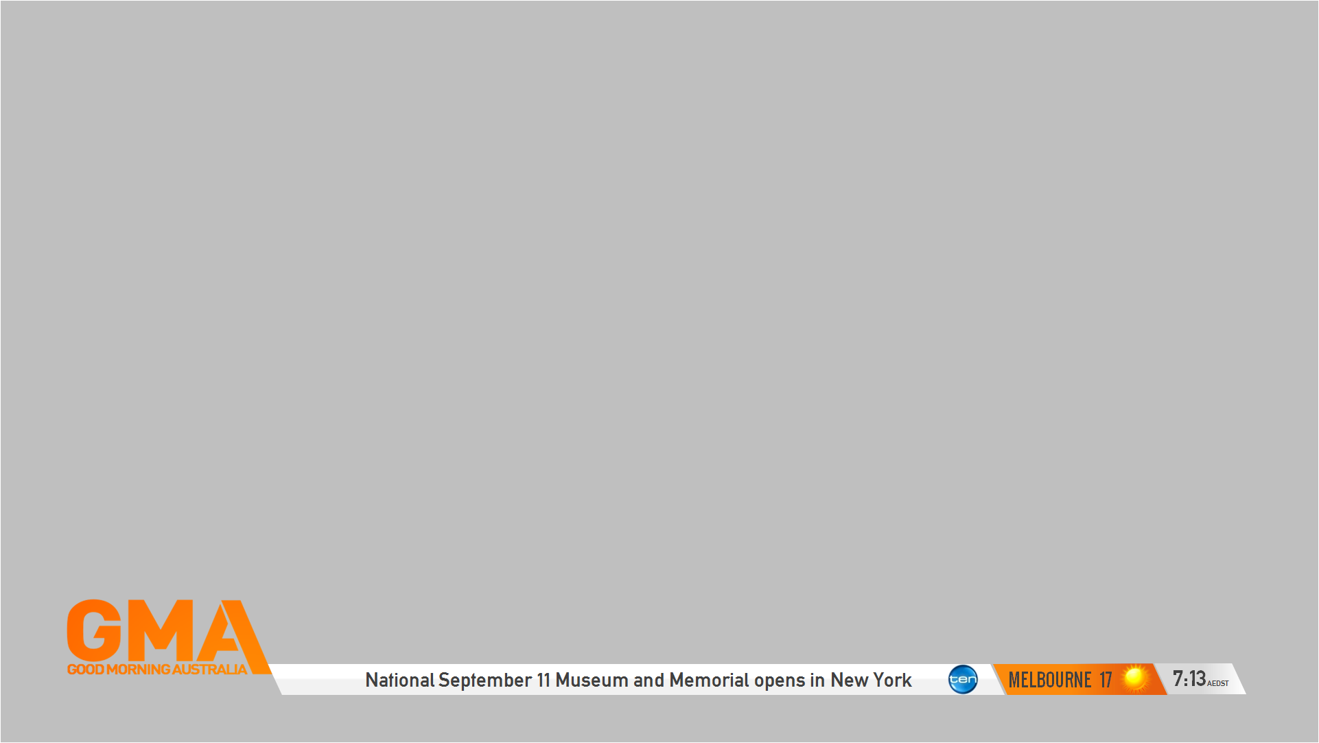
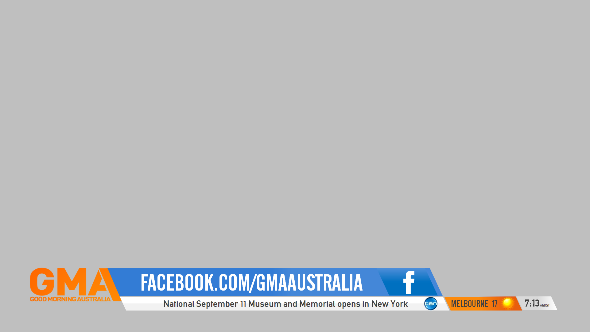
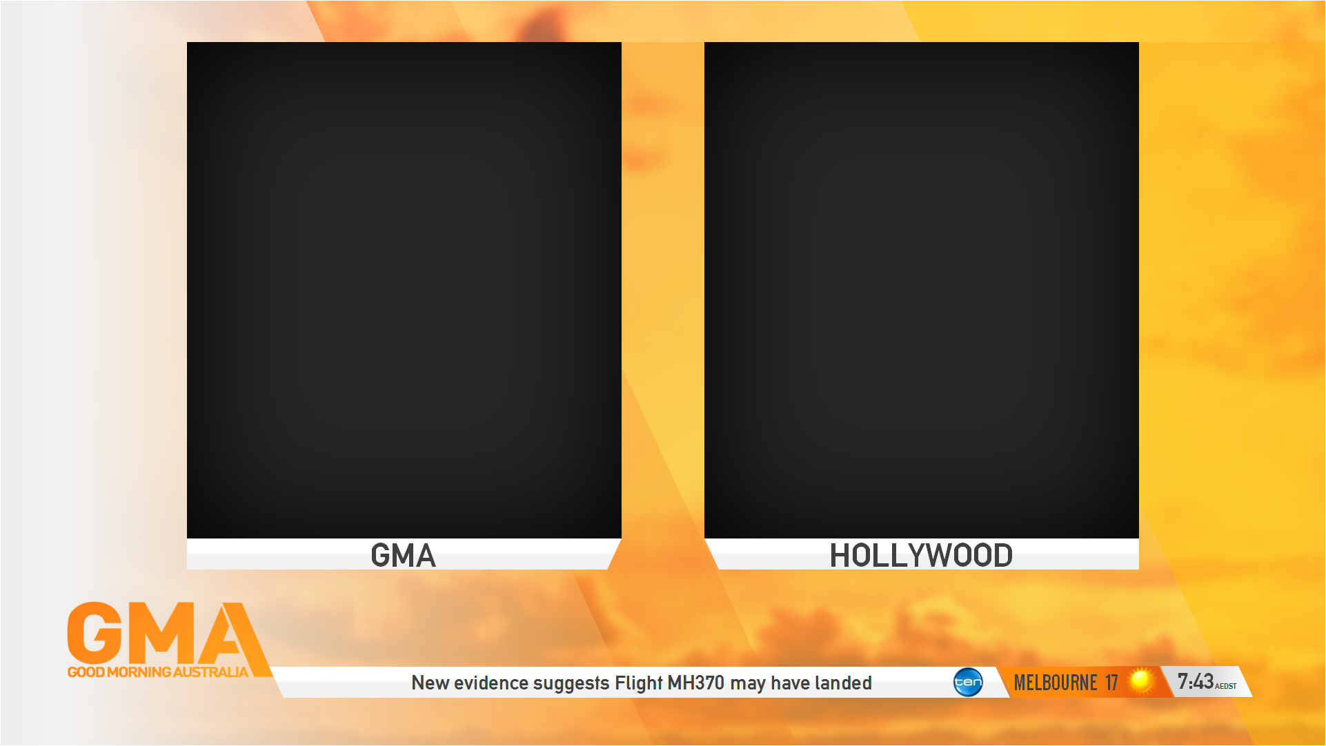
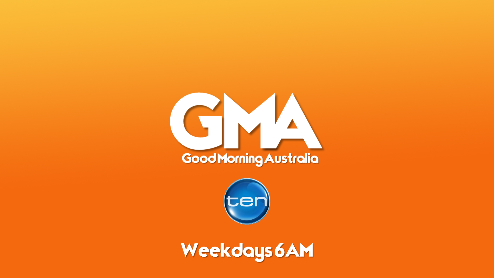
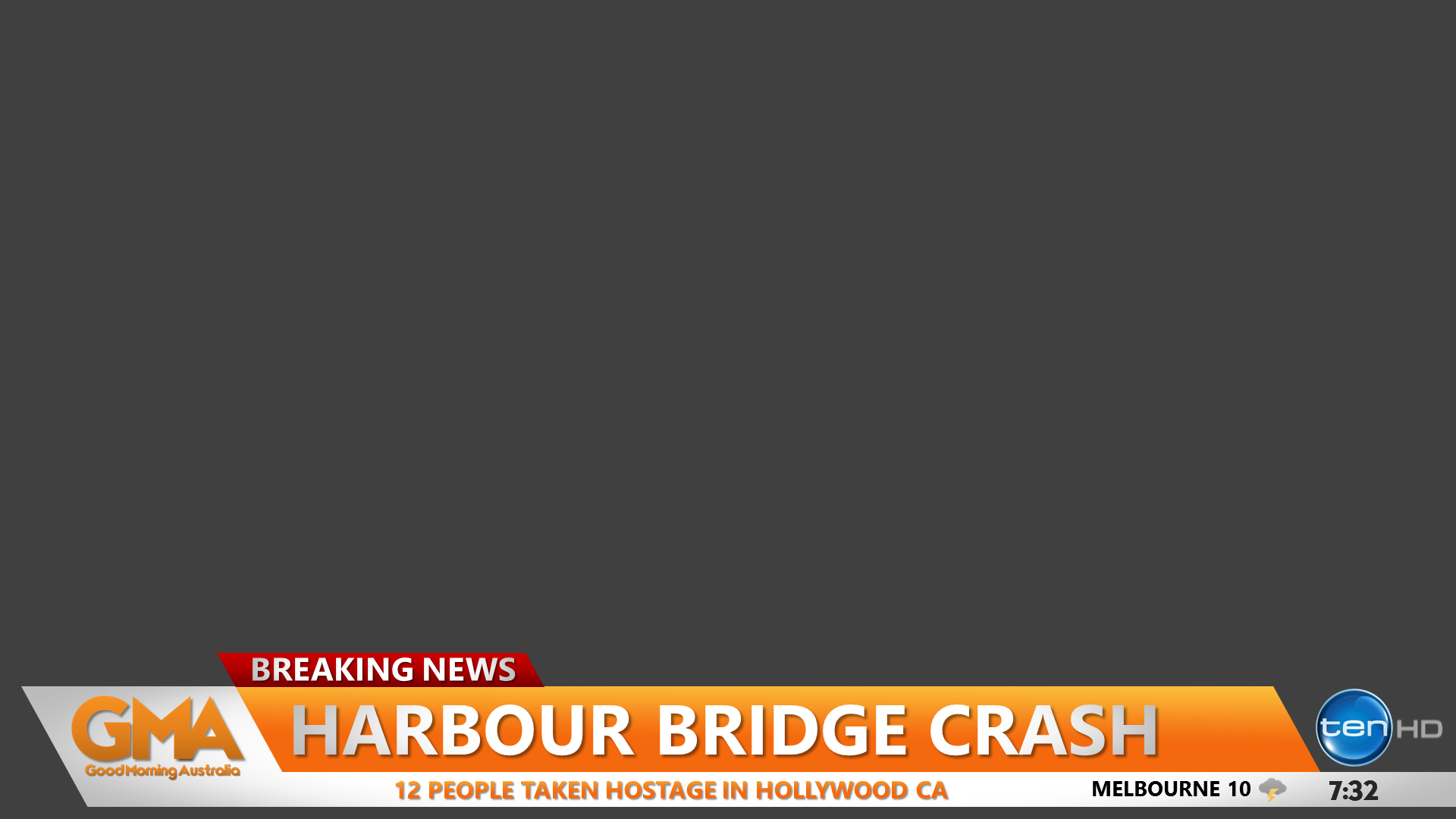
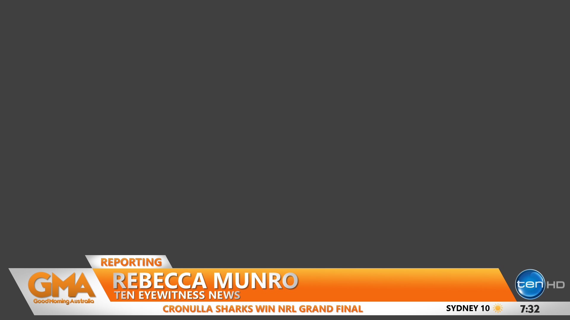
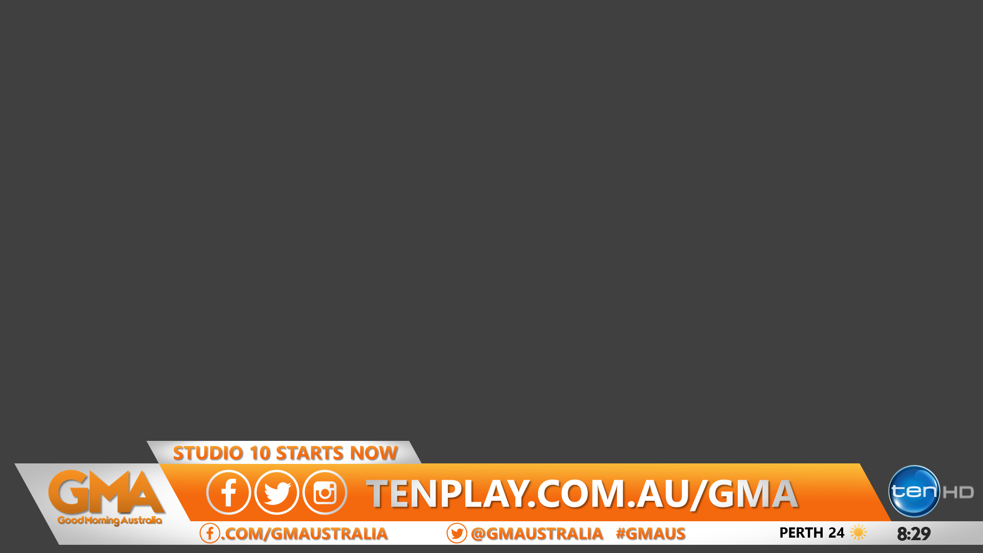
Here is a challenge for someone, create either a logo or a promo advertising a revamped ‘Good Morning Australia’ hosted by Sandra Sully and Matt White.
As I think this is the right time for ten to do another (and probably last) breakfast program.
2 Likes


They are Really good @RegionalTV and @MichaelPower 


18 Likes
LOVE IT!
So good  Man I love this thread sometimes.
4 Likes
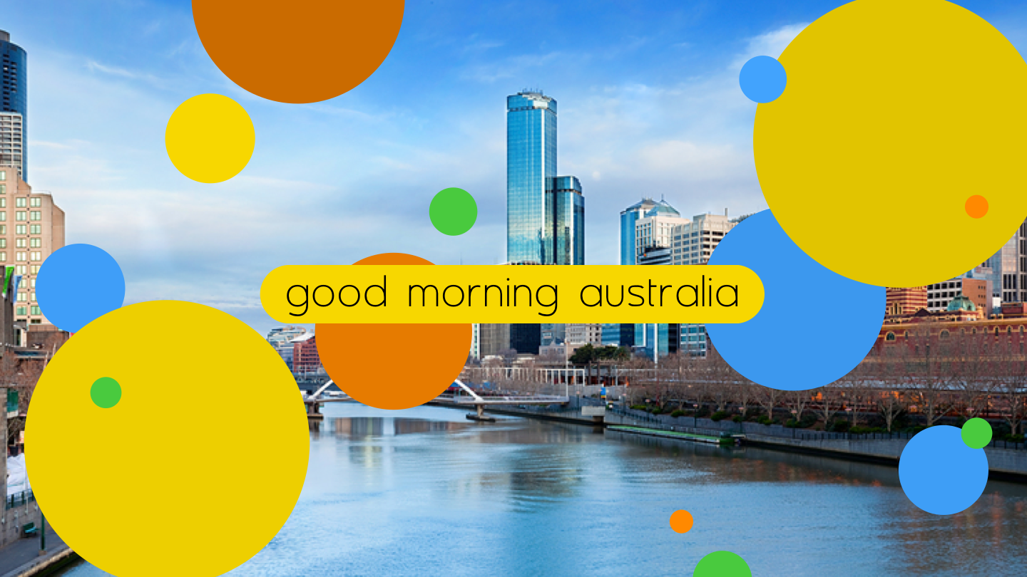
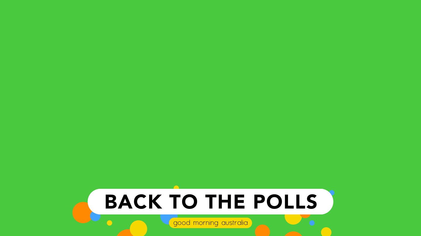
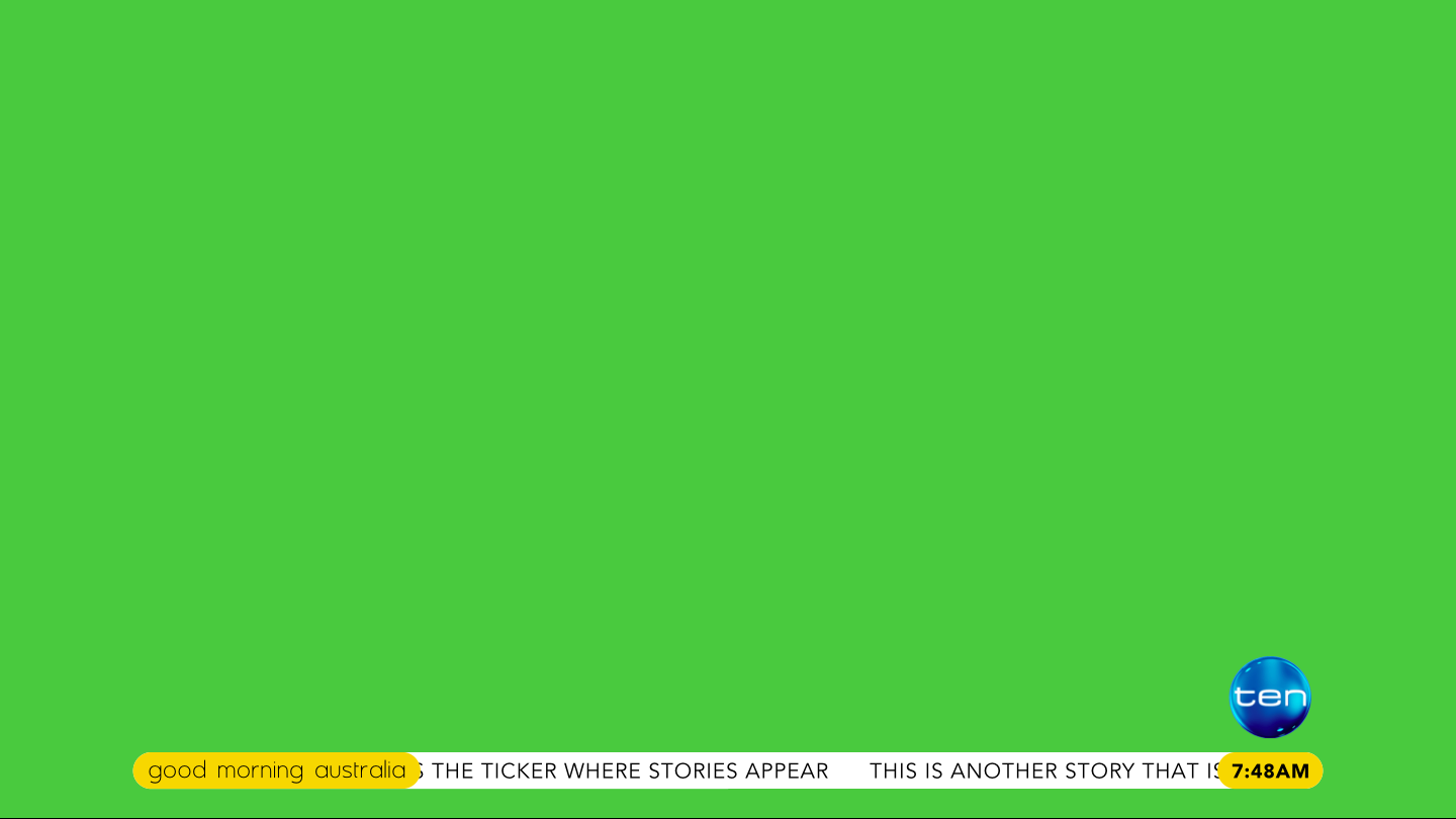
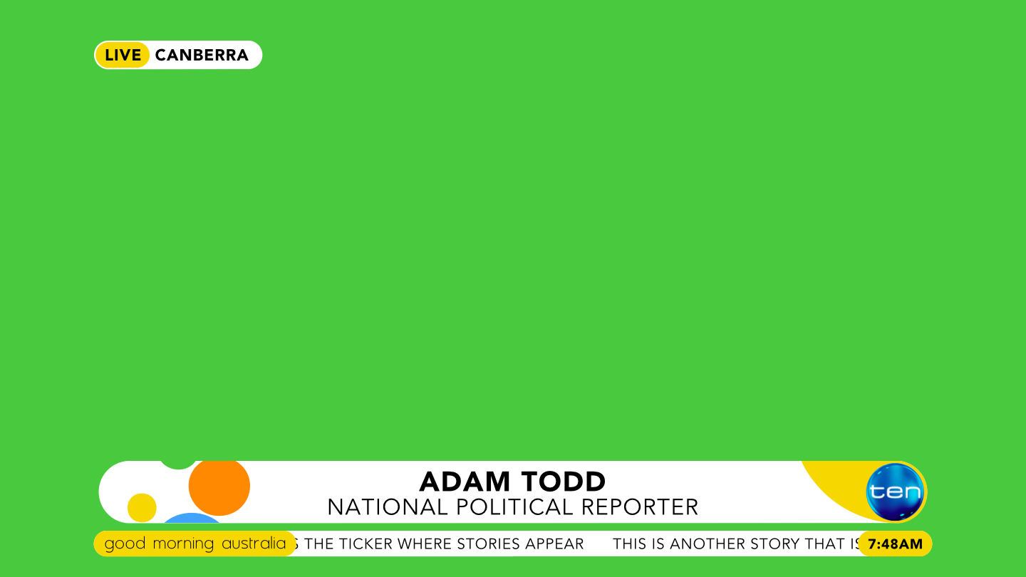
Something a bit different to the mocks above and a teeny bit retro (the bubbles would all be floating up from the bottom of the screen):


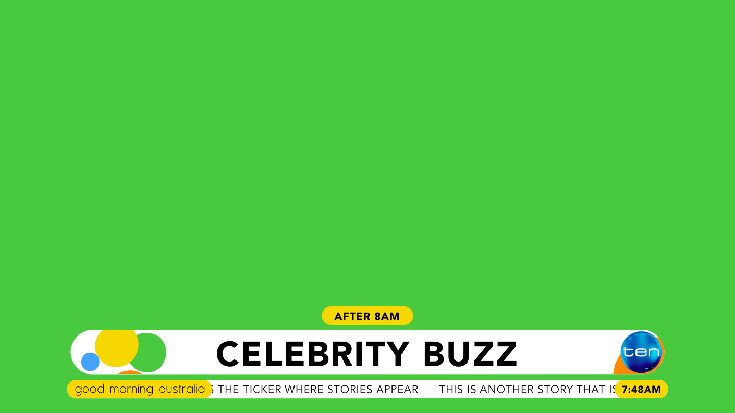
25 Likes
Awesome mock, but I think the glossy 3D Ten logo really does not fit with the 2D dots.
Agreed. I’d like to see it with a 2D logo, or even with the watermark placeholder hole.
Wow! Fantastic stuff guys. 
To be perfectly honest, I wouldn’t mind seeing any of these mocks being used if Ten were to have yet another crack at breakfast TV. Though the possibility of this happening anytime soon is remote to nonexistent IMO.
1 Like
A bit hypo for my taste. . Maybe for a children’s show, or lotto telecast
2 Likes
Round Two


Now with a gradient


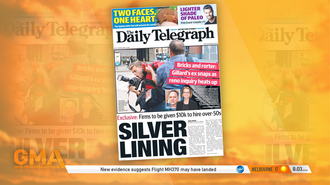
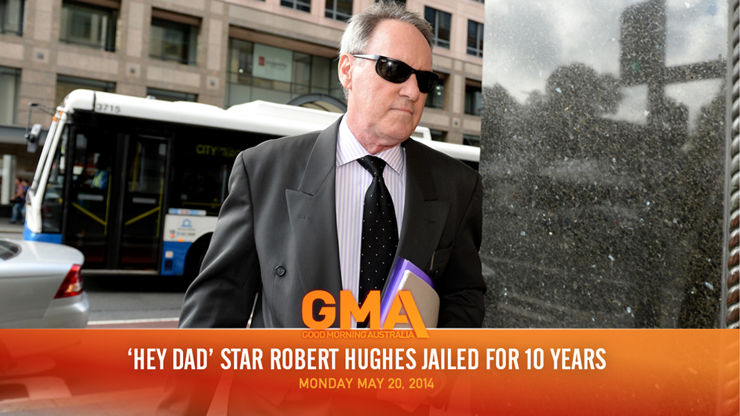
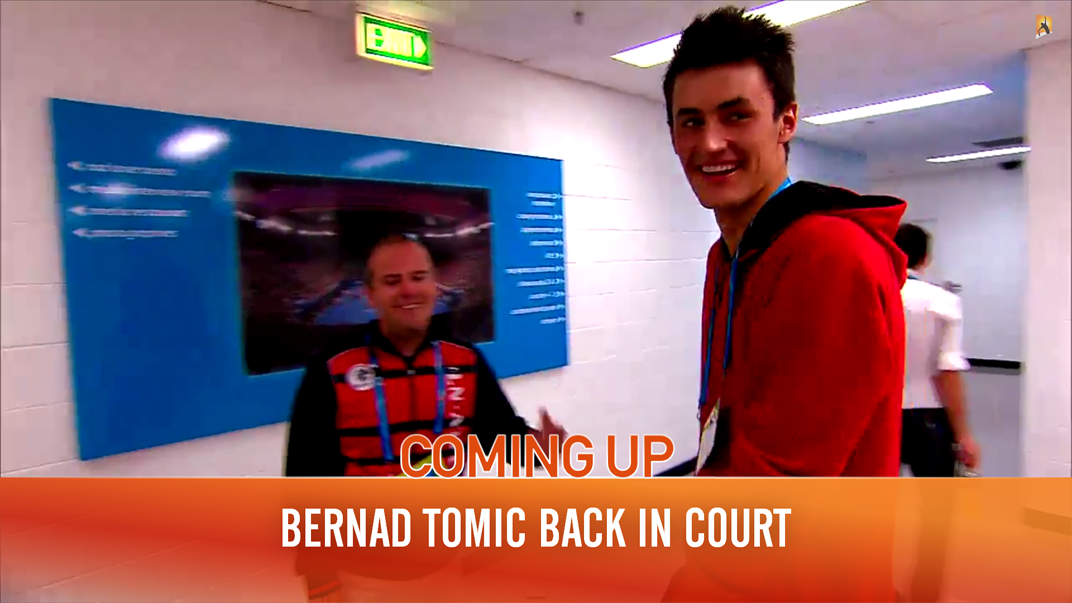
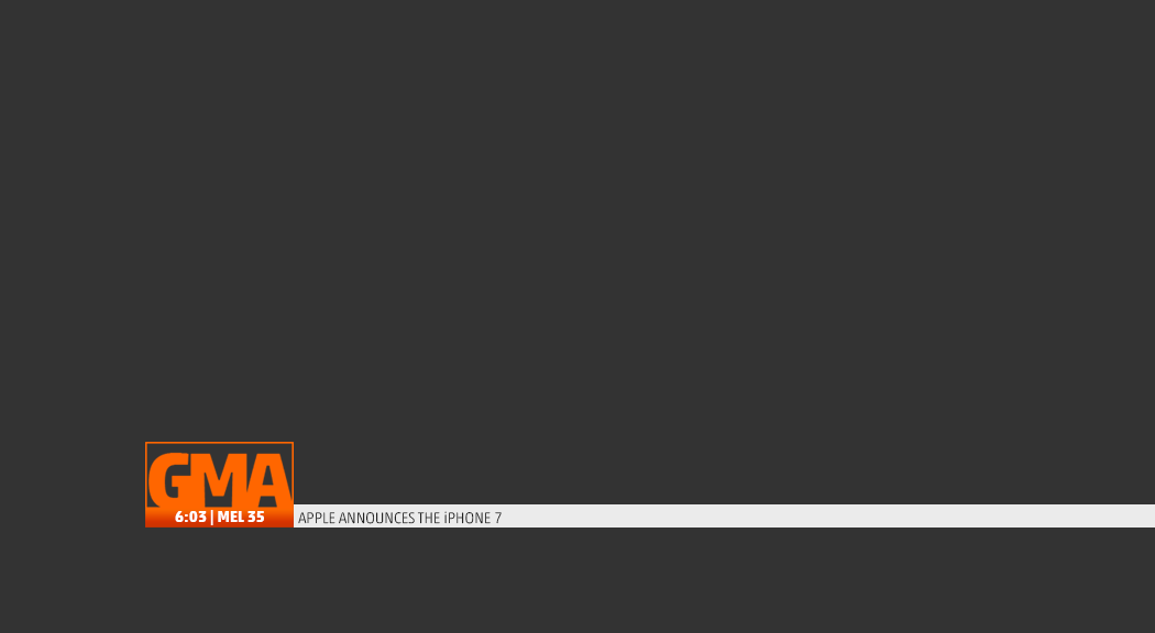
Some Extras
This is if the GMA & Ten logos would constantly revolve

This is much like what Studio 10 does
17 Likes
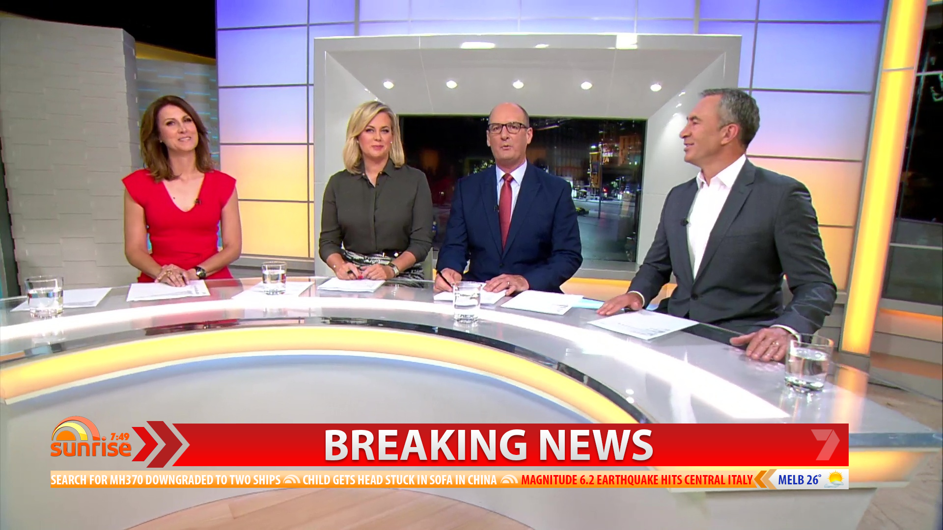
Here is my mock for Sunrise based on the Chevron arrow featured in Seven’s On-Air Presentation.
<img
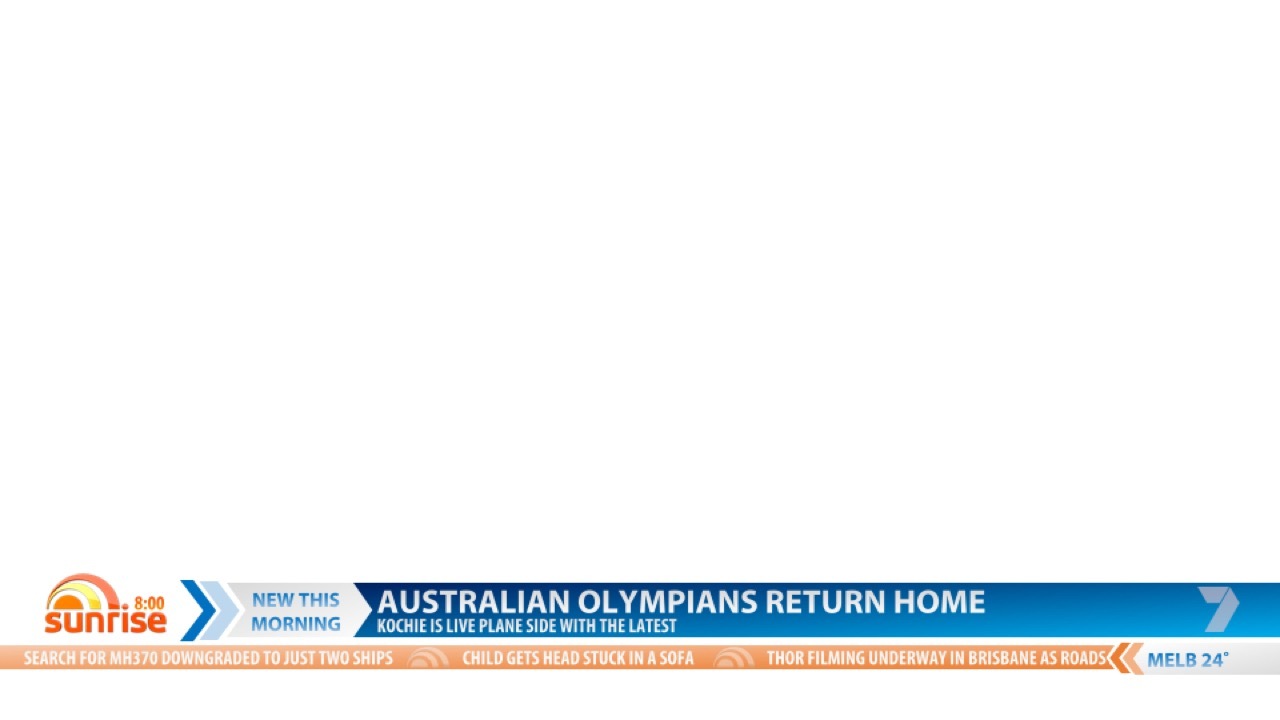

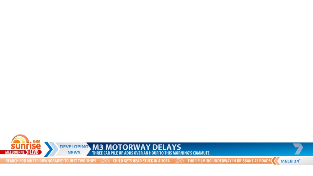
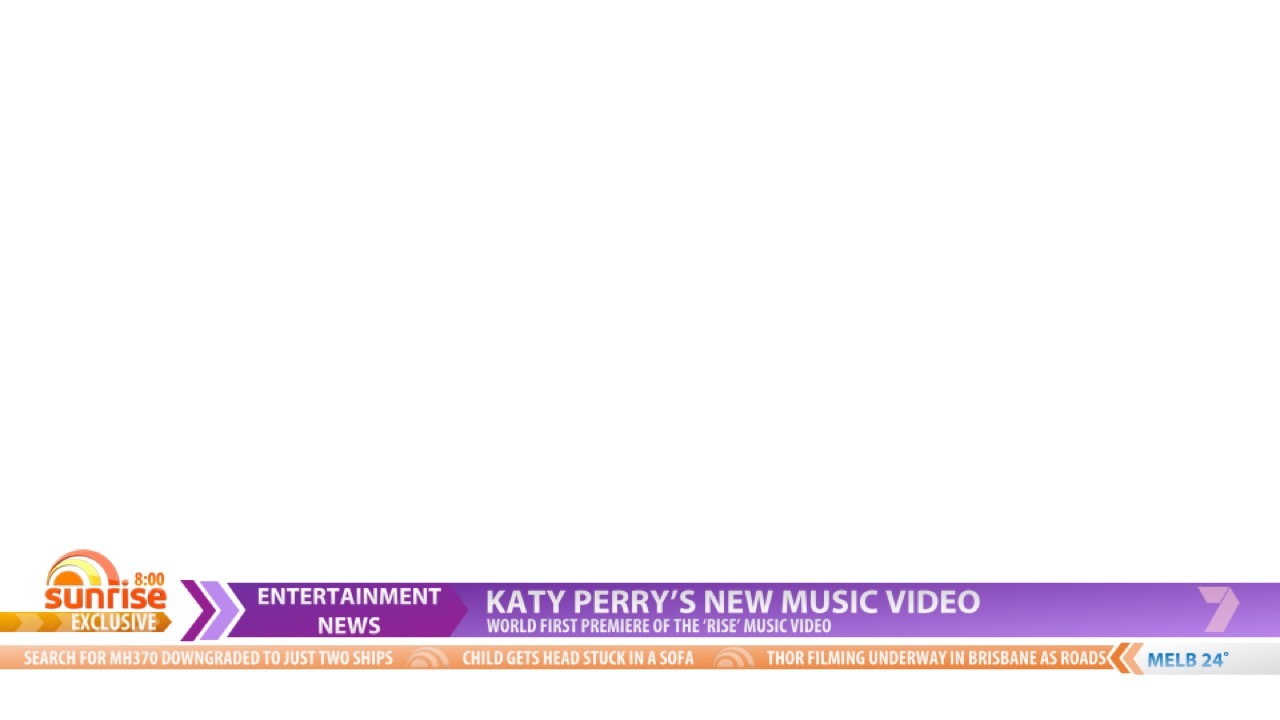
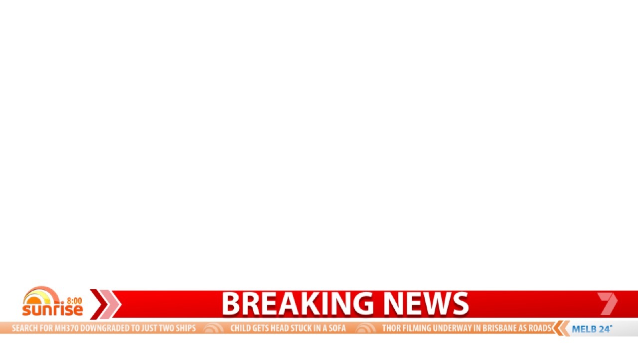
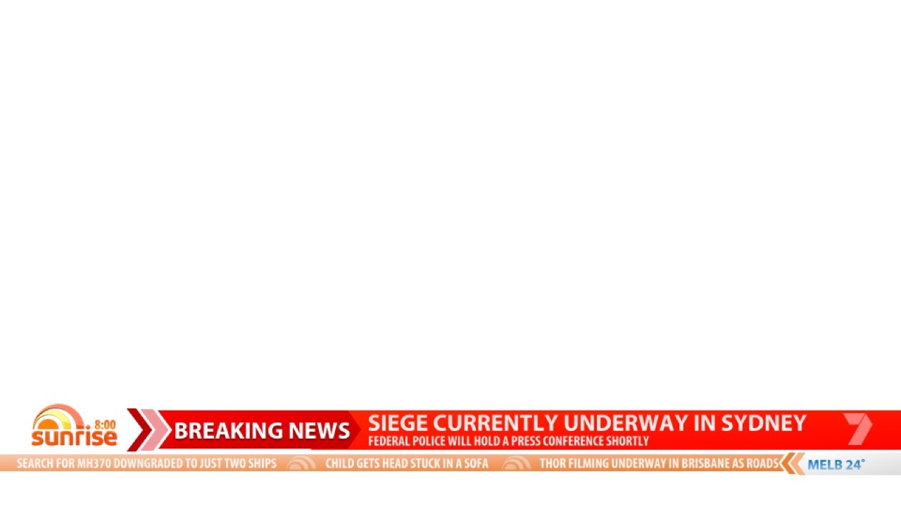
13 Likes
Really awesome mocks here. Well done guys! 
Made some tweaks to my Sunrise Chevron Arrow Mock. I think it looks more polished now, and adheres to safe areas (I hope). May look at animating the graphics if there is interest.


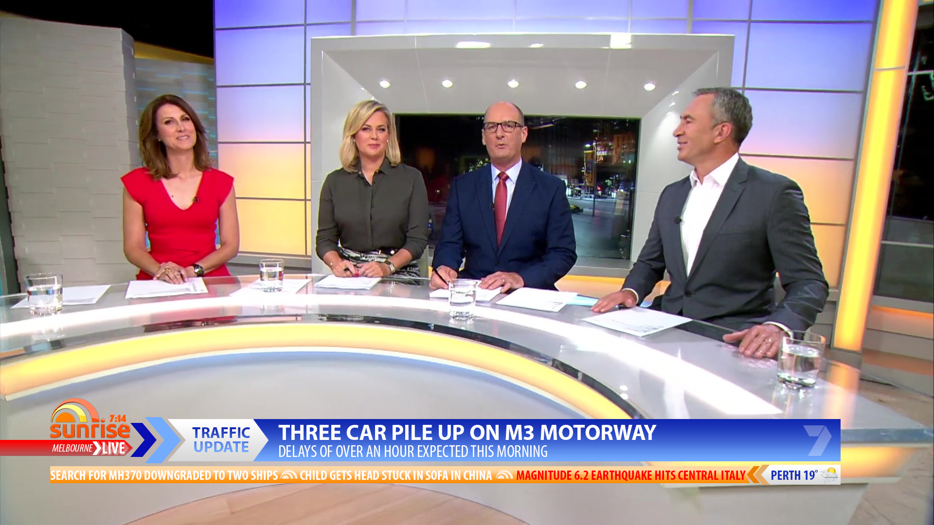
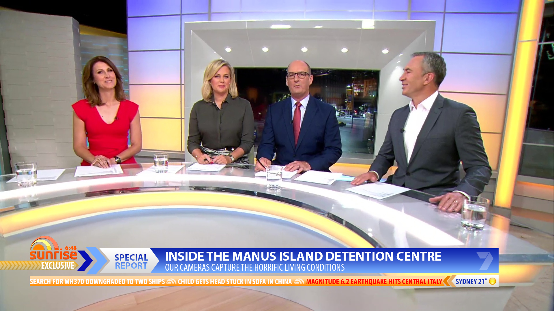
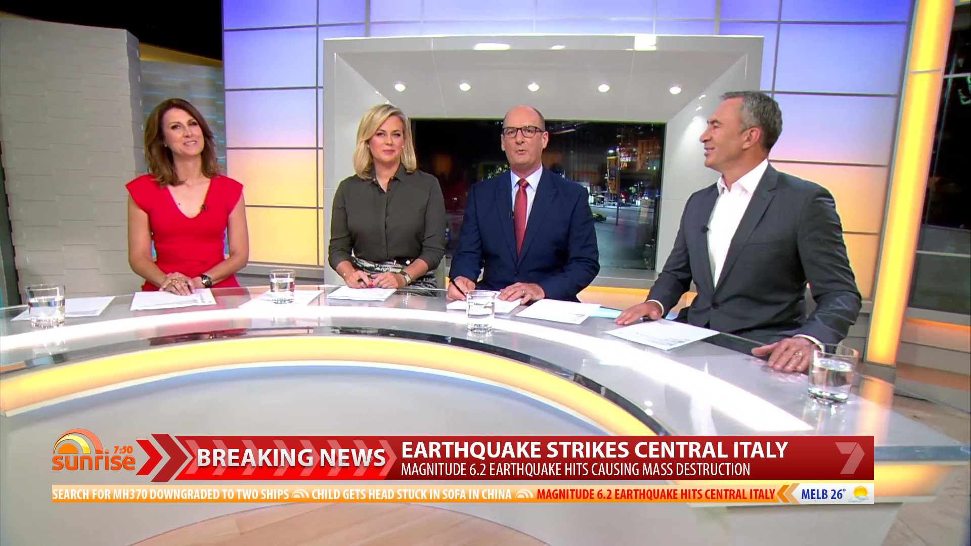
13 Likes
I liked the other ticker; this one is too hard to read.
Unsure about the full screen backgrounds also. Too pastel and clashes with the lower thirds.
3 Likes