New Nine News logo:

Would love to see them take a big dose of inspiration from the US networks for the impending relaunch.
New Nine News logo:
Would love to see them take a big dose of inspiration from the US networks for the impending relaunch.
I’m not a fan.
The concept is good, but I just don’t like the font used for the word NEWS.
No not Times New Roman! That font is about 80 years old, need something more modern!
I’m just bitter that we missed out on that whole style here in Australia 
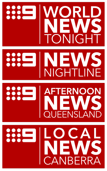
What about something more like this then, inspired by ABC World News Tonight:
(don’t like the Local treatment but these are only quick concepts).
Personally, I prefer that logo treatment over the one with a serif-type font.
While I don’t request mocks that often, one thing I’d love to see a really talented/dedicated mocker on this forum try is a relaunch teaser-type thingy for Nine News. I remember someone on the old forums (unfortunately I can’t remember who this was now, let alone find the clip) posting a similar mock promo for a Channel Ten rebrand which was pretty good! 
Was it the person who made this mock?
Awesome mock,btw.
Still my favourite mock of all time.
My version of a Test Card,
gfx inspired from the Nine 2012 package.
if anyone hasn’t already I recommend searching the term ‘rebrand’ on Vimeo.
They’re all so good
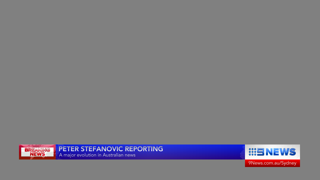
“Live from Perth, this is Nightline with Liam Bartlett”
@SydneyOnAirTV Based on Nine News’ new graphics, would you kindly make them better?
Here’s my take on a simplified Nine News super for use on national/East Coast 6pm bulletins:
Obviously the “Breaking News” image can be swapped out for one that matches the content of the report, like you see so often with the supers during news bulletins on all networks.
Also, I personally believe that the local news websites should be displayed on the 6pm bulletins with use of the main 9News.com.au address reserved for national bulletins only, so I’ve included an example of how it could be seen on Sydney’s news. The website wouldn’t be displayed as part of the watermark like it is now, only when supers appear on screen.
As always, thoughts, comments and criticisms are welcome! 
Its nice, but I actually prefer the new GFX. They look very nice IMO
Why?
@SydneyCityTV I agree local URL for news should be displayed. Also it should flip with their facebook and twitter.
I like your design - but the text is WAY too small. Remember - not everyone watches on TV. Clips posts don Facebook can get up to 20,000 views. That is 20,000 people unable to read your supers.
The GFX need to be designed mindful that people watch 9 News via other platforms that just on air - it’s 2016
40 seconds in NBC New York has a very very neat tidy way of displaying their URL and Twitter, Facebook and Insta - bottom left
Yeah, thanks for the constructive criticism KICK-IT!
In hindsight, I agree that the text is a bit too small and I probably would’ve benefited from thicker weights of font too.
@SydneyCityTV I like the design though, very neat and fresh! Great stuff. Just so small.
I’d love to see the URL, Facebook, Twitter and Insta for 7 News Sydney display the way NBC4 NY does - so neat!
Yuck! 
Wow, I didn’t know that it was the '70s again!