If Seven News keeps the font consistent throughout the outdated package:
11 Likes
A sky news based logo for ten and win (old color scheme):


2 Likes
You sure do have some interesting ideas, can’t fault your execution. Really taking the thread name of random to the extreme here though.
3 Likes
But why???
1 Like
Gosh!
3 Likes
That ABC News Breakfast mock is tight!
3 Likes
Tight?
1 Like
Dope, awesome etc etc
2 Likes
These were designed by a New Zealander mocker NaruTVMock,
Who isn’t yet on this forum, I hope one day he does join the family.
2 Likes
Not sure what the ‘mock’ part of those is.
1 Like
He’s just re-creating elements from different news programs?
1 Like
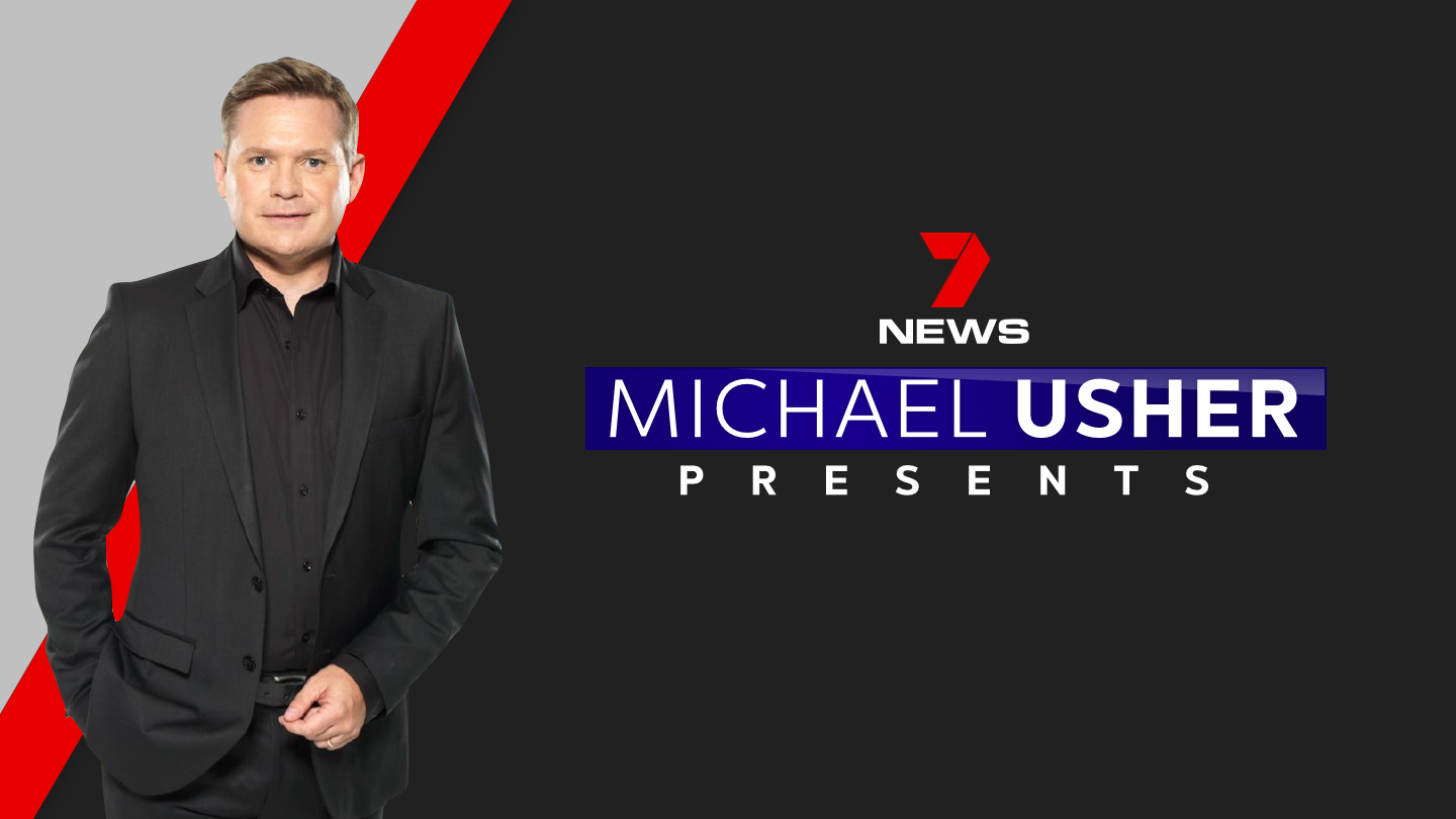
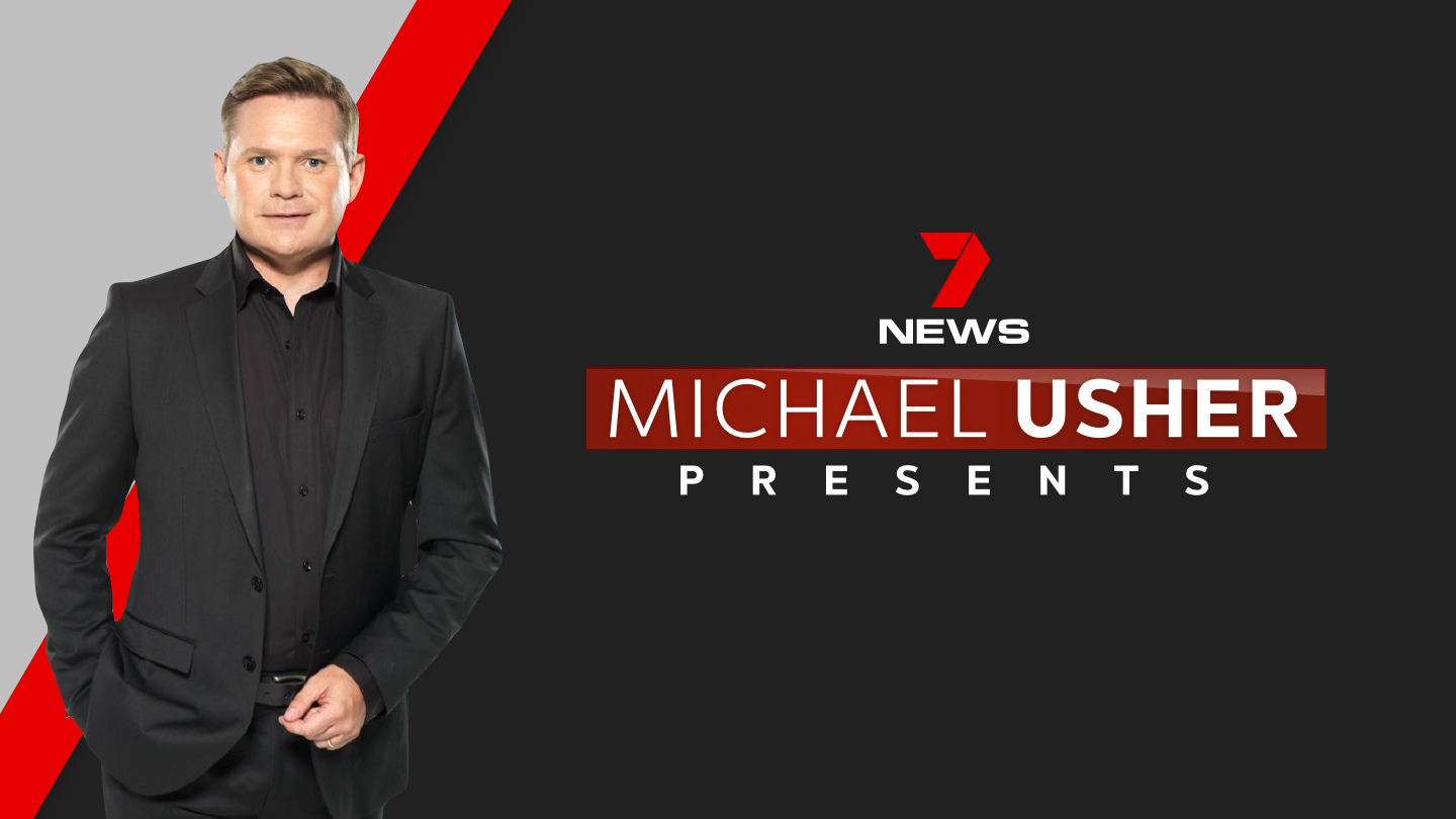
Red, the blue / white combo is too channrl niney
3 Likes
I agree, red all the way
5 Likes
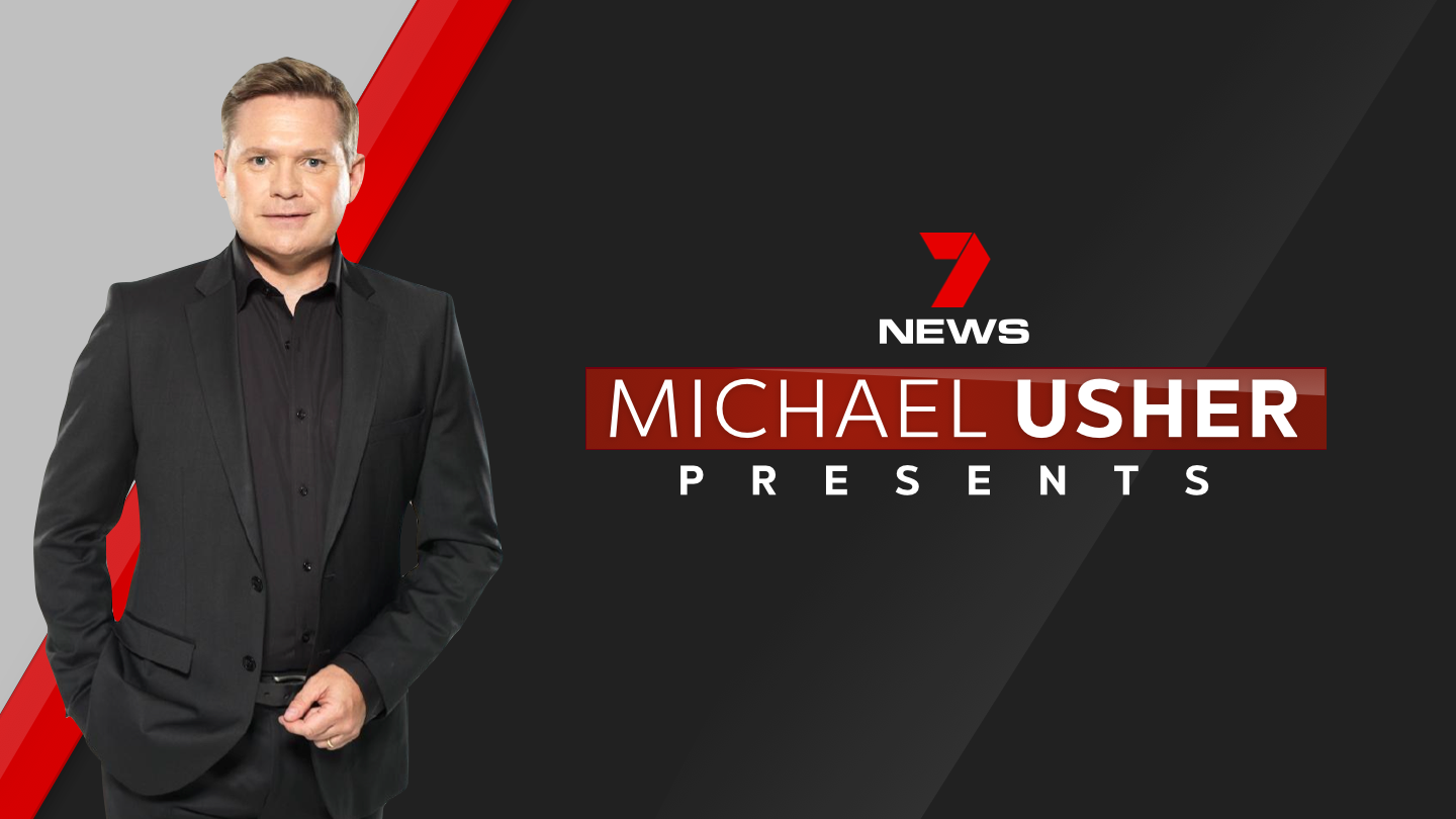
I agree too. Red, with the more developed background is my favourite
3 Likes
Looks awesome.
1 Like
Quick concept for a new look Nine News 6pm Opener:
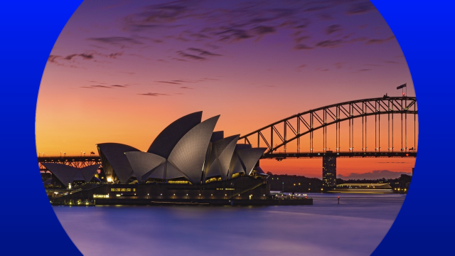
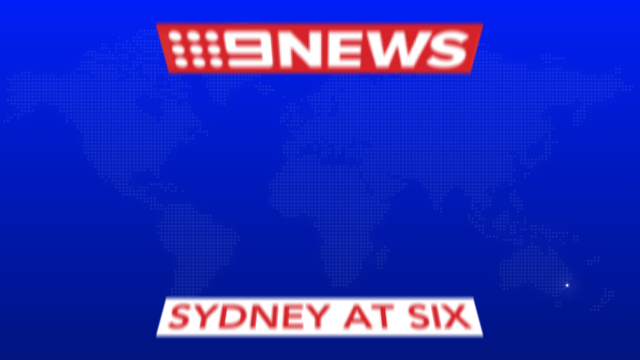
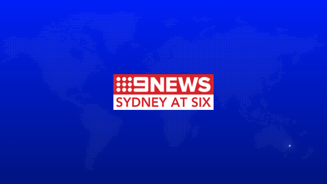
The Opener would start off by showing footage of the relevant local region (in this case, Sydney of course) before the circle flips over to white and the “dotted globe” map zooms out. The broadcast location is represented by having a “glow” on the specific dot on the map as well. Then the logo flies in for its full reveal and could possibly also transition into the headlines super.
Obviously the idea would work a lot better in video form (and would probably have a few more finer details to take advantage of HD, like location names or something in very small text flying around in the background), but I think you get the general idea.
As always, thoughts, comments and criticisms are welcome. So too is anyone who wants to refine this concept! 
6 Likes
Good start. The dotted map is very dull I can’t even see it. That’s with my phone brightness on full.
Yeah, I probably should’ve made the dotted map a little brighter.
1 Like