@OnAir@nztv@TV4@theGradyConnell@NaruTVMock@medianz Yesterday (31 October) was my birthday and here’s a parody of Paddy Gower Has Issues, a current affairs/comedy programme that screens on Three, although it’s only a mock design.
I recently made up my own late night music video show on Channel 9 that’s sorta like Rage and MTV called The Plug with James Elmer (former ABC ME presenter) on the Mock Schedules thread. so I wonder if there is a logo for my late night music program.
Been a while since I posted anything on here, so here’s some random news stuff reheated: BBC News
The new Future Earth programme looks more effort paid when it’s using the Chameleon BBC Earth graphics…
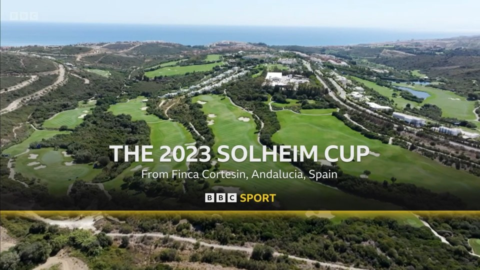
And an experiment that went nowhere, based on the refreshed BBC Sport endcap on generic matches (courtesy to RhysJR on Pres Cafe). Yes, I know the background didn’t age well…
Experimenting with some graphics for My53 News at 8/KMSG-LD in Fresno, after seeing discussions on the one-man-band newscast heated up again on TVNewsTalk. The colour scheme aligns closer to their opener, and the supers are more compact that looks better when without a ticker.
This one, from early 2022, was just done in disbelief, after seeing folks on TV Live Forum praising WSVN Florida’s over-the-top graphics and how they’ll be retained till the end of time. It’s slightly flatter than what they’re using (and more orange-red for the Circle 7 symbol), but I retained some reflective effects on the supers.
Open Air would be a new name for The Breeze and its mock logo and colours would be identical to that of Sky’s free-to-air television channel, Sky Open (in real life; see below).


")
")