It’s a good challenge. I’ll give it a crack with this in mind ![]()
Yeah?
don’t mind it (but do hate ‘host’ in the super)
Back again, trying to move away from the similarity of the Today (US) sun.
Thoughts? Feels more modern to me?
Love it! Would love to see lower thirds graphics developed using the logo
Looks amazing! I’m guessing the sun would be animated like the Sunrise one ?
Reimagining BBC News’ ‘pushback’ graphic - Or, just how much more detail can you put in a space in place of a gigantic QR code?
I first recreated the supers and ticker (as they’re mostly a direct port from the original), and unified the reds on the screen, rather than using the confusing bright red as ‘the Breaking News colour’. While I’m at it, I brought back the sub-heading as well.
For the pushback, I was inspired by how Bloomberg utilizes the real estate on the right not only for news headlines, but also a brief description - like this:
(Captured from my local station, i-Cable’s HKIBC)
Akin to this, I incorporated a time-accurate live text from BBC’s online update of the event, and placed it on the right. It can be a simple text explainer of the continuing coverage, as well as a ‘shop window’ to lead viewers to the online live. When the update is too long to be contained at once, I imagine it can be flipped upwards to reveal the rest. I also changed the caption for the QR code to make it more appealing.
To compare, this was the original, courtesy of Pres Cafe:
Thoughts?
A post was merged into an existing topic: Fictional News Bulletins In Films & TV
What if Sky acquired NZ’s own Bravo from Warner Bros. Discovery and renamed it as Sky Bravo as a collaboration between Sky and NBCUniversal?
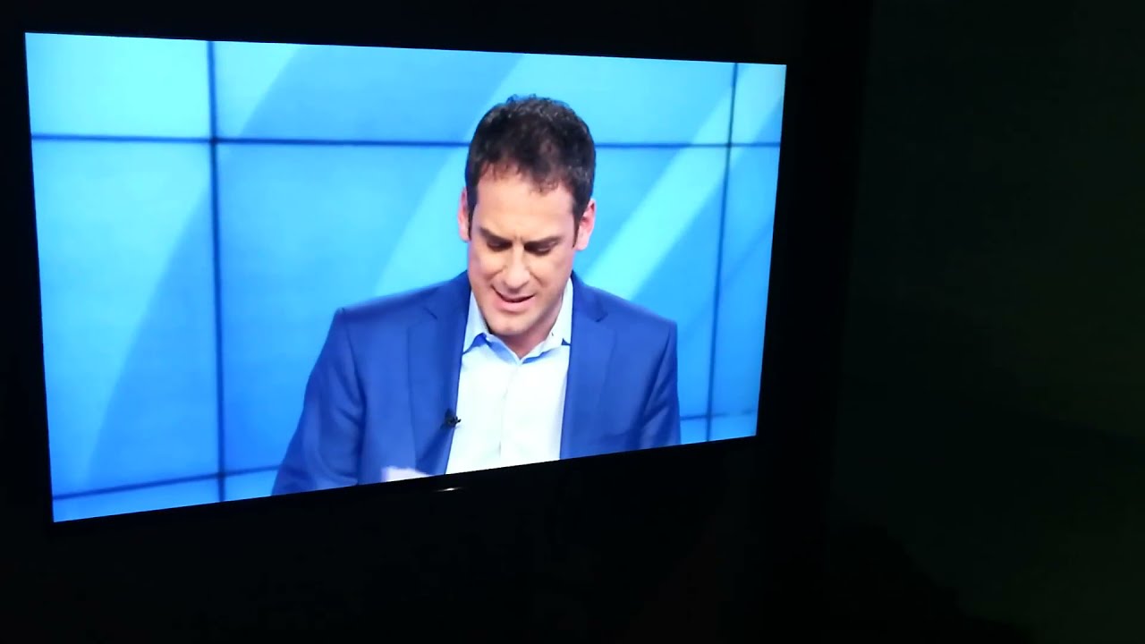
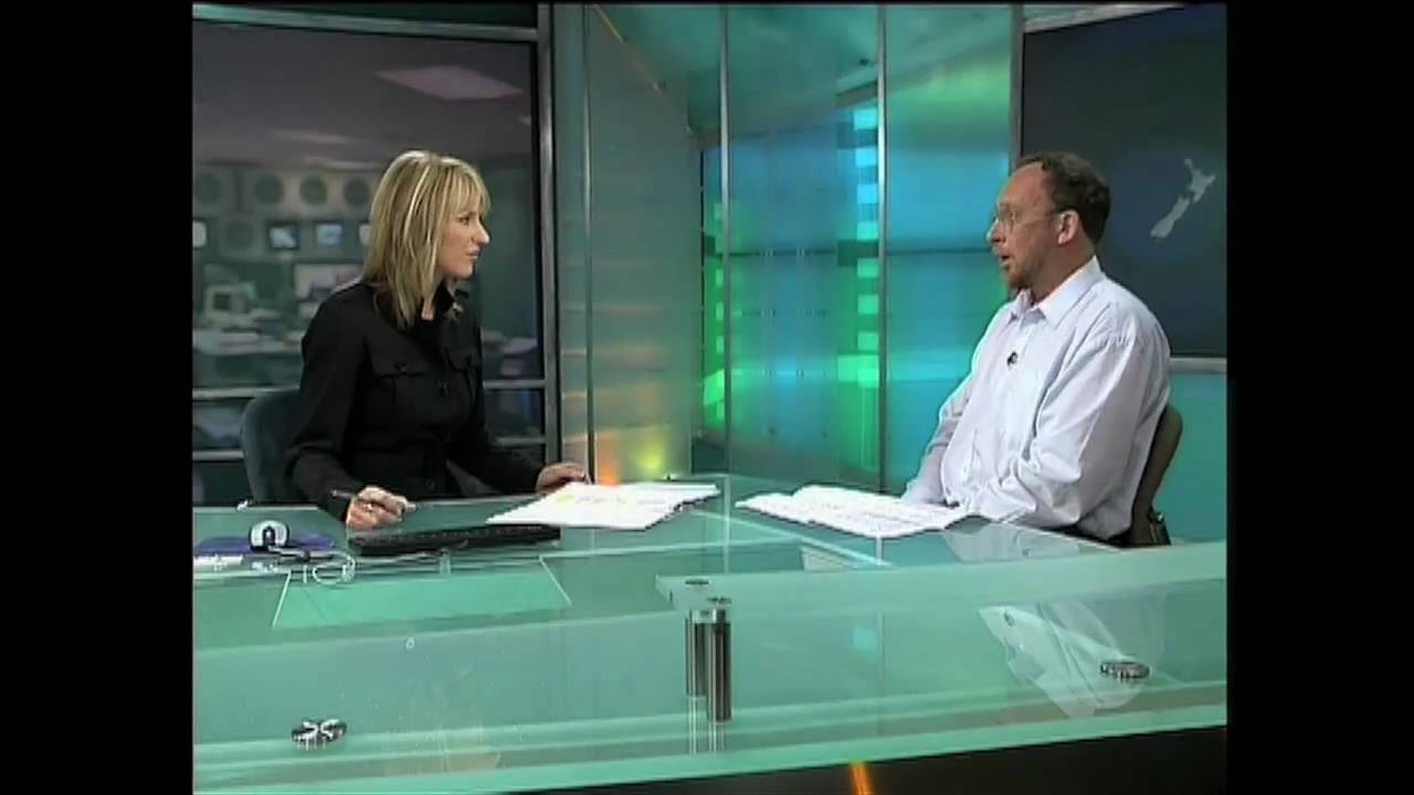
Not sure if I ever shared this, but this was an idea for a fictional news network opener to go with the Auckland Museum volcano house experience.
The fake news broadcast now features Daniel Faitaua here is the old version of the broadcast with Greg Boyed for those intereted.
And before that, Kate Hawkesby presented the segment.
I’ll raise you one better (?): News at Ten in the new branding and font!
The headline. I based the colour scheme on this Big Ben colour palette on Pinterest, as I thought a more distinct colour from the usual ITV News teal would be nice for the news synonymous with the clock. Font used - ITV Display Sans Bold.
The anchor strap, with the logomark and the clock in brown-orange gradient. I decided to do without the ticker, given the actual newscasts don’t have that much information.
The headline strap inverts the gradient to the background.
The Sky News-like name tag strap. In hindsight that looks a bit like @Medianext.MX’s mock CNN graphics…
Probably my least confident one - the interview spilt screen. I recreated the sliding parallelogram background with the brown palette, which looked less ideal than I imagined.
The live tag, which is now at the top rather than the bottom. Wrong time format for the clock in retrospect…
Have at me.
Your ideas don’t look half bad, but I find the oranges and browns a bit garish (and too morning-like). Maybe a darker hue of teal with blacks would help it look a lot better.
The clock down the bug should be 24-hour. Additionally, a news channel-like clock looks quite out of place for a normal newscast. Good move on dropping the ticker, though.
Yeah agreed. Although it looks like cup of tea with milk or a coffee, for broadcast it’s a bit off.
Nice work!
I’ve actually been working on a bit of a NaT mock with the new font, just been working on the logo, but I reckon it’s got potential!
Thanks for all the feedback! I’d like to keep the Big Ben-esque colour scheme, so I’ve toned down the brown and orange:
What do you guys think?
I like the overall concept and definitely agree that ITV News needs to have uniform branding across bulletins and programs but I’m not sure Brown suits a late news program like News at Ten. I’m also getting ITV Encore-ish vibes from the colour palate that you’ve chosen here (I don’t know why) which IMO doesn’t suit a news program at all.
Perhaps if you used darker shades of blue similar to the ones ITV1 currently uses for their general presentation package it may fit the brand better.
Fantastic mocks though. Well done! ![]()


