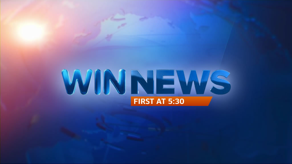
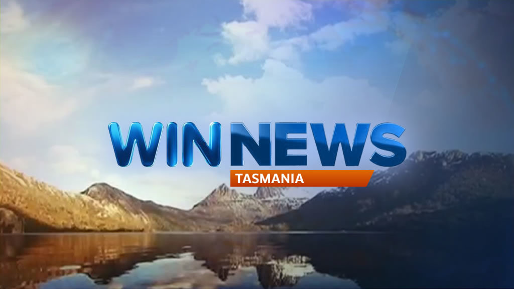
WIN News Tasmania cover up

Cap thanks to @JackMelbTV
Hope you don’t mind. i had a look to see what they would look like realistically!  TBH they look better than the current ones!
sorry mate, ive seen computer games graphics from the early 1990s look better than that. The rendering looks wrong and the background too out of place
Exactly what it needs now, Moe
[quote=“SydneyOnAirTV, post:485, topic:334”]
Had this WIN lineup lying around
[/quote]Wow, just wow!!! Beautifully done again! The last WIN-Ten lineup mock looked great but I’d definitely go with this one now. Brilliant work. 

[quote=“WAtvVideos, post:494, topic:334, full:true”]
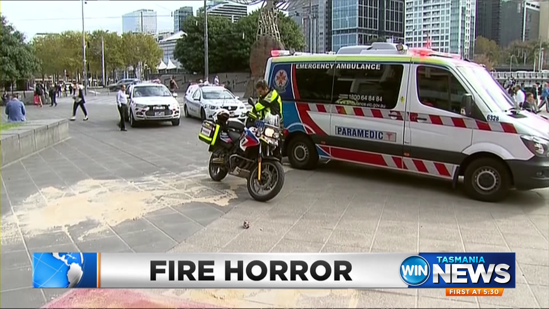
WIN News Tasmania cover up[/quote]I really like these WAtvVideos and the new tiltecard Moe.  Much better than WIN’s efforts of going with yet another solid block. Would also fix the issue of the “floating” blue graphic that’s on the headline super (which should have a coverup on top of it). They need an entire overhaul of their graphics, and very soon.

Footage From Lensaloft
[quote=“EyewitnessTV, post:500, topic:334, full:true”]Much better than WIN’s efforts of going with yet another solid block.[/quote]I must also add the ‘new’ solid block is far too big this time, too. Whenever there’s long text like Duncan McKenzie-McHarg’s name on the super it gets cut off. This needs to be fix. Either move it slightly to the right or make it smaller.
Not technically a mock, but I just wanted to see if it was possible to make the new Southern Cross Local News intro in PowerPoint like others on the forum said they could have. It’s a bit rushed but:
10 posts were merged into an existing topic: Mocks [Nicholas]
I’ve added an OTS to the original post. I wasn’t sure how to approach the OTS so I thought i’d try something different.
Good concept and great job for your first mock.
Interesting concept. Be careful with TV safe zones. The text on the right is too close to the edge!
Something inspired from the old update ender for the Late News
And of course something for the weekend!
EDIT: Also I have a dub of Peter Hitchener’s Lexus test drive - HMU if you want it uploaded! 
LOL at the last one! 
I forget how good that on-air look was for 2009
Win News intro in a Ten style…
Great work!
Looks bloody awesome, if they had a different keyed backdrop more in the new TEN style that would be a great overall package. Nice work!