It’s a reasonable quality recreation, however I’d probably still prefer to see @SydneyOnAirTV’s take on the current news graphics (or better yet, a completely new look for the news) of Nine or Ten! 
2 Likes


Brilliant. You’ve definitely got a future in practical news presentation!
21 Likes
What I like about these is,
…
I’m sorry I don’t know how to finish that sentence.
4 Likes
Bit harsh. This kid has gone out of his way to contribute to this forum in one way or another. I’m all for constructive criticism, but think it’s wrong to bag out ones efforts without giving scope on how they can improve.
13 Likes
I thought that was meant to be tongue in cheek lol
I agree with you.
There’s nothing worse than when people deliberately try to make others feel down about themselves. I personally can’t stand it and have no respect for people who act that way. There is nothing wrong with constructive criticism; it can actually be very beneficial. However, the comments above do not suggest this at all. They actually disgust me, to be honest. Very disappointing.
At least plugg1360 is contributing to the forums and attempting to produce mocks. I appreciate your efforts.
9 Likes
I like the baseline idea just needs touching up to follow the 16:9 graphic design baseline, as a few posts ago
I think to help encourage new mockers I reckon we should have a pinned post on the mock designs forum with basic tips and tricks similar to what tvforum.co.uk has in their mock designs forum.
2 Likes
Sorry, but I’m not a fan of that. My main criticisms would be that broadcast safe areas aren’t observed (see post #353 of this thread) and the weird edges around that “information box”.
2 Likes
@theGradyConnell and @SydneyCityTV I didn’t even think about the safe zones when I did it, I just mocked it up “as is”. And the weird edges, I feel, come from me resizing the Seven logo to use it in that way, or my incompetence to use an eraser correctly.
@Lemonsquash it’s a mock based around the old Ten News opener, like this:

If you can see in the bottom left there’s a Ten “logo” with “the late news” running round the rim of it. This was the base of my mock, as seen in the bottom left in my mock:

3 Likes
If your design were used on any standard tv anything outside the RED line would be cut off or could risk being cut off

the image of the Ten Late News you referenced is 4:3 and older aspect ratio which has its own safe area’s so only a small amount of that image would be seen in any instance.
Red: Invisible area
Yellow: Action-safe area
Green: Title-safe area

Thank you for contributing, but as far as how these appear, they’re very poor. As it stands, they’re basically just lines drawn on Paint.
I am not saying the idea behind these cannot be developed into something good, however these would benefit from further brainstorming and also the utilisation of more powerful tools. Paint is not good enough to develop a high quality mock. You can buy Photoshop, or download the free alternative Paint.Net (the latter of which I am a big fan of). If you want to get better at using these applications, there are hundreds of videos and blogs showing you basic and advanced techniques for creating decent mocks.
I would be interested in seeing more of your work posted on this forum, because to be honest we barely get enough mocks posted here, and no one’s ideas should be turned away on the basis that they’re badly expressed by technology. Even the worst mocks have a worthwhile idea behind them.
6 Likes
It has been cropped. This is an upscaled version (to 1080p):

and one scaled to PAL (720*576) as it would have been shown:

1 Like
[quote=“pelican, post:417, topic:334, full:true”]
Thank you for contributing, but as far as how these appear, they’re very poor. As it stands, they’re
basically just lines drawn on Paint.[/quote]
You obviously haven’t seen what I have posted previously[quote=“plugg1360, post:414, topic:334”]
it’s a mock based around the old Ten News opener[/quote]
[quote=“pelican, post:417, topic:334, full:true”]
I am not saying the idea behind these cannot be developed into something good, however these would benefit from further brainstorming[/quote]
I agree. I probably should have taken longer on it before posting but I want to show it here and get some feedback.
[quote=“pelican, post:417, topic:334, full:true”]
also the utilisation of more powerful tools. Paint is not good enough to develop a high quality mock. You can buy Photoshop, or download the free alternative Paint.Net (the latter of which I am a big fan of). If you want to get better at using these applications, there are hundreds of videos and blogs showing you basic and advanced techniques for creating decent mocks.[/quote]
I already use Photoshop, I hope that answers that.
I will hopefully be posting here more often and I also agree with you final points. However it’s not the fault of technology, it is the fault of it’s incompetent user (that’s me).


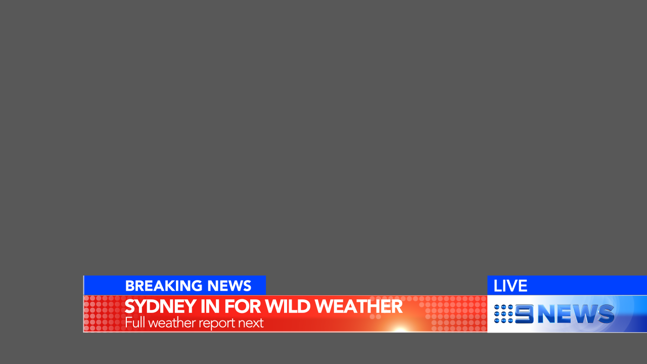


Another great mock as always, SydneyOnAir!
2 Likes
Firday? You must work for WIN 
2 Likes
Some general on air presentation designs for WIN, post July 1…
https://vimeo.com/171912008
10 Likes
Very nice. Seems like a design Nine would have done after their 2009-2011(?) package.
3 Likes