ohh my godddddddddddd
Love. it. totally.
ohh my godddddddddddd
Love. it. totally.
Seven News mocks…
(The repeated word “news” would obviously be “seven news.” I couldn’t find the font for it.)
I believe that the font of the “NEWS” text in Seven News’ logo is Square Extended or some variant of it.
In any case, another quality mock there. Why hasn’t one of the networks hired you already?! 
“Melanie McLaughlin” - is Helen Kapalos now running the graphics department at Seven?
I guess so! 
Its a great mock, but I really want to see the death of the scan lines they they obsess with. Makes everything look so dated.
And maybe one less lense flare. Or like a new variation that isn’t a sparkle one. 
[quote=“SydneyOnAirTV, post:420, topic:334”]
Some refined Nine News graphics:
[/quote] Just speechless. [quote=“SydneyOnAirTV, post:431, topic:334”]
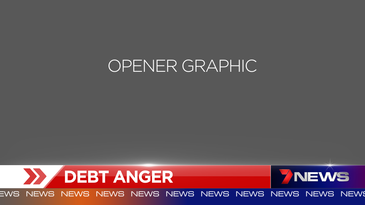
New [Seven News] Opener graphic:
[/quote] Looks good mate. Just one mistake- Mark Ferguson.
Somehow i feel this was a huge missed opportunity.
I think for a CSA, SC9’s version is fine and differentiates it from regular programming.
Here’s two different versions of my “Win News” logo.
V1 - I call it “Blackadder”
V2 - “Golden Times - A Ten-esque Logo”
Those colours haven’t been used on the TEN logo for about 4 or so years, maybe more. I’d definitely like to see a version of the ‘new’ win supers with a more ten inspired news logo albeit not with the circle win logo - moreso the news and tagline part.
I prefer them colours personally, but I do agree with you about having a new local News Logo to pull it into the “ten network” líne of news
Not sure about the orange, otherwise looks good! I think the landscape 7 news logo would look better in this application.
Much, much better than the disaster that is currently in use on all the bulletins. That’s what they should’ve used to start with.