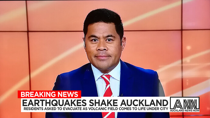
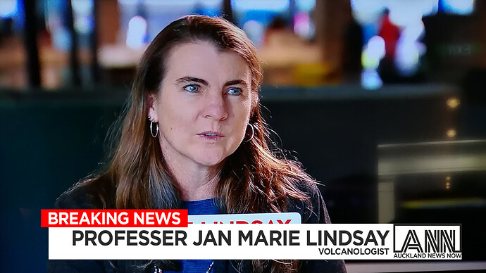
The yellow does stand out though. maybe that is what breaking news mean? It catches the viewers attention
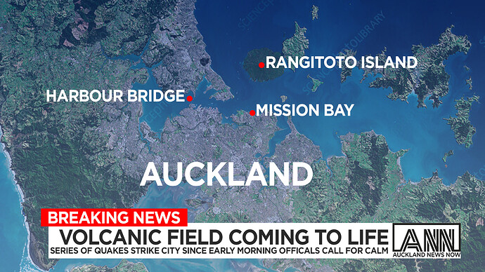
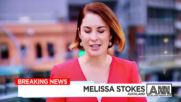
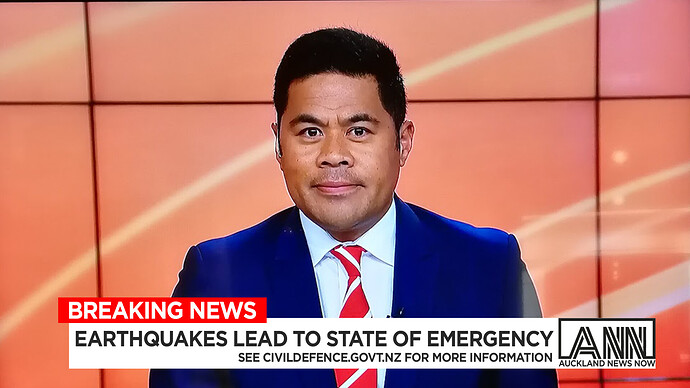
Was recently at Auckland Museum at the Volcano house, I Decided to make their own news network Auckland News Now as they currently they use 1 News
See the old bulletin here (STARTS 3min)
And the older bulletin hpsted by the late Greg Boyed which has since been updated and is now hosted by Scotty Morrison
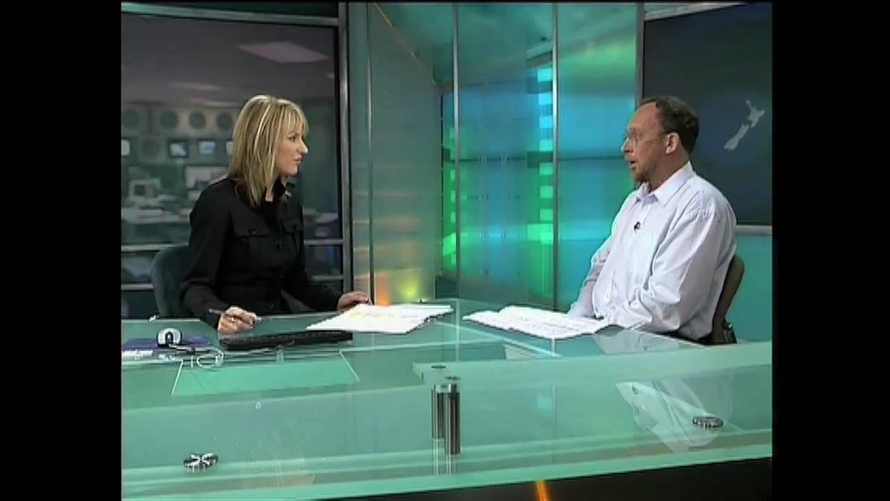
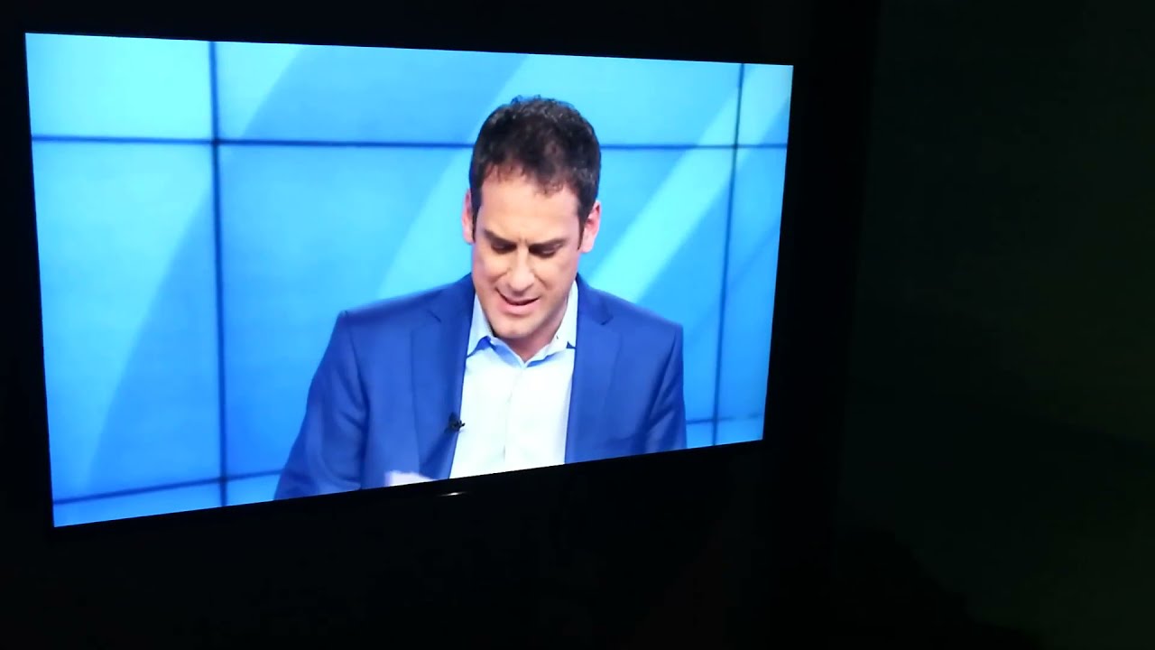
These caps are based around the first monitor you see as you enter the exhibit.
That’s pretty good. But with the amount of focus on Auckland in the main news bulletins already, would there really be a need for more Auckland news?
Just used TVNZ as shot fillers. Ideally if I was redoing the show, it would be filled with actors not tvnz talent.
@theGradyConnell Is that Daniel Faitaua?
Yeah he hosted the volcano exhibit entrance video made to feel like a 1 News Special (I think this is from his breakfast days / the old news set as the second video above had Greg Boyed hosting from the old set, which has since been updated with Scotty Morison hosting on the new set.
@theGradyConnell In my opinion, as an experienced Samoan journalist (although he was born in Christchurch and, at the time of writing, is based in London as a Europe correspondent), Daniel already has a relationship with New Zealand audiences in recent times - especially in his TVNZ days as a newsreader for Breakfast and 1 NEWS.
@Michael_Eccles Is that the Magic logo from the UK?
Oh oops that was the shape but not the logo and words. It must of not loaded when I screenshoted it. oops
Looks good, but some of those transitions need to be slowed down a little.
If Kmart ever decide to change their logo to make it more American.
Looks nice but the “K” looks too stretched
On the top version, I would delete the “k” from the bottom line so it reads “mart”. On the bottom version I would reduce the “mart” slightly.
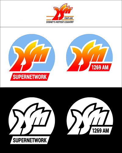
Reworking an old 2SM logo from the 90s. I have increased the size of the “M” as I thought it was a bit too small in comparison to the rest of the logo. The colour version did not sit well on a dark background, so I have used an all white version for that purpose.
I like the new look.
