Brilliant. Don’t mind the new Hit Network logo
Looks pretty good with the logos. I liked the 2nd one better. Their SPORT graphic are much cleaner than the 4th image. Stan Sport is the new home of rugby union and Tennis in 2021. A New era, a new stan, a new sport awaits.
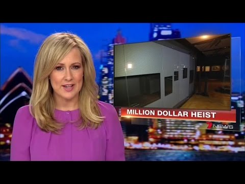
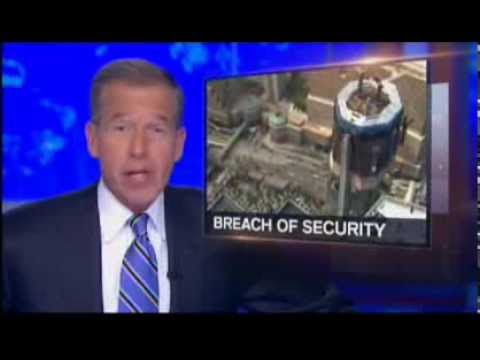
It’s been a while, but as per this discussion and many hours in Ae, I have kinda recreated the Seven/NBC opener from 2014, with a little twist too. It would mean we’d get 30 seconds from headline to top story, a rarity these days.
(at 00:24, presenters would say ‘good evening I’m (name), 10 News First starts now’)
Still pretty rough but continually working on it is making me insane ¯\_(ツ)_/¯
feedback all welcome.
for context:
Seven Opener
NBC Opener
Pretty decent effort recreating the graphics, your mock looks almost identical to the real thing!
The last one is probably the best, but the ratio of both parts is a little off. I’d say, much like Optus Sport the sport part of the Stan logo will be bigger with a thicker weight font.
Love it and the effort you put in. Well done! That was also my favourite style of opener for 7. Much better than what we now have IMO.
That looks incredible. Even better if it’s a live shot and not just a still image/loop
Imagine how incredible it would be if they actually used your creation or put the two images together and had a panoramic shot of the newsroom as their backdrop. That would be amazing.
The other states could either have a recorded loop or an artistic creation of the newsroom as their national backdrop.
Kinda the only problem with this is that it’s difficult to see three Ms in it.
Playing around with some more ‘modern’ designs for an online service - using @Leo_Puglisi6 's 6 News as the namesake for something a little different!
I don’t mind them, but it kinda reminded me of a doctor surgery or something.
Also the weight of the fonts could get lost when the logo is used as a small watermark etc
Nice job though.
Love it!
While I like the light and airyness overall, I do find it to be a little too much SodaStream 6 News.
Design wise the logo looks great, but probably a bit too light and airy for a news service.
Might be a great design for a radio station to adopt though.
Why doesn’t it include capital letters for news and Australia?
I think it looks pretty good to me. These graphics look to be clean and sharp.
Weighting can easily be adjusted, and certain elements wouldn’t be retained for a watermark etc, but I definitely see your point.
HAHA yes, I may have taken the “light, bubbly” vibe I was after, a little too literally - I can definitely see that.
It was definitely mean to be a fair bit light and bubbly - more of a lighter digital presence for less serious news. Honestly just playing around with some design elements and gradients. I could see a similar concept for radio though for sure!
Was intending for it to be quite informal - and a thinner weighting combined with a lack of upper casing tends to lend itself to more of a fresher/younger look. That’s my personal opinion though!
Cheers mate.
Like I said - just playing around with some elements! I’ve just discovered this board so I’m keen to experiment with some designs in the future.
Informal is fine but still use capitals otherwise it looks sloppy. I know it’s trendy to not use capitals but doesn’t make it right especially for a news service.


