Found myself inspired to whip up some Seven News mocks too!


13 Likes


Remember those mock DAB+ Slideshow Images I did for 2CH a while back? Well here’s an updated version to accommodate for the presenter changes which have been made since then:

Also while I’m at it, a “Now Playing” slide - obviously the album covers would go where the green square is with track info to the side of that:

Last but certainly not least, an updated version of the logo because 2CH are now playing “Classic Hits” instead of “Easy Classics” and also because they really like pushing the fact they’re in stereo on DAB+ Digital Radio:
Comments & constructive criticism welcome, as per usual.
10 Likes
I like it
3 Likes
Just look at that blur that fooled me! “The internet’s still buffering…”
3 Likes
This is seriously good! Would look even better with the new 9 logo you mocked up 
2 Likes
Thanks guys ![]()
1 Like
To me, the presenter images look “old-fashioned”. I think the outlined names would be better as a solid colour text.
Awesome, I can even the animations would be that the upcoming show circles would expand from the circles in the logo (not sure if that’s how you imagined it)
2 Likes
What programs does everyone use, Adobe, photoshop, illustrator? something else?
Yeah, I tried that but it clashed with the blue background in some of the pics.
1 Like
Hmm, yeah, does the text need to be blue? It may work if it was a black or grey. (Black probably wouldn’t work for some, (especially the first one). But yeah, maybe the outline is the only way to do it, unless you go crazy and use a pink or bright green 
Yeah, I decided to make the text blue because that’s obviously the dominant colour of 2CH’s branding.
My aim for these mock slideshow images is for something that’s simple, yet professional looking and easy on the eye. This by contrast, is an example of the actual “Now Playing” slide from 2CH’s DAB+ transmission:
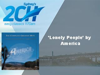
I get what they’re trying to do but that floating, background removed pic of The Rocks doesn’t really look that great IMO.
3 Likes


Looks great! Only thing I’m not really sure on is the use of gold for Breaking news?
Maybe a light orange or yellow would be better?
Great to see it live away from red though 
3 Likes
I personally think the gold sets it off well. Orange might blend too much with the red, this way “breaking news” and “emergency alerts” stand out easily.
But the gold and black looks tonnes better than gold and white! Great work! A refreshing take on the 2010 package, their last truly unique one.
1 Like


I like this and think Today should return the news ticker. Just where is the logo and clock?
Plus you will need an element of yellow or orange at breakfast.
1 Like


