Noticed on 9Go! the classification warning was in-tact, however the MA logo looked very different, it was more cubed/squished and mis-aligned (compared to its usual prominence and rectangular look). Not sure if all this is play-out bugs or errors or indeed some tinkering and gradual changes. Nine has also always (since the 2015 change) opted for ‘generic’ designs of the classifications, whereas the other networks seem to take an exact replica of the ACB’s original designs.
I’ve always liked how Nine treats classifications. The box over the watermark for the consumer advice is well designed and doesn’t overly intrude. I also like how the PRG classification logo is tucked away next to the Nine logo.
Remember when they faded in the classification logo with a flashing colour sequence in the last pres package? So cool.
I don’t remember this. Got a video?
I remember it well, used to be lightning fast multi-coloured little squares. I didn’t realise it was intentional though, always thought it was a system thing that resulted from the automation of the classification/CC bug play-out. It was when they (and Ten) still used the Supertext logo too.
Like this:

It came in around the 2006 or 7 package and hung around for 5+ years afterwards IIRC.
That explains why they seemed so different/special/out of place to other elements in a respective package from the times (what I was trying to get at with my previous comment)
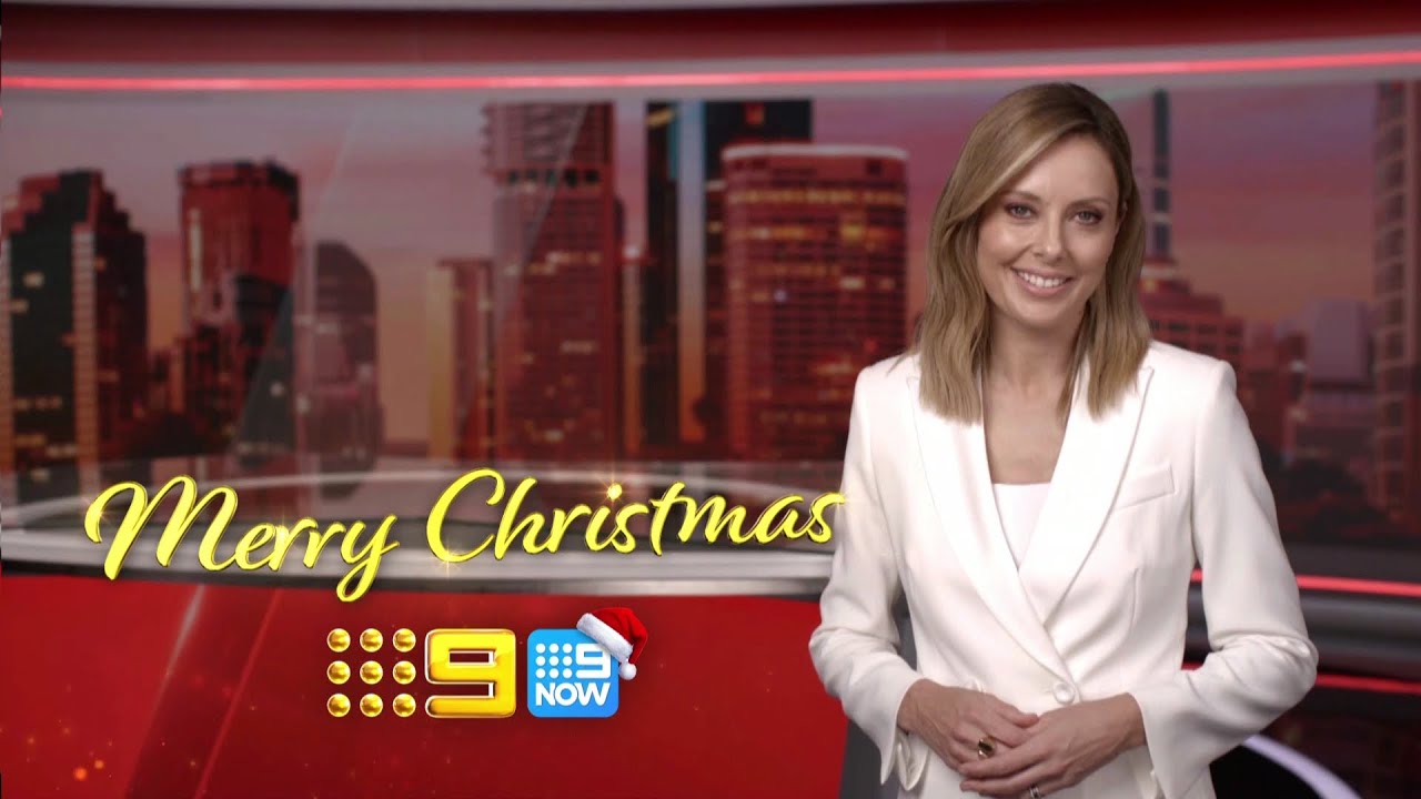
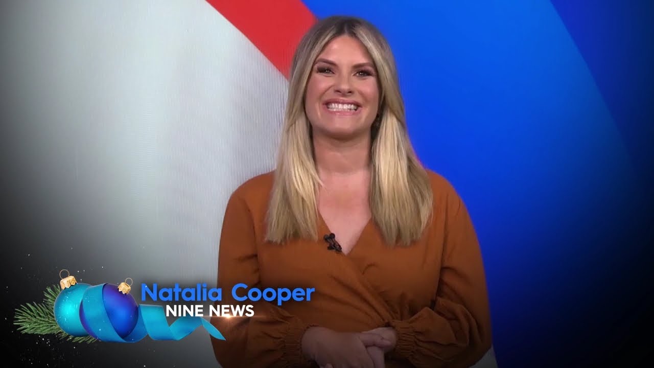
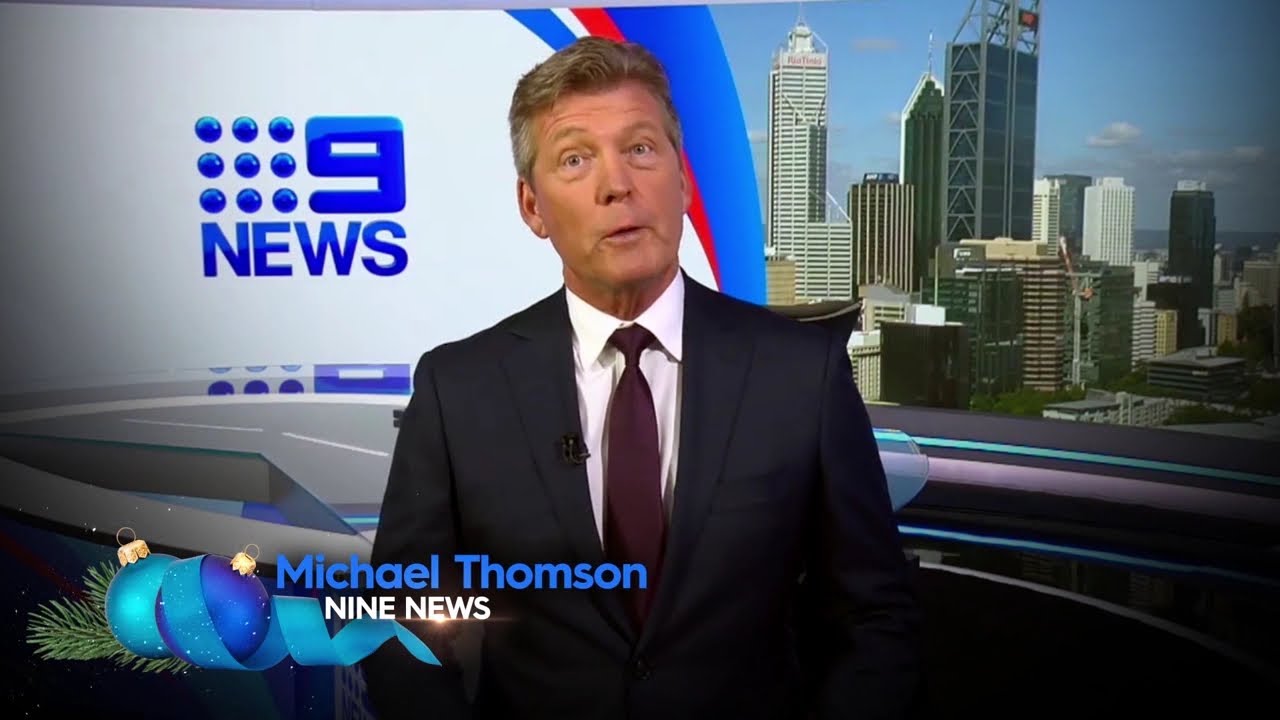
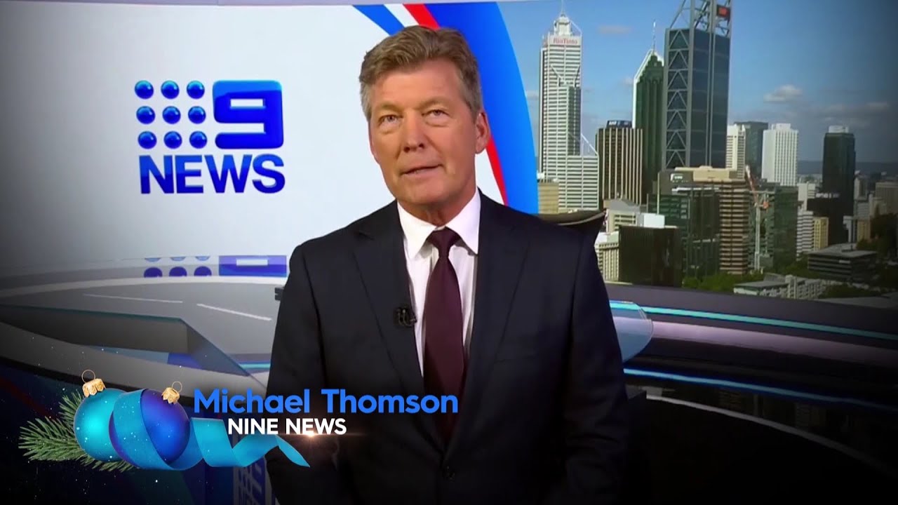
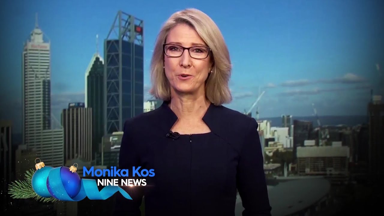
Nine Perth is airing local Christmas Idents again this year. However they are in the same style as last year, and for those people that had one last year, the same one is airing again this year.
The new ones for people who did not have one last year are:
The one for Michael Thomson is the same, but with a different music base:
The originals from last year:
I don’t think that’s true. It came in during the original multi-coloured 2012 Welcome Home package to my memory.
I do vividly recall the multi-colour entry for the classification bug definitely came in around 2007.
It may have been refreshed for 2012, but the style itself had been around for a number of years.
I don’t remmeber that at all. From what I do remember, the classification logo was in the grey box with orange line above it. Slid in from the left.
The colour phase is of the 2012 colours too.
Yes. It may have been 08, although for some reason I distinctly remember that multi-colour entry sometime during the box logo era, although may possibly could have even been the orange HD bug, if not the classification bug at the start of a program.
2007 - coloured classification logo came in (was more generic looking)
Jan 14 2008 - current version of the classificaton bug
April 2012 - flashing coloured squares before the classification
2014 - S (Supertext) changed to CC (Closed Captions)
Jan 2016 - classification bug loses its animation (back to the same as Jan 14 2008)
Jan 2023 - Hopefully a new animation
Just checked my uploads looked like it was sometime between December 2 - 18, 2015. Last upload I can find was it was using the animation on December 2, next upload was 18 and it was gone by then.
December 2:
December 18:
The current presentation was introduced on December 15, 2015 so it must of been then.
Thank you for clarifying! Would make sense ![]()
Looks we won’t see the flat logos next year.
Yep… what did I say? ![]()
