Are Nine so short of presentation ideas that they have to resurrect a 16 year-old look? In 2000 when Ten was using it, it it looked fresh and original and coincided with networks first promoting a web presence; now it looks dated and more like they are copying Seven’s chevrons.
I’d rather that they use the dots a bit more in their graphics but for what it’s worth, personally I don’t dislike Nine’s use of square brackets. And yes, I can certainly see the comparisons with Ten. But I think that the square brackets have been off Ten long enough to look different on Nine from most graphical elements seen on TV in recent times…
If we want to talk about Nine taking some of Ten’s past On-Air Presentation elements, here’s another one: Nine currently uses at least three former longtime Ten voiceover artists for their network branding!
I agree. Something like this one (but with the colour changing along with the Nine logo, of course) would probably work well:
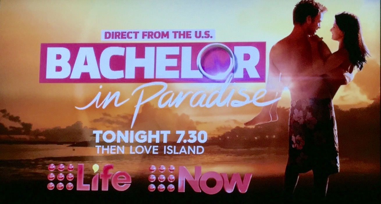
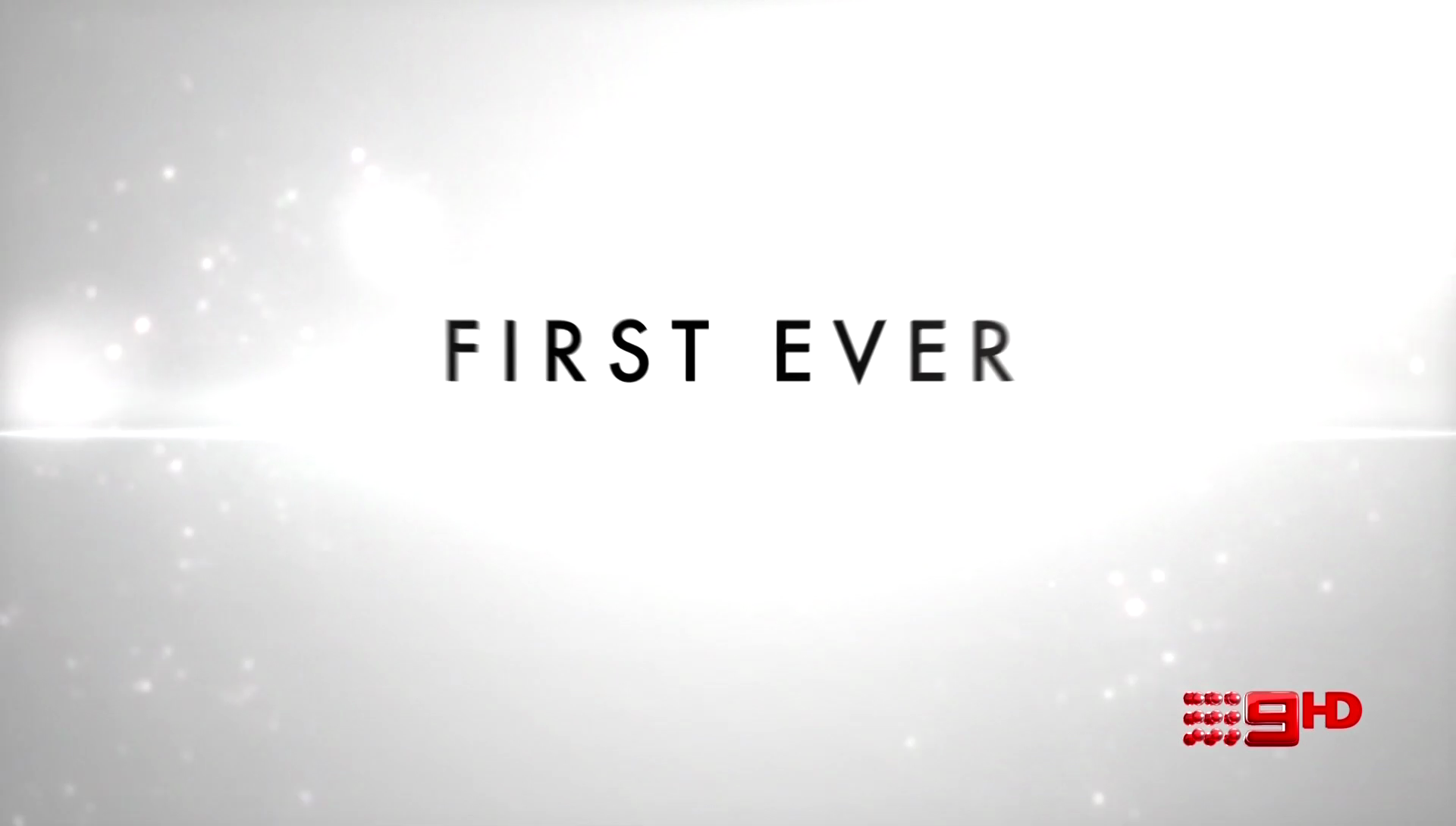
There’s definitely been a little bit of a graphics refresh and much more emphasis on 9HD lately.
Here’s a couple of videos I’ve recorded this afternoon:
With the heavier emphasis on Nine HD in the promotion and On-Air Presentation, I wonder whether we might see some new generic promos for Nine HD anytime soon?
With Seven clearly maintaining the opinion that it’s generally more important for most metro viewers to see a multichannel in HD, Nine HD broadcasting most/all premium main channel content in HD to every metro market and the major regional areas is a very strong selling point that probably should be taken advantage of IMO.