Last bulletin from Dianella is now up! for anyone interested:
4 Likes
@TV.Cynic you are always going to have certain stations be strong in certain markets.
Perth has always been and will for a long time be a channel 7 town. Newcastle will
Always be a channel 9 (nvm) town. And in tasmania and wa Southern cross and GWN absolutely dominate - unproportionaly so to how seven performs on a national level
In the us say you have abc which dominates in New York and la. Go down to Miami and the #1 2ngkish station is FOx (well wsvn - fox affil)
And then In Indianapolis NBC dominates
1 Like
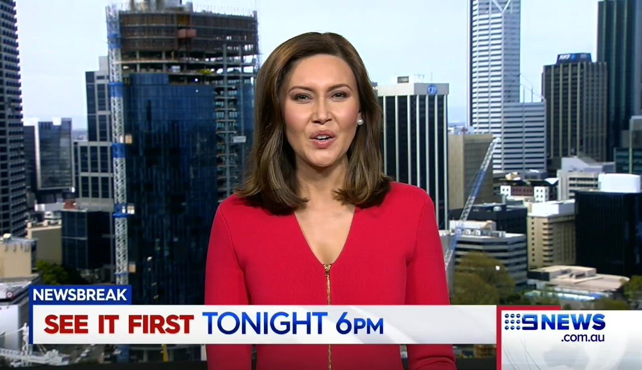
A bit of a struggle this morning… 
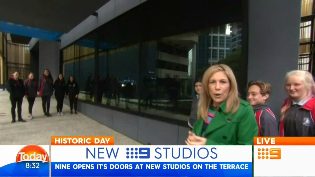
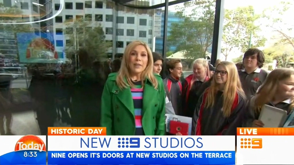
Today Perth news presented from 9 Plaza, saving the studio for 6pm. A couple of technical issues but mostly quite smooth, considering they are on an OB.
1 Like
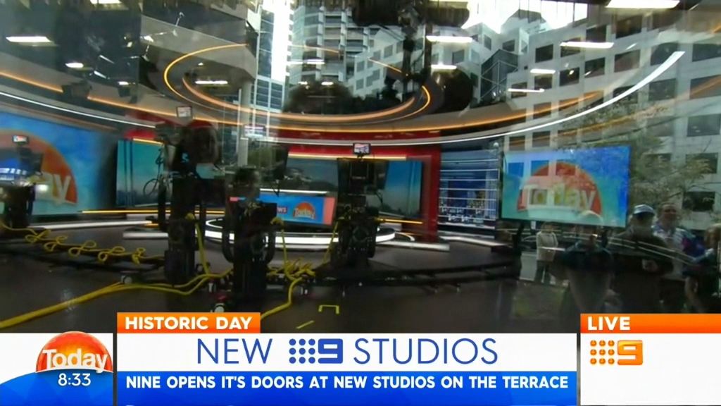
That screen (?) to the far left of the set with the today logo is huge.
2 Likes
Because only Perth is getting a new look today…I think.
1 Like
Tim did say all new graphics. However could be Perth only for now until Sydney updates their set. Maybe the new graphics really integrate with the set so it might not look right in the other markets.
Internet now is fast enough here so I can cap any news updates. I gave up with the old aerial.
7 Likes
Kind of inspired by Ten Eyewitness News’ graphics, isn’t it?
6 Likes
Ooh, I like those new graphics.
Much better than Seven’s recent refresh
4 Likes
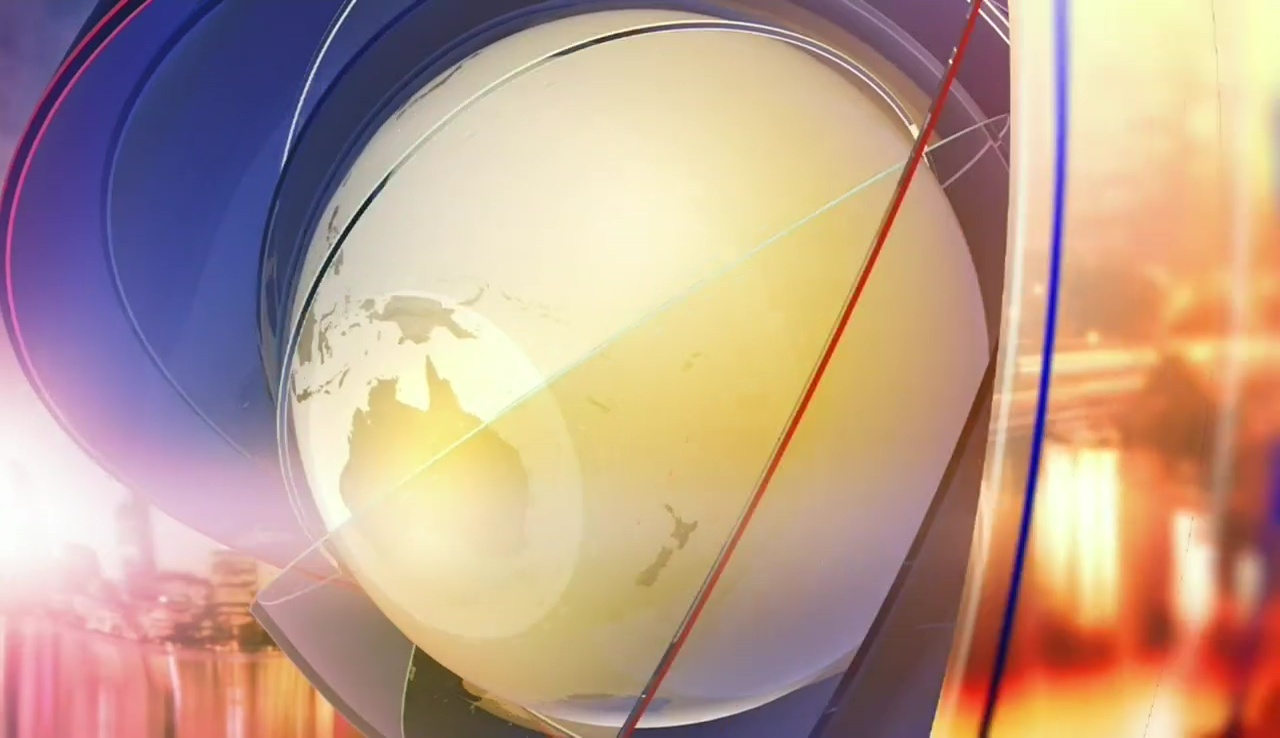
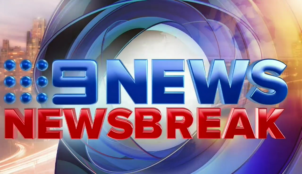
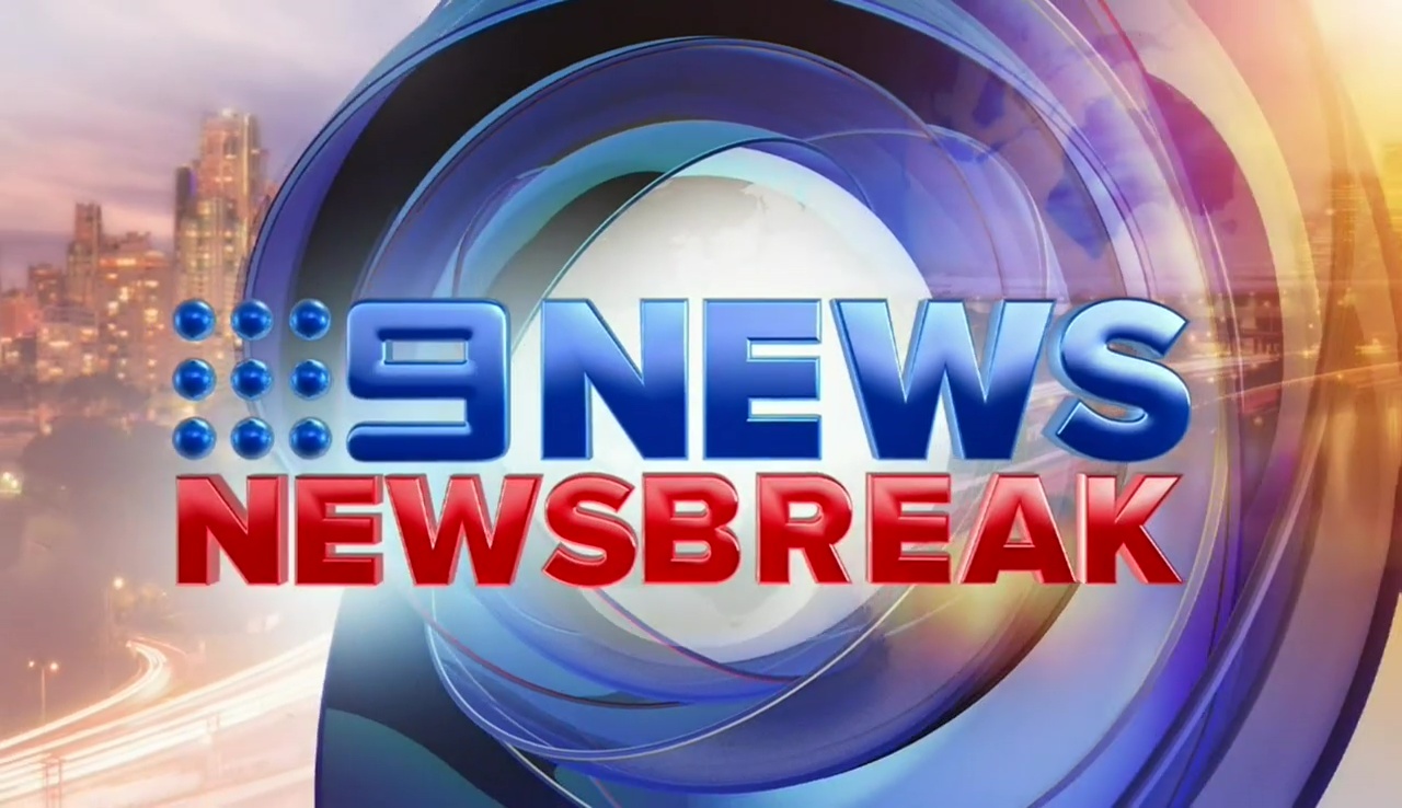
Video of Newsbreak
9 Likes
Much better than Seven’s refresh
2 Likes
Even despite the fact that the general presentation quality is far better than Seven News, the refreshed Nine News Perth is an extremely blatant rip-off of Ten Eyewitness News’ On-Air Presentation and moreso in video form IMO. Also, the theme music/transition SFX don’t really go well together. For that, I have to dislike this new look.
Nine News Sydney: Please keep the dotted globe in your branding when you next relaunch!
4 Likes
That super combination obviously inspired by the networks current on-air package, should we expect a HD version of the logo and brackets at 6pm?
2 Likes
Can’t really see Ten’s graphics in it. I can see parts of Nine’s previous look (the one before the now old ones and the late 2008 ones with the red and blue (the ones with the yellow vertical lines animating) otherwise we seen both the ribbons and the bracket from the current on-air look integrated. IMO it’s better than Ten’s and Seven’s.
1 Like
Very average graphics IMO, just looks like a mess of random shapes on the screen even after pausing and rewatching a few times to try and figure out what is going on.
Not a fan of the big white box on the bottom right of the supers either.
Still better than what Seven has served up though.
6 Likes
I would like to have seen them do a new rendition of ‘Cool Hand Luke’
I don’t mind that full screen transition but those supers… I don’t like them. They seem very right heavy and unbalanced and the white lines don’t line up because of the weird red square corner, don’t get it.
3 Likes