Very Nine like
6 Likes
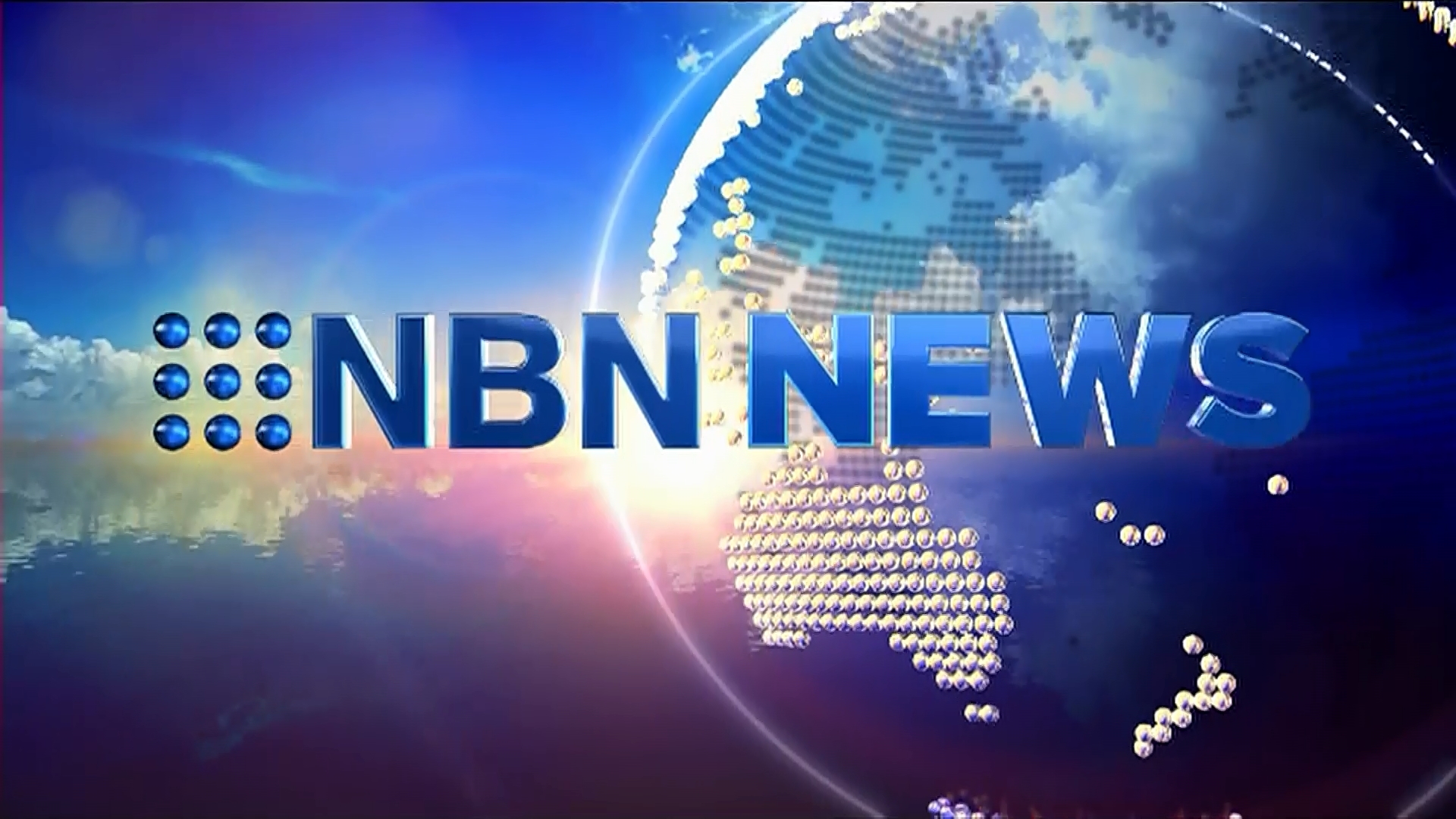
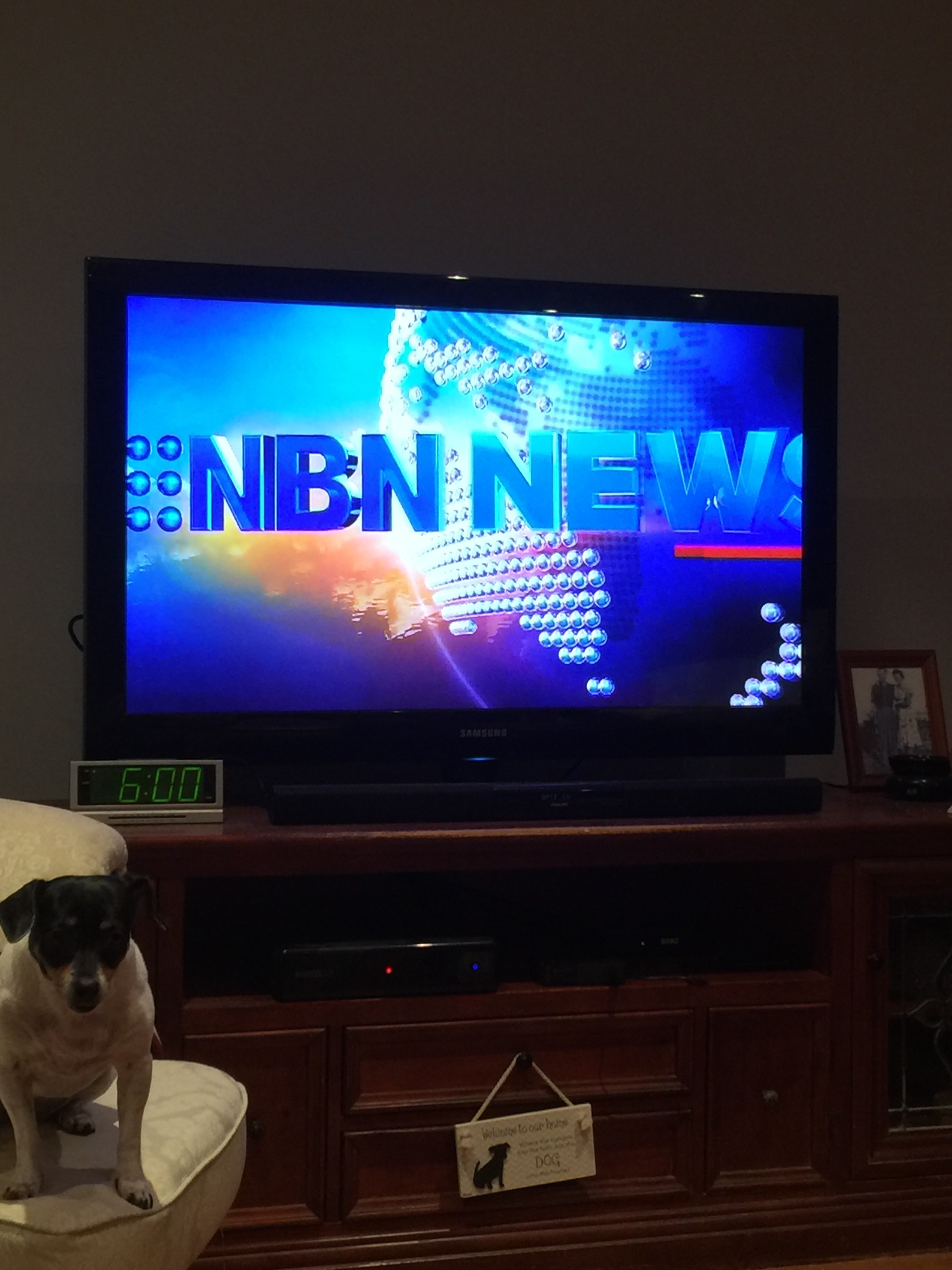
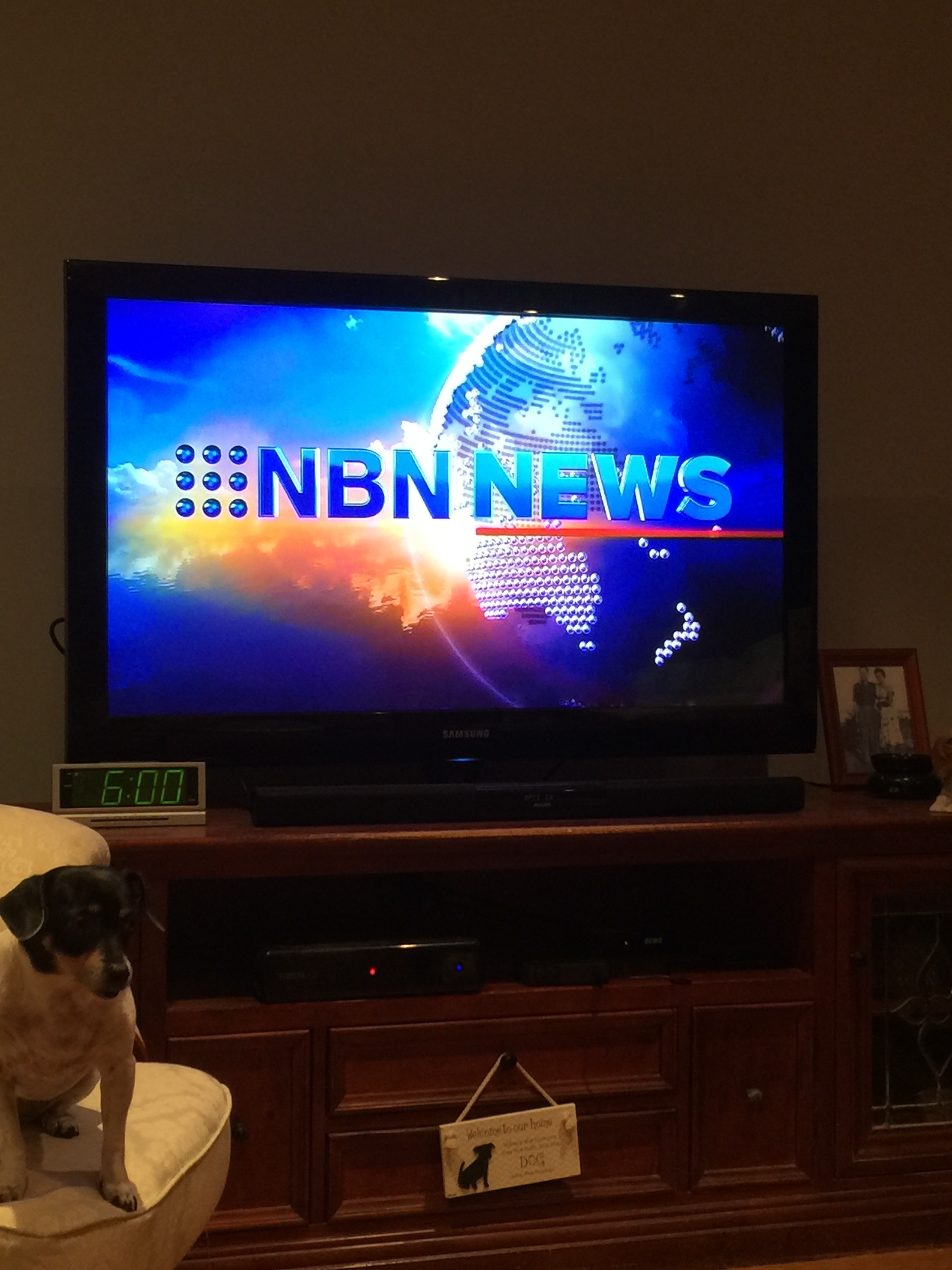
That NBN looks so tacked on I’d have assumed it was a mock.
5 Likes
Hmm…the “NBN” logo text looks tacked on even though the “NEWS” and dots elements look spot on.
Although I do think that it is a slight improvement on NBN News’ previous “lens flare overboard” titlecards and probably just a temporary thing until NBN News is finally rebranded to Nine News, so OK for what it is I suppose…
1 Like
I missed the opener tonight!
The Nine opener moves very quickly and is very short, which to me wouldn’t suit the NBN theme music, which sounds like it’s made for a longer and slower moving opener.
Will check tomorrow night.
This indicates that NEC are slowly moving to the Nine brand bit by bit by bit by bit.
I had thought the move to Nine News branding, theme music and opener would all be done in one go.
What is next… Adopting the Cool Hand Luke music THEN the rebrand later?
it’s just rubbish - on a read:
“the network investigated…”
then in a report:
“Nine News understands… Dimity Clancey, NBN News”
So are we “the network,” “Nine News” or “NBN News”
Messy is one word.
NBN News has been like that for years.
The mish mash of “network”, Nine News and NBN News branding is just a joke.
1 Like
Somehow, I think you might be very surprised at how well NBN News’ current theme music could work with Nine News-style opening graphics. I did a mock/re-edit of Nine News Sydney video with NBN News’ current theme a while back and thought that NBN’s theme would work quite well with Nine’s style of opener.
If NBN News are now using the Nine News-style transition sound effects (typically used with graphics after returning from a break or going to a live cross, anyone who’s familiar with Nine News’ current presentation on a national/Sydney basis should get where I’m coming from) then you’d think that they’re intentionally choosing not to go with Nine’s current theme music.
Personally, I think that the full rebrand from NBN to Nine will most likely happen when Nine News next gets a major branding refresh.
Surely the updated/Nine-ificated NBN News titlecard and everything else would look 100% spot on if the network was planning to keep the current news branding for more than say…6-12 months or thereabouts? That’s my theory anyway.
1 Like
THIS… 110%
It does sooooo seem like NBN does NOT want to be dragged kicking and screaming into a Cool Hand Luke era!
3 Likes
Does the opener of NBN News have pictures of Newcastle, mid north coast, northwest, Gold Coast and northern NSW or not?
I presume that the Opening Titlecard of NBN News mirrors Nine News’ generic/national titlecard, because the same Opener (and the statewide, national and international news reports) is shown in all six regions if I’m not mistaken.
Not. Generic opener.
1 Like
A shame. Would be nice if NBN could incorporate some local imagery into the opener.
With some thought out design, they could incorporate a Newcastle and Gold Coast skyline, and some coastal and inland images that represent the broadcast area into the opening few seconds and closing few seconds of the new 9 News look opener.
Some small repeating sliding text could then “scroll” ever so slightly across the screen that said “Newcastle / Northern NSW / Gold Coast”
They could also use local images and “live” shots like 7 news queensland does on the backdrop. Have a Newcastle one, a Gold Coast one, a coastal beach one and inland one. And alternate between then throughout the newscast for different shots and angles.
While I agree that it would be nice to see NBN incorporate local imagery into the On-Air Presentation of its news service, it may not be practical under NBN’s current news format.
As it’s been said before, all of the statewide, national and international news segments (including the Opener and Closer, if I’m not mistaken) are shown in every market. As far as the local news windows are concerned, only Newcastle’s is actually live while the others are pre-recorded. Can you really adopt local imagery in a news bulletin that has such a unique format/structure without looking weird and inconsistent?
Unlike Sydney or Melbourne where most if not all viewers can identify with their city skyline so it makes sense for Seven or Nine to use a primary backdrop of the city in those markets, the NBN licence area is very diverse ranging from coastal holiday spots to inland towns in the bush. To use the most extreme example, how can you get a single image that viewers in both Tamworth and the Gold Coast can identify with? While the generic/national look might make NBN News feel more like a national bulletin than a local one, having a “national” look for an entire bulletin probably allows for more consistency in presentation.
Besides, NBN certainly aren’t the only regional news service in Australia to opt for generic news imagery as the base of their On-Air Presentation. I’d say that almost all regional news services in this country opt for a generic news-type look for their graphics and On-Air Presentation. Even in metropolitan markets, there has been a history of local news services (even in markets like Sydney and Melbourne) presenting themselves more like a national bulletin.
Once the transition from NBN News branding to Nine News branding has been complete, I think that planning an eventual upgrade to HD production needs to be a bigger priority before localising the graphics and presentation.
2 Likes
From their Twitter feed. 
6 Likes
I wonder if/when they’ll change the logo in the supers, to match the font that Nine News uses in it’s “NEWS” part of the logo… 
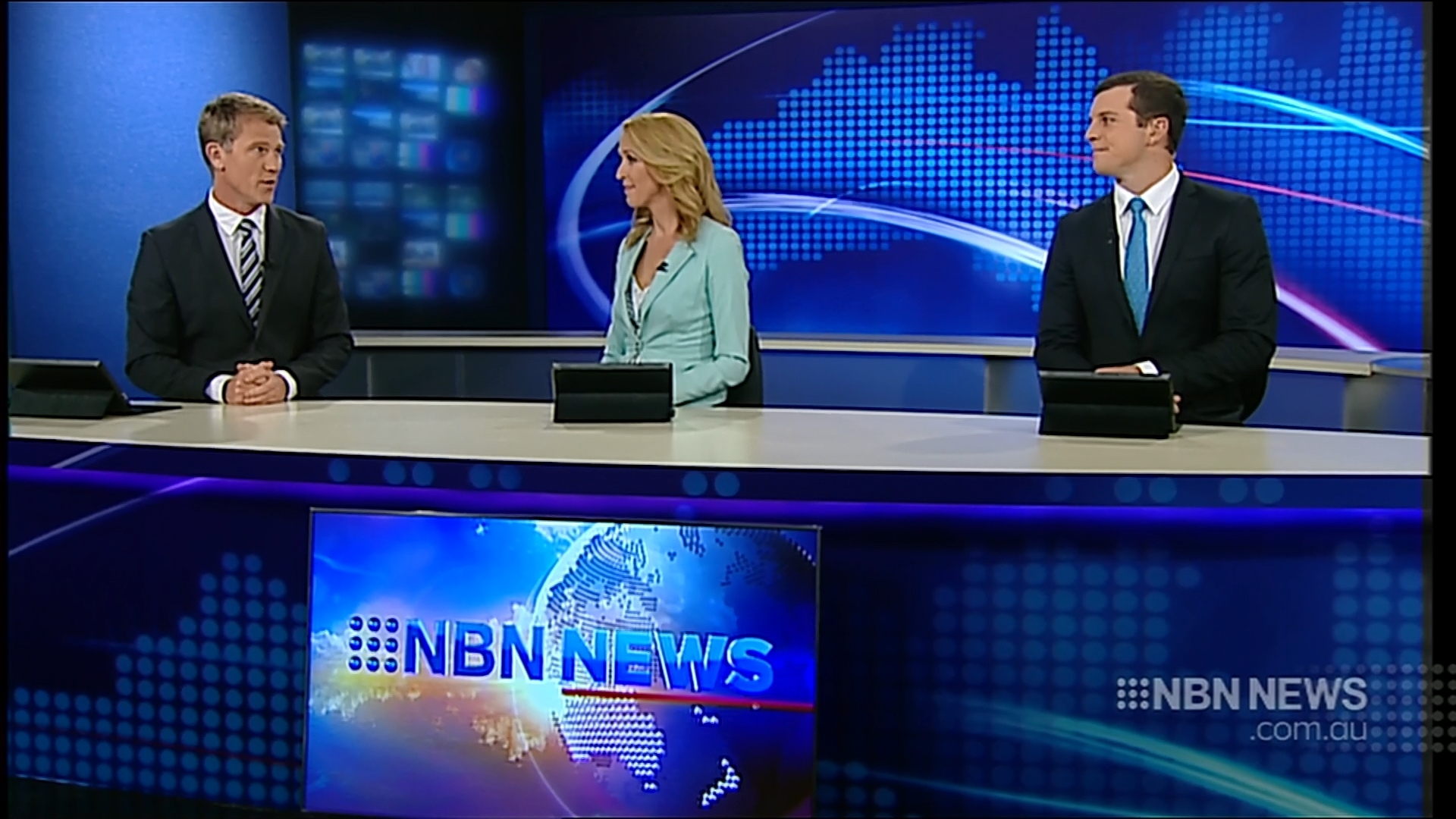
Starring role from Bethaney on the couch 

2 Likes
Still using the NBN News theme or Cool Hand Luke now?
Laurence Schuberth’s. I’m wondering if they have a contract with him as part of his Creative Services role there?