This is another interesting one. WWJ/CBS Detroit has launched its on air newscast. This station has been without an offical news operation for 20 years with a few false starts with First Mornings back in 2010’s which didn’t last long. It has been the only CBS O&O without a local newscast.
Be very interesting to see how it performs in the market. The set is different it’ll be interesting to see how they use it for different newscasts.
A journalist from Florida TV station Spectrum News 13 has been killed while reporting on an earlier shooting outside Orlando. The suspect has been arrested.
EDIT
UPDATE 24/2:
The slain reporter had been identified as 24-year-old Dylan Lyons.
And there’s another CBS O&O adopting the new graphics package: KTVT/CBS Texas, dropping the CBS News DFW name used in streaming.
Similar to the WCBS interlude, the station placed the 11 symbol and eyemark in the black box usually sitting call letters. The first broadcast had a little hiccup though, as the white streaming tag was obstructed by it:
But that was soon fixed, now in the usual blue gradient. There’s also a cute little animation announcing the change:
And another one last week: KCNC is now CBS News Colorado.
Over on NBC, their Washington DC O&O, WRC, has a new set. The space was formerly used by Meet the Press before they moved to their DC bureau, and might be shared with WZDC (Telemundo):
You can tell the KCNC wasn’t fully ready for the transition. Their opens look like they are half baked/done. Plus the CBS News Colorado isn’t centred vertically in bug which triggers my OCD
And now it’s WFOR’s turn, now CBS News Miami. On streaming, they used the full score for the rebranded open, according to TVNewsTalk:
Meanwhile, the 5pm newscast has this:
And there’s also this. What’s with the O&Os and their habit of fiddling around with font sizes?
Moving on from CBS, Gray, one of the biggest stations groups in the US, is preparing a new graphics package for its local stations. It’s largely based on the one used in WANF in Atlanta, though it seems like they can be customizable, such as the CBS3 with the dissected eye background.
Here’s a sizzle reel for the graphics, originally posted on Creative Director Matt Quinn’s LinkedIn page, reuploaded by folks over at Pres Cafe:
Some has made it on air, such as the new logo on the KFYR group of stations in North Dakota (and with WBTV in Charlotte expected to follow a similar style), their news streaming service, Local News Live, and a sports promo on WCSC Charleston.
I was comparing the two I think the top one is an overlay for their Online stream of WFOR and what is underneath is what is actually on air as you can see below it covers the Orange variant of the graphics.
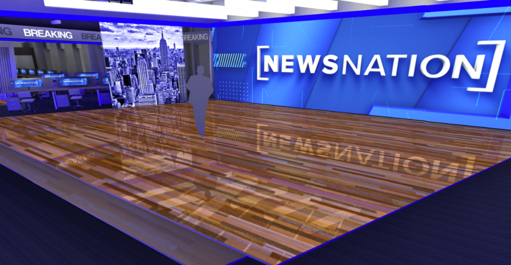
After months of preparation since last June, WPIX in New York debuted their new studio tonight at 6, alongside the new open and supers:
The 10PM news looks like this:
And the weather ticker looks incredibly large over the headlines in morning news:
According to morning anchor Hazel Sanchez Rapciewicz, the official launch date is on next Monday, so maybe this is a soft launch? https://www.instagram.com/p/Cp5nqG-t3js/
And as discovered by TVNewsTalk, the studio is also going to be NewsNation’s NYC bureau. This is what the latter may look like:
The long-rumoured new open from KDKA/CBS News Pittsburgh debuted during their News at Noon today. Like their previous package, they broke free of the generic blue and used a black/yellow combination:
… or solely the former, in case of the lower thirds, which doesn’t look good to the full-screen graphic, also in black:
The headline super is still white though:
Meanwhile, their morning news is running on a lemony-yellow accent:
[Update: That’s the default supers for the station now.]
Well, more generally, the black and gold colours are the official city colours of Pittsburgh, coming from the coat of arms of William Pitt the Elder, the city’s namesake.
The 3 looks horrendous IMO - inconsistent with both the main CBS brand and the legacy Westinghouse brand (anklepants). We’ll see how it’ll be seen on screen…
Meanwhile, WBZ Boston is the latest recipient of the new graphics. Or should I say, WBZ NEWS streaming on CBS News Boston?
“We also recognized we couldn’t just completely get rid of the three,” said [Kelly] Frank, while noting that channel numbers mean something different in the world of streaming. “We knew that there was recognition and affinity and value in that three… We needed to maintain that tip of the hat, that legacy, that homage to the iconic three. So we kept it and made sure that it was married to the CBS brand.”
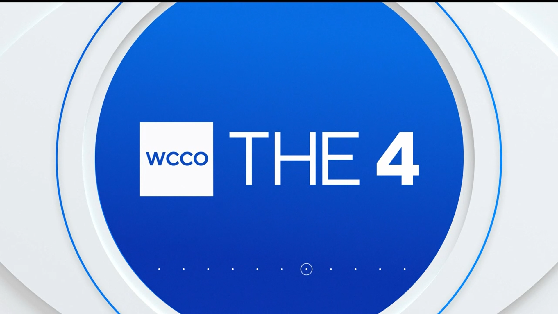
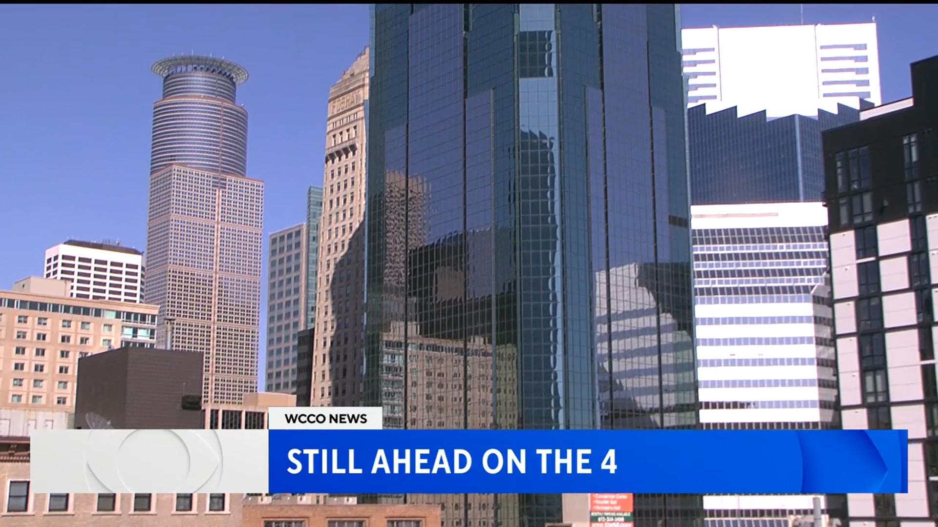
And now it’s WCCO/CBS News Minnesota’s turn, taking the WBZ route as WCCO NEWS streaming on CBS News Minnesota.
Their 4pm newscast, The 4, flipped first with standard blue branding:
Then the 5pm news followed with the new brand. Contrary to what we’ve seen in the practice run, no red is used in the new open:


")

 - Full Open (2023)")
")


 - Debut New Set and New Graphics - Mach 20, 2023")
 - Debut New Set and New Graphics - Mach 20, 2023")


.thumb.png.61f81526faff0299b4671586097c1056.png)

")