Some animated promotion for Nine News Melbourne perhaps?
Some animated promotion for Nine News Melbourne perhaps?
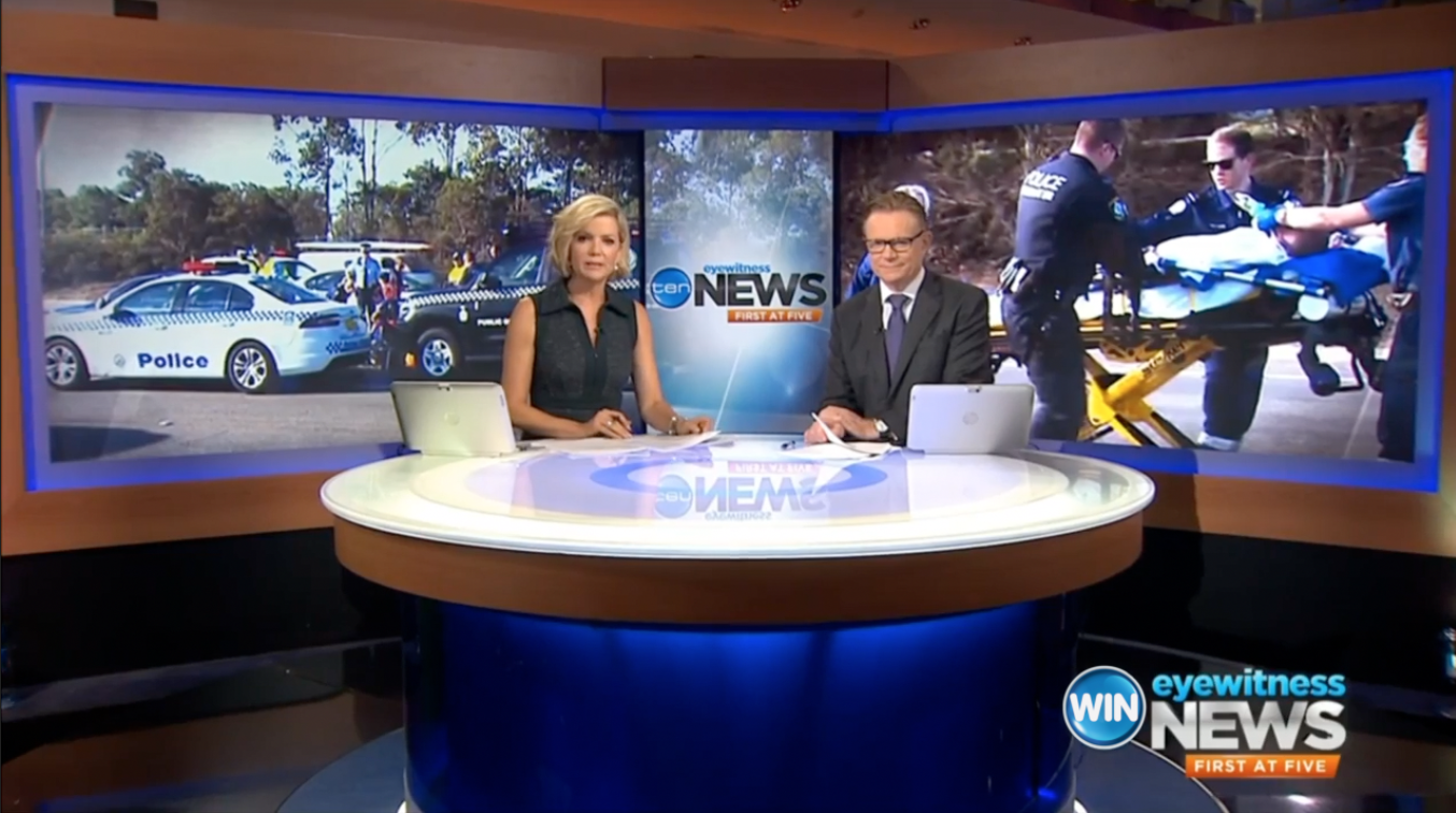
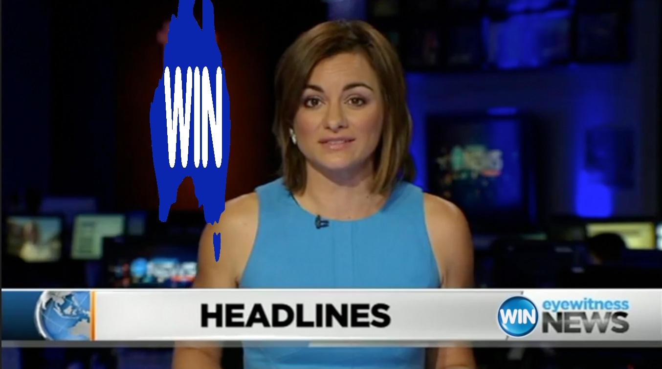
The WIN isn’t big enough.
Completely and utterly unrealistic
The picture quality is too good for WIN SD
It’s an improvement. Your blurred out one is more in line with Bruce’s expectations.
WIN should hurry up and copyright their map watermark before the rest of the world catches on to their genius and starts copying them.
Please, don’t stop there @TV.Cynic! 
[quote=“eddel, post:167, topic:1135, full:true”]
WIN is like one of those dodgy YouTube channels that is trying to avoid copyright detection:
[/quote]LOL! 
I’m glad you did a better mock thanks to my website. 
I will update it with even more coverups, I mean a few more gems I got.
Please don’t give them any ideas @SEQTelevision! 

Mind you, I think that would work perfectly for the local news editions. Better than the ‘slanted block’ they currently use (with an empty orange graphic attached to it in Tassie  ).
).
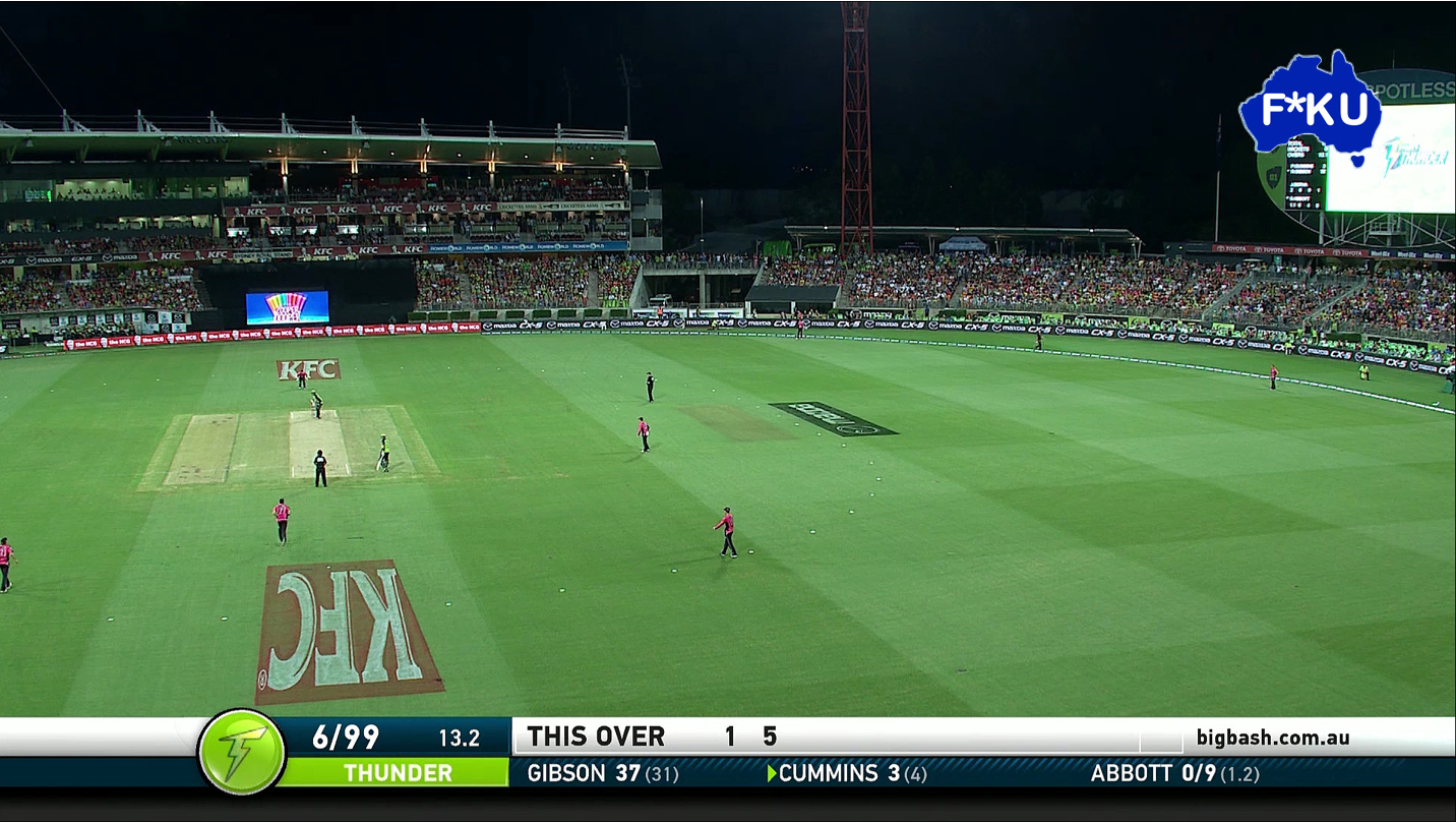
Those coverups are not big enough.
Needs to be a mappy one, complete with covering the EY and the N on the right.
Okay, so here goes a few ideas for a refreshed WIN…
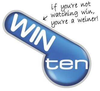
Instead of 'ol Mappy, how about taking the TEN logo as a clockface, and superimpose WIN to it at the 10 o’clock position. This shouts, ‘without TEN, WIN would be nothing’.
In fact, they could animate it by starting at 5 o’clock (clearly a dig at 9 on 5), turning up to 10 o’clock.
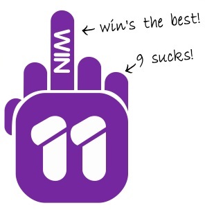
Now for 11, imagine a bar-graph of the other networks above the 11 logo, WIN being on the tallest bar. This implies they’ve got it over the other networks, WIN’s #1.
Not sure about ONE, I’ve run out of Ideas, but I’m sure Bruce has a few 
… whadda you mean offensive?