Discuss changes here.
1 Like
I’m expecting more of a refresh of the current set and maybe revised graphics than a major overhaul, but still nice to see some changes 
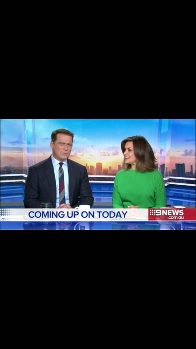
First look at the new Today set on Nine Early News, watching LIVE from London on 9Now on my iPhone after doing the same last Sunday night for Sunrise
2 Likes
Well I’m a huge fan. Looks superb!
1 Like
Talk about double standards. This time last week it seemed everyone was up watching Sunrise. This week, it seems there’s only two of us watching today.
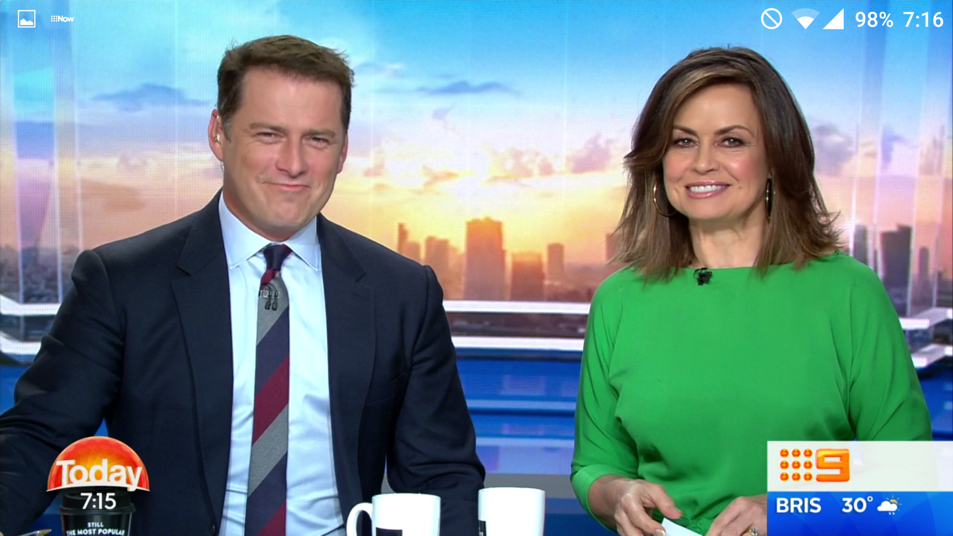
Graphics are brilliant, clean and neat and the background is a really nice change.
2 Likes
It really is a much better relaunch than Sunrise!
@Read_It_First I suppose because Sunrise promotes their relaunches more and make it more of an event. Also, a Sunrise relaunch occur less often. February 2010 compared to late 2013 and early 2013 etc. Plus Sunrise’s former EP used to post in this forum, like how the Studio 10 thread gets more interaction thanks to the lovely Rob McKnight.
1 Like
Very clean and simple graphics. Quite like the colour mix. Finally Today doesn’t look like Sunrise v2
1 Like
The modified logo also appears on Today’s Facebook page, and a new cover photo that features Karl, Lisa, David and Sonia
[quote=“Read_It_First, post:6, topic:775”]
Talk about double standards. This time last week it seemed everyone was up watching Sunrise. This week, it seems there’s only two of us watching today.
[/quote] I’ll be watching when it comes time in about 45 minutes. From what @fournews posted, I love the idea of the city backdrop.
Opener has the same theme music.
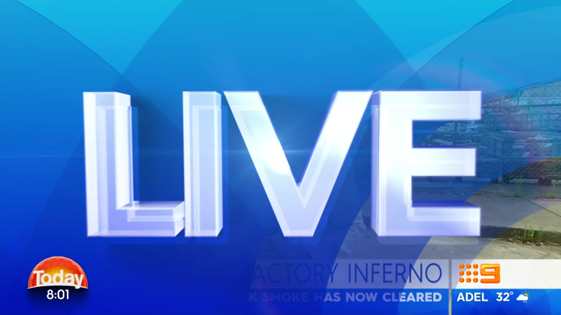
It’s crisp and clean - NBN can’t work out what to do with the right-side white bar, so at the moment it’s blank and the time is under the logo.
Hopefully Nine News has these sort of small graphic changes too.
Inspired by Nine News from what I can see. Clean and crisp. More evolution.
It’s a better look than before so that’s a positive thing. I would say the same about both programs.
2 Likes
I’d argue your points there @fournews but respect your opinion and will move on.
So you’re upset because more people care about Sunrise than they do about Today? Personally, I had completely forgotten there was going to be any change.
1 Like
An improvement. Less tabloid looking. Nice and clear, but I feel Sunrise’s graphics are superior and look more appropriate for a news program. Today’s very simple look could be used on a children’s program even.
Certainly are. I love the backdrop, makes it look more open, a look they need to head for. Although it is an evolution, it feels like a fresh change.[quote=“MarkHD, post:12, topic:775”]
It’s crisp and clean - NBN can’t work out what to do with the right-side white bar, so at the moment it’s blank and the time is under the logo.
[/quote] WIN has had a few difficulties too with the old WIN bug and time appearing over all the graphics before they were soon removed.[quote=“fournews, post:8, topic:775”]
I suppose because Sunrise promotes their relaunches more and make it more of an event. Also, a Sunrise relaunch occur less often. February 2010 compared to late 2013 and early 2013 etc
[/quote] I agree. Plus with the old forum,IIRC, Sunrise had heaps more pages of posts than Today.
I will posts some caps soon plus add my 10 cents worth. P.S. Keep your sighs to yourself! ![]()


9 Likes
Can’t say I like all that white behind and to the right of the 9 logo. Why not just have a yellow 9 logo and no background? The Today logo on the other side looks great that way.
yet again for aussie tv, nothing too great. dont like the mish mash of the gfx and the set is too newsy.
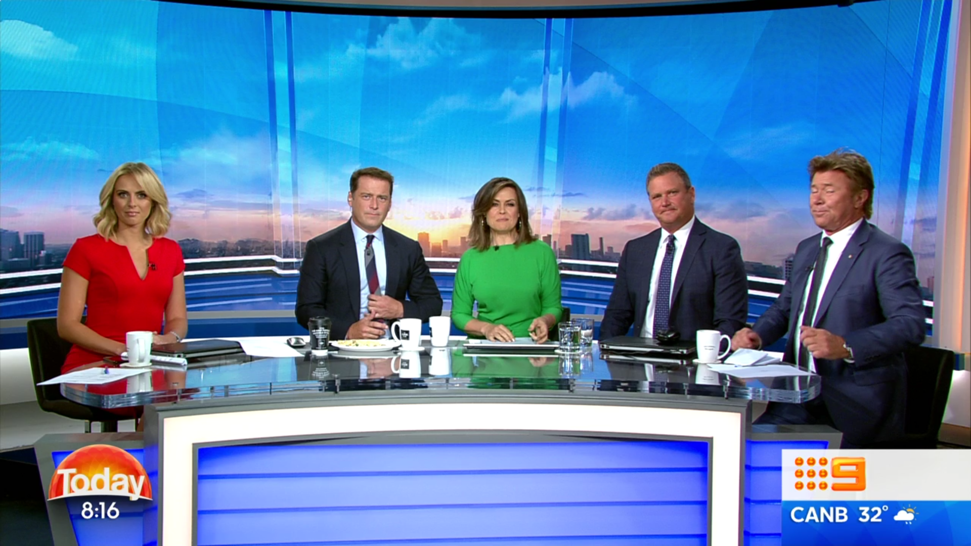
The soft set is AWFUL. Basically Mornings set. Plus with the wideshot, you can see Sylvia and Lisa at the desk.
1 Like