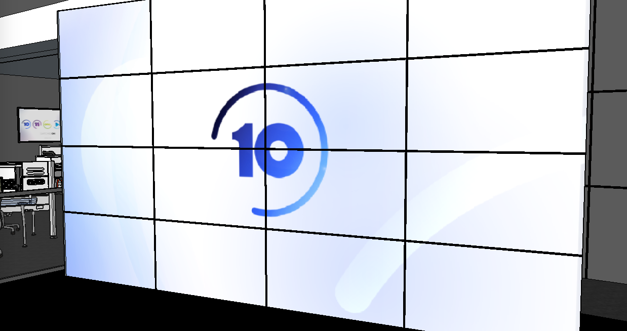
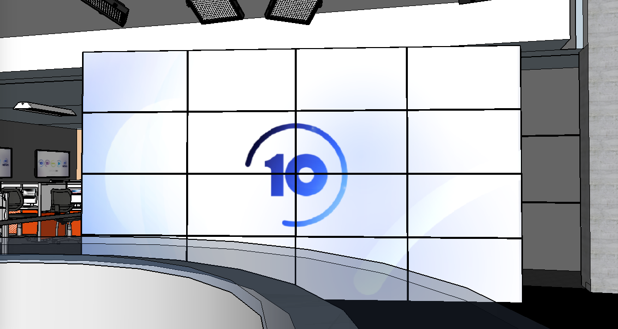
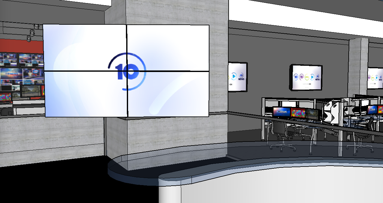
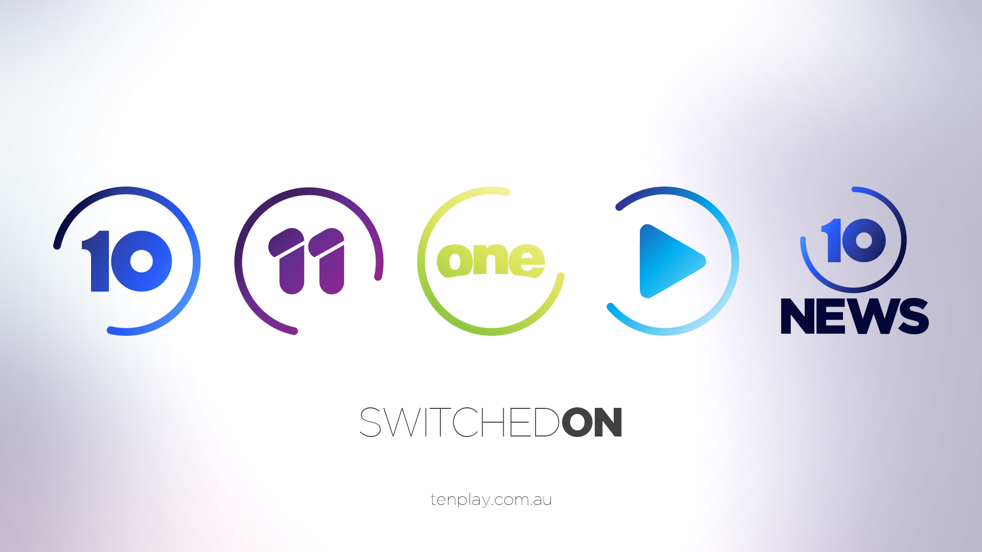
I have used these rebranded logos to develop a series of on-air graphics for the Ten Network and it’s multi hannels, which tie all the channels together in a bright and fresh way. I have used white space to enhance the branding of the network colours across each channel.
The logo itself is based of a ‘Loading’ circle, as posted by @DDN in the Random Mocks thread. The concept is that the circle surrounding each channel logo (10, 11 & one) is a continuously moving circle and never stagnant. You’ll notice by the watermark, that the circle disappears.
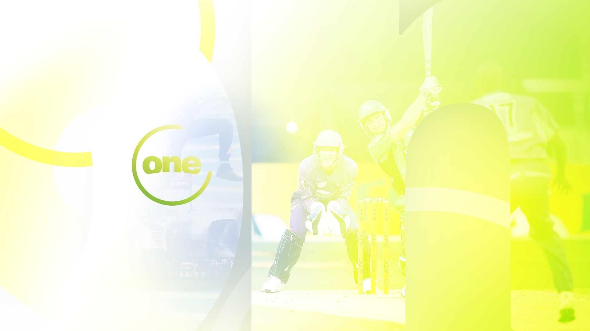
So here it all is - it’s a little hard to convey how i would envisage it all to move (After Effects is not my friend unfortunately) however the idea behind it all is a lot of reflective surfaces, moving gradient colours & sliding numbers & loading circles with network personalities a big part of station idents.
PRG
The concept behind this, is the circle begins its loading motion and NOW appears, before transitioning to NEXT and then to 10 - as the RPG ends the circle will motion down to nothing leaving the 10 - before it fades into the simple watermark.
@n1ck Holy shit, well done. I mean this when I say it, I want ten to adopt this presentation style right damn now. I truly see this working. You have to get a job at ten! Brilliant Job!
Could you, if it’s within your abilities (I’m sure it is judging by your brilliant work) design new on-screen graphics, logo etc for ten news based on this design?
Absolutely love this - gorgeous design and so Well considered!
Two notes:
I think - because you are are clearly trying to sell the suite of channels, that either “Ten, One, Eleven” should be chosen to work with - or “10”, “1” “11”
Personally, I would like to see the names brought in line with TEN, the way we have 9, 9Go, 9Gem, 9Life, 7, 7TW, 7mate, 7flix, ABC, ABCME, ABC2, ABC News etc.
So for One something like TenWorld - as it is male and adrenaline (could still be the lime green) and for 11 something like XTen or TenX as it has that millennial sound to it -again keeping the Purple.


 I mean this when I say it, I want ten to adopt this presentation style right damn now. I truly see this working. You have to get a job at ten! Brilliant Job!