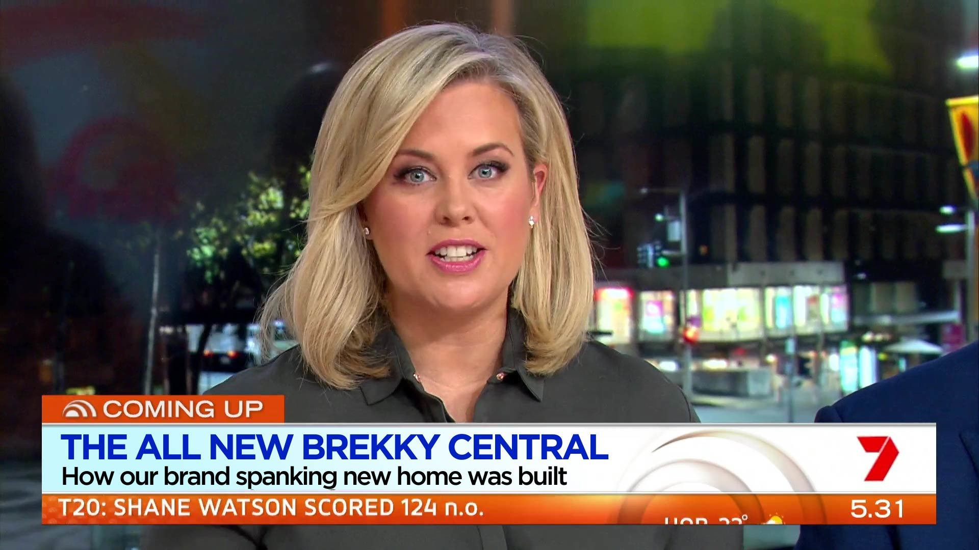
The condensed uppercase font looks horrible. It looks squashed up. On the white background, I think they should be both blue. Not blue and black. The Morning Show does it better.
2 Likes
Can see that this exists to frame out the inky blackness on the inside of those big pink marble pillars. Removing it would be of no benefit in terms of view and look worse overall.
I’m liking it. But the LCD screen behind the desk is just way too small. Make that a larger screen, and we’ve got a winner.
3 Likes
I’m liking it, but as most have said the screen behind the desk is too small for what is a wide shot with the team in front. I love the news shot with Nat, its great.
I did notice that the new “seamless” plasma wall (which still has gaps) behind the couch seems to have a flickering issue and it has bad reflection when they use it as a cutaway shot for stories. Need to do an ABC and get a matte film to put over it! 
Also the flipper, weather and logo all changing at the same time is way too distracting. Its like everything is falling off the screen one after the other. The weather should fade instead of drop and I think it would help the distraction, and have the sunrise logo on longer before it switches to the Seven logo…
Aside from that it’s a great change, some of the single shots look great with the various lit set columns etc.
1 Like
Yeah, the fonts are standing out like a sore thumb. The blue headline font doesn’t look that great when paired with the nicer black info text. When you combine that with the Seven News font being used for the segment identifiers (eg; Sunrise Entertainment), it’s really a mis-mash of fonts.
Also I hope this becomes eviddent in the next few days but it seems Eddy’s role isn’t really clearly defined. If she’s simply doing entertainment segments, you have Nelson Aspen as an entertainment correspondent for a reason… It doesn’t help that Bec was there this morning for some reason doing segments that Eddy could have done instead.
Everything looks great but the blue font on the super. The originally used gotham font would’ve worked better.
7 Likes
Very NBC esque with the rotating Sunrise/Seven logo. Taking a lot of inspiration from Today it seems. I like the new graphics, but I feel like some take up too much screen space. Overall, nice change 
1 Like
Does anybody also find the glare on the screens a little unpolished? I certainly did.
4 Likes
They can keep the font but just stop using all the different Ubuntu variants. Stick with the original one and I’m happy 
4 Likes
The glare is noticeable. They may need to reposition some studio lights or adjust angles.
Yeah its a but of a problem, each time they would do a sweeping shot of the plasma wall with story images on it the reflection of the lights was terrible! Need to put a matte film over the screens. I’m doubting all of the sweeping shots will stay anyway though…
For the main desk screen, yeah camera angles or something need to change.
The main criticism I have is the blues used in the supers. Don’t like the navy of the headlines of the slight blue gradient on the background. Much prefer the cornflour blue of the NBC Today show

2 Likes
I like the white on blue background. That looks so much better than white.
That is used most often on the show from what I have seen.
1 Like
The Perth News on sunrise began abruptly in the middle of a report
1 Like
you guys are hard to pleased. I can’t really find a fault with it, the GFX are great, the lighting is excellent - better than I’ve ever seen on a breakfast TV show and the set looks fantastic. All will look great in HD.
Well done.
7 Likes
I just realised, a lot of the glare on the main screen behind the desk was because they had a gigantic Sunrise graphic on the screen of the 7News set, which is leading to the glare and lighting up the camera guy from behind. May just need to avoid using that for the show and use the Sunrise set only…
Some are easily pleased.
1 Like
Maybe it’s just me, but I can’t help but feel that this new look for Sunrise is going to age rather quickly once the initial gloss and shine of having a new look wears off. I don’t know, but to me this whole new look feels like something that should’ve been done 2-3 years ago rather than in 2016.
Judging by what I’ve seen, I’m probably going to stand by my earlier comments on this new look being some sort of hybrid of Sunrise, NBC Today and Nine’s Today.
4 Likes
I’ve got to agree.
If anything, you’d expect this look to have come before the previous graphics on Sunrise which was more minimalistic without the gloss
1 Like