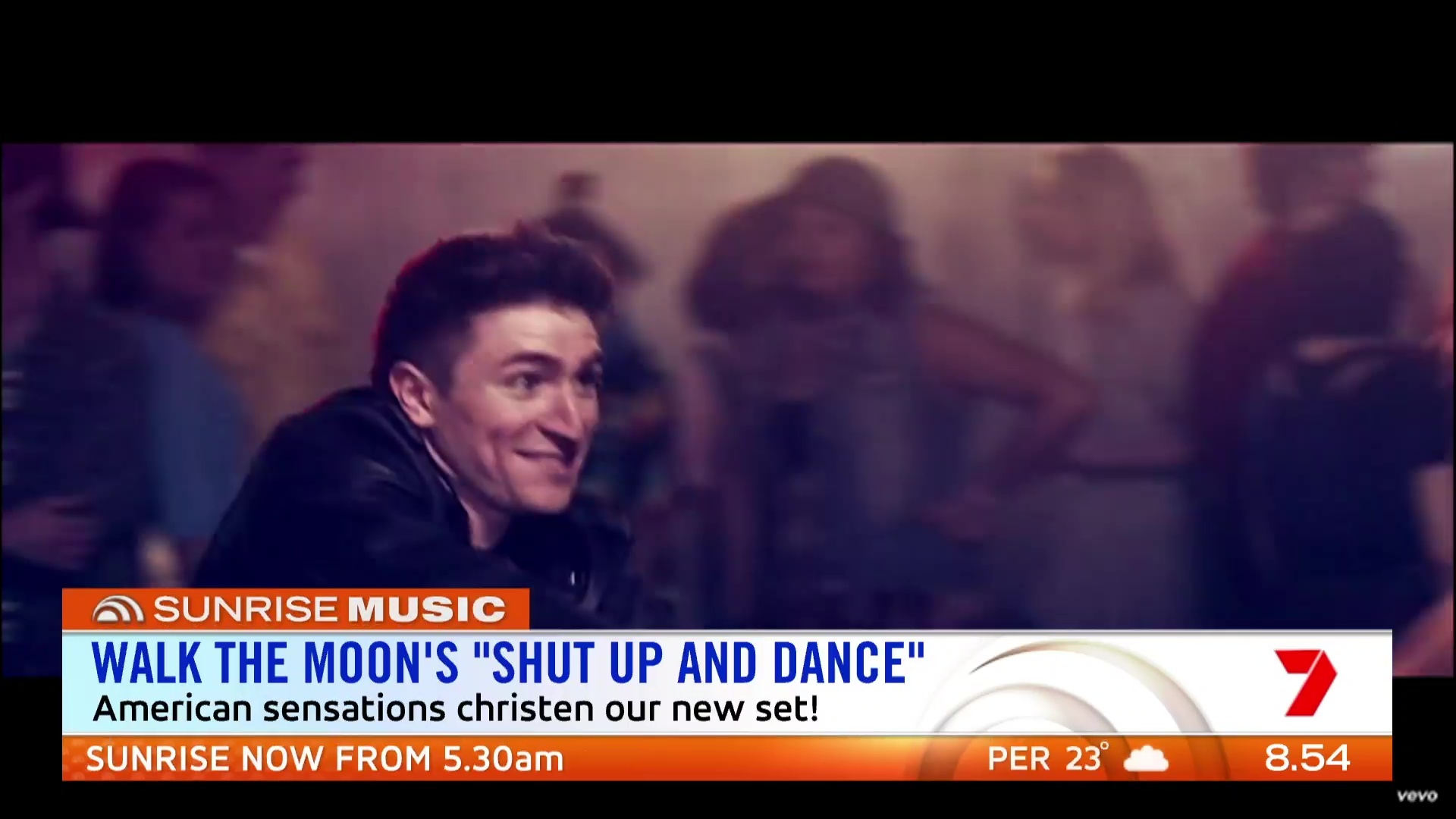
Too much orange. Reminds me of fanta. Why aren’t fanta sponsoring this?
2 Likes


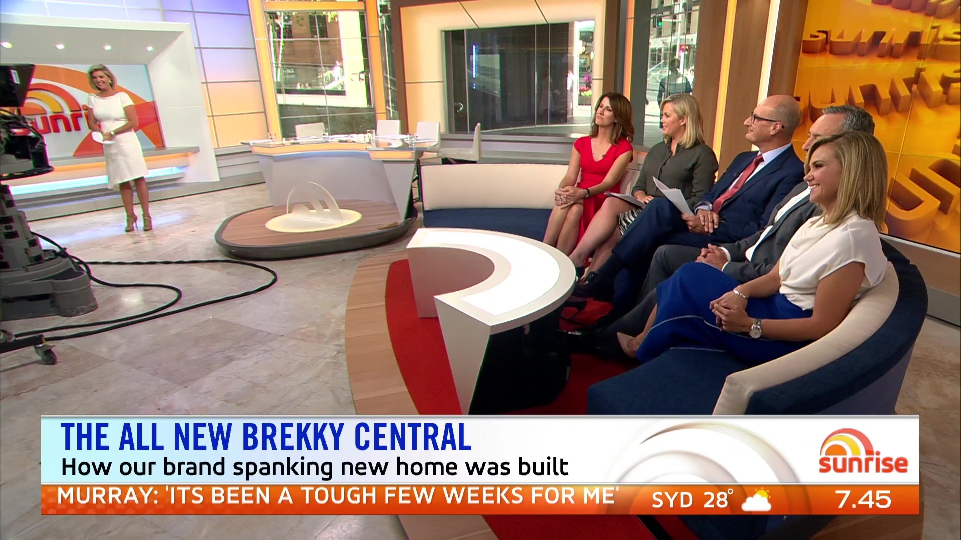
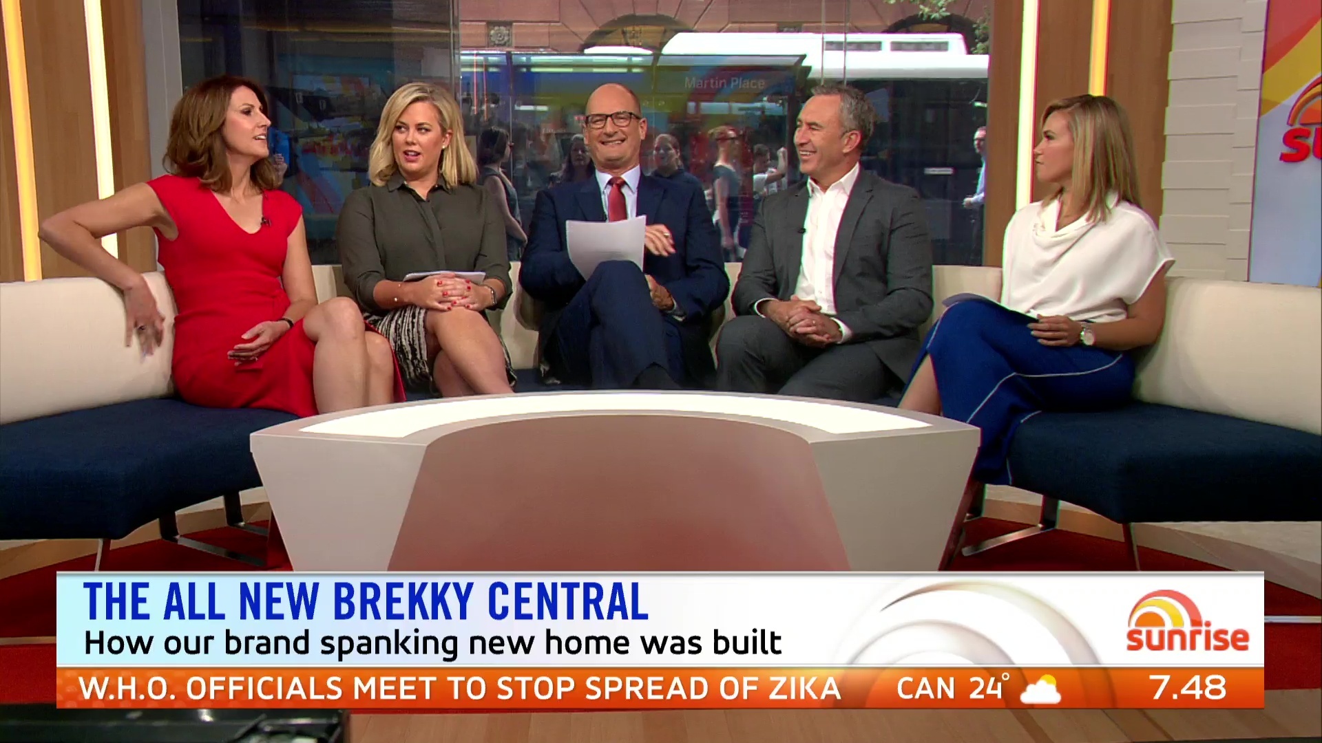
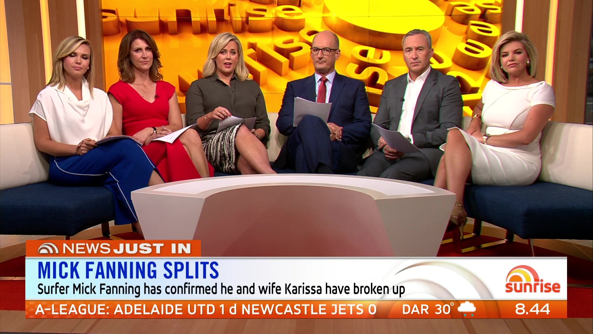
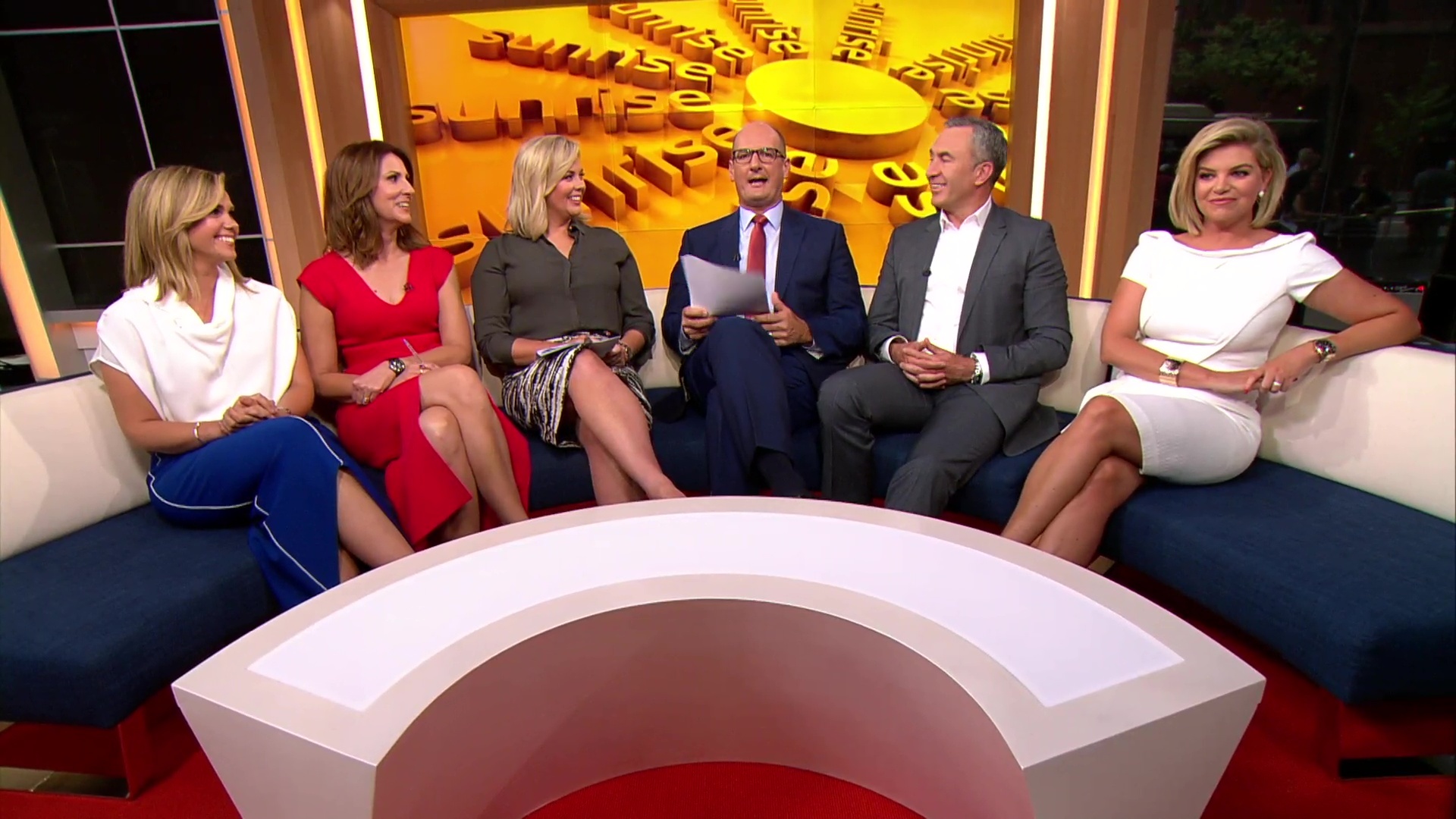
Now they even have Bec in the studio… What the? I love Bec, but is there really any need for her to be introducing the new set? They have 5 people already sitting on the couch…
5 Likes
Just turned the telly on and on 7 in Adelaide, it looks like arse. The picture quality is quite horride. Prefer to watch today on 9HD where it is a more crystal clear picture.
1 Like
[quote=“greenleaves, post:30, topic:730”]
Not a fan of the format we’ve seen so far. One of the good things about Sunrise is that i can tune in on the half hour and get everything I need to know about news, sport and weather in about 5-10 minutes. Sport only came on at 6.51 after an ad break. Hopefully this is just the beginning and it will change slightly!
[/quote] I would say that is only in the 5.30 slot. But the 30 minutes we have seen so far has been inspired by Channel 9 TODAY with 10-12 minute news bulletin, weather, sport at 5.50, Front Pages and Entertainment, so the format might have been different if TODAY 9 wasn’t so successful in the timeslot.[quote=“MLVD, post:17, topic:730”]
Here we go:
[/quote] Sorry, but I am not a fan of the new theme song. I found Kochie and Sam yelling over the top of it plus it didn’t suit the pace of the opener. Graphic wise, the headline supers are not that appealing, too big and ugly especially when the headlines appears before it shrinks. Set, really nice and the lighting is so much better. I am yet to see the format so I won’t judge that yet.
[quote=“greenleaves, post:30, topic:730”]
The graphics are very classy and TODAY like, obviously because they’re the same designers
[/quote] Yes I do like the general supers, obviously inspired by NBC TODAY. I like all the graphics except the headline super in the opener, the specialised titlecards and the weather. The weather maps for a start have been used for years, surely you can tweak them. The titlecards too are rather ugly, the weather one is so unimaginative, and rather simple, maybe that’s the look they are going for. I like the news presentation from what I have seen, yes it is inspired by NBC but at the same time IMO a little like Seven News with the LIVE transition. I think that the OTS’ graphic with ‘Sunrise News’ should be specialised with stories. So if they are reporting on storms- have a image of the damage etc. A generic image with specialised titles doesn’t work. [quote=“greenleaves, post:30, topic:730”]
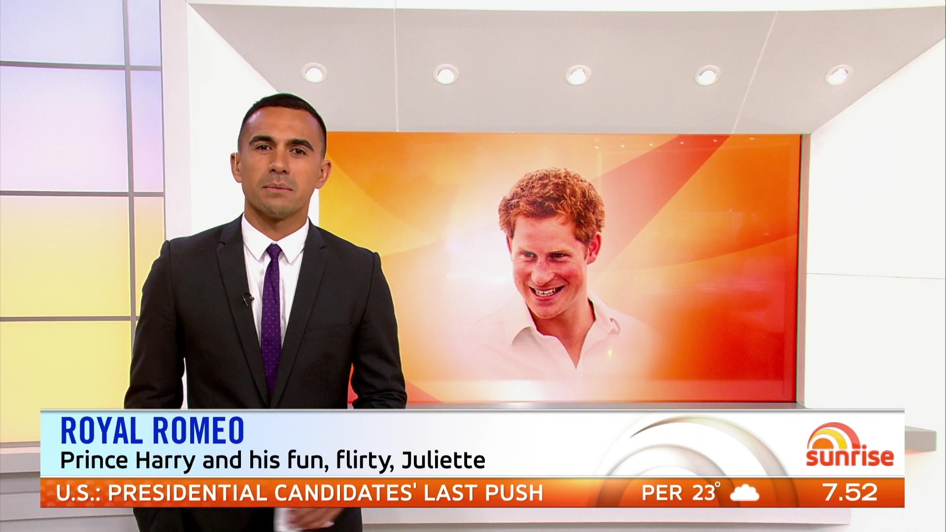
Where is Nelson Aspen!!?
[/quote] I told you to expect him to be gone or at the most seen minimally. Pell tried this before, but with all the viewers comments, Nelson soon returned.
1 Like
Quote from twitter:
“Part of Eddy’s new role, will be bringing you the entertainment reports”.
Recycled again? Already don’t like it.
Same old Nuala & Fifi repeat 
Needs more that that.
1 Like
Hey now, let’s keep that kind of talk for the “Today 2016 tweaks” thread.
5 Likes
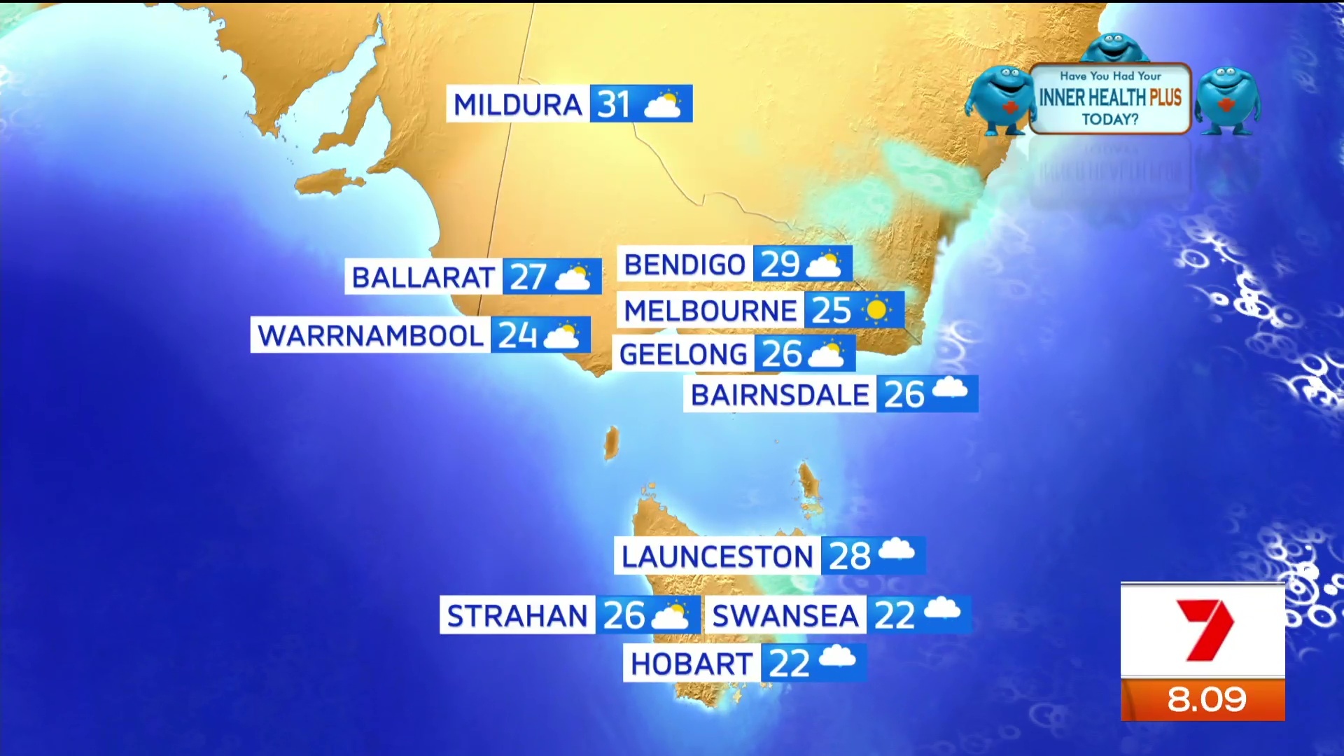
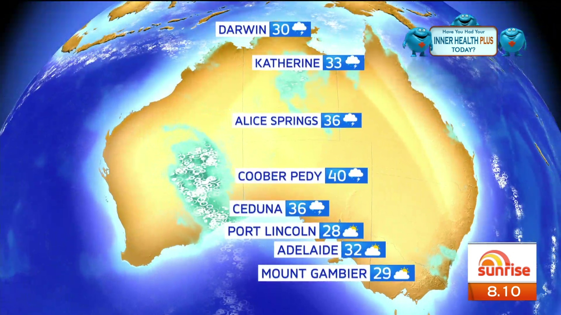
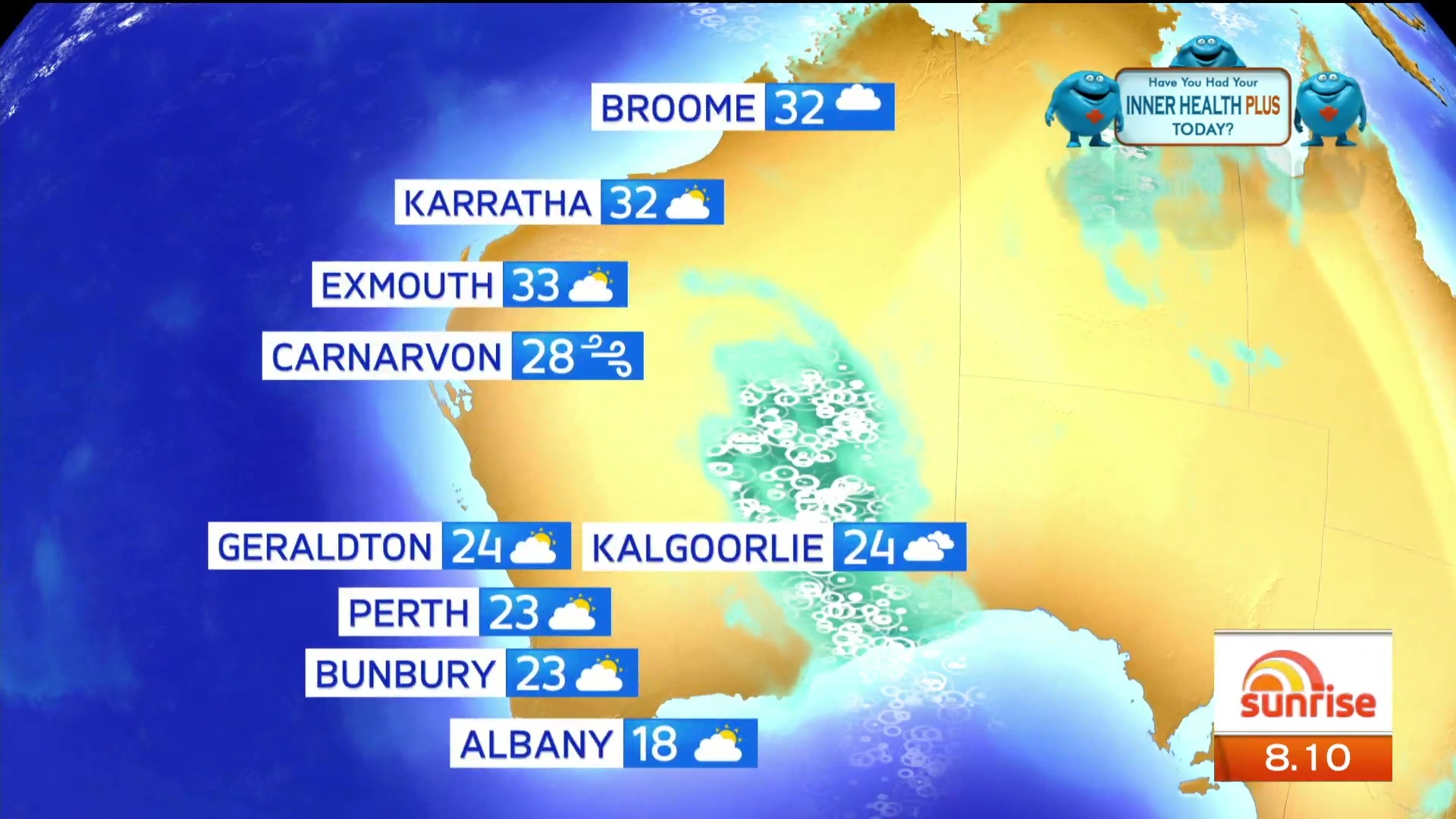
The graphics don’t look good on screen, definitely suited for HD.


Really dislike that wide shot at the desk with the alcove minimising what should be an asset- the view onto Martin Place. The entire look is a little too glossy and clinical.
2 Likes
So what else is Bec actually doing on today’s show apart from the cap l’ve seen of her talking about new set.
Are there any new segments apart from Eddy’s role?
She’s (Bec) presenting a story now.
Nat provided a news update at 9.02am and Sunrise showing no signs of finishing yet. I don’t mind the set, but the program and segments just seem all over the place now days.
1 Like
Sunrise transitioned to Morning Show about 9:10am. Sunrise crew at the desk, Larry & Kylie on the couch
Good idea having a 9am update.
Will Bec be in the studio every morning or just for today?
Trying to have more people on screen than Studio 10. 
4 Likes
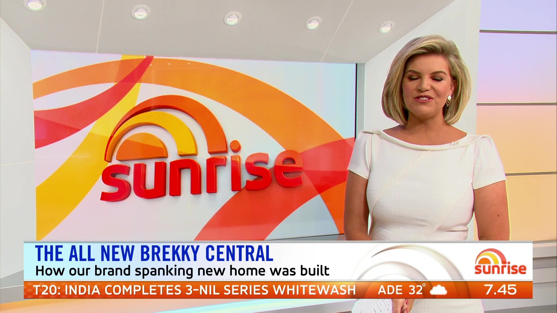
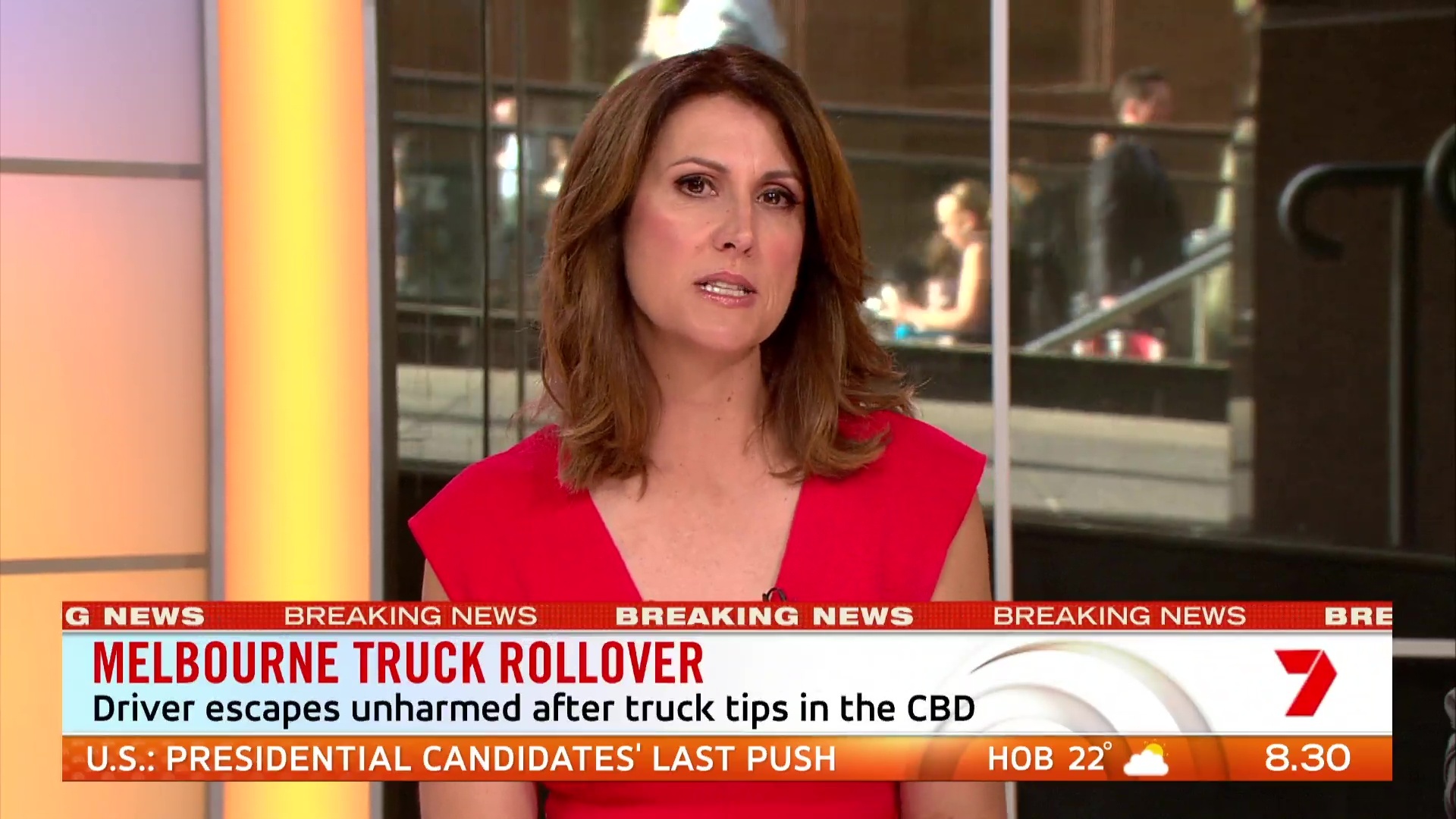
Why did Bec wear white when her main backdrop is mostly white and why did Nat wear orange/red on an mostly orange background?
I had the same thought. The view is great but it is impeded by the white. If it can be removed, it should be.