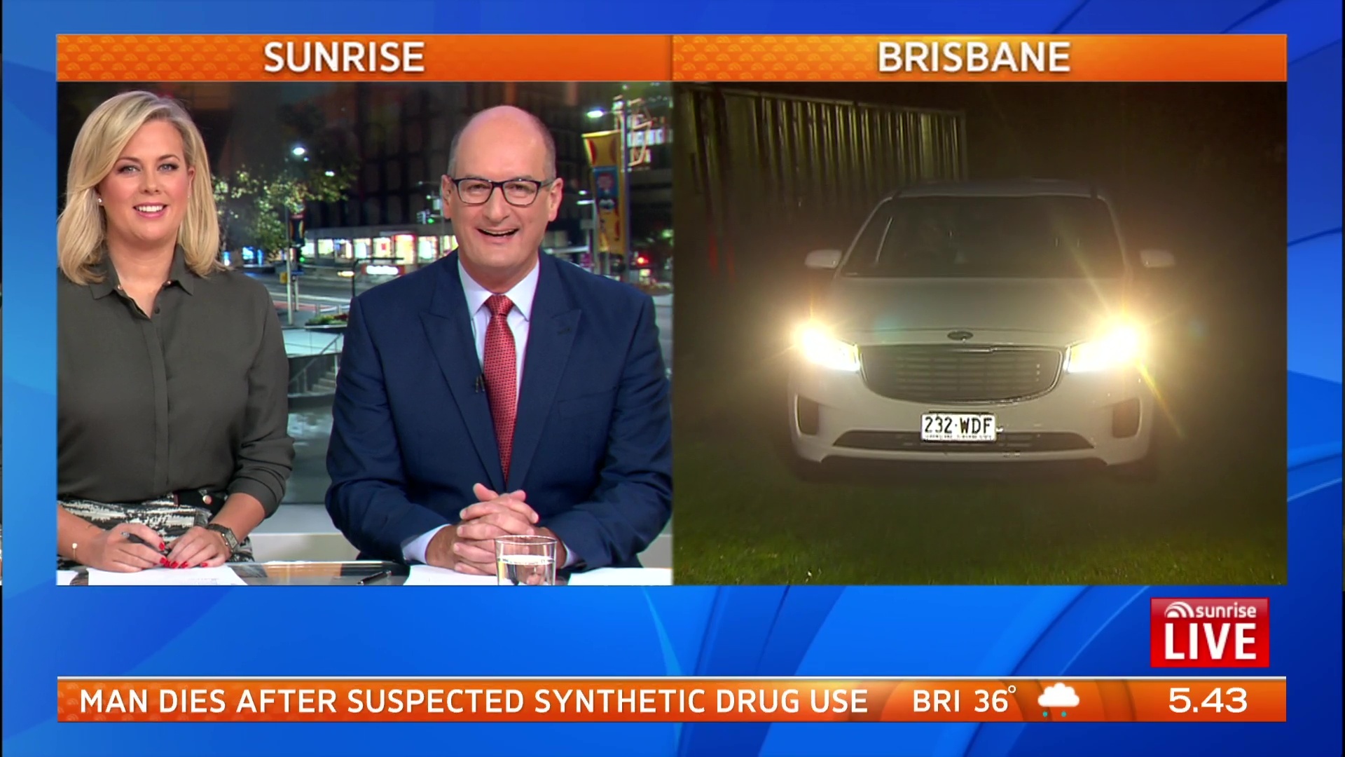
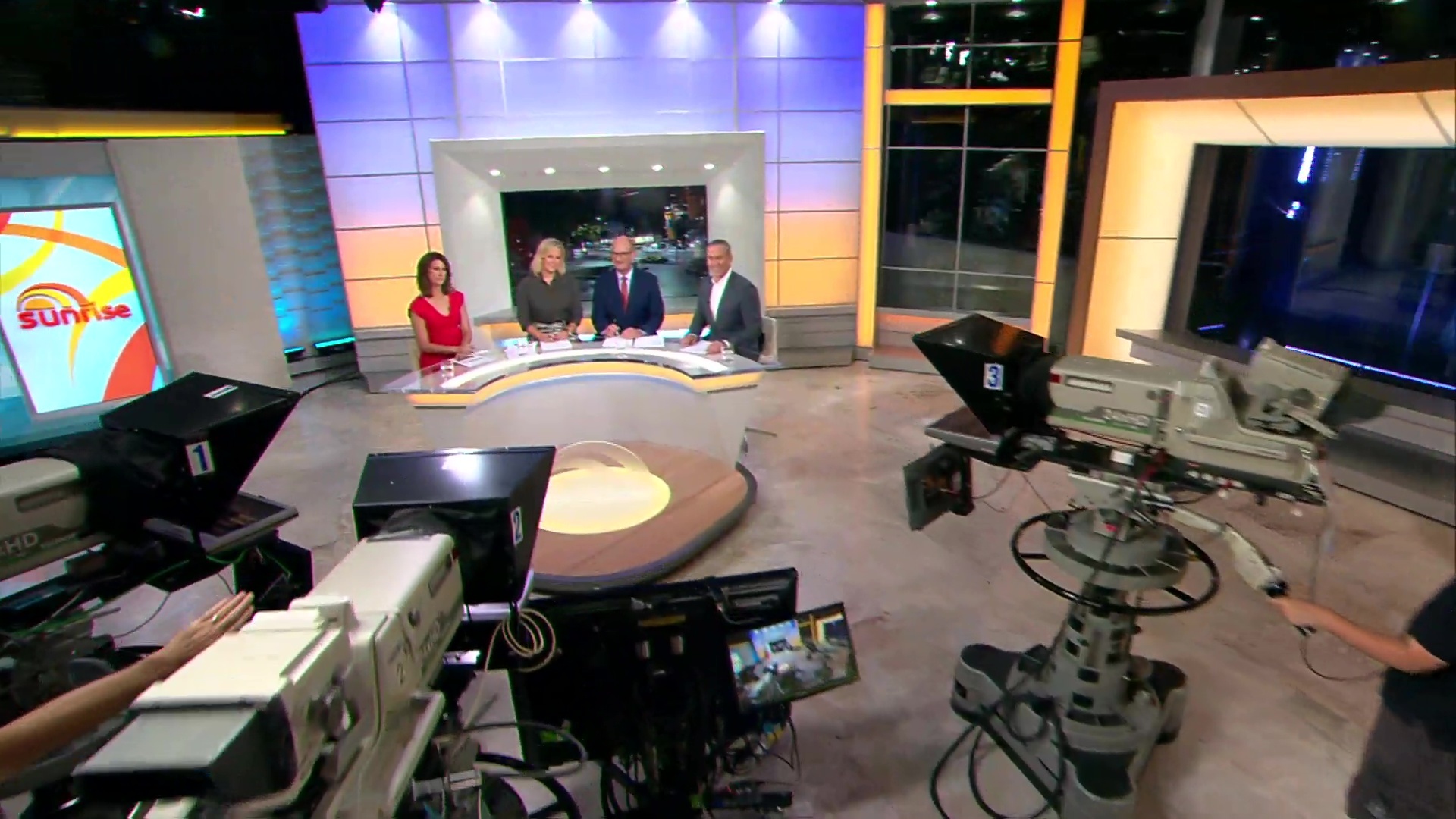
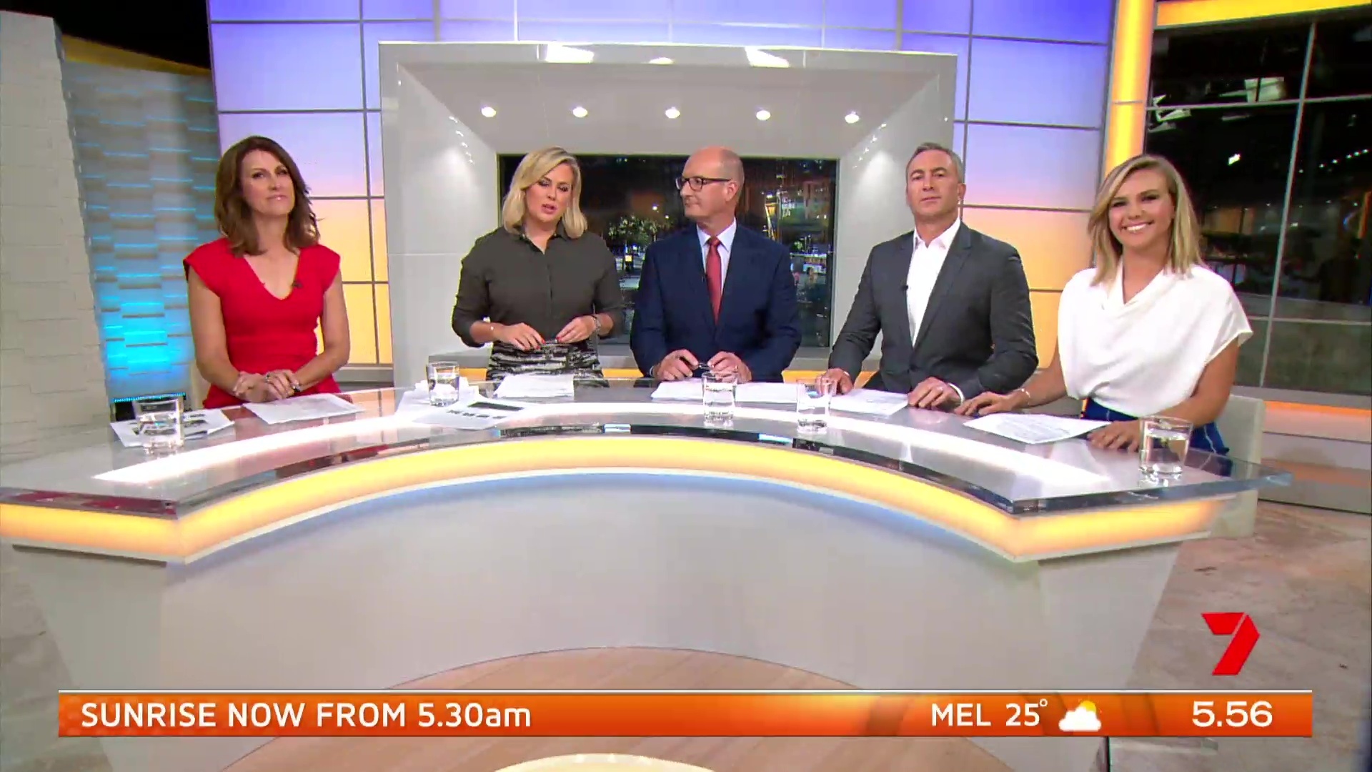
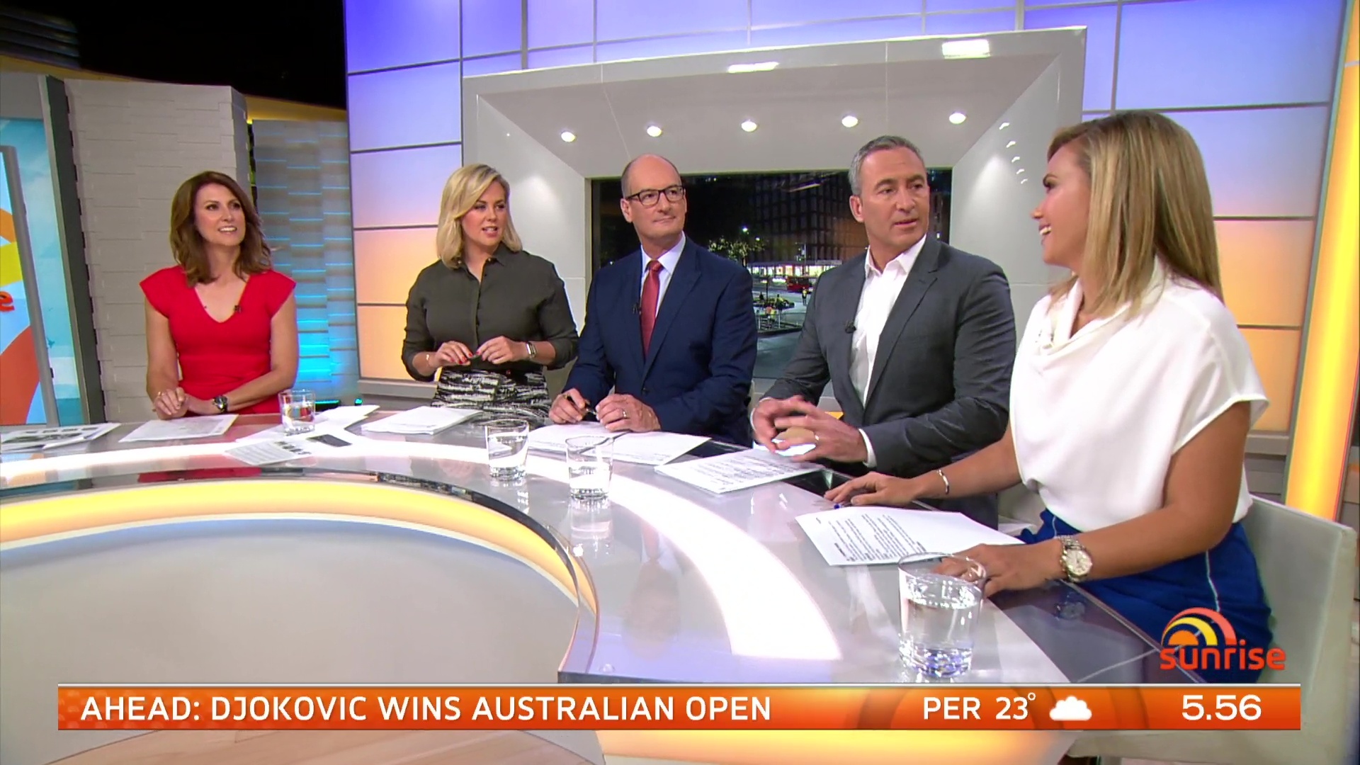
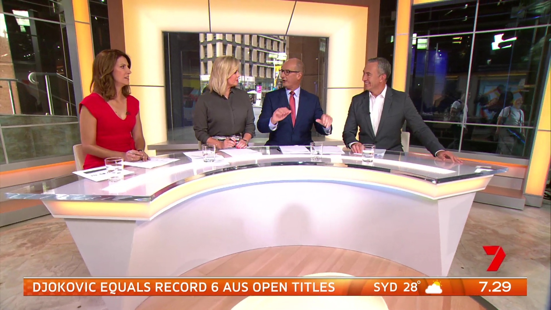
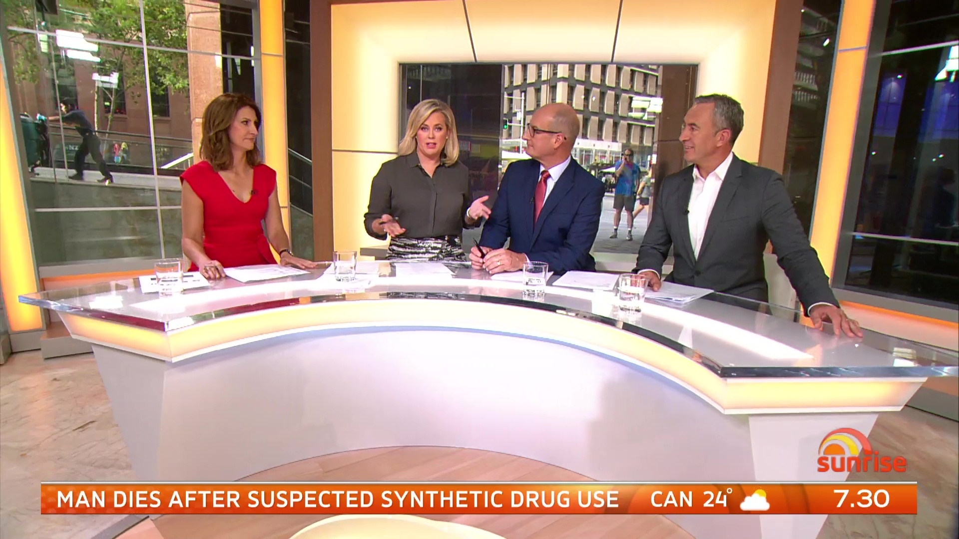
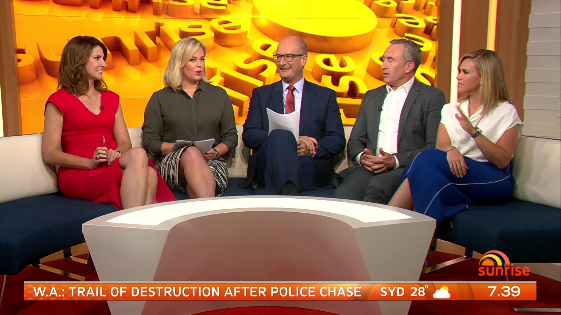
Lighting is sensational. Really like the side desk shots that they have been using.
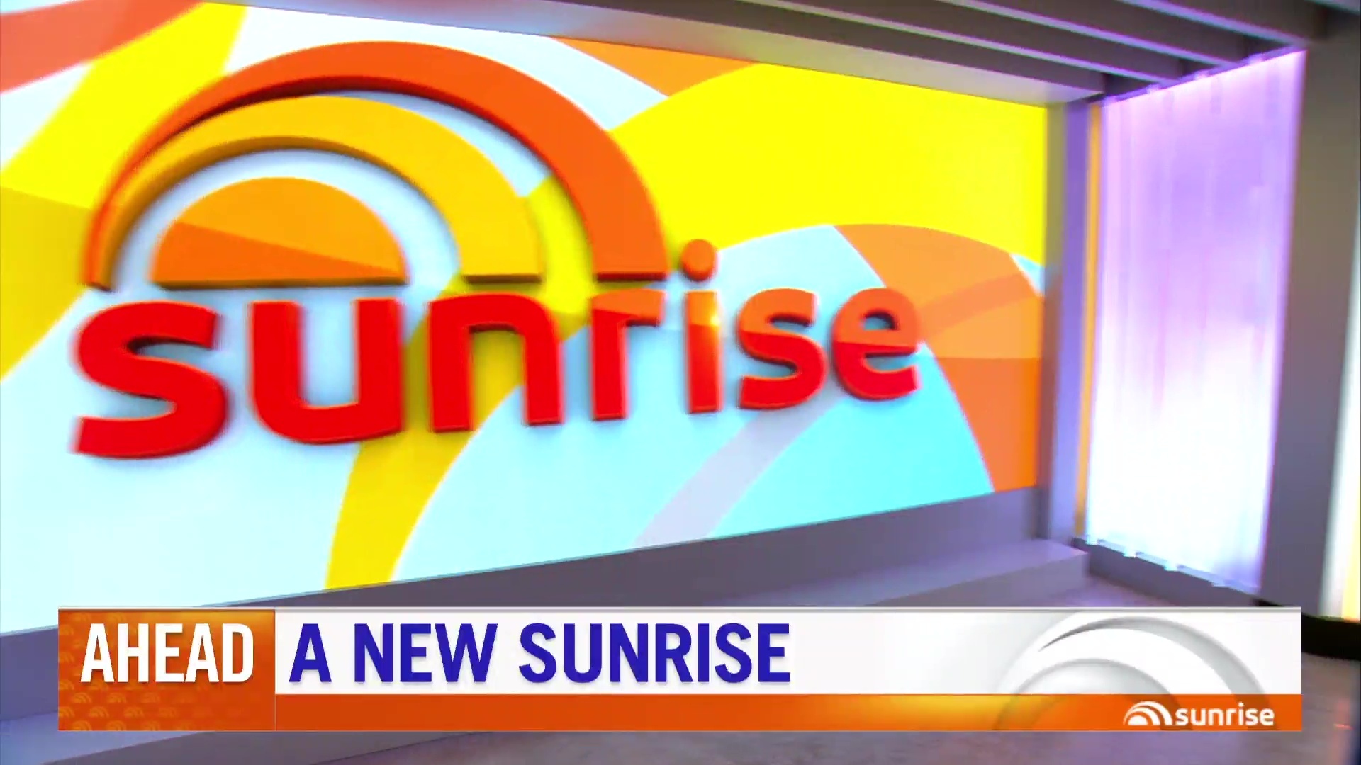
Not entirely convinced by some of the graphics but they’ve committed to a brand new look and have really pulled it off well.
Lighting is sensational. Really like the side desk shots that they have been using.
Not entirely convinced by some of the graphics but they’ve committed to a brand new look and have really pulled it off well.
Liking what I have seen so far… they really have thought about every element. It is quite a different look though. Set looks really good.
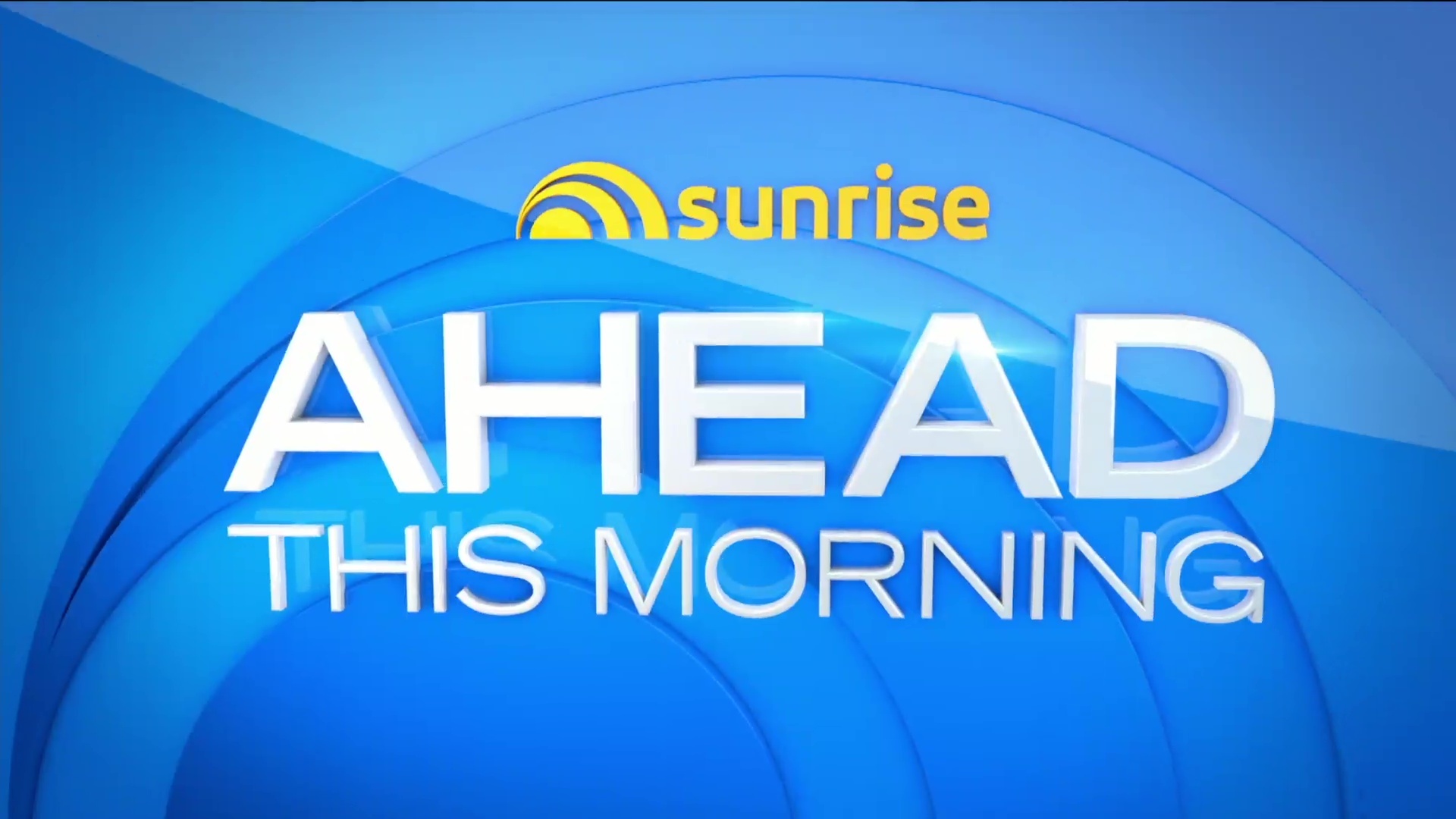
New Sunrise Opener, I agree with Travis, seems very American/NBC
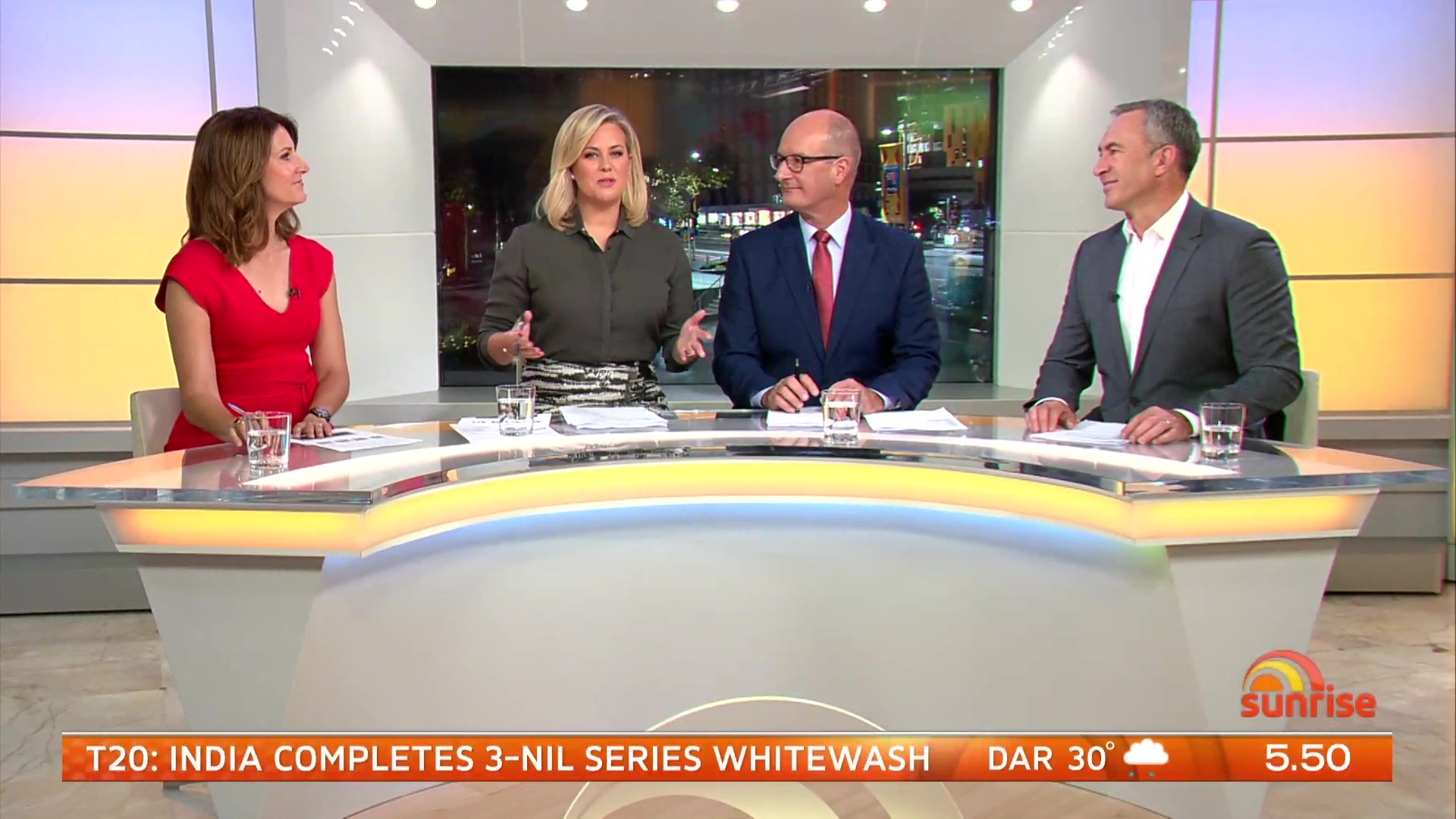
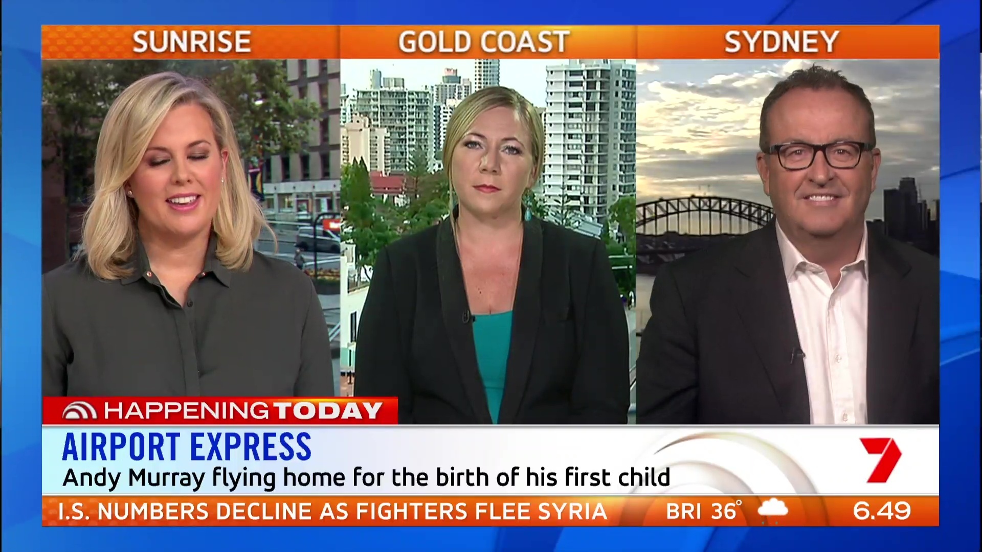
they’re sitting too close together and the set is boring with its colours.
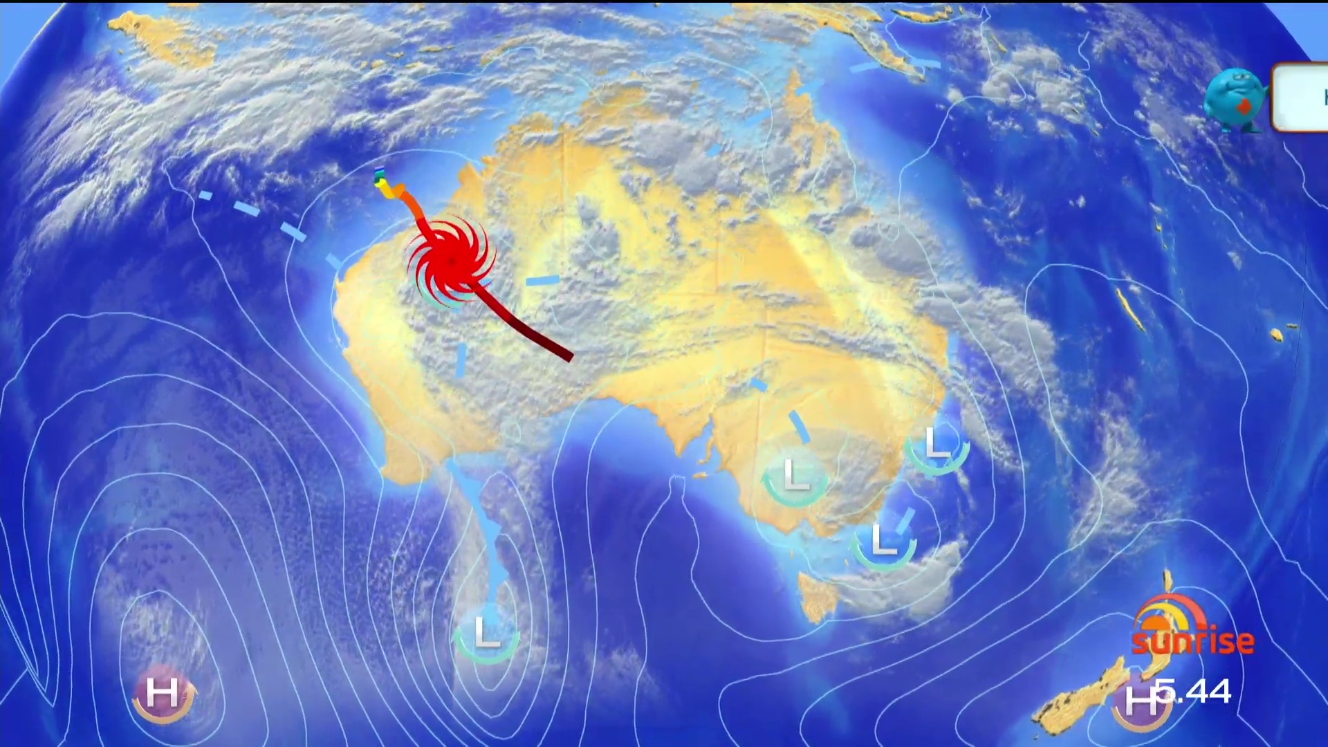
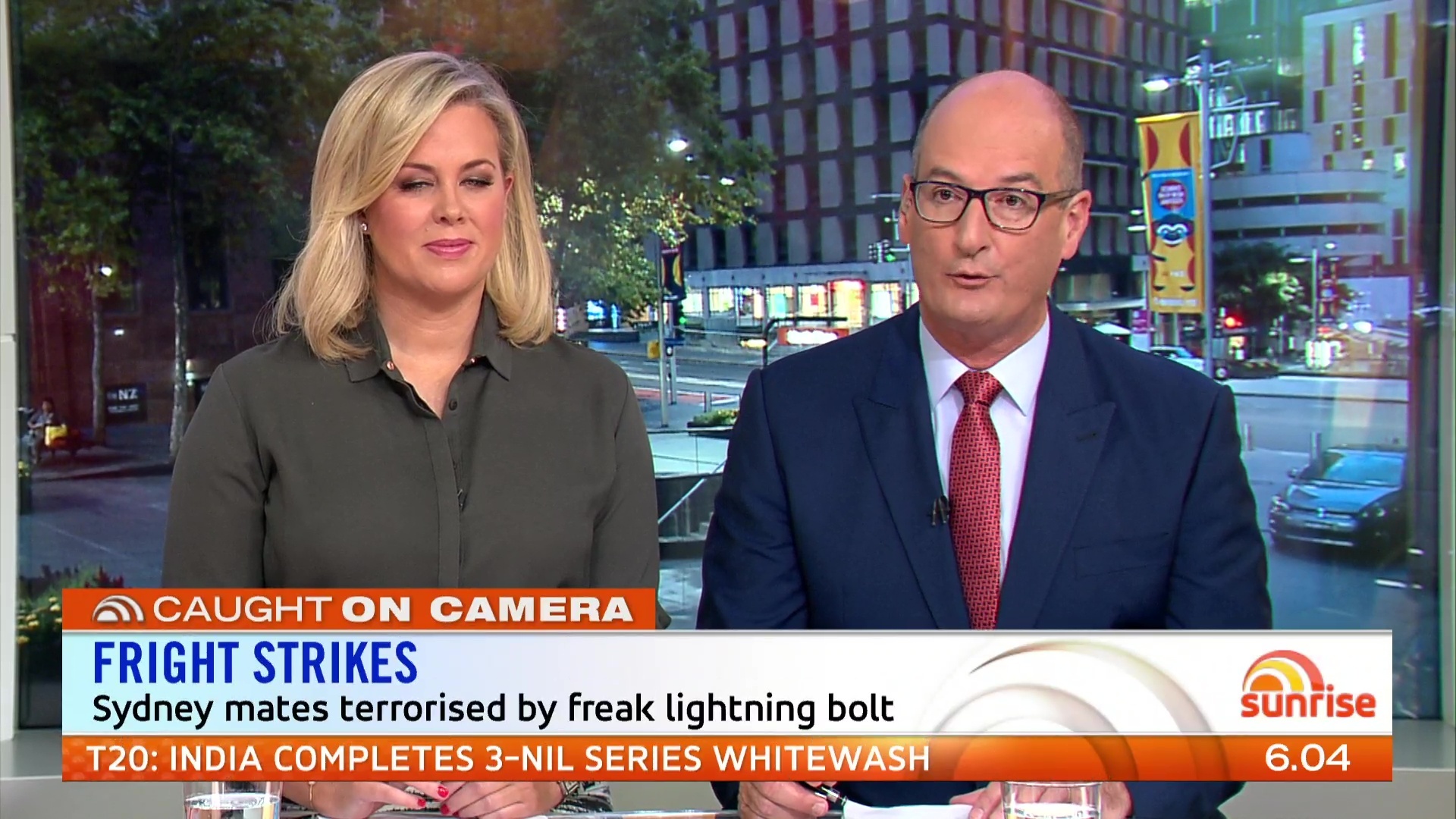
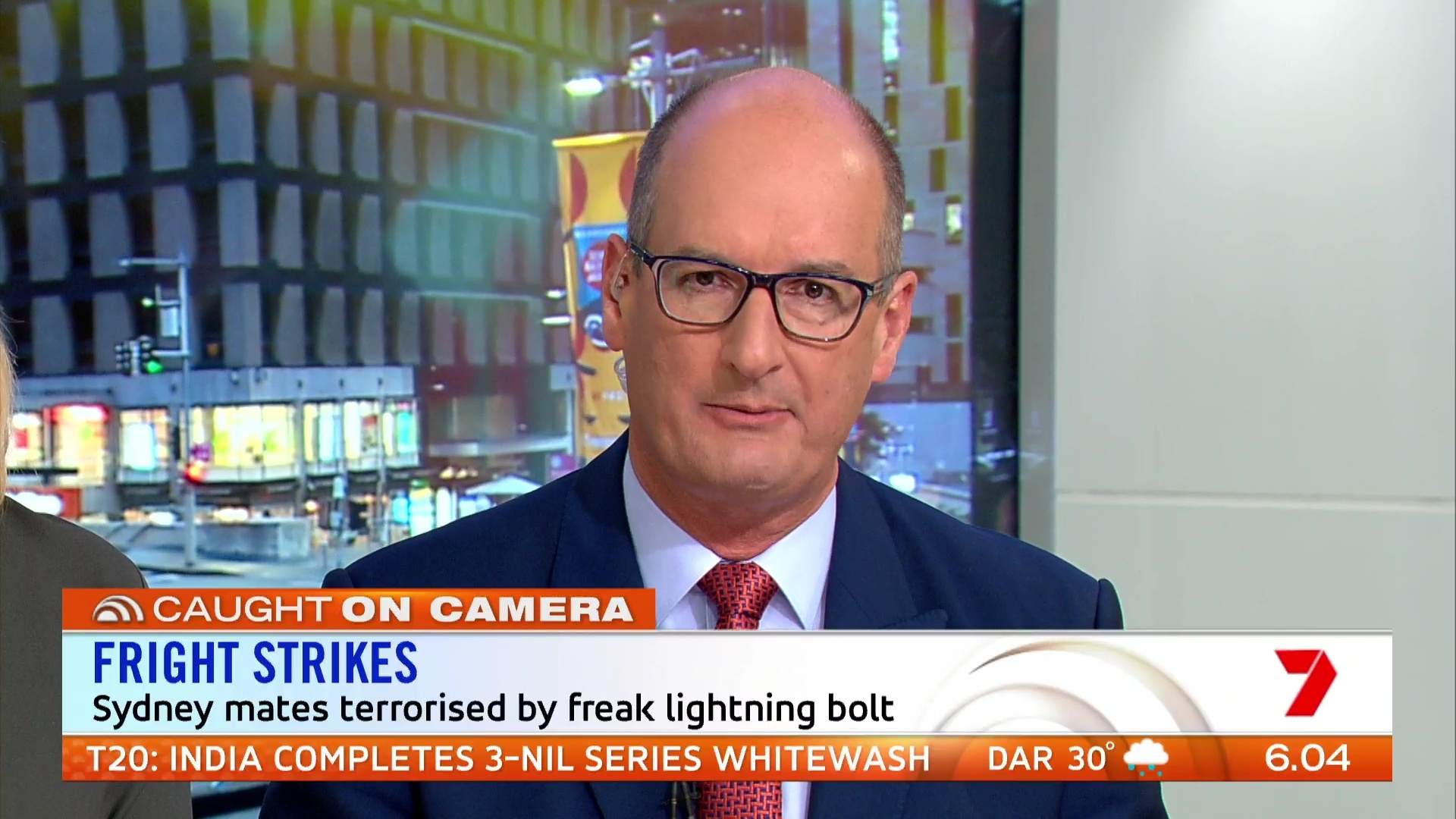
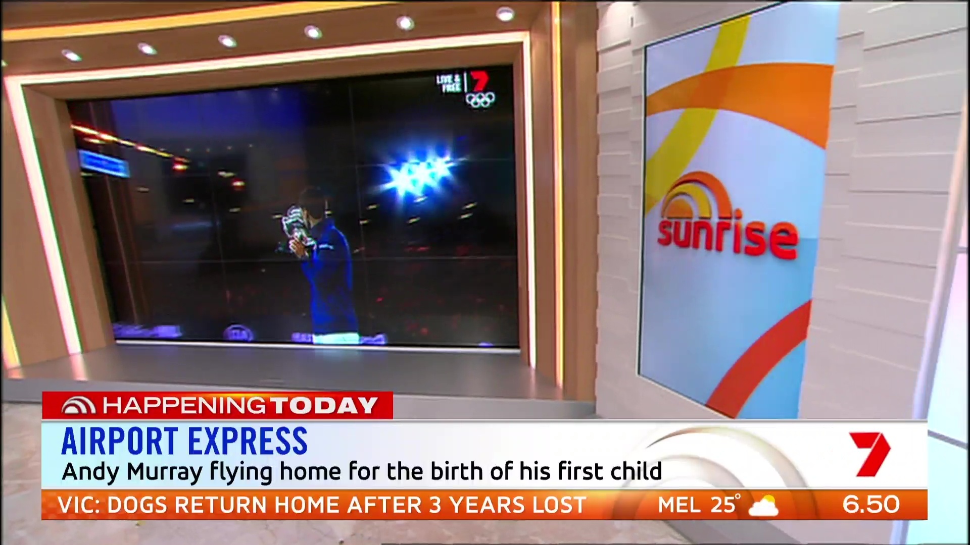
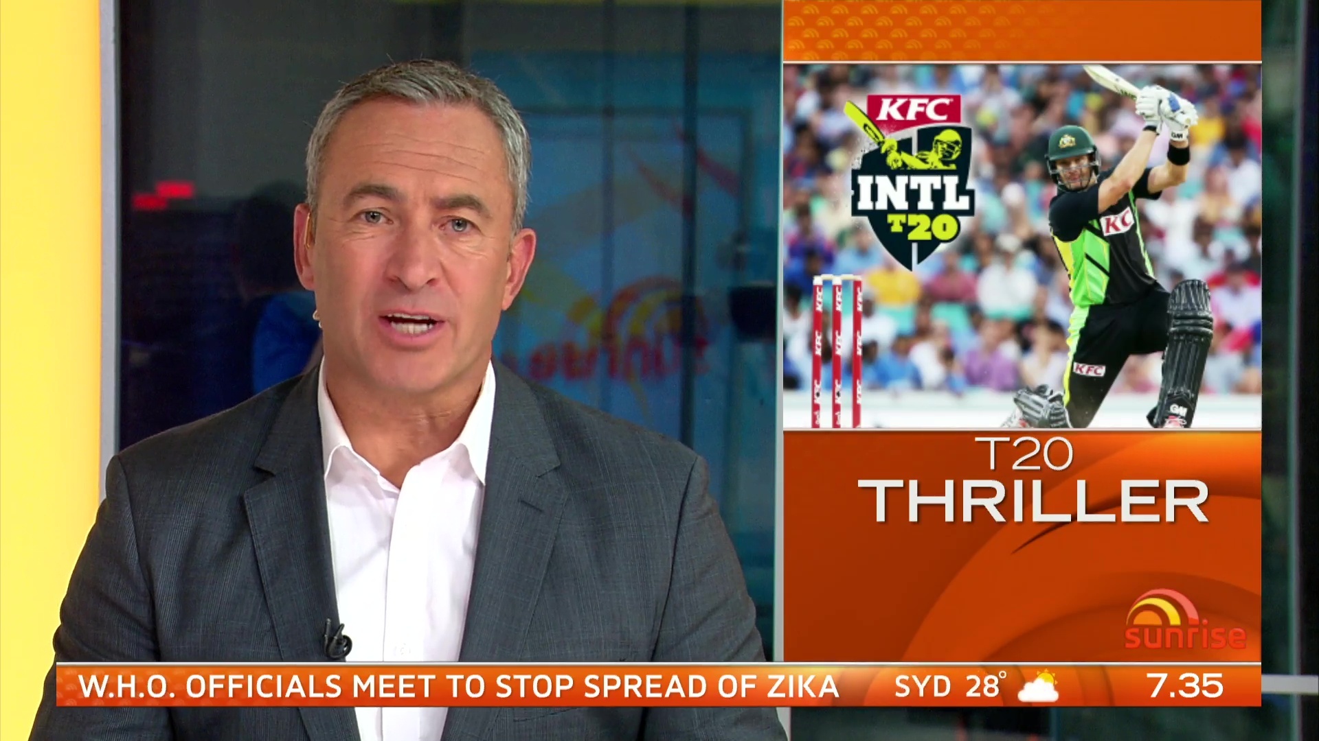
And I don’t care what you say, a lightning strike isn’t a top story.
Today changed up their 5.30 news hit this morning too doing it as they normally do the 7am hit with all three anchors doing stories.
Lots of Sweeping Camera shots
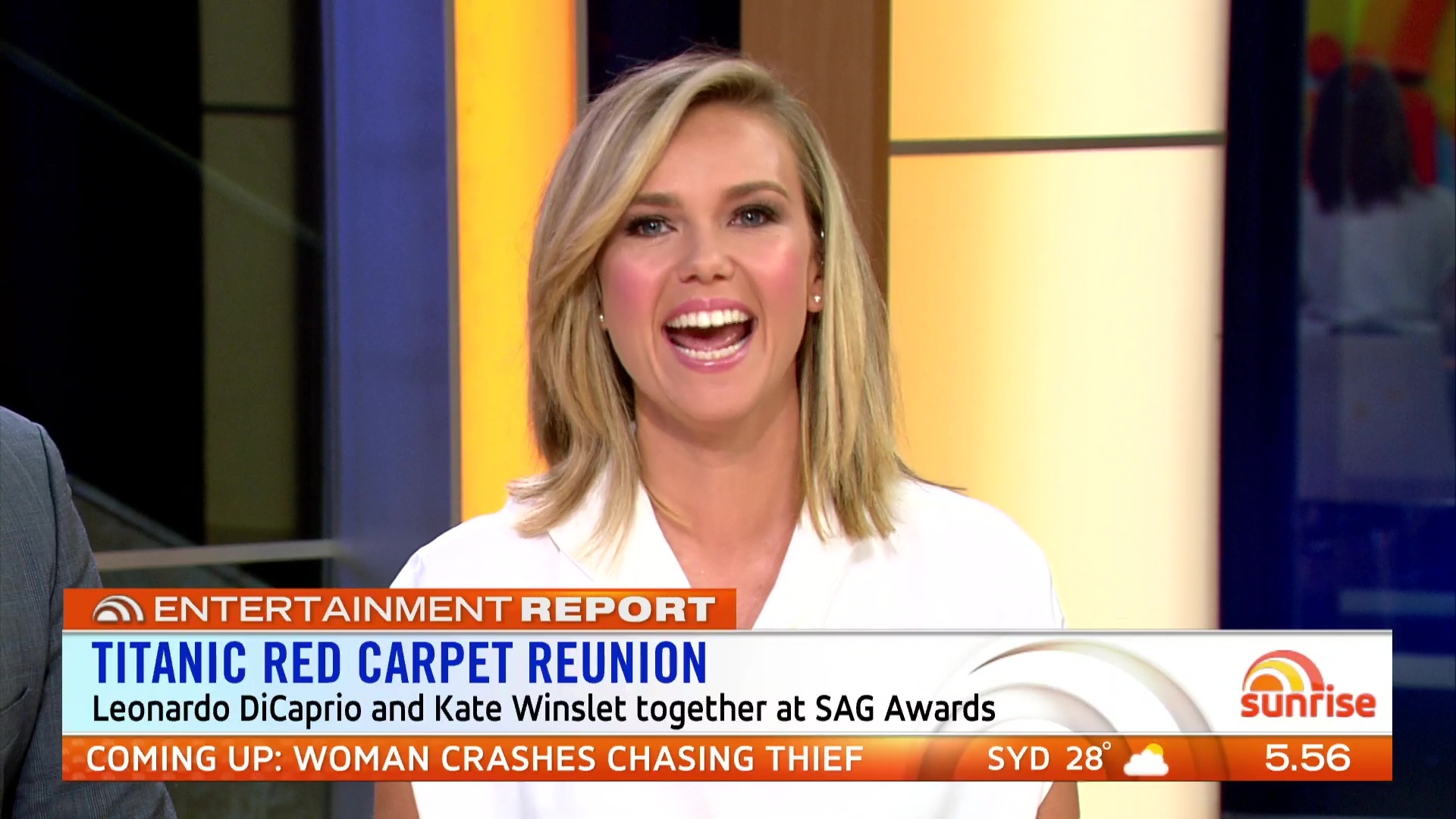
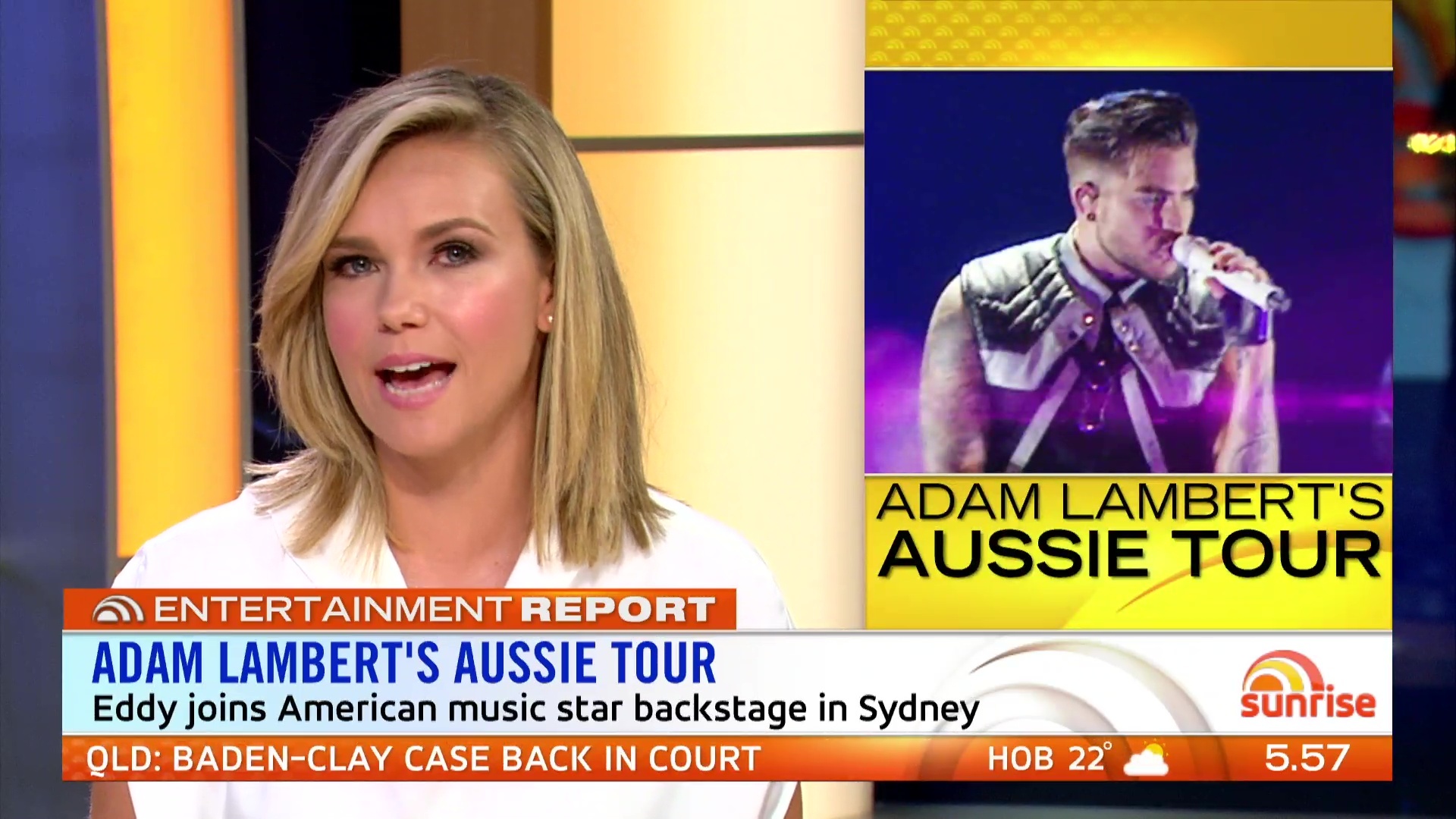
The graphics are very classy and TODAY like, obviously because they’re the same designers. I wonder how much say the designers got on the graphics, format etc?
Not a fan of the format we’ve seen so far. One of the good things about Sunrise is that i can tune in on the half hour and get everything I need to know about news, sport and weather in about 5-10 minutes. Sport only came on at 6.51 after an ad break. Hopefully this is just the beginning and it will change slightly!
Where is Nelson Aspen!!?
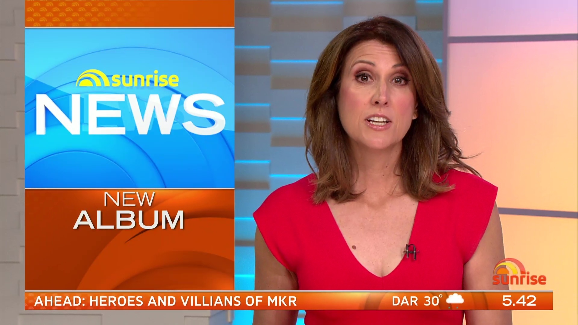
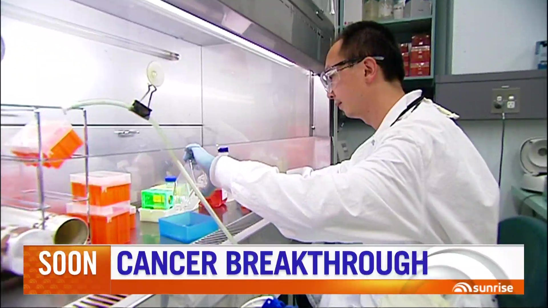
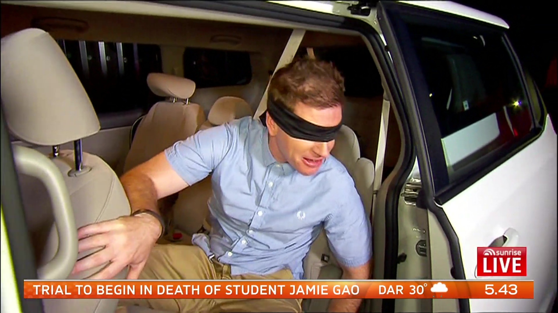
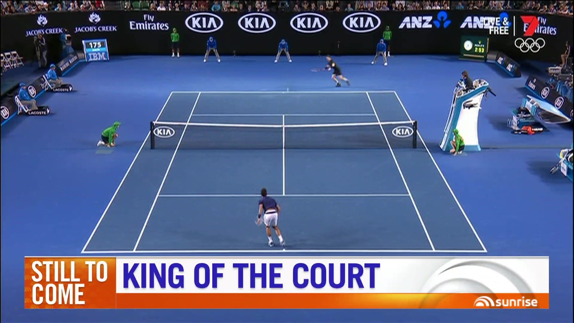
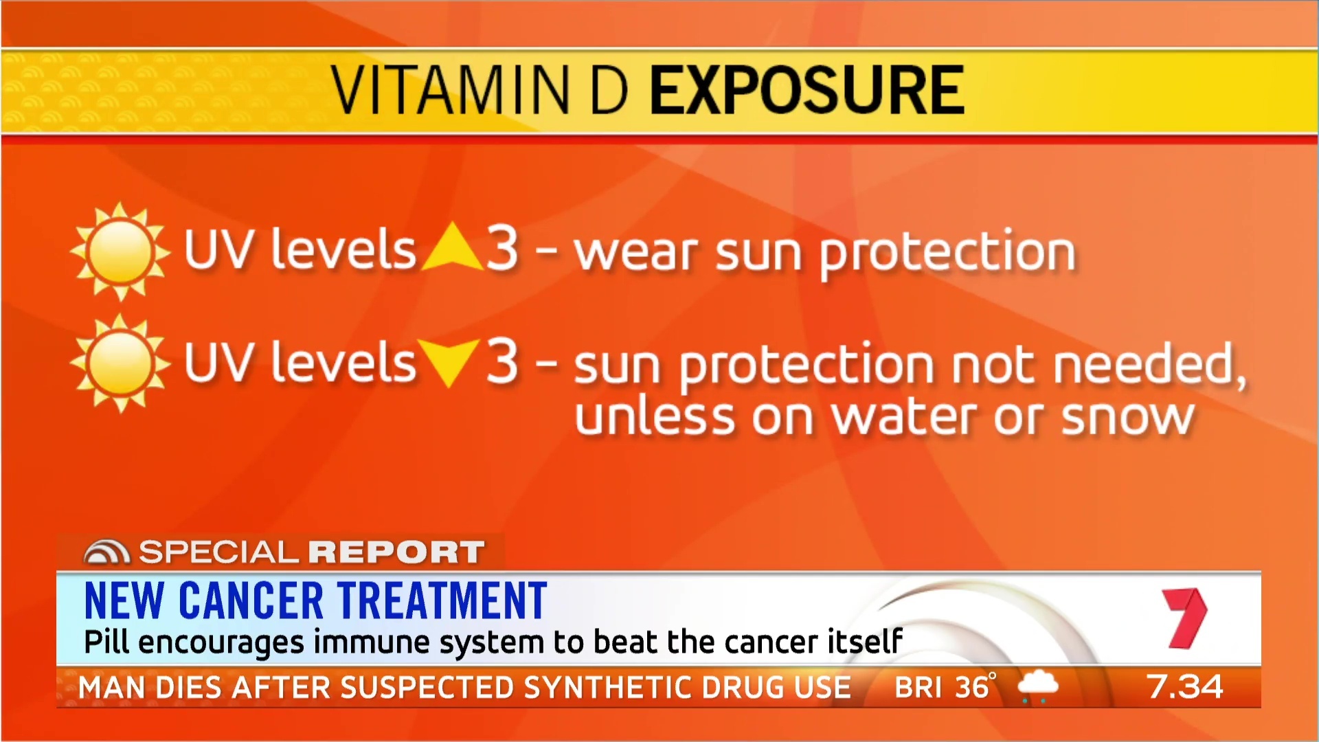
I think the white banner is too big, It takes up too much of the screen. I don’t like the use of both blue and black on it.
Also, white on orange is harder to read.
One thing that is really getting to me is the font used on the supers.
The really condensed Ubuntu font, the normal font, and the really stretched out font.
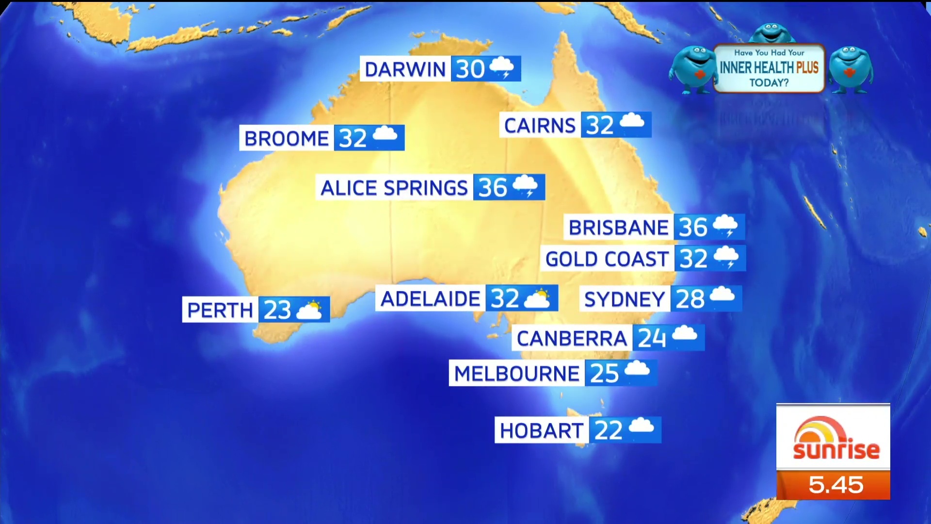
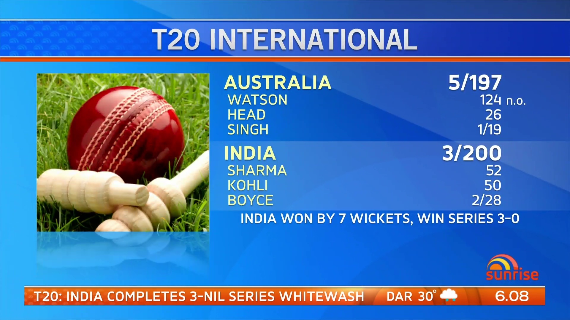
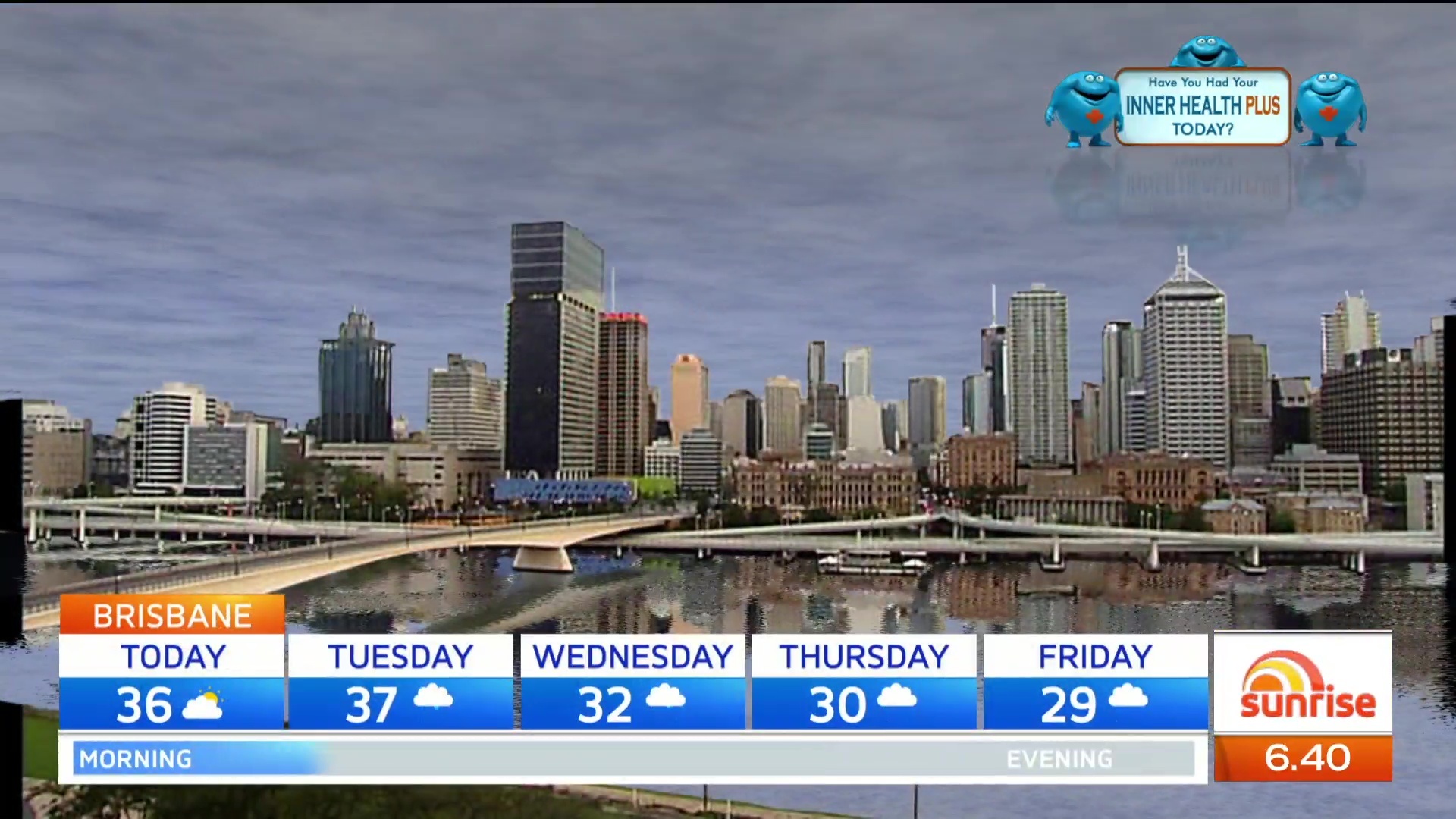
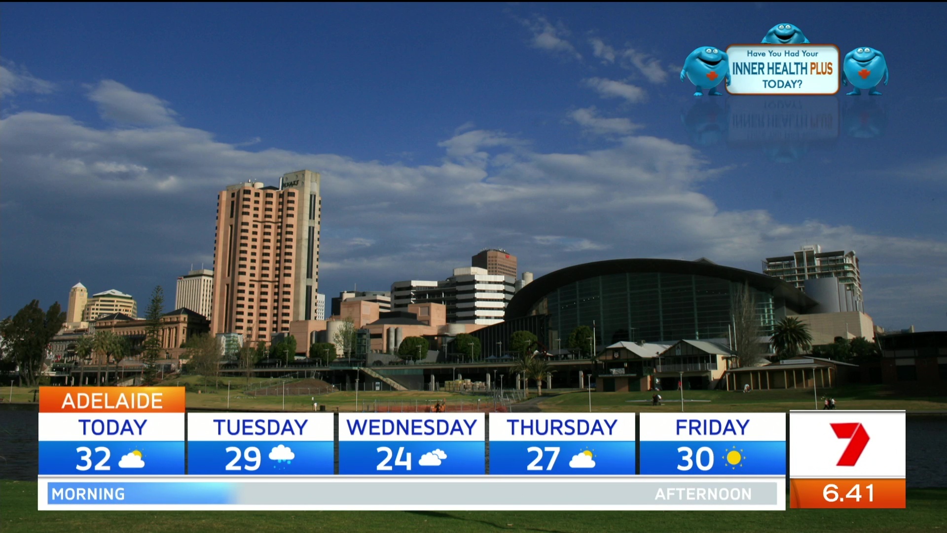
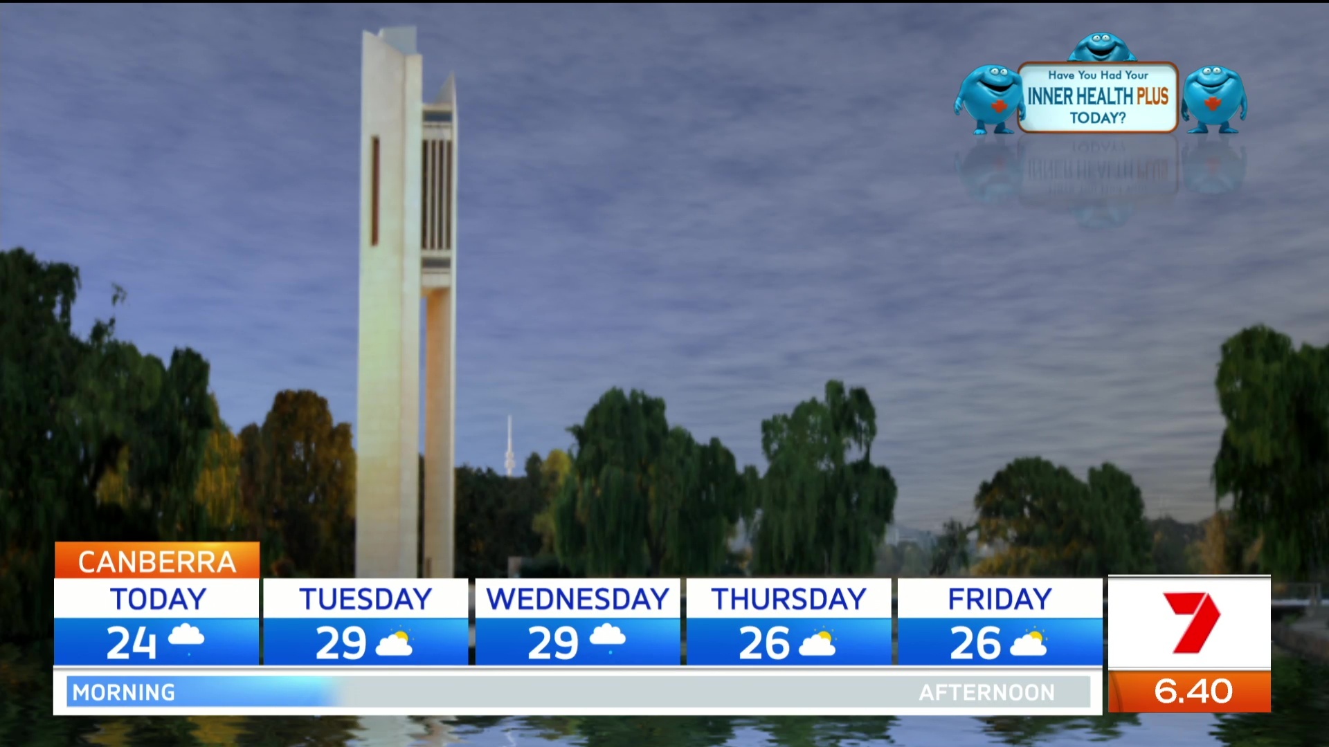
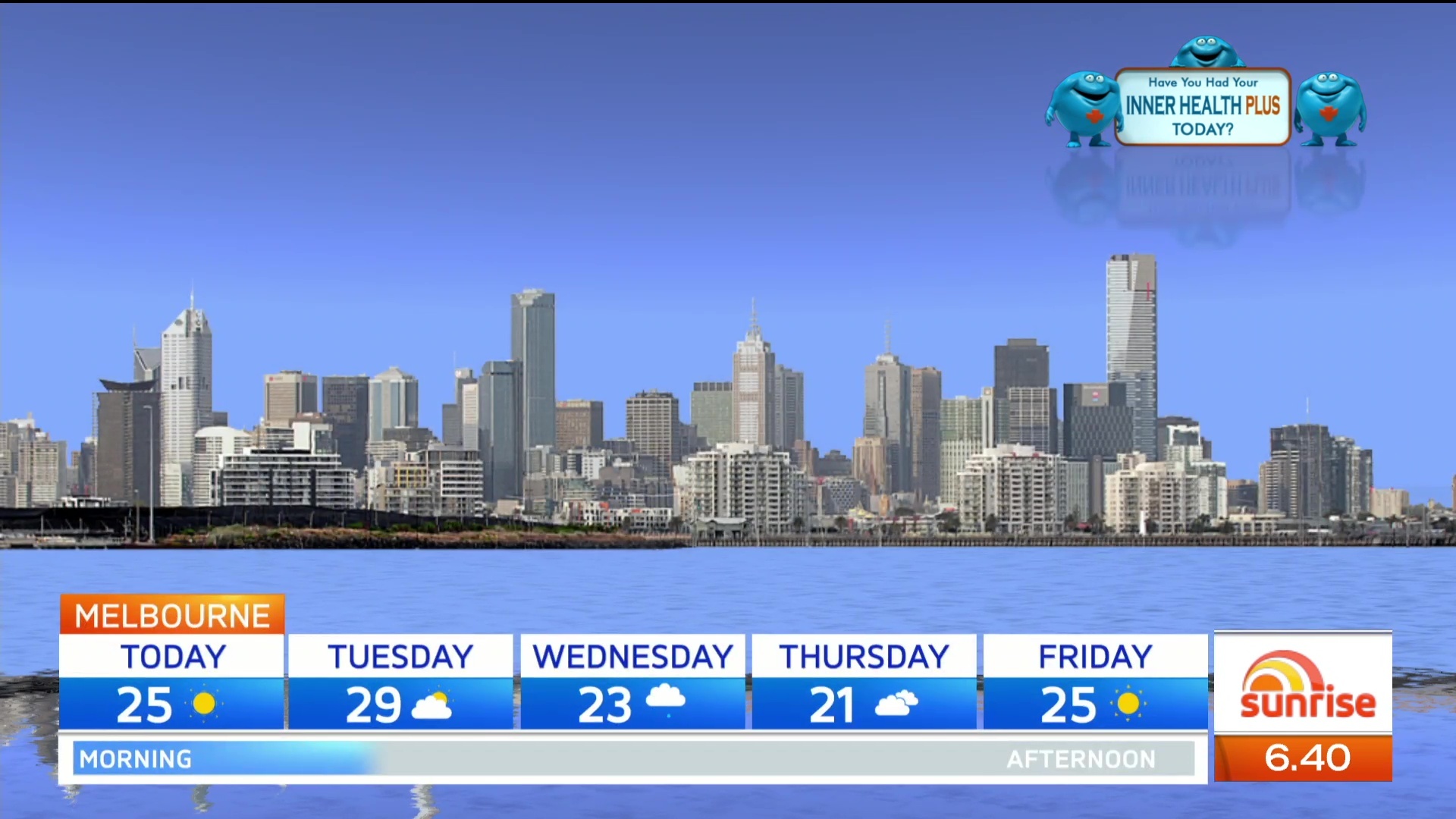
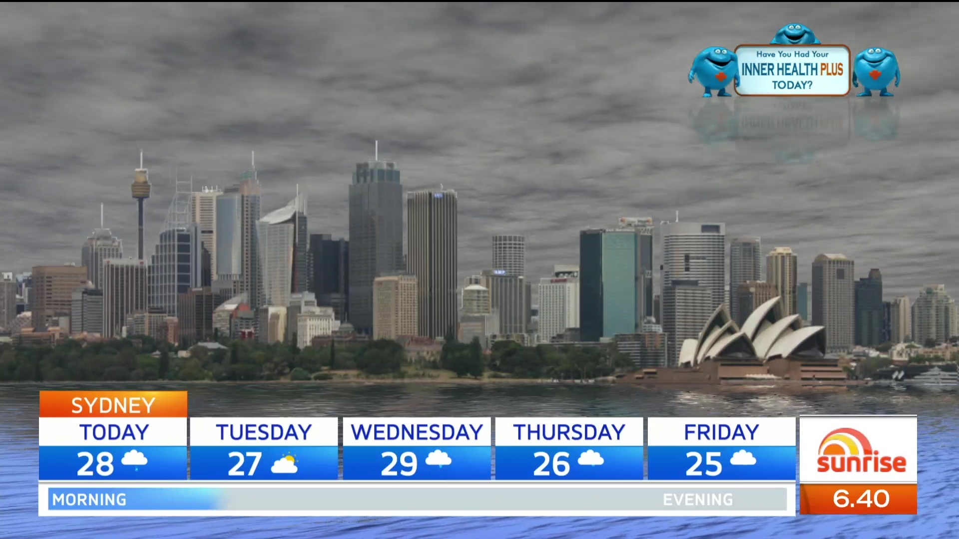
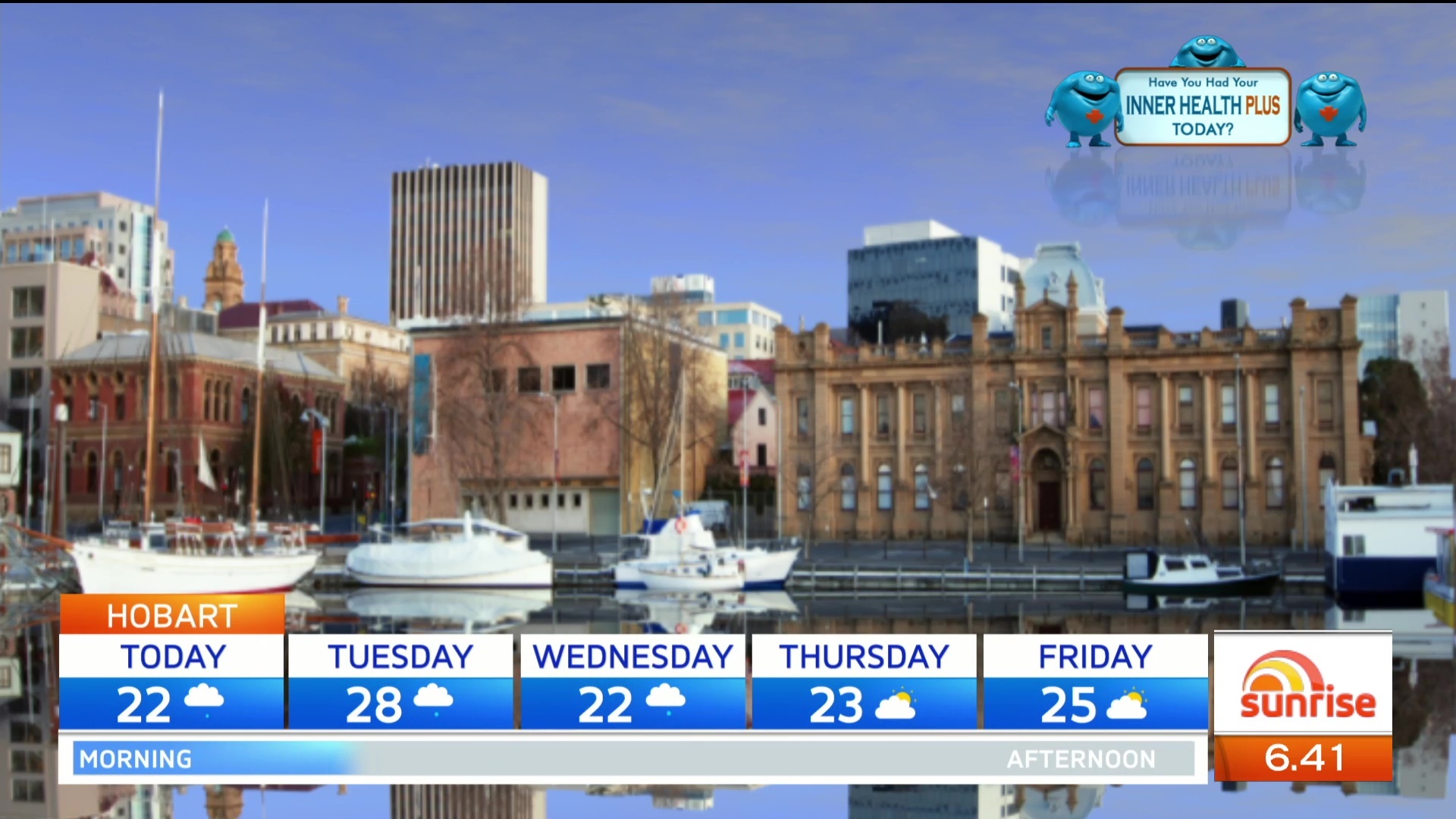
The picture of Adelaide is in the afternoon not morning. The shadows are afternoon shadows… Lol.
Set & graphics look great! Don’t really like the blue font in the super & the Sunrise logo\7 flipper, apart from that everythings nice 
In all honesty the entirety of the relaunch is ten steps back imo. Nothing revolutionary or modern about it.