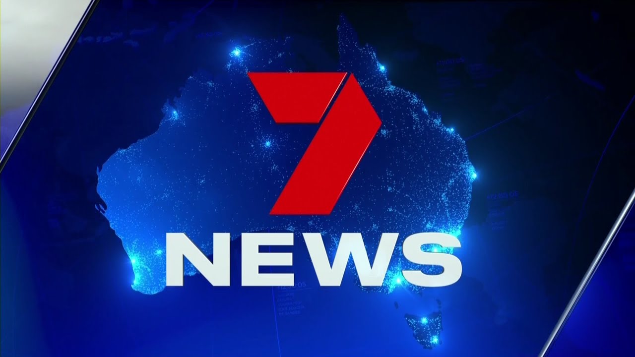
What was the point of this? So insignificant that most wouldn’t even notice a change and for those that do it’s not even a refresh, just more mish-mashing.
Hopeless
Looks like a mock from this forum, and not a good one.
Michael Usher presenting Sunday now?
 Adelaide’s NEW Profile Pic
WHY is the ticker dark blue and then the supers are a washed out blue?!
Also the angle glass transition on that titlecard could look really classy, yet that looks bad.
I’m dying laughing. Is this the twilight zone?
An improvement for sure. Nothing to write home about.
Goodness me, this is rubbish IMO. I quite liked the previous graphics - to me there was nothing wrong with them! The news brand - in terms of presentation is wrecked
I don’t get it? This is just a bad recreation of the existing package?
Have they switched to a new graphics software or something that required them to recreate everything in a different format?
Melbourne looks horrid. The set panels are vertical but every screen has the angles graphic animating to the right.
They kept the bloody Marvel stadium shot too - fail.
AND SO MUCH BLUE! dear lord.
A great representation of the inconsistency with this rebrand in just one screencap.
I’d be willing to predict that the forecast map is likely to be tweaked before overly long - the location names would probably be unreadable in SD!


![No no no no funny laugh[sound effect]](https://img.youtube.com/vi/KyPbLqK1un4/maxresdefault.jpg)


