Can I just say how nice it is to have headlines without an abundance of blue!
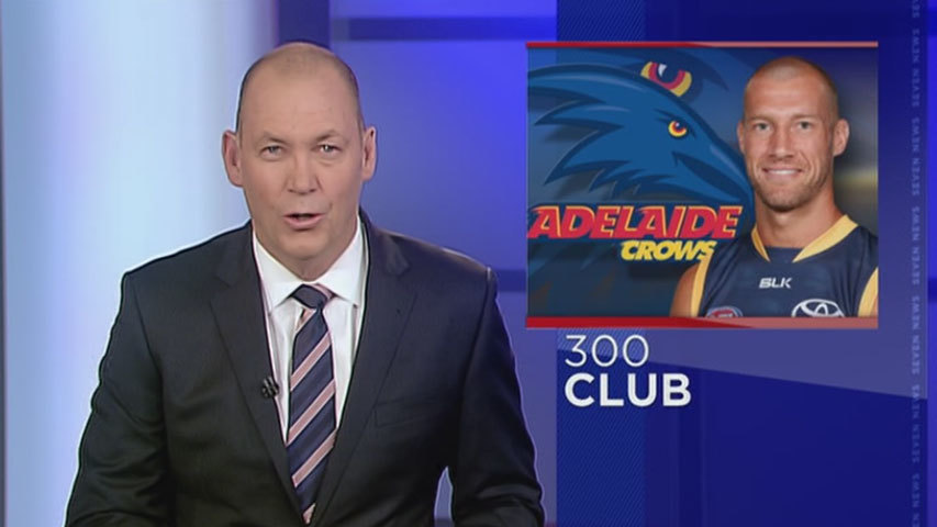
Adelaide caps coming shortly…
Video of the headlines: (the font size and transition sound effect in this video are more appropriate compared to Brisbane, Sydney and possibly others IMO) https://www.youtube.com/watch?v=hKyXSl-6u_w&vq=hd720
Unlike most others, I actually quite like the changes. I hate the old supers and hope they update them soon, but I like the changes they’ve made myself.
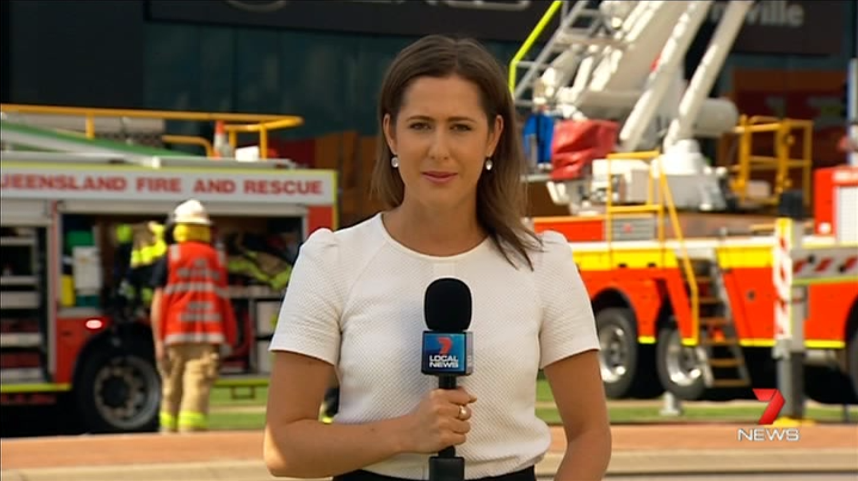
Although, once again, I think 7 Local News here in QLD have done a better job at making these changes look good then the metro services have.
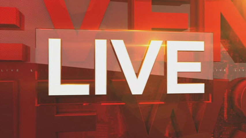
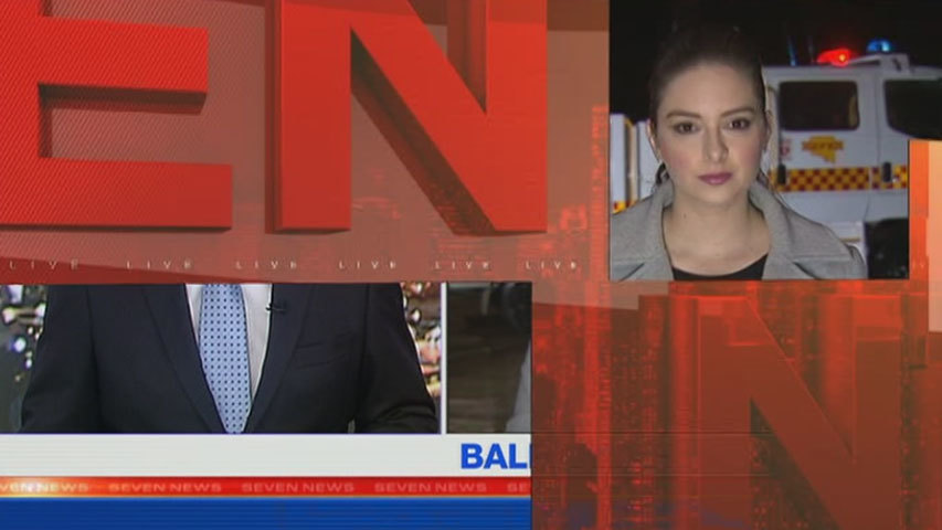
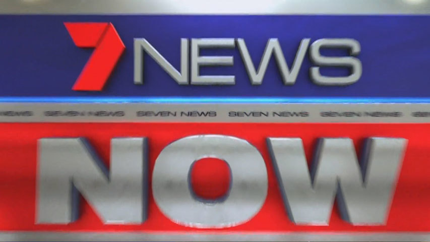
I quite like the changes they have made (though the blue is too strong on the OTS graphics I think - would prefer seven go completely red/white). Headlines and coming up look 10x better and even the live/breaking news look more professional compared to what they had before.
All let down by the elements they didn’t touch… and why they didn’t touch them, god only knows! Makes the whole thing look so thrown together (unless something went wrong before launch… but that should affect all markets).
haha - When you look at the ratings of the various 7 News bulletins in the top 5 markets - and the regional ratings of these Newscasts on the east coast - more Australians watch 7 News than any other news service.