Seven News Content and Appearance (2015-2020)

Very poorly calibrated monitors in the Gold Coast. Top two match and the bottom two match. But not all together. The lines are less noticeable now I have notice.

4 Likes

He’s rockin’ the 80’s mo! :stuck_out_tongue:

4 Likes

Do any ‘designers’ in aussie know that you can have a news brand for tv that DOESNT have to have a globe or world map on it? Do they all just sit round on photoshop messing round with globes, maps, gradients and lens flares? Cos thats how it all looks. All networks. Lol

6 Likes

Then lets hope that the Nine News refresh moves away from this :wink:

I’m pretty sure that it wouldn’t be a spoiler to say that Nine News most likely won’t be moving away from globes with it’s next refresh.

In any case, Australia certainly isn’t the only country in the world that has it’s TV news branding dominated by globes, maps, gradients and lens flares…

3 Likes

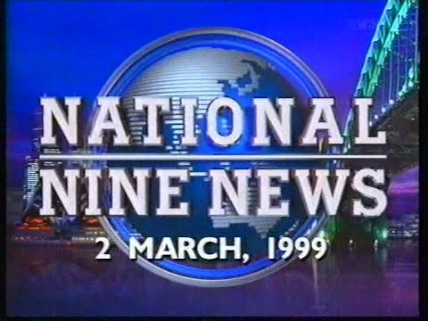
Nine has always had that globe element in their presentation. The globe is kind of a Nine staple so I doubt they’ll get rid of it.

5 Likes

Apologies for the horrible quality but I just noticed a national update air with the globe now at the top right. Looks even worse :frowning:

6 Likes

That globe is just atrocious!

1 Like

From the Afternoon News:

Cannot believe how utterly awful it looks. What is with Seven and terrible backdrops? It’s not hard.

9 Likes

Why does the globe keep moving places during different bulletins? Also, why is there clouds, OUTSIDE of the globe? :confused: Reminds me of a PS1 game’s overworld! :stuck_out_tongue:

1 Like

That shot sort of reminds me of Nine with the clouds lol

Before I made this post, this cap was originally captured to showcase that Seven has returned the “Nightly at 6.00” title-card during the nightly updates, but it also made me think… Why not use a daytime version of the backdrop? :thinking:

5 Likes

Here is city vs city comparison of the Morning and Afternoon News bulletins of Nine, Seven and ABC.

Some caps of the new background

The Sydney Olympic Homecoming on Monday

The Melbourne one today

2 Likes

Thanks mate. It looks even worse in the wideshot.

It’s hard to believe that Martin Place set is relatively new, it looks so dull and dated already.

8 Likes

I’d actually go one further and say that Seven News’ current branding in general is so dull and dated, despite being relatively new.

The sad thing though is that we’ll probably be stuck with Seven News’ current look (evolutionary tweaks not withstanding) for at least 3-4 more years, well after all other TV news services have moved onto new branding…

2 Likes

Everything about the background in that wideshot looks exactly like Nine News minus the ugly globe :stuck_out_tongue:

Except Nine News’ globe graphics actually look half decent, albeit nearly half a decade old with some elements.

Seven News’ current graphics are like a bad combination of their previous branding mixed with elements borrowed from Nine News, Ten News and NBC Nightly News. :confused:

2 Likes

Im surprised Melbourne hasn’t updated its set yet.

2 Likes