Surely it’s not real. Surely.
1 Like
Looks terrible, poorly executed.
1 Like
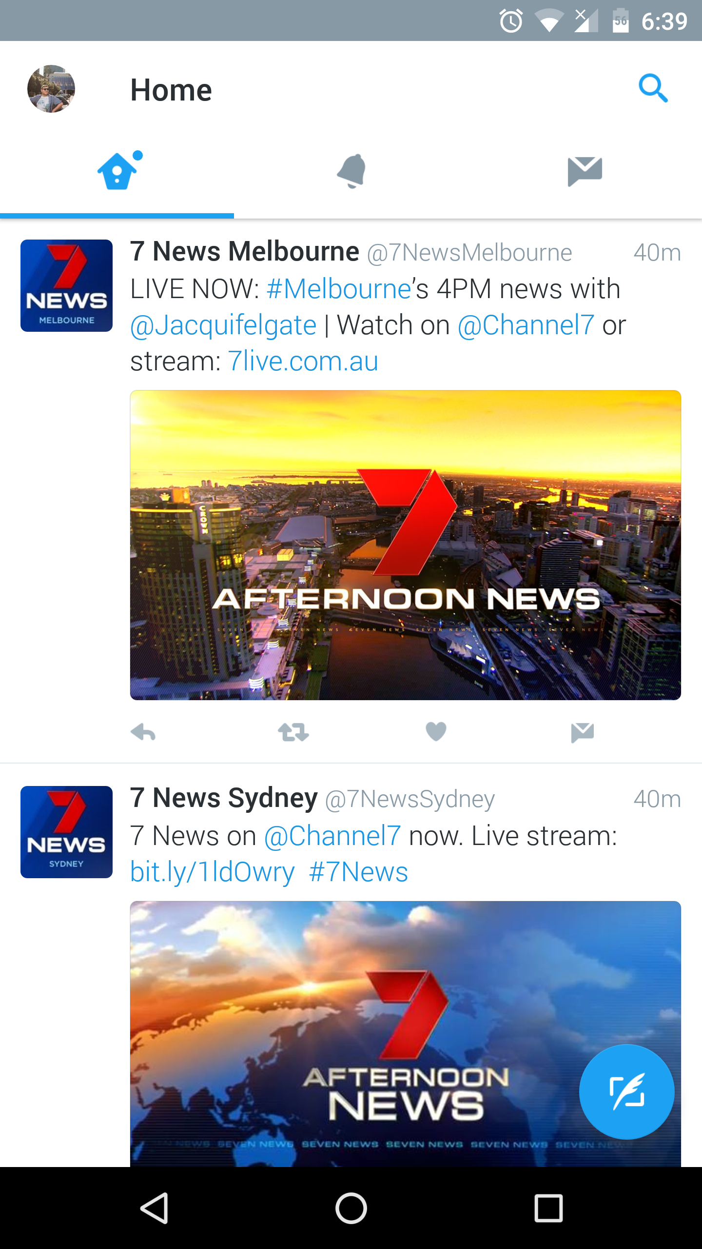
Morning News coming from Melbourne today, with Jacqueline Felgate presenting
2 Likes
Coming soon to ten, Ten Early News live from Martin Place , a simulcasted 7 Early News bulletin. Finally the real reason for 7’s obsession with new blue graphics! Might be a cheaper option for ten rather than producing their own bulletin and would give 7 a bit of extra change… (Channel ten would just need to edit out the coming up in sunrise plugs) 
1 Like
At least Ten’s globe looks nice. This one looks like shit 
7 Likes
I agree. Seven’s globe looks like one of those stock “news” images/graphics that you’d find on the internet…
7 Likes
Why don’t they use the large map that they use in there new opener and have the arches rotate around the map of Australia.
4 Likes
I think a more zoomed in globe would of worked better, with the focus on Australia. You can barely see Australia in that backdrop! My question is, judging the fact it’s a still image, does it rotate? 
I feel it should of looked like the Sponsor title-card background instead:
5 Likes
Yes it does spin.[quote=“JackMelbTV, post:2155, topic:103, full:true”]
Morning News coming from Melbourne today, with Jacqueline Felgate presenting
[/quote]
Would you have any caps? Did they use the new backdrop? The national Afternoon News is.
1 Like
No, they used the previous one
1 Like
It looks odd because it’s in the centre above the presenters head. I personally think a darker background is more suitable for the dark blue graphics
2 Likes
I wonder what this studio looks like.
Also afternoon news on twitter. Can’t even get the right backdrop. I saw a tweet after that had the right picture.
2 Likes
Very poorly calibrated monitors in the Gold Coast. Top two match and the bottom two match. But not all together. The lines are less noticeable now I have notice.
4 Likes
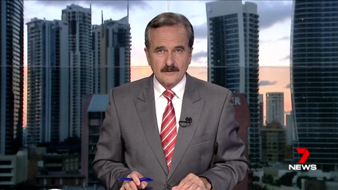
He’s rockin’ the 80’s mo! 
4 Likes
Do any ‘designers’ in aussie know that you can have a news brand for tv that DOESNT have to have a globe or world map on it? Do they all just sit round on photoshop messing round with globes, maps, gradients and lens flares? Cos thats how it all looks. All networks. Lol
6 Likes
Then lets hope that the Nine News refresh moves away from this
I’m pretty sure that it wouldn’t be a spoiler to say that Nine News most likely won’t be moving away from globes with it’s next refresh.
In any case, Australia certainly isn’t the only country in the world that has it’s TV news branding dominated by globes, maps, gradients and lens flares…
3 Likes
Nine has always had that globe element in their presentation. The globe is kind of a Nine staple so I doubt they’ll get rid of it.
5 Likes
Apologies for the horrible quality but I just noticed a national update air with the globe now at the top right. Looks even worse 
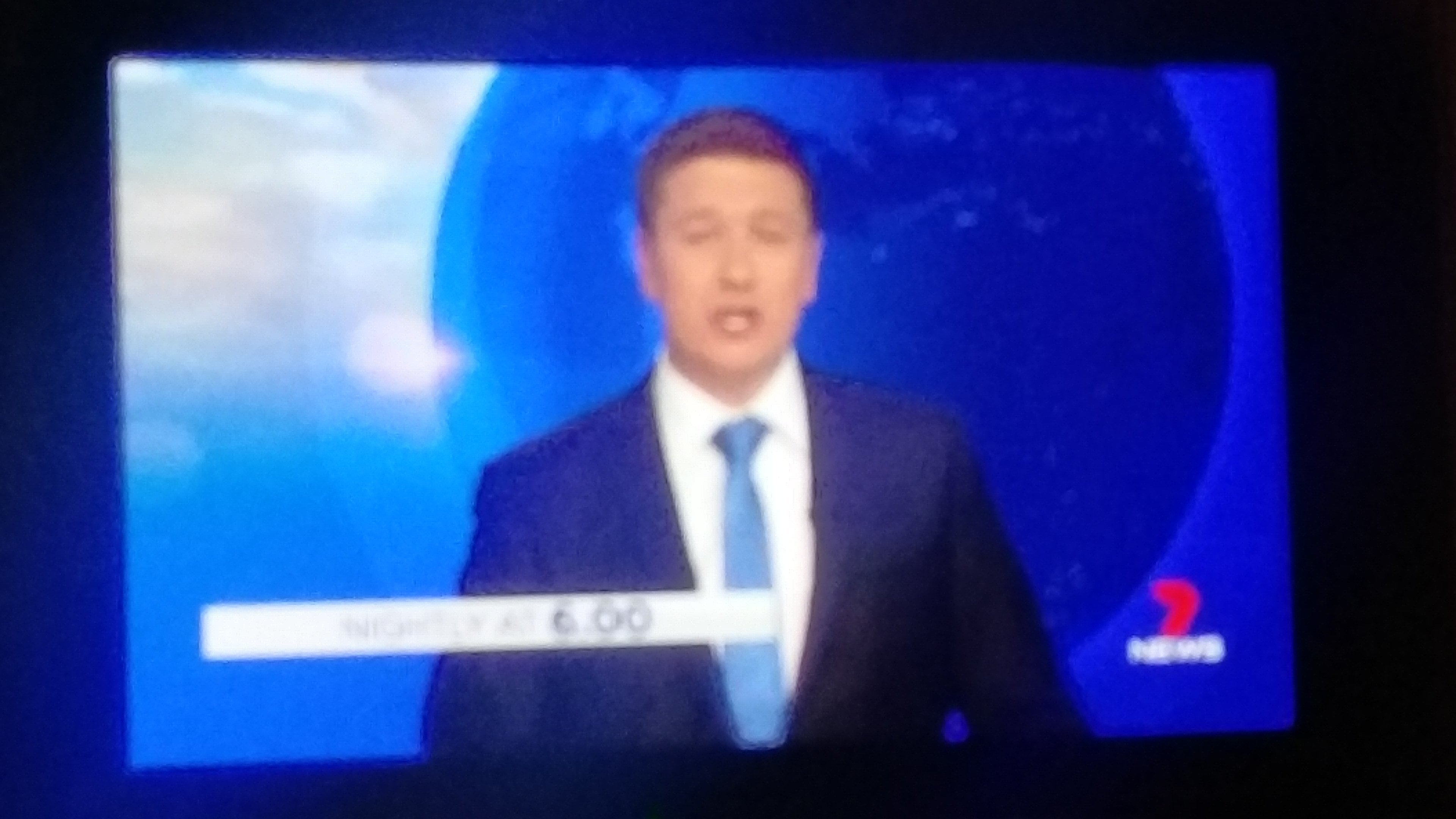
6 Likes
That globe is just atrocious!
1 Like