and here’s a set idea…
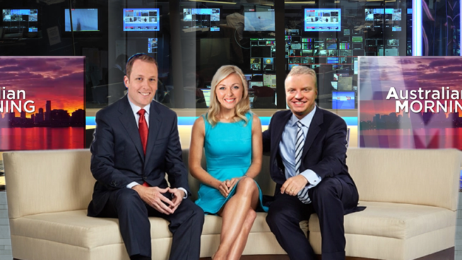
and here’s a set idea…

Set aside, I actually think your choice of talent is spot on.
So… with inspiration from the Ten Presentation thread, I have made some quick logo mocks on the logos. I will make some presentation to go with the logos soon.
The 11 logo looks a bit too thick but other than that it is pretty well done
Nice. I’m not seeing a real visual connection between the ten and the NEWS First At Five, though. Perhaps NEWS needs to be down and closer to the logo? For me it doesn’t flow.
That’s what she said.
Thought i’d do something like this… It’s sort of like Imparja mixed with Ten mixed with Seven.
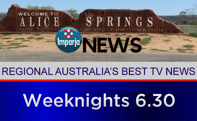
IMO, the lettering on the Ten logo is too small. Below example uses proportions from their current logo:
and then copied off this: http://cdn.scahw.com.au/cdn-1d20e2df07e6c60/imagevaultfiles/id_427526/cf_14/website_slide.gif
the logo doesn’t line up, or look very good, and what is it? an update end board? a promo?
also that slogan is probably pushing things a bit?
I just posted in the Network Ten 2017 thread a cap from the 2017 lineup promo, and came up with the thought l, of ten going with a 3/4 circle as their logo:
Yeah, looks good. But as I said, it would look better if this were the 80s
Not a bad mock, but it reminds me of a logo you’d expect from a perfume or a high-end department store…
Perhaps they could use the 3/4 circle as a consistent promo element
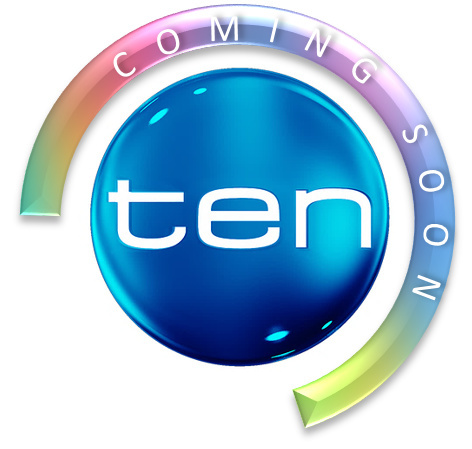
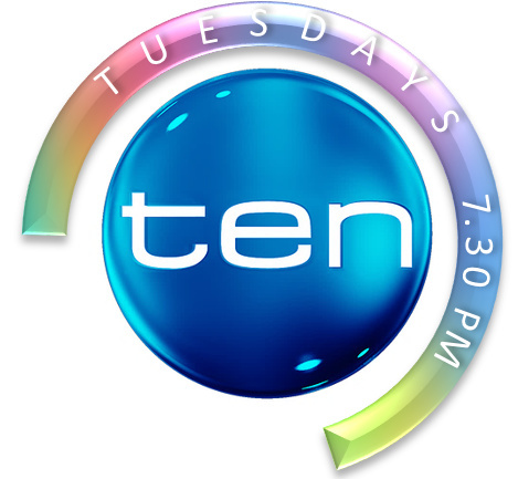
I love that gradient. Can we see a mock using this gradient and a complete circle?

I imagine its animation to be like a loading icon
I actually don’t mind that one
Edit: @n1ck do you mind if I use that as my profile pic?
Reminds me of the last Fox Kids logo, the green one!