Very simple yet elegant all at the same time.
2 Likes
Oh sorry, that should have been Ten Eyewitness News at Ten to keep the branding on message.
In my opinion ten has always lacked a good identifiable logo. I think if ten were to rebrand, a brand new logo is needed. Here is a challenge for someone, design a completely new logo for ten. Something we haven’t seen before.
1 Like
I don’t hate Ten’s current logo but you certainly wouldn’t say that it’s as iconic as Nine’s logo or the ABC’s logo or even SBS’ logo.
I wouldn’t mind seeing a completely new logo design for Ten, rather than endless tweaks to a design that is a quarter of a century old.
1 Like
If any Channel were to change their logo I would definitely want it to be NINE. I know its iconic but I personally think it’s an eyesore. The dots are fine but the ‘9’ is so outdated. I don’t fancy the colour variations either.
4 Likes

Not bad. Wouldn’t mind seeing a combination between the old and current Ten HD logos though! 
1 Like
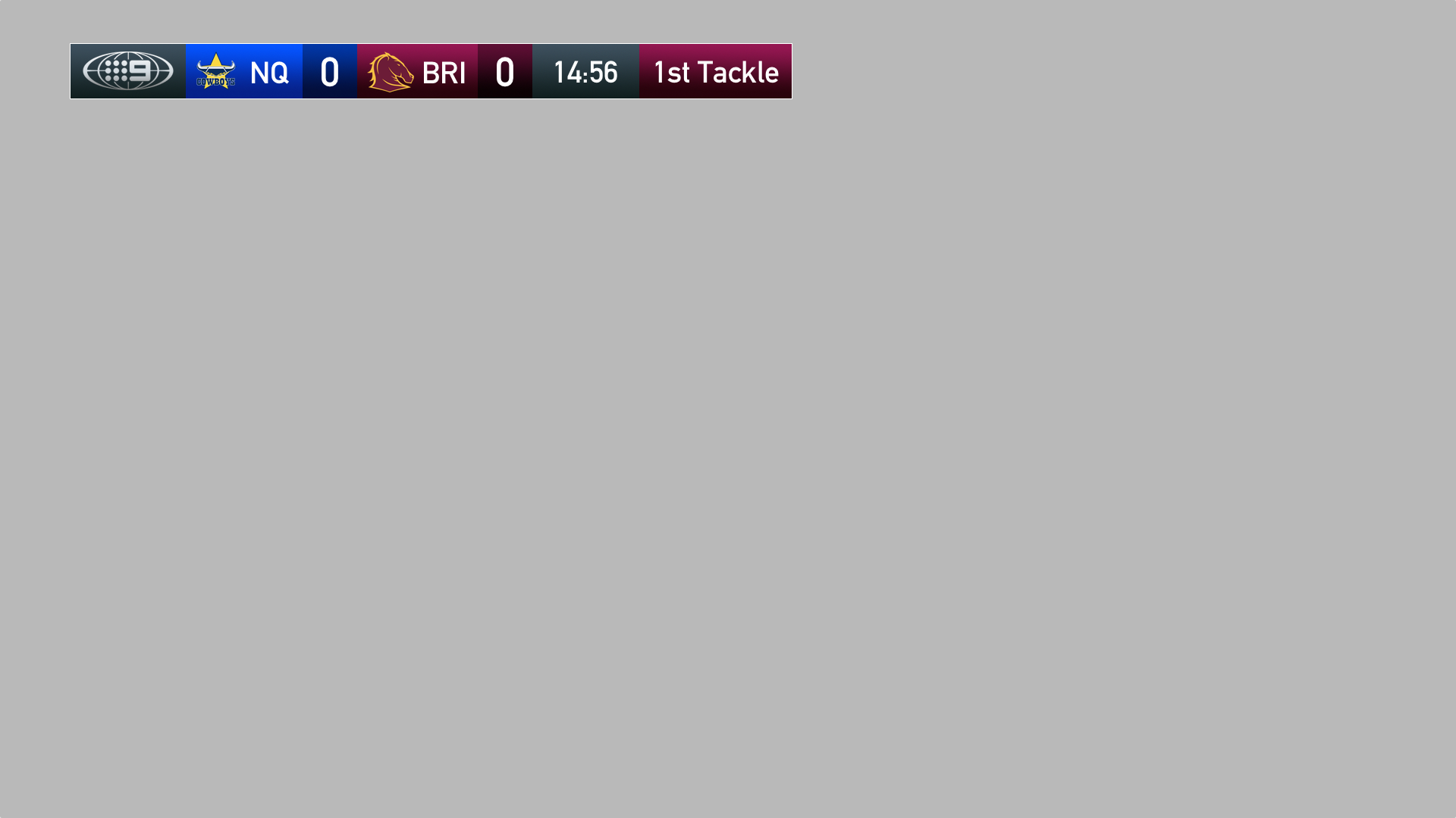
NRL on Nine scoreboard with the CBS Sports graphics look. It’s probably a little on the chunky side.
6 Likes
Yeah, not a bad simplification of the scoreboard graphics but I don’t think that it works on the top of the screen.
2 Likes
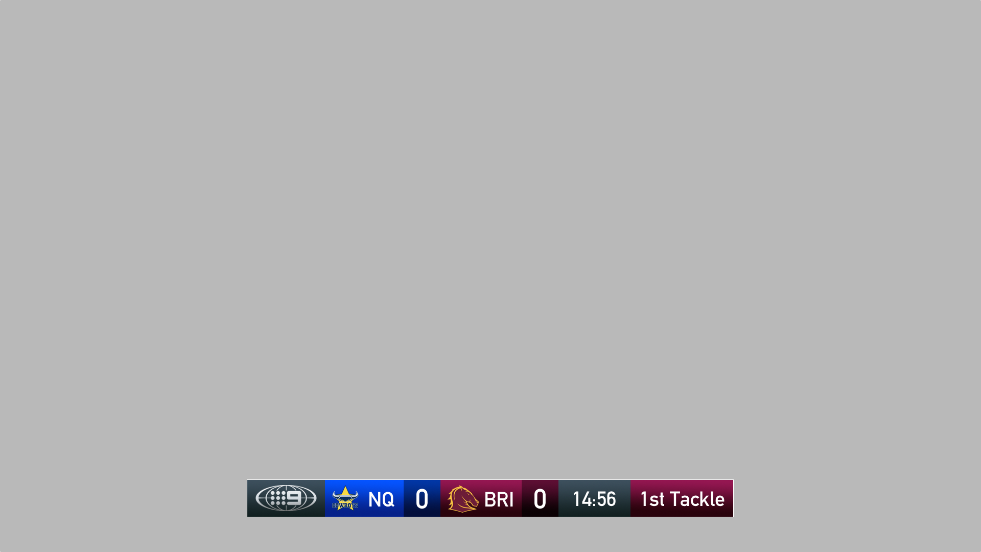
I dunno, NRL fans generally aren’t ones who care about tasteful, clean design.
The design might work for cricket or AFL, though.
Just playing around with the late 90’s:
https://s18.postimg.org/6ybyzry4p/Domingo_Maior2014_copy.png
https://s18.postimg.org/wv5nce1s9/Domingo_Maior2014_remake.png
1 Like
Here’s some “possible” ten logos:
https://s15.postimg.org/rsz0myyd7/ten_1.png
https://s15.postimg.org/ppolfaykb/ten_2.png
https://s15.postimg.org/erdbx49yz/ten_3.png
https://s15.postimg.org/m8mjcbzi3/ten_5.png
2 Likes
Mate, in brutal honesty these hurt my eyes, especially trying to make out the “TEN”. They look too outdated for broadcast and don’t do anything for the brand.
6 Likes
These logo design probably would’ve been great in the Late '90s/Early 2000s. These days, not so much.
3 Likes
I see hints of stuff.co.nz
Would prefer to see something more cohesive rather than three totally separate elements that are just placed next to each other.
Like the main TEN SPORT part though.
1 Like