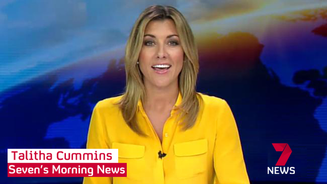
LOL at that headline. If it happened for real, you could just imagine how much of a frenzy the local media would get into! 
But aside from that comment, not a bad mock if I say so myself tvcl. Prime News NZ-inspired headline supers?
LOL at that headline. If it happened for real, you could just imagine how much of a frenzy the local media would get into!
But aside from that comment, not a bad mock if I say so myself tvcl. Prime News NZ-inspired headline supers?
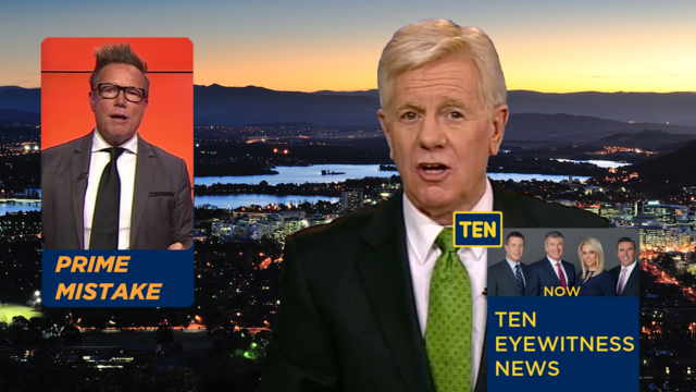
I hadn’t seen the Prime NZ supers before, actually. But now that you mention them (and now that I’ve looked them up), I can see the similarity.
Now with white:
Here’s a concept inspired by https://youtu.be/-yNcMvygcTA:
I also changed the logo to try to tie it into the idea
looks far too cluttered
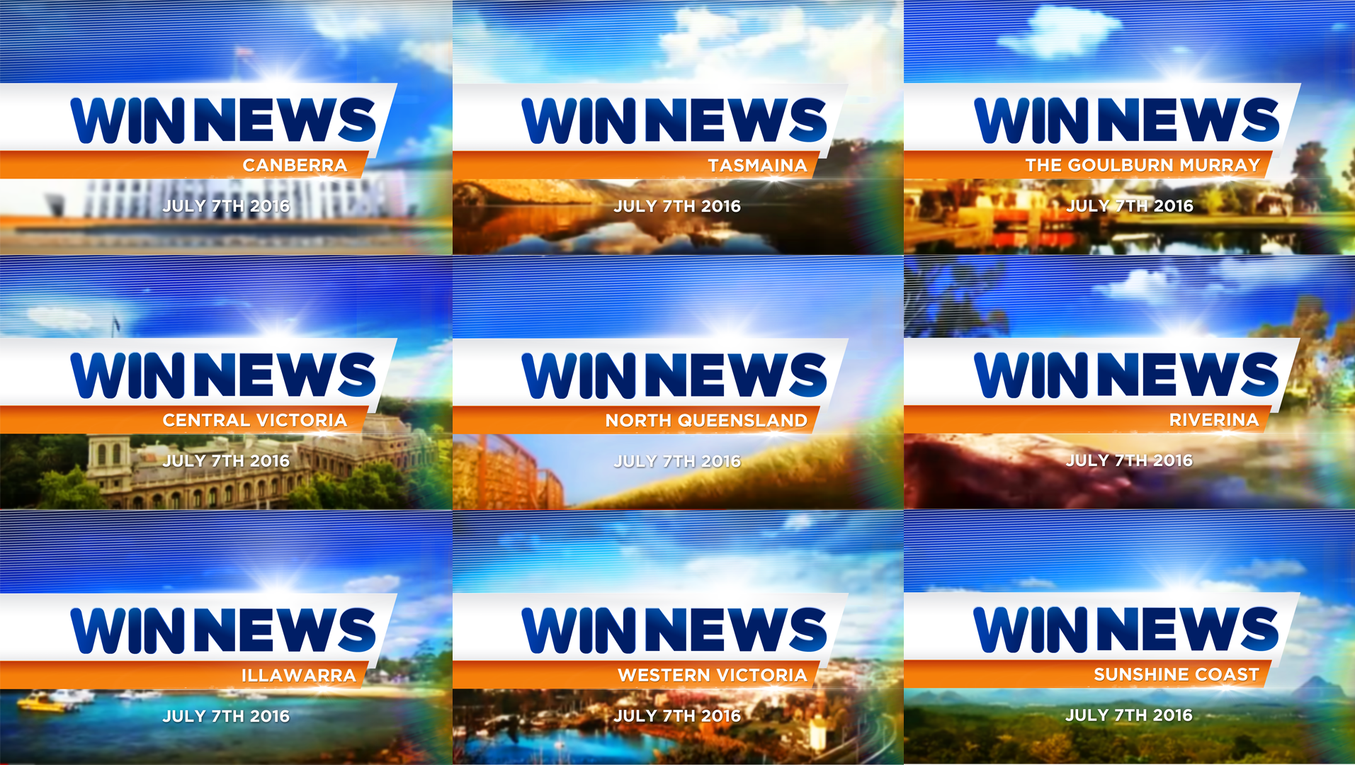
Looks neat. With regards to the Goulburn Murray bulletin - would this be a consolidation of the Albury and Shepparton bulletins?
WIN refers to the Shepparton bulletin on the opening titles as The Goulburn-Murray and the Albury bulletin as Border and North East.
Scan Lines! Noooooo let them be gone please!
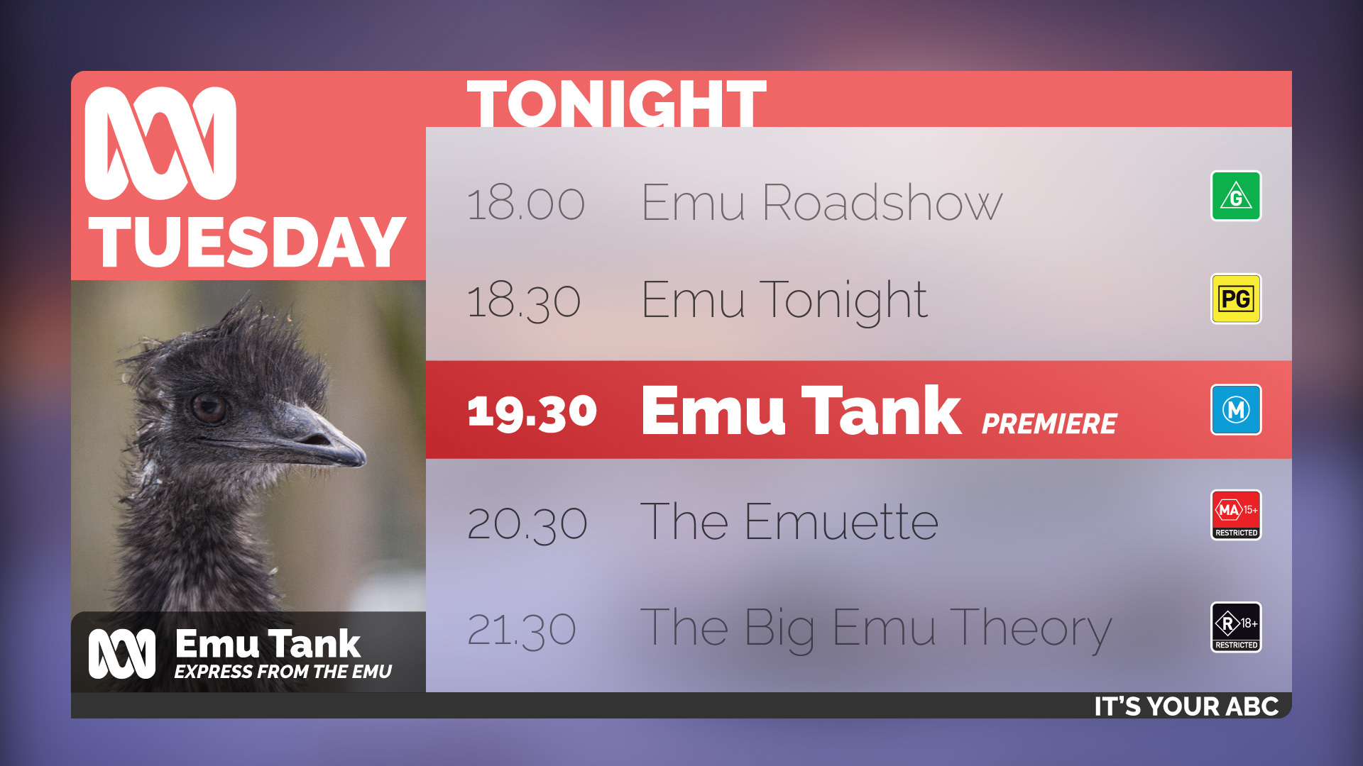
I really like it, especially using the slogan. A few nitpicks though.
Firstly, I’d remove the ‘restricted’ text off the classification logos; one realistically wouldn’t be able to make that out on an SD picture. Secondly, I’d get rid of the second ABC logo in bottom left. Thirdly, I’m not sold on the positioning of the TONIGHT text, I don’t like that it’s touching the bottom of the bar, but that could be just personal preference.
It was more to show the bottom right corner rather than the top left of the pic
Another update of the ongoing saga that is my Channel 4/seven crossover
Portrait:
Landscape
One way of putting it.
I like the stacked Seven News logo more than the other. What is the white dash on the right side of the lower strap?
It’s not supposed to be there, I didn’t double check before I saved/posted it
And a “what if” logo mock, with thanks to @tvcl (from whom I took the idea from) and @eddel for the “new” seven logo (which makes a subtle appearance).
Q: WHAT WOULD THE SEVEN LOGO LOOK LIKE IF IT KEPT THE RIBBON?
A: It would look exactly the same as it did when they brought it in.
You’ve put text on an image. Well done.
[quote=“Moe, post:644, topic:334, full:true”]
[quote=“MELBOURNECITYTV, post:642, topic:334”]
my attempt a mock
[/quote]You’ve put text on an image. Well done.
[/quote]Wow. They do look great! Don’t be so modest, Moe. 
Best to give this guide a read
Did you use Comic Sans?
Sorry but these are bad.