Thanks!
Yeah, I abandoned that whole mock pretty quickly. It’s hard finding fonts that work well with the 7 logo while also creating something different and new, I will persevere though!
Thanks!
Yeah, I abandoned that whole mock pretty quickly. It’s hard finding fonts that work well with the 7 logo while also creating something different and new, I will persevere though!
Picky alert!
Love everything about it except one thing - it looks skewed because the long segment is slightly too long. I think it’s best explained in this pic showing the real 7 logo in black over the top of yours:

That’s not entirely accidental (the dodgy angle on the top left is though, will fix that!).
The whole thing just felt very top heavy to me with all the extra detail/lighter colours in the top half so I adjusted some of the proportions.
Haha, fair enough. Just thought I’d point it out.
Reworked 7SPORT logos using Seven’s new Chronica Pro font:
Not at all, looks great!
Very nice though some of the text is difficult to read in places due to the light colourings
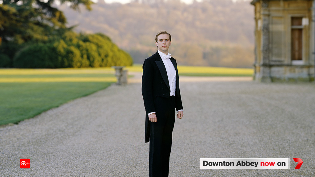
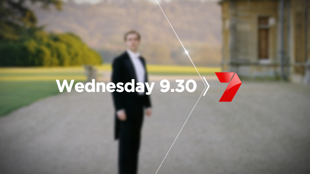
Need feedback on which one I should go with for a 7/C4 mock.

EDIT The black would be obviously white in the future
Yes - needs some work 
Fantastic mocks! Looks similar to the 2000-2003 on air look. 7 leaving Yahoo and signing with NBC Universal could be possible in the future.
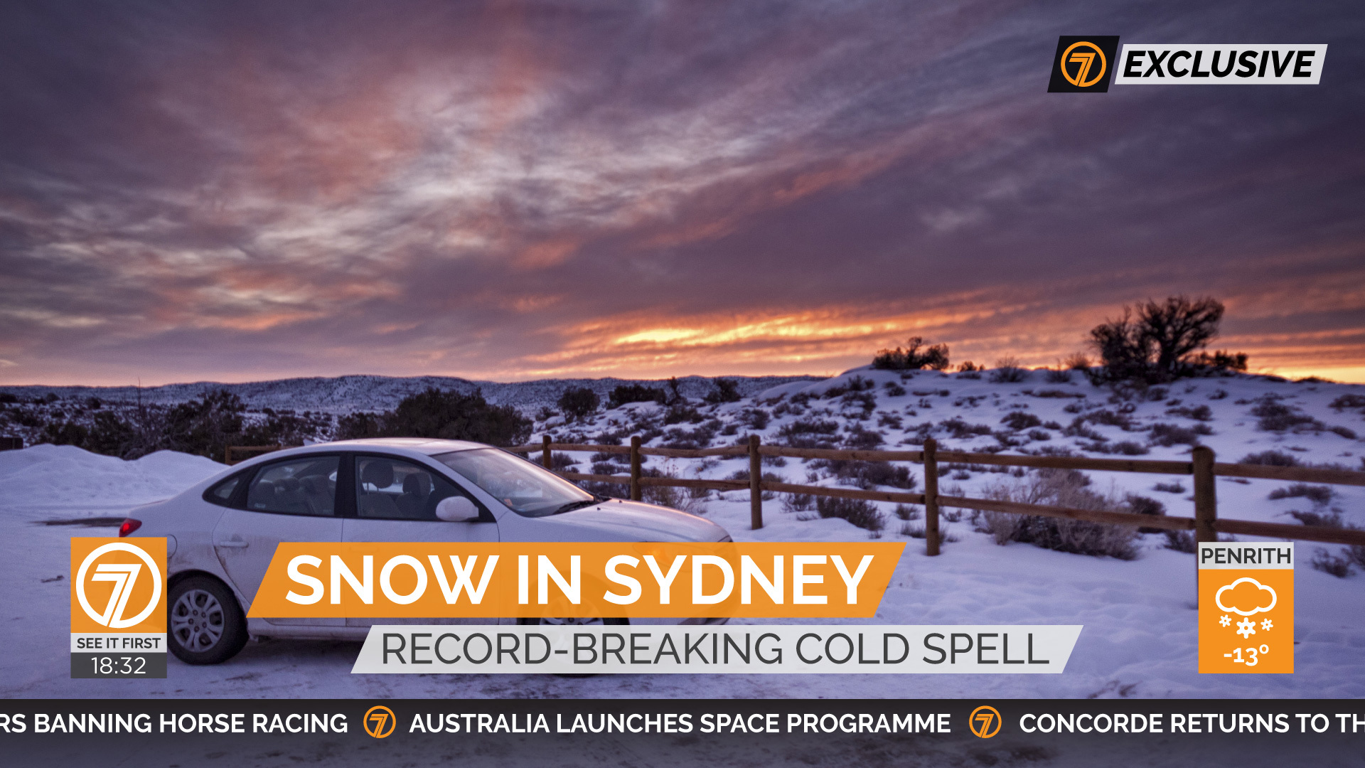
Very nice I would have made the ticker tape bigger and make the main banner text less stretched out.
Thanks, GradyACN. By less stretched out, you just mean smaller?
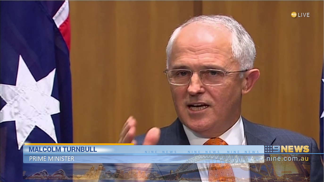
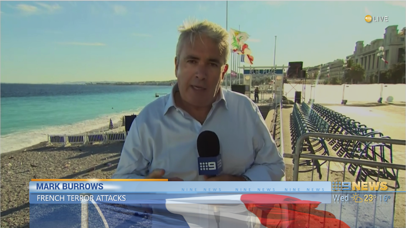
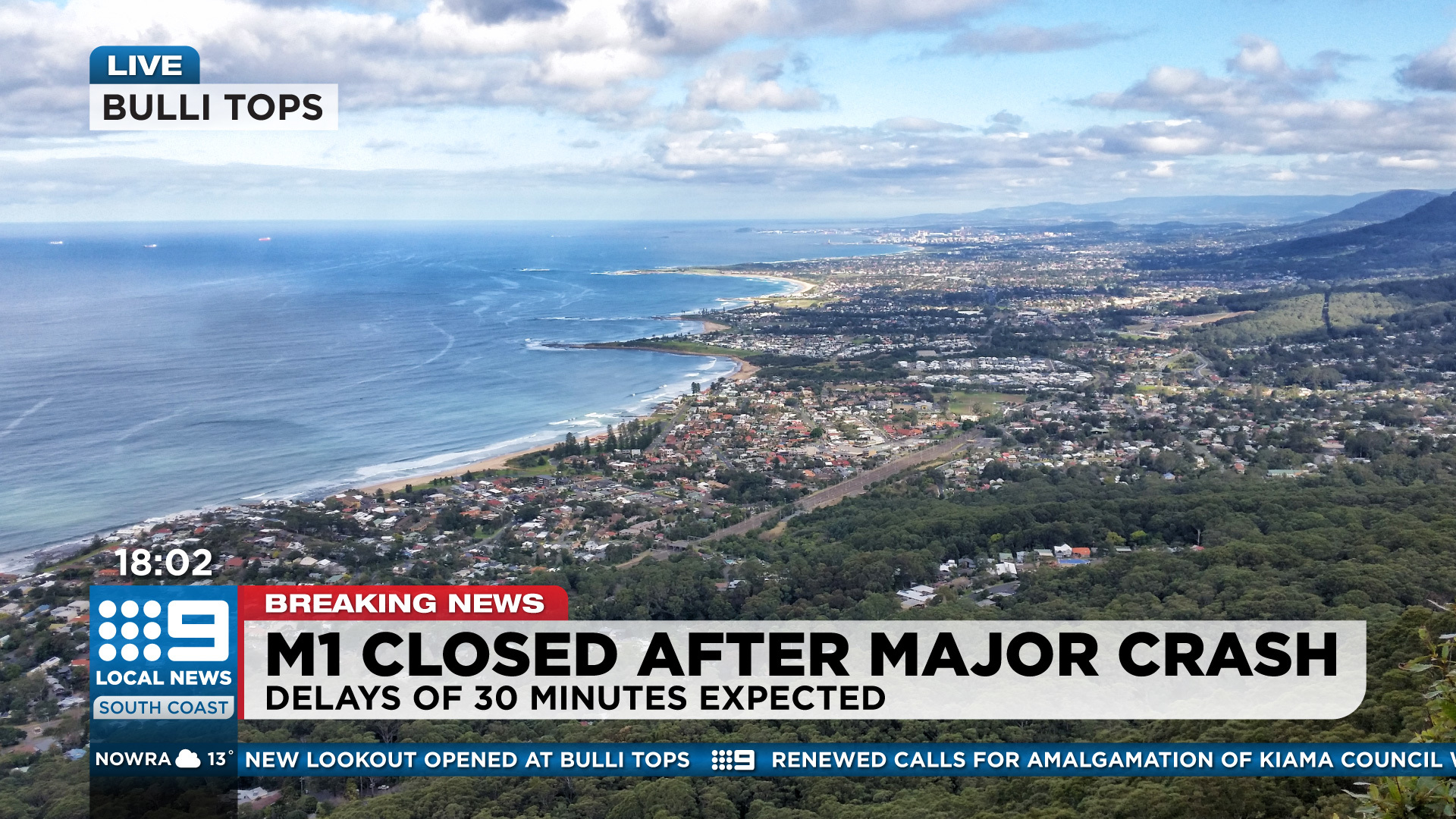
And a mock-up with the presenter and a local live shot in the background:
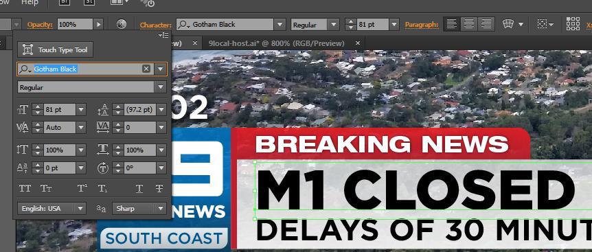
the banner that says M1 closed the text looks stretched to me,
the ticker tape and weather could come up a font size or two
Could just be me.