2/3


4 Likes


Sorry that score is way too big still
Yeah, I get it’s big but in terms of the actual package it’s probably a better use of the package than Fox League’s current weird look which I’m not a fan of IMO
Been working on this version for the last month and I think I’m finally happy with it. I’ve used the base theme from the 2005 package.
11 Likes
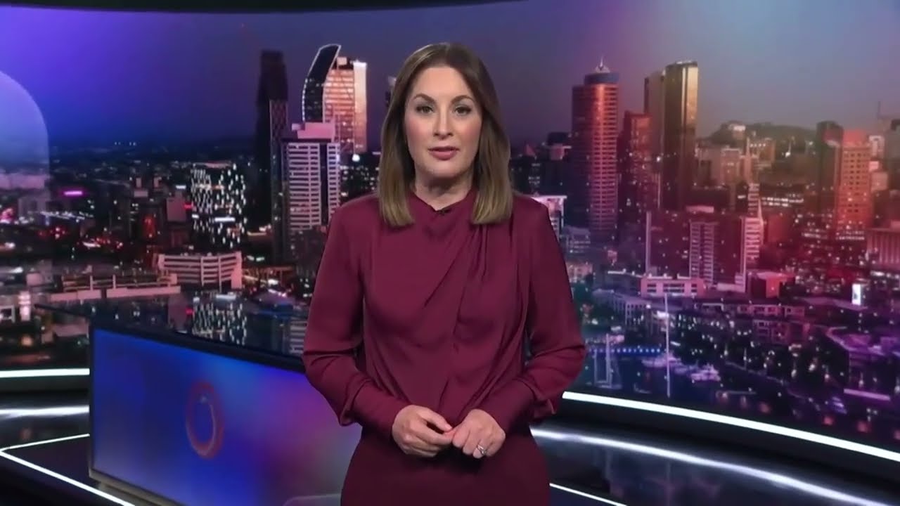
Got to wondering if Three News could return to a physical set for 6PM news at some stage. The odd comment I have seen is some find the VR studio a bit cartoonish so I had a go. Keeping the colours but playing around with the logo as well.

24 Likes
As the only fan of the “+Hr=e” logo, i actually really like the logo!
Highly unlikely Three will ever see a physical set again though.
6 Likes
Some Fox Sports logos if they were made in the style of the Fox Cricket logo (see logo on the far left hand side for reference)

25 Likes
look great!
1 Like


I see this happening. Maybe in a more purple tone though.
6 Likes
Very good! I’d like to see the 10 logo included though.
3 Likes
14 Likes
Fantastic. Way better than the current theme 
1 Like
Mocked up what the new SBS2 look will be come later this year.
Keeping it youthful with the stylised 2 and purple colour scheme not used elsewhere AFAIK on SBS.
Not sure which is better, the horizontal or vertical lockup with this logo idea.


17 Likes
The current Viceland branding and logo is better than any of the SBS2 logos they’ve had. It’s simple and effective. It’s a shame it will be going later this year.
4 Likes

Forbid I use imagination to make a mock…
9 Likes
I doubt it. SBS seems to be, becoming more creative these days.
I’d assume the logo would be done by the same agency that did the recent brand refresh.
The outline logo would be pretty cool to see
1 Like