You are single-handedly embarrassing the entire network with how much better your mocks are!
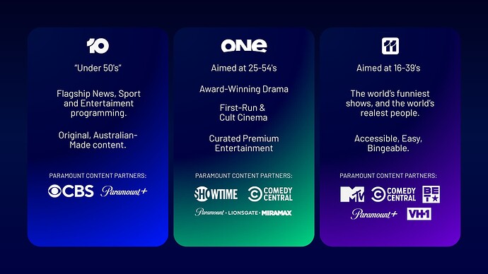
I’m sure there are incredibly imaginative and creative people who work at 10 that are being held back by a really poor c-suite. I was inspired to mock these up because I remember how exciting it felt to be watching 10 when I was a kid, the network was so different from 7 & 9 and it felt proud of that too.
I miss that energy the network used to have, I often wonder what 10 would look like now if the Gordon/Murdoch sale had gone through and CBS/Paramount were never in the picture to begin with.
Ah yes, 10 having spark. Miss that.
10 should be looking at this thread and being embarrassed. These mocks are what 10 should be.
This looks brilliant! Great relaunch.
“The One to Watch” brings me back memories of Channel 7 from 1999-2003
I wish I knew how to use Premiere so I could animate the concept pictures, I did try a quick animation using canva to try bring HE11O! back to life ![]()

also just want to quickly say thank you to everyone that’s left a reply on my mocks! It’s really cool to have found this community and I’m thrilled the reception has been super positive! Thanks everyone!
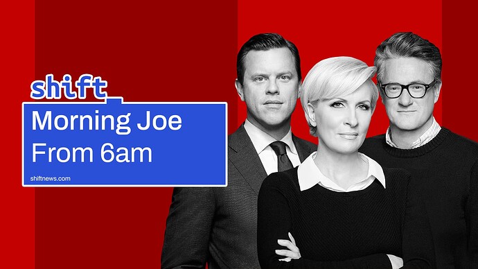
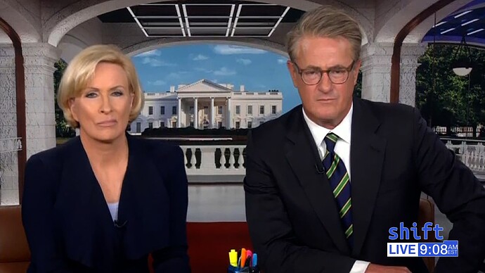
They would need to be extremely careful with the kerning on their urls, my eyes read ‘shitnews .com’ - though likely that’s my brain doing word association with Morning Joe…
Redesigned MSNBC with the rebranded names that corporate came up with
If they named each channel after Versant, with Verse News and Verse Business respectively
Place your bets… mine would be on News Australia and simply dropping all the Sky references in their current supers.
Other random news stuff from me…
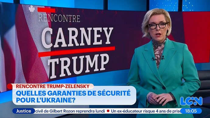
Putting more love to the French-language TVA’s news channel, LCN… especially with the Montreal local news operation in a new studio a few months ago. Bringing the symbol in line with the main network and making the supers in the colour scheme after the opening sequence, instead of a flat CNN copy.
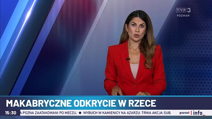
Saw a compilation of Polish local news opens on TVP3 by Tevebits, and their looks and quality really vary… so what if they have a standard opening based on their news channel, similar to BBC? Used Poznań (midwest Poland) as an example, which has a decent opening but not so much on the supers.
Redesigning USA Today’s breakfast show, having less ‘traditional US’ colour palette (because the viewers it appeals to are sticking with Fox anyways) and having more of the masthead’s colour around. Not the best star symbol there…
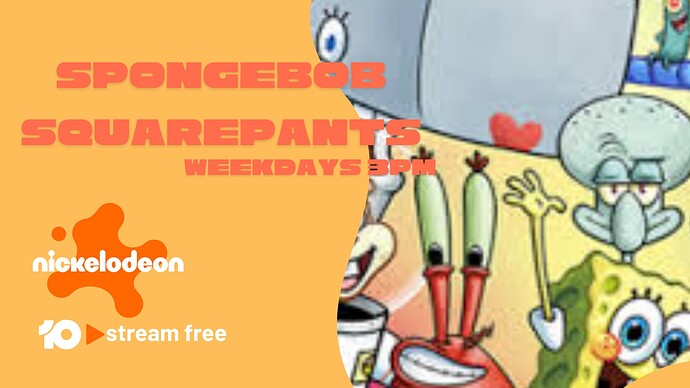
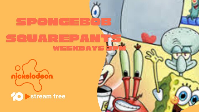
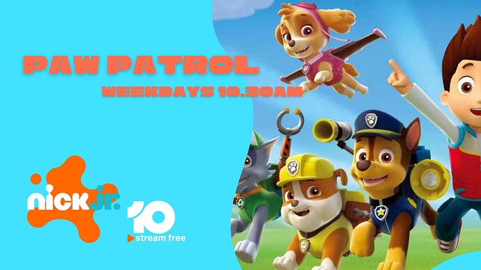
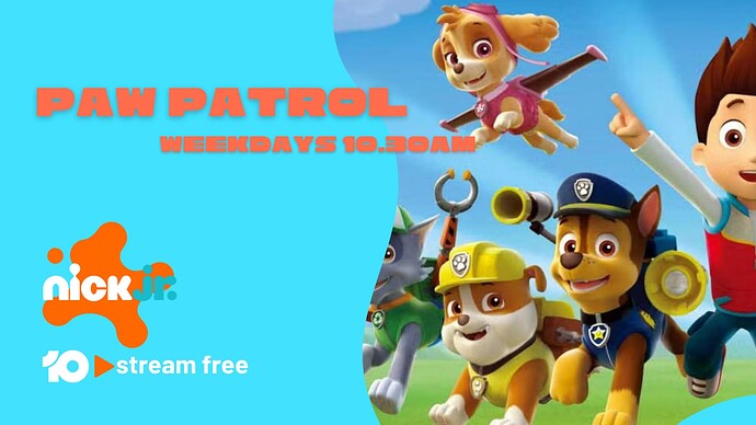
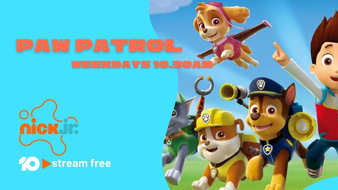
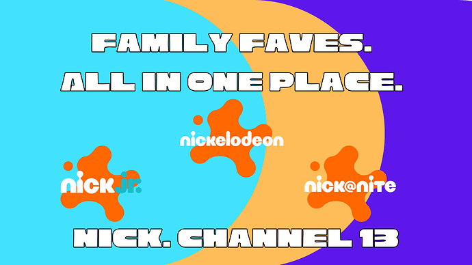
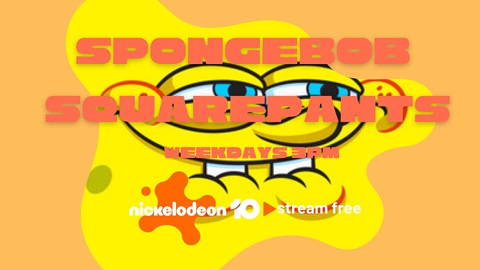
I truly wish that 10 cared for Nickelodeon. The promos are so outdated and still mention 10Play. It’s been a solid two months. I’ve mocked up how a refreshed Nickelodeon.
Call the channel Nick and divide it up into blocks.
Nick Jr from 4am-1pm
Nickelodeon from 1pm-7pm & 1am-4am
Nick@Nite from 7pm-1am
Given each block its own distinct colour scheme.
Nickelodeon has yellow
Nick Jr has light blue/cyan
Nick@Nite has purple
Done a few different endboard variants experimenting with the 10 stream free logo and the outlined/coloured Nickelodeon logos.
Feedback on this and the watermarks would be muchas gracias much appreciated
Some watermarks
With now/next bugs.
Experimented implementing a 10 > Stream Free bug into the w/m and tried a 10.com.au into a Nick Jr logo to see how it looked
The cross-bar on the T doesn’t look quite right, especially on the left. Might need a little thickening.
Fun idea.
That “family faves” image would look nicer without the black outline
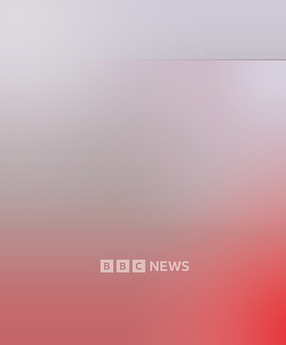
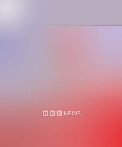
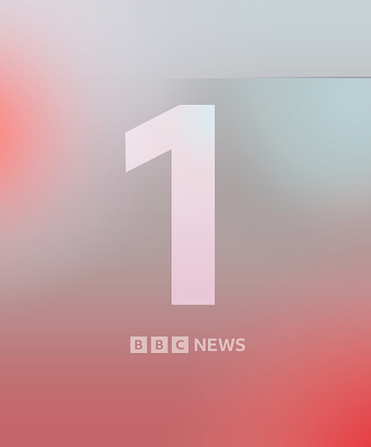
Tried recreating the new BBC national news backdrop…
… and realised the One in Salford is now the odd one (heh) out
Originally wanted to have some sort of homage to Breakfast by mixing orange/blue in there, but I noticed the 10 backdrop has more purplish blue to fit with the newsroom lighting at that time, and Salford is in teal. So teal it is.
Sloppy on-screen mockup with the display on the right - hence the elongated oval chair in the background
